Language Translation Vertical SaaS Professional Website Template
The Translate real time translation analytics dashboard landing page template is built for localization teams who need live visibility across every workflow. It combines a Feature Tab Switcher hero, an animated comparison table, and a Stats-First Impact layout to turn raw translation data into a compelling, conversion-focused landing page that earns the install before visitors ever reach the download button.
by Rocket studio
Quick summary
This landing page template gives localization teams a mission-control-grade web presence for their translation analytics dashboard. Built on a Dynamic Motion theme with a Carbon Fiber color system, it showcases throughput, quality, and cost metrics in a single scrolling page. The layout frontloads undeniable performance data so visitors are already convinced by the time they reach the call to action.
Who this template is for
Translation operations run on tight deadlines and scattered data. This landing page was designed for the people responsible for keeping those pipelines on time and on budget. If you manage translation workflows at scale, this template speaks your language directly.
- Localization managers running forty-language rollouts who need live workflow visibility across every target language and locale
- Translation agency ops leads tracking freelancer output against service-level agreements and needing clear engagement metrics by translator
- Product teams shipping multilingual apps who need to know which locale is dragging build timelines and inflating cost
What problem this template solves
Traditional translation methods rely on manual work: spreadsheets updated after the fact, generic reports that miss the bottleneck, and time consuming status meetings that still leave ops leads guessing. When you are managing dozens of language pairs across different segments of a global rollout, that approach breaks down fast. The landing page template gives your dashboard a front door that reflects the urgency of the problem it solves.
- No landing page design built for translation ops: most dashboard pages borrow generic SaaS layouts that fail to communicate the real-time nature of the product
- Missed conversion opportunities: visitors arrive curious but leave without installing because the page cannot show the dashboard working
- Disconnected messaging: a landing page that does not match the power of the underlying platform raises the bounce rate and kills trust before it builds
What you get with this template
This template delivers a fully structured, single-page conversion experience designed around one goal: getting localization professionals to install the dashboard. Every section is purpose-built from the hero to the footer, with no filler and no generic placeholder content.
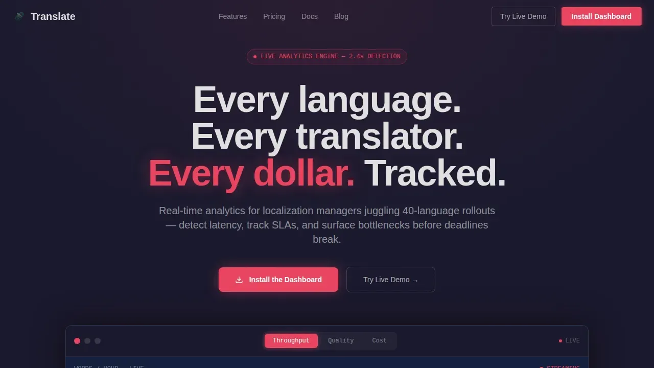
- A Feature Tab Switcher hero with three animated tabs (Throughput, Quality, Cost) that morph the dashboard mockup beneath them in real time
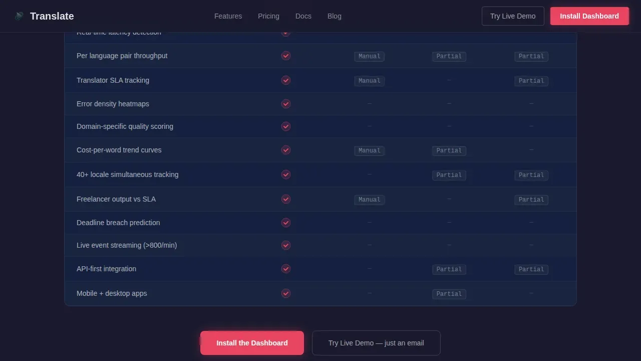
- A twelve-row comparison table benchmarking the dashboard against spreadsheets, generic business intelligence tools, and competitor translation management system platforms, with scroll-animated checkmarks
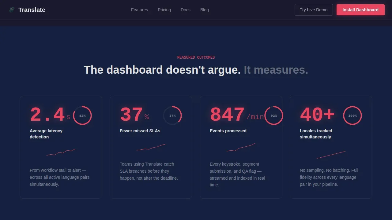
- Stats-Impact sections featuring oversized metrics like "2.4s average latency detection" and "37% fewer missed SLAs," each paired with sparklines, progress rings, and counter animations
Feature list
This landing page template is engineered around the specific needs of translation ops teams. Below are the key features built into the page structure and design system.
Feature Tab Switcher Hero Section
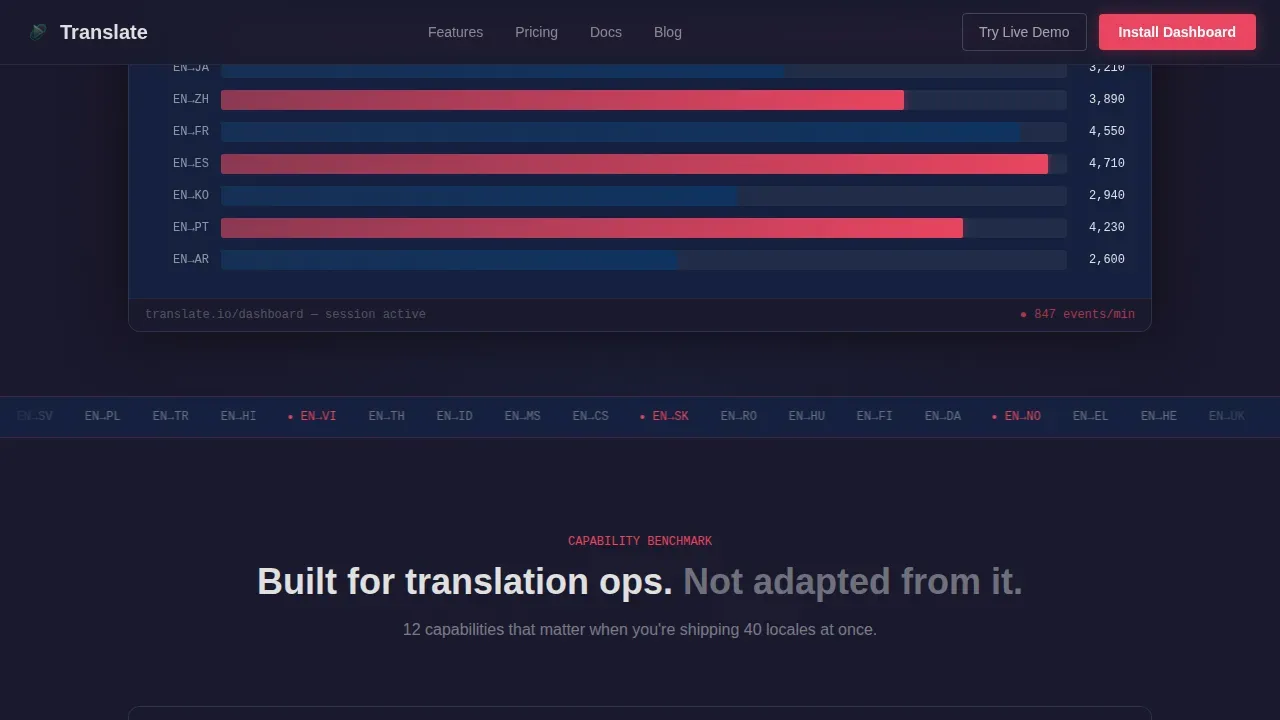
The hero centers on three clickable tabs labeled Throughput, Quality, and Cost. Each tab triggers a fluid morph animation across the entire dashboard mockup beneath it. Throughput shows language pairs ranked by words per hour with animated bar races. Quality reveals error heatmaps across fifty locales pulsing in red gradients. Cost displays per-word spend curves with live trend arrows. Numbers count up rather than swap, and charts reshape rather than cut, making the transition feel like watching a live system rather than a static slide deck.
Animated Comparison Table
Immediately after the hero, the landing page surfaces a twelve-row benchmark table. It compares the dashboard head-to-head against manual spreadsheet tracking, generic business intelligence platforms, and competitor translation management systems. Checkmarks animate in on scroll, one by one, so visitors experience each advantage as a deliberate reveal rather than a block of text. This structure makes it easy for different user groups to see exactly where the dashboard wins across key metrics like latency detection, SLA tracking, cost visibility, and error density monitoring.
Stats-First Impact Sections
Each feature explanation opens with a single oversized metric before revealing the detail beneath it. This Stats-First Impact rhythm ensures visitors absorb hard numbers before reading narrative copy. Counters tick upward, sparklines draw across the screen, and progress rings fill in real time. The motion is constant but disciplined so the page feels alive without becoming distracting. This approach keeps the customer journey moving forward without overwhelming visitors with dense blocks of text.
Dual Call-to-Action Structure
The primary call to action, labeled "Install the Dashboard," appears locked to the header and again after the comparison table. Paired buttons support both iOS and desktop installs. A secondary path offers "Try the Live Demo," linking to a browser-based sandbox requiring only an email. High-contrast sticky call-to-action buttons remain visible as users scroll, reducing the risk of a high bounce rate by keeping the conversion path accessible at every stage of the page.
Carbon Fiber Visual Identity System
The entire landing page design is built on a Carbon Fiber color system: deep graphite black, woven carbon mid-tone, phosphor data-green, and electric signal blue reserved for live data points, active tabs, and call-to-action pulses. Typography uses JetBrains Mono for all data and numbers, and DM Sans for body copy. Every illuminated element signals that something is live and transmitting, giving the page a mission-control console feel that matches the product's real-time nature.
Social Proof and Testimonial Section
Before the final call to action, the page includes a social proof block with metrics-driven testimonials from localization leads and company logos. High-converting landing pages rely on strong social proof cues like customer testimonials and trust badges to build credibility. This section translates that principle into the localization context, using specific SLA improvement numbers rather than vague endorsements, so the message lands with the technical audience this platform serves.
Page sections overview
| Section | Purpose |
|---|---|
| Hero Tab Switcher | Showcases Throughput, Quality, Cost tabs with animated dashboard mockup and dual call to action |
| Comparison Table | Twelve-row benchmark versus spreadsheets, generic BI tools, and competitor TMS platforms with scroll-animated checkmarks |
| Stats Impact Blocks | Oversized live metrics with sparklines, progress rings, and counter tick-ups before each feature explanation |
| Feature Showcase | Three capability deep-dives using animated counters and live data visualization panels |
| Social Proof | Metrics-driven testimonials, company logos, and SLA improvement numbers from localization leads |
| Final Download call to action | "Install the Dashboard" section with iOS and desktop paired buttons and secondary demo path |
| Footer | Linear single-row footer pattern with minimal navigation |
Design & branding system
The landing page design follows a Dynamic Motion theme built on a Carbon Fiber palette. Every color choice is functional: backgrounds stay in the graphite-to-carbon range, text renders in cool silver-white, and the electric signal blue fires only on interactive moments. The result feels like the interior of a mission control console where every illuminated element means something is alive.
- Colors: deep graphite black (#1A1A2E), carbon mid-tone (#16213E), phosphor data-green (#0F3460), and electric signal blue (#E94560) reserved for live data points, active tabs, and call-to-action pulses
- Typography: JetBrains Mono for all data, numbers, and performance counters; DM Sans for all body copy and navigation labels
- Motion system: tab morphing, counter tick-ups, sparkline draws, progress ring fills, and scroll-triggered checkmark reveals working together as a coherent Dynamic Motion system
Mobile & speed optimization
The landing page design is built desktop-first to deliver the mission control console experience on large screens, and then scales responsively to tablets and mobile phones. Analytics-heavy pages must be optimized for retention to prevent slow load times from pushing visitors away before the data lands. The template uses a static hero with client-side tab switching and Intersection Observer scroll animations to keep the experience lean.
- Desktop-first layout scales to tablet and mobile, with charts designed to remain readable and touch-friendly at every breakpoint
- Intersection Observer triggers scroll animations only when sections enter the viewport, avoiding unnecessary processing on page load
- Static hero construction paired with client-side tab switching keeps initial load fast while preserving the full animated experience after the page renders
How this template helps you convert
Conversion rate measures the percentage of visitors who complete a desired action on a page. This landing page is engineered to move localization professionals from curious to convinced without friction. Landing pages are designed to minimize distractions and provide the right amount of information to convert visitors, and every structural decision here serves that goal.
- The page earns trust before it asks for action: visitors see the dashboard working across three different tab views, a twelve-row comparison table, and multiple oversized performance metrics before they ever reach a download button, so the conversion feels like a logical conclusion rather than a sales push.
- Dual call-to-action placement removes the commitment barrier: the primary "Install the Dashboard" button and the secondary "Try the Live Demo" path give visitors two entry points matched to where they are in their customer journey, whether they are ready to install now or need one more proof point first.
- Social proof at the final section closes the gap: metrics-driven testimonials and SLA improvement numbers from real localization leads answer the last objection at the last moment, reinforcing business performance claims with evidence rather than promises.
Other information about this template
This template was built specifically for the Language Translation Vertical SaaS niche, a category where generic landing page design consistently underserves a technically sophisticated audience. The following details provide additional context for teams evaluating whether this template fits their platform and workflow.
- Website translation is essential for targeting global markets: only 25.9% of internet users are English speakers, meaning nearly 75% of customers prefer content in their own language, making a strong localization process a genuine business priority
- The landing page design integrates visual dashboards and compelling content together so that the localization process is visible rather than described, helping visitors understand the product through demonstration rather than text alone
- Teams connecting external analytics platforms, including Google Analytics and similar tools, can use performance data from those sources to frame the dashboard's value proposition within their existing reporting stack
- Google Analytics event tracking and goal configuration can complement the landing page performance reporting from this template, giving marketing teams detailed information about how visitors interact with each tab, table row, and call-to-action button
- The comparison table structure supports marketing campaigns and ad campaigns by giving teams a ready-made asset that speaks to the specific pain points surfaced in paid traffic sources, reducing the bounce rate for visitors arriving from targeted ad campaigns
- The template supports global content strategies: because the dashboard handles both left-to-right and right-to-left language layouts, the landing page messaging around multilingual support aligns naturally with the product's actual capabilities
- Preparing a website for localization involves optimizing technical and branding elements to accommodate different languages, and this template models that principle in its own design by using a neutral, language-agnostic visual system
- Social media traffic sources driving visitors to the page will encounter a landing page design optimized for first impressions: the hero loads with a clear headline, a live dashboard mockup, and a call to action above the fold, satisfying expectations set by social media ad campaigns
- Teams running marketing efforts across digital channels, including social media and search, benefit from a landing page that reinforces the same message regardless of which traffic source delivered the visitor
- The custom dashboard widget system described in the product is reflected in the page's own modularity: teams can adapt the template's section order, swap testimonials, and update metrics panels to match their platform's current performance data
- A strategic move for any localization platform is to present a personalized experience to different user groups: localization managers, agency ops leads, and product teams all see their own pain points named in the copy and addressed in the comparison table
- Existing users returning to the page for reference or sharing with colleagues will find the comparison table and stats sections easy to navigate directly, because the page structure is linear and each section is self-contained
Theme
Dynamic Motion
Creative direction
Stats-First Impact
Color system
Carbon Fiber
Style
Comparison Table
Direction
App Download
Page Sections
Feature Tab Switcher Hero
Animated Comparison Table
Stats-first Impact Sections
Dual Call-to-action Layout
Carbon Fiber Visual Identity
Social Proof Testimonial Block
Related questions
Who is the primary audience for this landing page template?
What sections are included in this landing page?
Can I customize the metrics and copy in this template?
How does this template support the app download conversion goal?
Does this template work for localization platforms beyond translation dashboards?



