Live Ticket Command Dashboard Landing Page Template
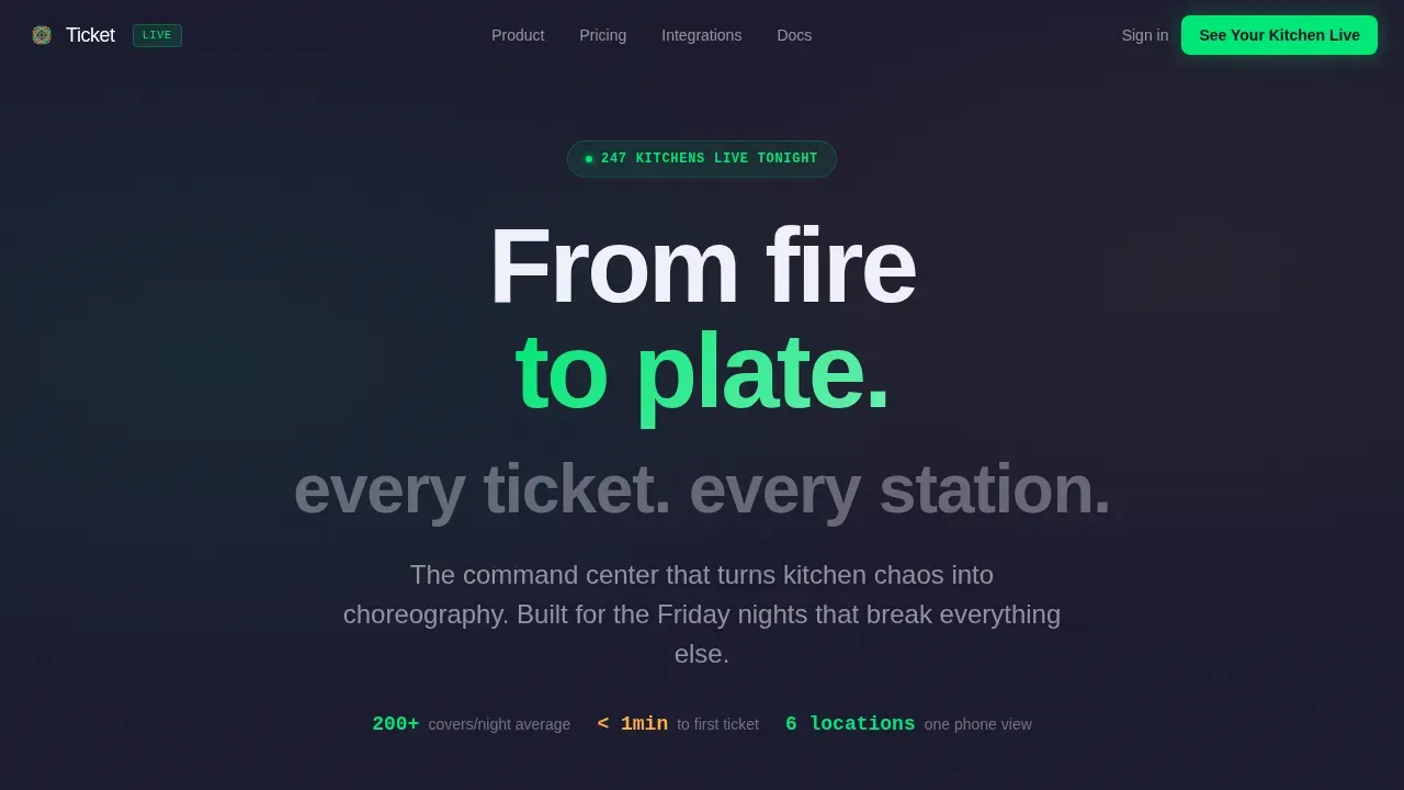
Ticket is a glassmorphic, dark-themed landing page template built for restaurant order management platforms. It opens with an interactive Order Volume Calculator, flows into an animated feature grid of frosted-glass station cards, and closes with a focused lead-gen form. Independent operators and multi-unit restaurant groups get a single command center that tracks every ticket from fire to pass.
by Rocket studio
Quick summary
Ticket is a single-page, lead generation landing page template designed for restaurant software platforms. It uses a glassmorphic dark visual system, a calculator-first creative approach, and an animated dashboard preview to show operators the exact value they get before asking for a single detail. Every section is purpose-built to move visitors from curiosity to qualified sign-up.
Who this template is for
This landing page template speaks directly to the people running busy kitchens and growing restaurant operations. It is built for teams who need to prove ROI before committing to a new platform, and for developers or product teams creating a compelling web presence for a restaurant SaaS app.
- Independent restaurant owners handling 200-plus covers on a Friday night who need proof that a new tool will actually reduce ticket errors and improve table turn time.
- Multi-unit operators who need real-time visibility across several locations from one screen, and front-of-house managers who are tired of shouting orders across the expo line.
- Development teams and product marketers creating a high-converting landing page for a kitchen order management app, dashboard, or restaurant SaaS product.
What problem this template solves
Running a busy service without a centralized command center means tickets get lost, stations fall out of sync, and managers spend the whole night at the window. Visitors who land on this page already feel that pain. The template meets them with instant, personalized answers instead of generic product copy.
- Kitchen teams lose time and service quality when tickets are tracked on paper or across disconnected screens. This template shows how a live management dashboard can change that, station by station.
- Restaurant operators struggle to justify a new platform without seeing real numbers. The built-in Order Volume Calculator gives visitors a simulated, personalized dashboard view before any sales conversation starts.
- Developers and product teams waste time building landing pages from scratch. This template gives them a well structured, production-ready starting point with all the sections, layouts, and interactions already defined.
What you get with this template
This template delivers a complete, single-page landing experience structured around five carefully sequenced sections. Every section has a clear job, and together they move visitors from first impression to form submission without friction.
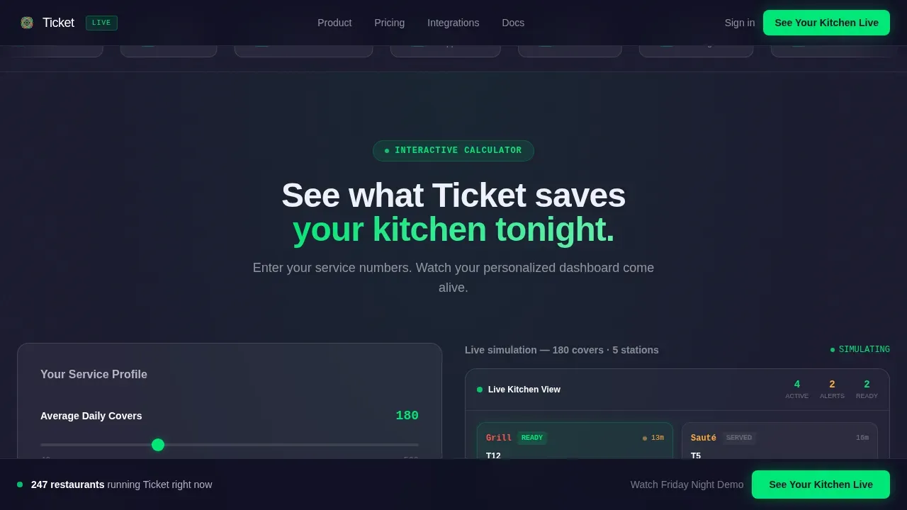
- A hero section combining a scrolling restaurant logo bar with an interactive Order Volume Calculator and a live animated dashboard preview that updates in real time as visitors enter their details.
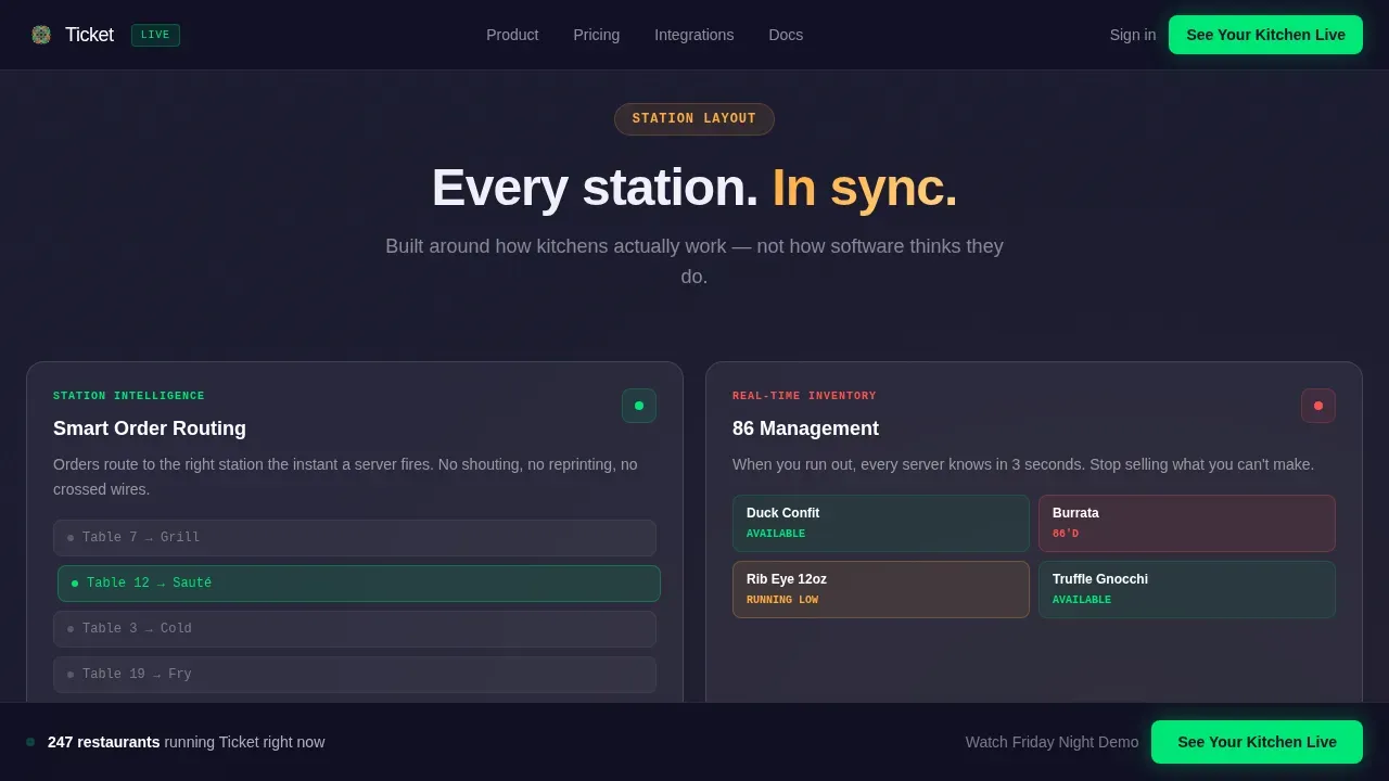
- A frosted-glass feature grid organized like a kitchen station layout, with micro-animated cards covering order routing, 86 management, multi-location sync, and point-of-sale integration, followed by a single calm social proof quote from a chef.
- A three-step progressive disclosure lead-gen form anchored by a sticky bottom call-to-action bar, so visitors who are ready to act can always find the entry point.
Feature list
This template is built around a specific set of interactive and visual capabilities drawn directly from the source brief. Each one plays a defined role in converting visitors into leads.
Interactive Order Volume Calculator
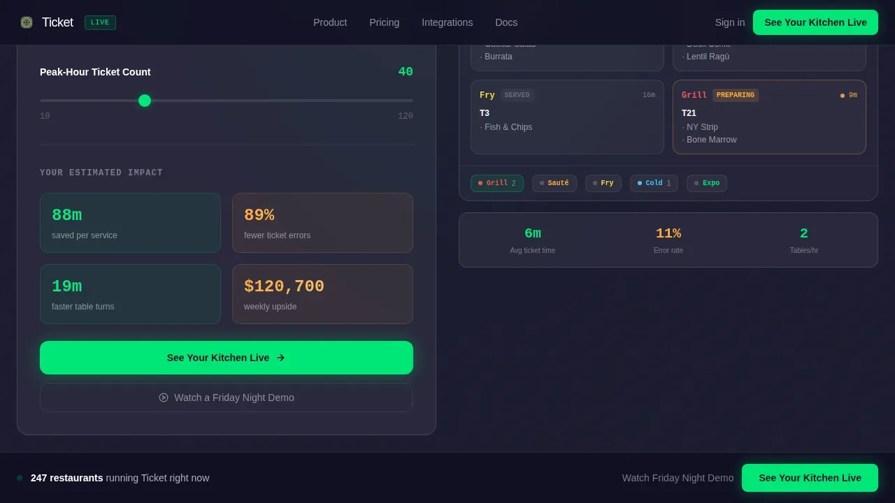
Visitors input their average daily covers, number of stations, and peak-hour ticket count. The calculator instantly renders a simulated admin dashboard showing estimated time saved per service, reduced ticket errors, and projected table turn improvement. This is the core conversion engine of the landing page, and it does the convincing before a single line of product copy appears.
Live Animated Dashboard Preview
Attached to the calculator results, the dashboard preview brings data to life. Orders animate through four stages: received, preparing, ready, and served. Station cards glow and resolve in ticket-green and expeditor amber. A small key performance indicator (KPI) bar ticks upward in real time. Visitors see the product working before they read about it, which is a powerful advantage for driving sign-ups.
Glassmorphic Feature Grid
Below the hero, a data grid of frosted-glass station cards presents each platform capability as its own tile. Cards include micro-animations that demonstrate the specific interaction, for example an 86 flag appearing on an item or a ticket routing from one station to another. The scroll rhythm is designed to build density and then resolve into calm, mirroring the rhythm of a real kitchen service.
Scrolling Restaurant Logo Bar
The header opens with a horizontal ribbon of restaurant brand logos scrolling in a slow, infinite loop. This immediately signals social proof: restaurants like yours already run on this. It sets trust before visitors even interact with the calculator, which is especially important for independent operators who are skeptical of new tools.
Three-Step Progressive Lead-Gen Form
The lead capture form uses progressive disclosure. It asks for three things in sequence: restaurant name, number of locations, and the point-of-sale system currently in use. Each step feels lightweight on its own. A sticky bottom bar repeats the primary call to action after the feature grid, catching visitors who scroll past the first form placement.
Sticky Call-to-Action Bar
A persistent bottom bar carries the primary call to action throughout the lower half of the page. It stays visible as users scroll through the feature grid and social proof section. This ensures that visitors who are ready to act do not have to scroll back up to find the entry point, reducing drop-off at the moment of decision.
Page sections overview
| Section | Purpose |
|---|---|
| Logo Bar | Establish social proof and brand trust immediately on landing |
| Order Volume Calculator | Deliver personalized ROI data before any copy appears |
| Live Dashboard Preview | Animate order stages and KPI metrics in real time |
| Feature Grid Cards | Demonstrate each platform capability with micro-animations |
| Social Proof Quote | Resolve tension with a single calm chef testimonial |
| Lead-Gen Form | Capture qualified leads via three-step progressive disclosure |
| Sticky call to action Bar | Keep the primary call to action accessible throughout scroll |
| Footer | Provide navigation and supporting links in a single linear row |
Design & branding system
The visual identity is built on a glassmorphic dark substrate that feels like looking through the glass of a semi-open kitchen at midnight. Every color decision has a functional role. The palette is deliberately minimal to reduce cognitive load and keep visitor attention on the data.
- The deep charcoal substrate (#1A1A2E) keeps backgrounds recessive. Frosted translucent card surfaces use white at 12 percent opacity with thin 1-pixel borders at 20 percent white, so cards appear to float. Electric ticket-green (#00E676) signals active orders and confirmations. Warm expeditor amber (#FFAB40) marks alerts and time-sensitive states.
- Typography uses Plus Jakarta Sans for interface and body copy, and DM Sans for data and metrics. Both are clean, highly legible web design choices that hold up at small sizes on high-density screens. Together they support the calm, authoritative tone of a professional operations tool.
Mobile & speed optimization
This landing page template is built desktop-first, reflecting the reality that operators typically check dashboards on tablets or monitors during service. The layout is mobile-responsive as a fallback, so visitors who arrive on a phone still get a complete, readable experience with touch-friendly interactive elements.
- Static sections of the landing page use server-rendered components to keep the initial page load fast. The interactive calculator, live dashboard animations, and infinite logo scroll are handled as client components, separating heavy interactivity from the critical rendering path.
- The layout is mobile friendly with large tap targets on the call-to-action buttons and readable type at every breakpoint, ensuring visitors on any device can complete the three-step lead form without friction.
How this template helps you convert
The conversion architecture of this landing page is deliberate and layered. It does not rely on a single hero headline to do all the work. Instead, it builds trust and demonstrates value progressively before asking for anything.
- The Order Volume Calculator personalizes the experience immediately. Visitors input their own numbers and see results that are specific to their kitchen. By the time they reach the call-to-action button below the calculator, they have already seen their own estimated time savings and projected improvements, making the decision to act feel logical rather than risky.
- The feature grid deepens confidence by showing the product working in context. Each frosted-glass station card with its micro-animation acts as a mini demonstration. Visitors do not need to imagine how the platform handles 86 management or multi-location sync. They can see it. The single chef testimonial that follows the grid resolves any remaining hesitation with a calm, credible human voice.
- The sticky call-to-action bar and the secondary "Watch a Friday Night Demo" link ensure that every visitor type has a clear next step. High-intent visitors use the form. Lower-intent visitors click the demo link and watch a 90-second screen recording. Both paths generate trackable interest and move visitors toward a conversation with the sales team.
Other information about this template
This template is part of a broader ecosystem of dashboard and landing page admin templates designed for modern SaaS products. Builders and product teams working across different software categories will find the underlying structure familiar, since many admin dashboard and management dashboard patterns translate well across industries.
- The template's component architecture draws on conventions common across admin templates and SaaS dashboard layouts. Elements like the sidebar navigation, data widgets, analytics panels, and structured data grids are standard building blocks in professional web design today. Developers comfortable with HTML, CSS, and component-based frameworks will be able to customize the template and adapt it to their specific app preferences with minimal extra cost.
- The landing page is built with a well structured set of ui components and ui elements that cover the full interaction range needed for a modern restaurant SaaS landing page. This includes animated data widgets, a calculator tool with live preview, progressive form ui ux patterns, and a sticky call-to-action bar. Ready made widgets for KPI display and order tracking are already included in the template, so teams can start building quickly without sourcing additional components.
- Developers working with mapping or location features in related admin dashboard pages may find it useful to know that similar projects in this template family support tools like leaflet maps and google maps for multi-location display use cases. Those elements are not part of this specific landing page but are available in related admin panel templates within the same ecosystem. Features like a file manager, to do lists, and chat modules are also common in companion admin dashboard templates if teams need a fuller back-office suite alongside this landing page.
- This template fits naturally alongside other admin templates used for e commerce platforms, event management, and customer support operations. Teams building a saas dashboard or a classified listings product will recognize the dashboard and management dashboard patterns here. The template family also supports regular updates, so the code base stays current. Users looking to deep dive into customization can access all the options for layout, color, sidebar configuration, and data display preferences without needing to post a support ticket. All the details needed to get started are included in the template documentation. Importantly, users who download the template get access to the full component set from day one with no additional license tiers required beyond the standard options.
- The event landing page conventions built into this template follow established best practices. A strong benefit-driven headline and a clear call to action anchor the hero section. High-quality animated visuals capture the platform's atmosphere above the fold and create an emotional connection with visitors. Trust indicators including the scrolling logo bar and the chef testimonial reassure visitors the way social proof does on a well-designed event landing page. The primary objective of a landing page for any live ticket order system is to convert visitors by minimizing friction, and this template is designed to do exactly that. An event landing page that creates a sense of urgency through live data and personalized calculator results can significantly increase the likelihood that visitors take the desired action and complete the lead form.
Theme
Directory & Discovery
Creative direction
Calculator/Tool First
Color system
Glassmorphic
Style
Dashboard/Data Grid
Direction
Lead Generation
Page Sections
Interactive Order Volume Calculator
Live Animated Dashboard Preview
Glassmorphic Feature Grid
Scrolling Restaurant Logo Bar
Three-step Progressive Lead-gen Form
Related questions
Who is this landing page template designed for?
Does the template include the interactive calculator functionality?
Can the template be customized to match a different brand?
What sections are included in this landing page?
Is this template suitable for a desktop-first audience?



