Network Landing Page Template | Last-Mile Delivery
Locker is a modular card-grid landing page template built for locker and pick-up point networks operating at scale. It opens with an animated, dark-mode network map, then builds a data-first argument across animated stat cards, a twelve-metric comparison table, and two conversion paths: a network analysis form and a gated infrastructure brief download.
by Rocket studio
Quick summary
Locker is a single-page template designed for last-mile delivery infrastructure businesses. It leads with a live interactive network map, advances through animated proof-point cards, and closes with a head-to-head comparison table. The layout speaks directly to logistics managers, property managers, and municipal planners who need hard numbers before they commit.
Who this template is for
This template is built for organisations that operate or pitch locker and pick-up point networks at a meaningful scale. The content structure and conversion flow are tuned for decision-makers who read data before they read headlines.
- E-commerce logistics managers routing thousands of parcels daily across multiple delivery zones
- Property managers dealing with overflowing mailrooms and unattended package liability
- Municipal planners and infrastructure teams redesigning curb space for the modern delivery economy
What problem this template solves
Last-mile delivery is expensive, failure-prone, and hard to justify without clear numbers. Missed deliveries, stolen porch packages, and failed handoffs are not just operational frustrations, they are measurable cost lines. This template gives locker network operators a page that turns those pain points into a structured, data-led argument.
- Visitors arrive with scepticism and need proof fast; the animated live counters and stat cards answer that demand immediately
- Prospects comparing alternatives need a clear side-by-side view; the persistent comparison bar and twelve-metric table deliver it without friction
- Internal stakeholders building a business case need downloadable evidence; the gated infrastructure brief addresses that need directly
What you get with this template
You get a complete, conversion-focused landing page layout structured around the Engineering Blueprint visual theme and Stats-First creative direction. Every section is built to carry the weight of a serious B2B pitch.
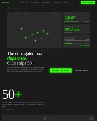
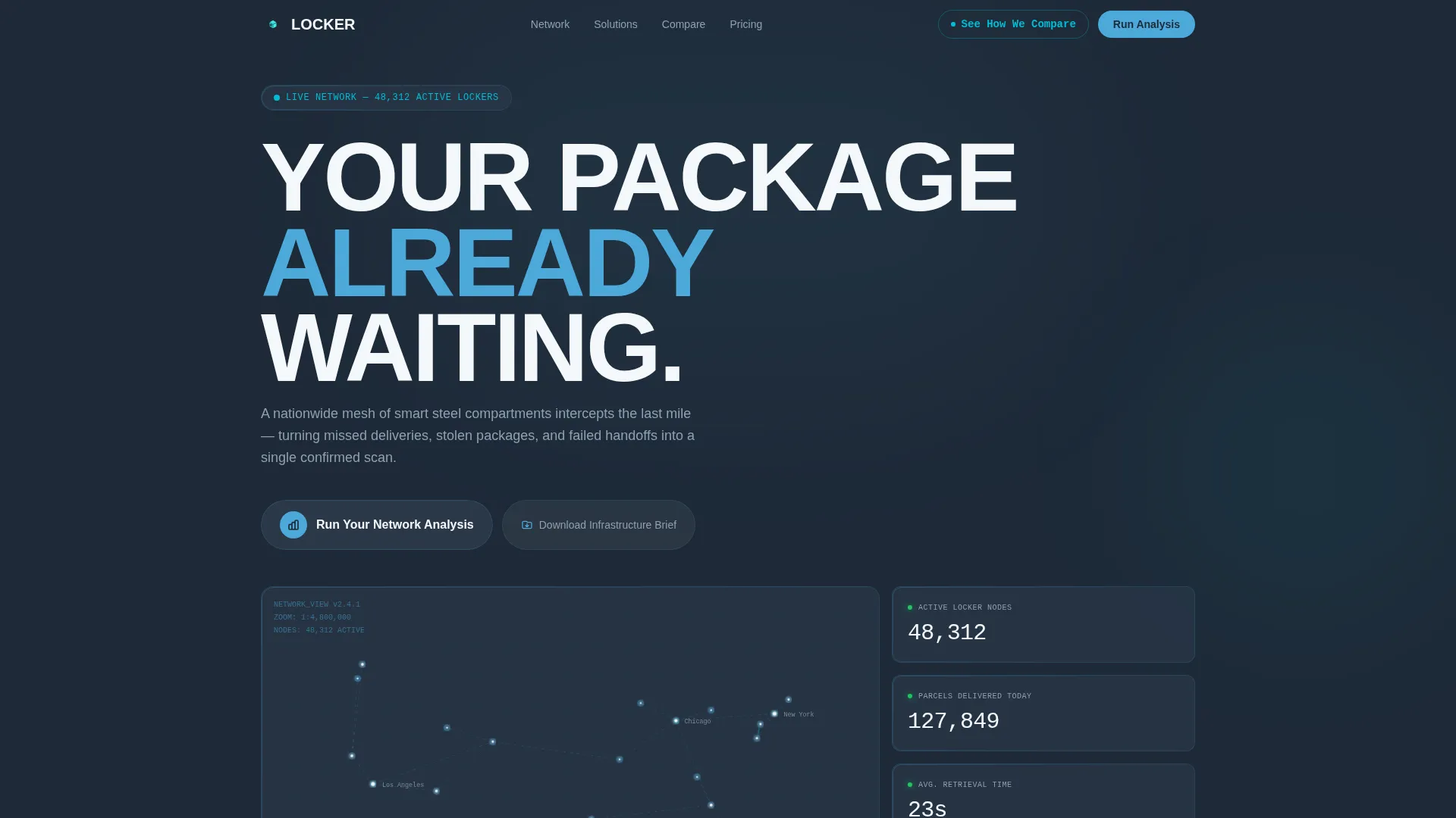
- An interactive dark-mode network map header with animated counters for active lockers, parcels delivered today, and average retrieval time
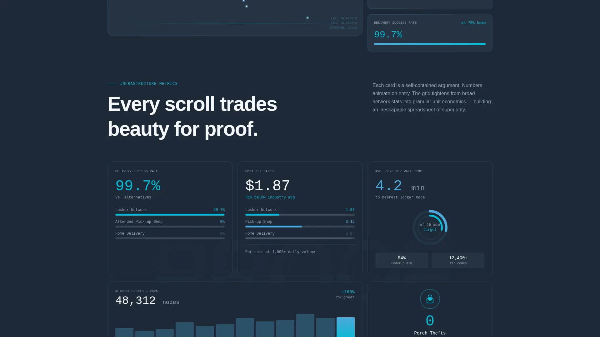
- A modular card grid of animated proof-point statistics covering delivery success rates, cost-per-parcel comparisons, and consumer walk-time data
- A persistent sticky comparison bar anchoring to a twelve-metric feature table, plus dual conversion paths through a network analysis form and a gated brief download
Feature list
This section breaks down the core functional and visual components built into the template.
Animated Network Map Header
The header renders a dark-mode geographic view of the locker network in blueprint linework. Locker clusters appear as sky-blue nodes connected by faint routing lines. On page load, three counters animate upward: total active lockers, parcels delivered today, and average retrieval time in seconds. No hero photography is used, the infrastructure density makes the visual case before any copy loads.
Modular Animated Stat Cards
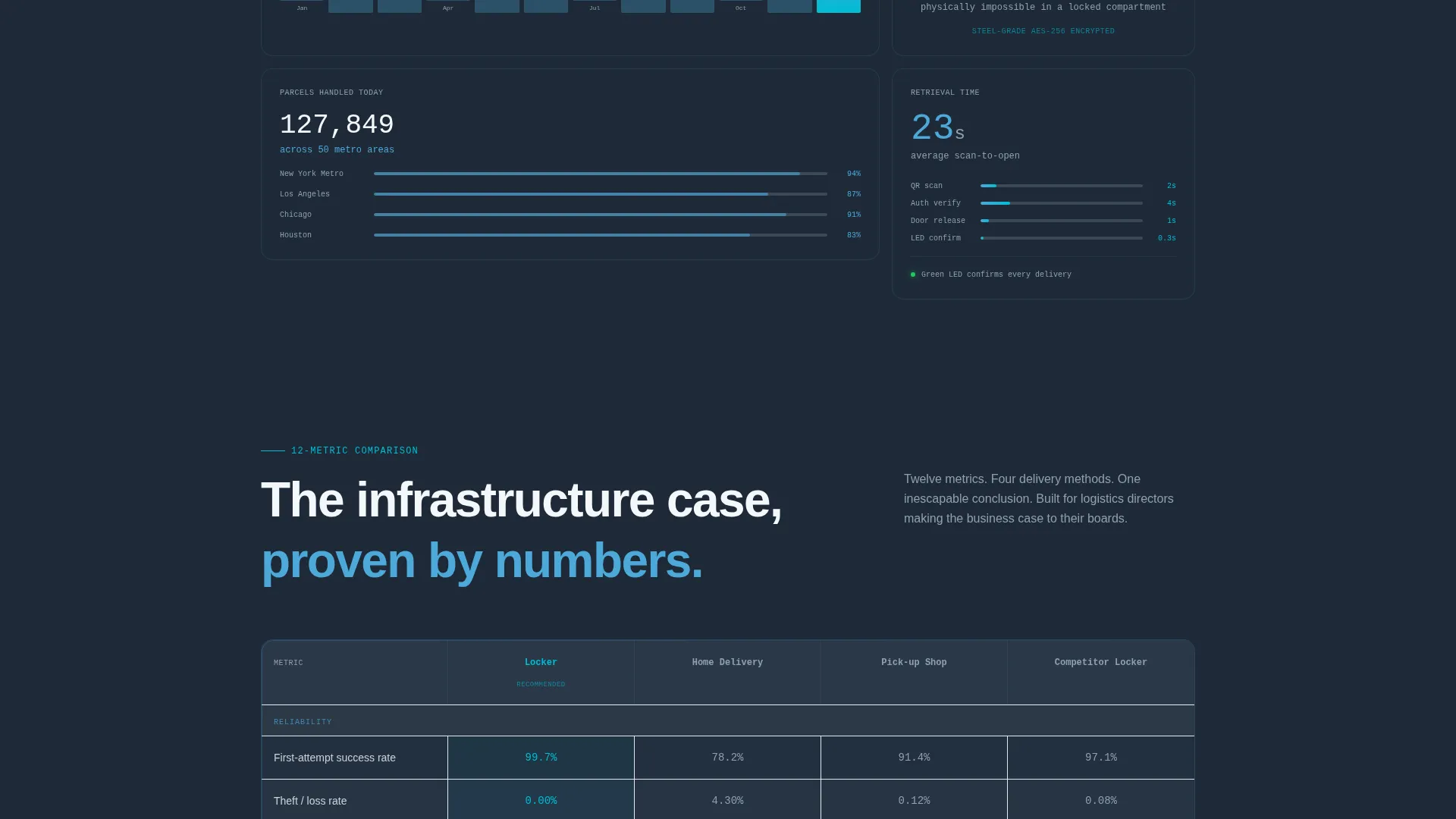
Each card in the grid is a self-contained data argument. Numbers animate into view on viewport entry, set in monospaced engineering typography against slate backgrounds. Cards progress from broad network statistics toward granular unit economics as the visitor scrolls, building a compounding case for the network's efficiency.
Twelve-Metric Comparison Table
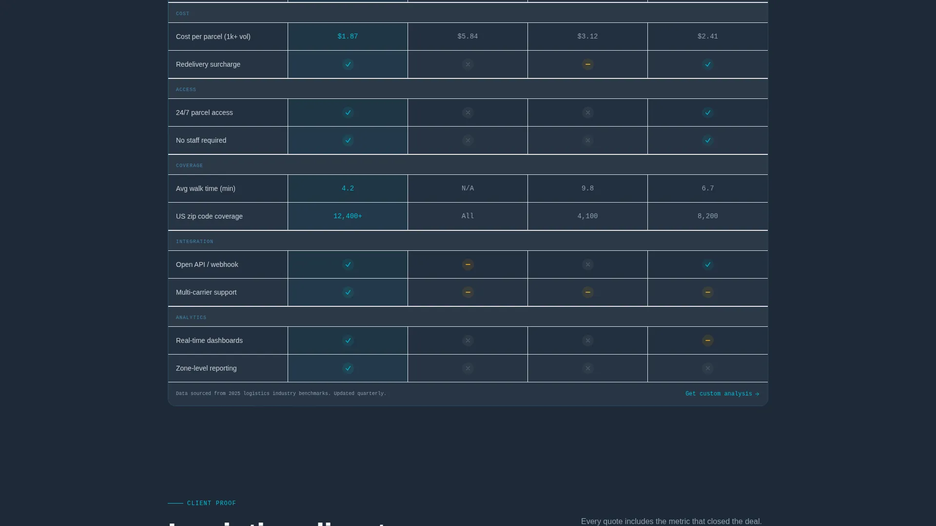
A detailed, feature-by-feature comparison table measures the locker network against home delivery, attended pick-up shops, and competitor smart locker systems across twelve defined metrics. The table is anchored by a persistent sticky bar reading "See How We Compare", which stays visible throughout the entire scroll journey.
Dual Conversion Path Layout
The primary conversion path is a short network analysis form asking for monthly parcel volume, number of delivery zones, and current failed-delivery percentage. The secondary path offers a downloadable infrastructure brief behind an email gate, designed for logistics directors still building internal approval cases.
Engineering Blueprint Visual Theme
The full page follows a structured blueprint aesthetic. Card surfaces and data labels use bright confirmation white. Structural slate and deep graphite form the dark panel backgrounds. Hover states and live counters pulse in signal cyan, reinforcing the sense of a live operational control room.
Page sections overview
| Section | Purpose |
|---|---|
| Network map header | Visualises live locker network density with animated counters |
| Animated stats grid | Delivers proof-point data cards with viewport-triggered number animations |
| Delivery comparison table | Compares locker network against three alternatives across twelve metrics |
| Network analysis form | Primary conversion form capturing parcel volume and zone data |
| Infrastructure brief gate | Secondary email-gated download for internal stakeholder cases |
| Sticky comparison bar | Persistent navigation element anchoring to the comparison table |
Design & branding system
The template uses the Slate and Sky colour system built around four defined values. The palette is designed to feel like a logistics control room at dawn, dark instrument panels catching the first blue light, every indicator reading nominal.
- Core colours: structural slate (#3B4856), deep graphite (#1E2A38), open-sky blue (#4DA8DA), and bright confirmation white (#F4F7FA) for card surfaces and data labels
- Accent interactions pulse in signal cyan (#00BCD4) on hover states and live counters, reinforcing an active, operational feel
- Typography uses monospaced engineering fonts for all numeric data displays, keeping the visual language consistent with the blueprint theme throughout
Mobile & speed optimization
The card-grid layout is modular by design, which means each block scales and reflows cleanly across screen sizes. The Stats-First creative direction keeps visual weight on data rather than large media assets, which supports a lighter page footprint overall.
- Modular card structure adapts naturally to narrower viewports without breaking the data hierarchy
- The dark-mode map header and blueprint linework use vector-style rendering, keeping visual complexity high without heavy image files
- Animated counters and viewport-triggered card entries are scoped to individual modules, so each section loads and performs independently
How this template helps you convert
The entire page is structured as a progressive argument. Each scroll step adds more evidence, and the layout channels that evidence toward two clearly defined actions.
- The animated network map and live counters create immediate credibility before a single line of copy is read, reducing the time it takes a sceptical visitor to decide whether the network is worth exploring further.
- The sticky comparison bar keeps the "See How We Compare" anchor visible at all times, so visitors who are evaluating alternatives always have a direct path to the twelve-metric table, the moment they are ready to compare, the trigger is already on screen.
- The dual conversion paths serve two distinct buyer stages: the network analysis form captures prospects ready to act now, while the gated infrastructure brief captures decision-influencers who need to build an internal case first.
Other information about this template
This template is purpose-built for the locker and pick-up point network category within the broader last-mile and delivery logistics space. It is designed to serve operators, vendors, and infrastructure planners who need a page that communicates at the level of a serious logistics pitch rather than a consumer product launch.
- The template style is Card Grid (Modular), meaning individual stat blocks, comparison panels, and form sections can be rearranged or expanded to match different network scales or regional configurations
- The header concept is Map-Based, making it well suited for networks with geographic coverage stories to tell, the denser the network, the stronger the visual argument
- The landing page direction is Comparison/Versus, which is particularly effective for markets where buyers are actively evaluating locker network operators, attended pick-up services, and home delivery alternatives side by side
- The theme and colour system are consistent with the Engineering Blueprint and Slate and Sky conventions used across this template family, making it straightforward to align with existing brand guidelines that already lean toward industrial or infrastructure aesthetics
Theme
Engineering Blueprint
Creative direction
Stats-First Impact
Color system
Slate & Sky
Style
Card Grid (Modular)
Direction
Comparison/Versus
Page Sections
Animated Network Map Header
Modular Animated Stat Card Grid
Twelve-metric Comparison Table
Dual Conversion Path Layout
Engineering Blueprint Visual Theme
Related questions
Who is this landing page template designed for?
Does the template include a comparison table?
What are the two conversion paths in this template?
Can the modular card grid be reorganised?
What does the animated header show?