Self-Storage Vertical SaaS Professional Website Template
Locker is a hub-and-spoke self-storage CRM landing page built for operators who need total visibility at a glance. It opens with a Feature Tab Switcher showing live-styled occupancy, payments, and access control data. The Void and Violet design system gives the page a sharp, data-command feel that instantly earns trust from serious storage professionals.
by Rocket studio
Quick summary
Locker is a single-page, anchor-nav landing page template for a self-storage customer relationship management platform. It leads with three hero metrics, walks visitors through unit visibility, payment automation, and gate access, and closes with a full-width call-to-action. The dark Data Command aesthetic makes complex operational data feel clean and credible from the first scroll.
Who this template is for
This template is built for self-storage software teams and SaaS founders who need a high-converting landing page that speaks directly to operators. The page tone and structure mirror the daily reality of managing units, tenants, and late payments across multiple facilities.
- Regional self-storage managers overseeing many facilities at once
- Independent, mom-and-pop storage owners moving off clipboards and spreadsheets
- Real estate investment trusts rolling up storage portfolios who need investor-ready occupancy dashboards
What problem this template solves
Storage operators are drowning in disconnected tools. Gate codes live in one place, rent records in another, and occupancy data in a third. This template gives a self-storage CRM platform a landing page that immediately mirrors that frustration and then proves the solution.
- No single view of unit status, tenant accounts, and delinquency data across locations
- Slow, manual collections processes that let late payments age without automatic follow-up
- No portfolio-level dashboard that satisfies investors or lenders on short notice
What you get with this template
The template delivers a complete, section-led landing page structured around three core pillars: visibility, automation, and portfolio intelligence. Every section is designed to earn attention before asking for a click.
- A Feature Tab Switcher header with three live-styled dashboard mockups for occupancy, payments, and access control
- Stats-First Impact layout that surfaces three hero metrics before any paragraph copy appears
- Anchor navigation with a sticky "See Your Facility Live" call-to-action and a secondary "Talk to an Operator Specialist" text link
Feature list
This template packages purpose-built components that work together to move storage operators from curiosity to conversion.
Feature Tab Switcher Header
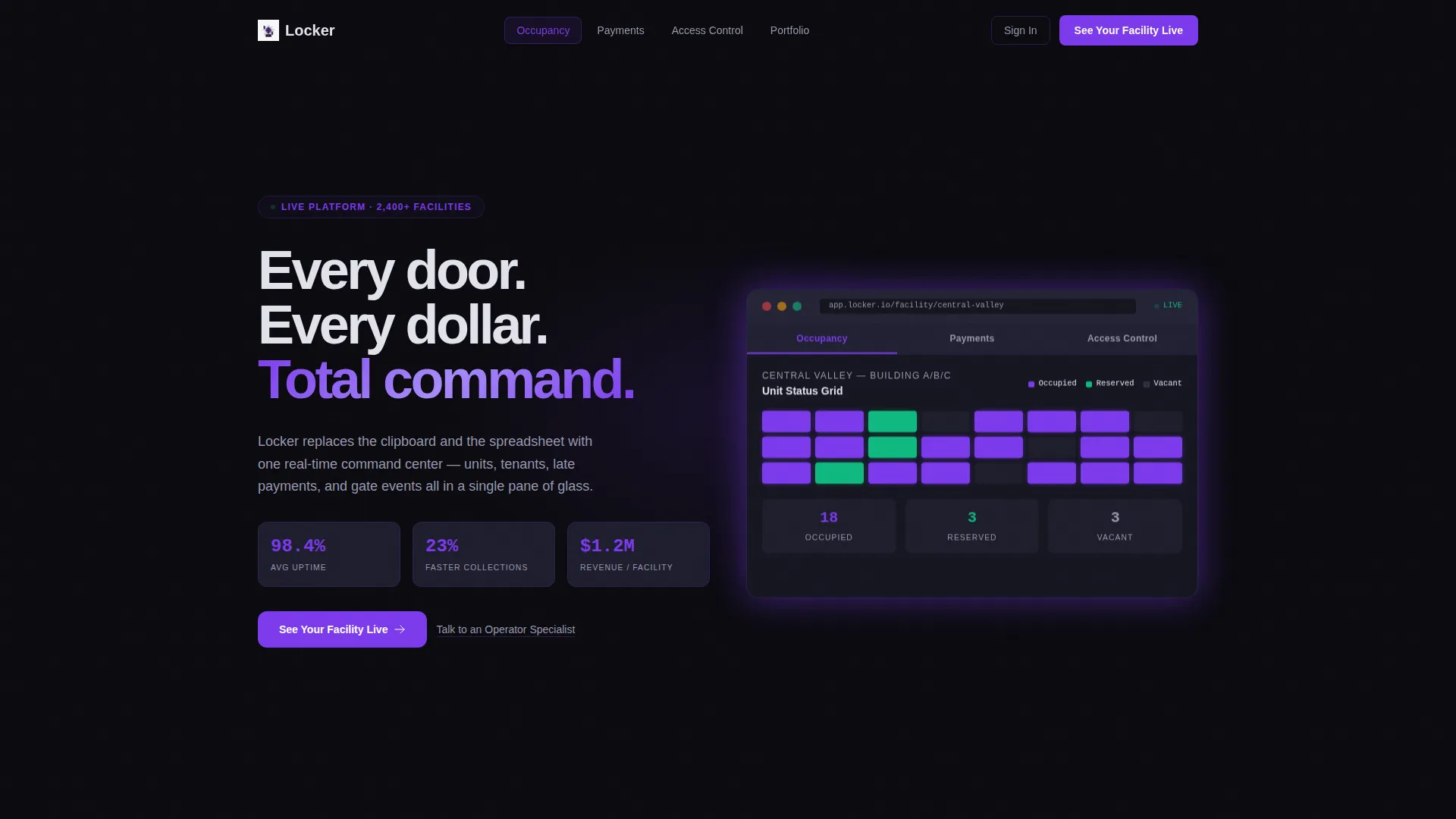
Three clickable tabs labeled "Occupancy," "Payments," and "Access Control" sit above a live-styled dashboard mockup. Each tab swaps the visual to a different data view: a color-coded facility map, an aging receivables waterfall chart, or a timestamped gate log with tenant photos and lock status icons. Unit numbers like B-217 and real dollar amounts make the mockup feel immediately familiar.
Stats-First Hero Section
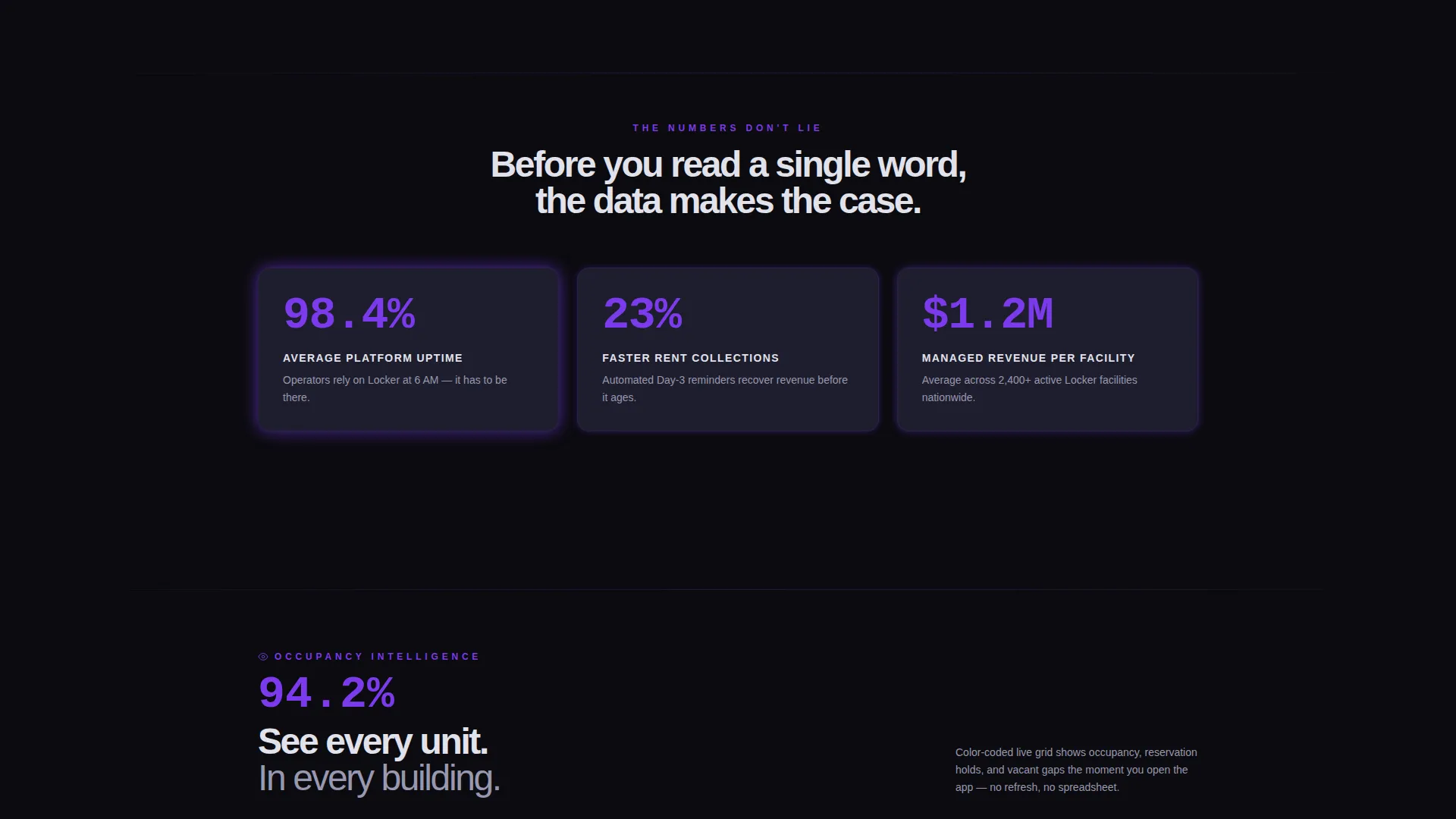
Three headline metrics anchor the top of the page before any feature copy appears. "98.4% Average Uptime," "23% Faster Collections," and "$1.2M Managed Revenue Per Facility" are displayed as bold impact numbers. Each spoke section lower on the page repeats this pattern with its own opening stat, so the narrative builds through proof rather than description.
Hub and Spoke Anchor Navigation
A sticky navigation bar links directly to each spoke section: unit visibility, payment automation, and portfolio intelligence. The primary call-to-action button, "See Your Facility Live," is embedded in the nav and stays visible throughout the scroll. This structure lets operators jump to the section most relevant to their role without losing the conversion path.
Spoke Section: Unit Visibility
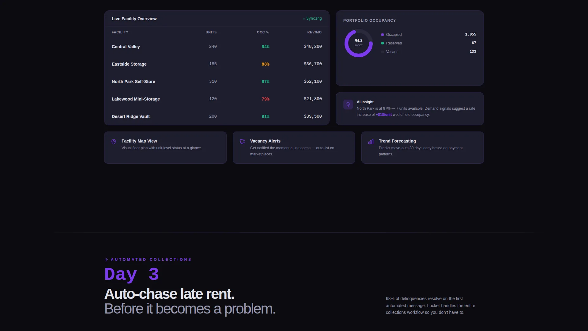
The first spoke section opens with a single undeniable number about occupancy, then explains how the platform delivers it. The occupancy grid uses green, violet, and dark gray to indicate occupied, reserved, and vacant units. The visual language is borrowed directly from the operator's daily workflow so the pitch feels like recognition, not persuasion.
Spoke Section: Payment Automation
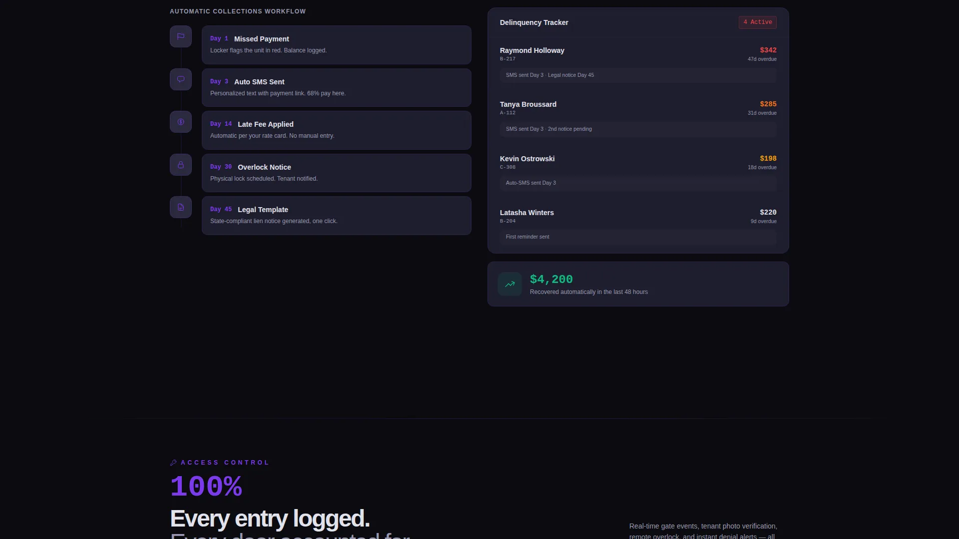
The payments spoke leads with a stat about collections speed and then shows the aging receivables waterfall chart from the header tab in greater detail. Copy escalates from seeing late payments to automating the chase on day three. This section speaks directly to the cash-flow anxiety that drives storage operators to look for better tools.
Spoke Section: Portfolio Intelligence
The final spoke addresses multi-facility operators and investors. It opens with a metric about portfolio scale and then describes comparing forty facilities in a single view. This section is positioned to close enterprise buyers and real estate investment trust clients who need data they can present to stakeholders by a specific deadline.
Page sections overview
| Section | Purpose |
|---|---|
| Sticky Anchor Nav | Keeps primary call to action visible throughout scroll |
| Feature Tab Switcher | Shows occupancy, payments, and access control live mockups |
| Stats Hero Block | Delivers three impact metrics before any body copy |
| Unit Visibility Spoke | Proves real-time occupancy awareness across facilities |
| Payment Automation Spoke | Demonstrates automated late-rent collections workflow |
| Portfolio Intelligence Spoke | Addresses multi-facility and investor reporting needs |
| Full-Width call to action | Closes the page with primary and secondary action options |
Design & branding system
The Void and Violet color system creates a Data Command aesthetic that reads like a professional operations terminal. Every color decision is intentional and functional, not decorative.
- Abyssal black (#0B0B0F) as the primary background, muted graphite (#1E1E2E) for card surfaces and section dividers, and cool platinum (#E2E2EC) for body text
- Electric violet (#7C3AED) used surgically on progress bars, hover states, active tab indicators, and the glow around live metrics to signal activity rather than style
Mobile & speed optimization
The template is designed so the dense data-command layout stays readable and functional on smaller screens. Hub-and-spoke anchor navigation adapts to mobile browsing patterns where operators check dashboards from a truck cab or facility office.
- Tab switcher and spoke sections stack cleanly for vertical scrolling on phones and tablets
- Sticky anchor nav and primary call-to-action remain accessible at any scroll depth on mobile devices
How this template helps you convert
Every structural decision in this template is built to reduce friction and build confidence before the visitor reaches the call-to-action.
- The Stats-First layout proves platform competence with three specific metrics before asking for any click, so operators arrive at the call-to-action already convinced.
- The sticky anchor nav with an embedded "See Your Facility Live" button keeps the conversion path one tap away at every point in the scroll, removing the need to hunt for next steps.
Other information about this template
This template is built specifically for the self-storage vertical SaaS category and pairs well with demo-first acquisition funnels. The no-form click-through model sends visitors directly to a guided demo environment pre-loaded with a sample facility, which lowers the barrier for operators who are skeptical of long sign-up flows.
- The secondary call-to-action, "Talk to an Operator Specialist," floats as a subtle text link beneath the primary button to capture enterprise buyers without cluttering the main conversion path
- The page narrative escalates in three deliberate steps: visibility, automation, and portfolio intelligence, matching how operators think about their own operational maturity
- The template is categorized under Technology and Self-Storage Vertical SaaS, making it a strong fit for founders building in the storage management software space
Theme
Data Command
Creative direction
Stats-First Impact
Color system
Void & Violet
Style
Hub & Spoke (Anchor Nav)
Direction
Click-Through
Page Sections
Feature Tab Switcher Header
Stats-first Impact Layout
Hub and Spoke Anchor Navigation
Spoke Sections with Escalating Narrative
Click-through Call to Action Architecture
Related questions
What type of page is this template?
Who is this template designed for?
Does the template include a sign-up form?
Can I adapt the stats and dashboard mockup data?
Is the dark color scheme easy to customize?



