Locker - Powerful Storage Landing Page Template
Locker is a scroll-reveal landing page template built for storage directory and listing sites. It opens with an animated stats dashboard, flows into an interactive size estimator, and closes with a lead-capture form that feels earned, not forced. The glassmorphic Tech Glass design makes complex data feel clean, confident, and immediately trustworthy to renters comparing units.
by Rocket studio
Quick summary
Locker is a single-page, scroll-driven template for storage directory and listing businesses. It guides visitors from a live metrics header through an interactive unit-size calculator, a color-coded facility map, and animated comparison cards, before delivering a focused lead form. Every section builds on the last, so visitors arrive at the call to action already informed.
Who this template is for
This template is designed for operators who connect renters with storage options across a local or regional area. If your business depends on listing multiple facilities and turning browsers into qualified leads, this page was built for you.
- Storage directory owners who list climate-controlled units, warehouse bays, and portable pods across a wide search radius
- Small business owners or marketplace builders who need renters to compare facilities by price, availability, and access hours before converting
- Operators targeting time-sensitive renters such as people relocating, managing seasonal inventory, or handling a home renovation
What problem this template solves
Finding and comparing storage options online is fragmented. Renters visit multiple sites, lose track of pricing, and abandon the search before committing. This template consolidates discovery, comparison, and lead capture into one seamless scroll experience.
- Visitors cannot easily compare unit sizes, rates, and access hours without jumping between separate pages or tabs
- Generic directory pages fail to build confidence before asking for contact details, leading to low form completion
- Storage seekers often do not know what size unit they need, so they leave without converting
What you get with this template
You get a fully structured, visually complete landing page ready to represent a storage directory or listing site. The layout is purpose-built around progressive disclosure, meaning each scroll section earns the visitor's attention before asking for anything in return.
- An animated stats dashboard header with live-counter cards, sparkline graphs, and cursor-parallax effects
- An interactive unit-size estimator where visitors drag furniture icons onto a floor plan and receive a live square-footage and price recommendation
- A multi-step lead capture form pre-seeded with calculator output, covering ZIP code, unit size, move-in date, and email
Feature list
This section covers the core built-in components that make Locker function as a complete storage directory landing page.
Animated Stats Dashboard Header
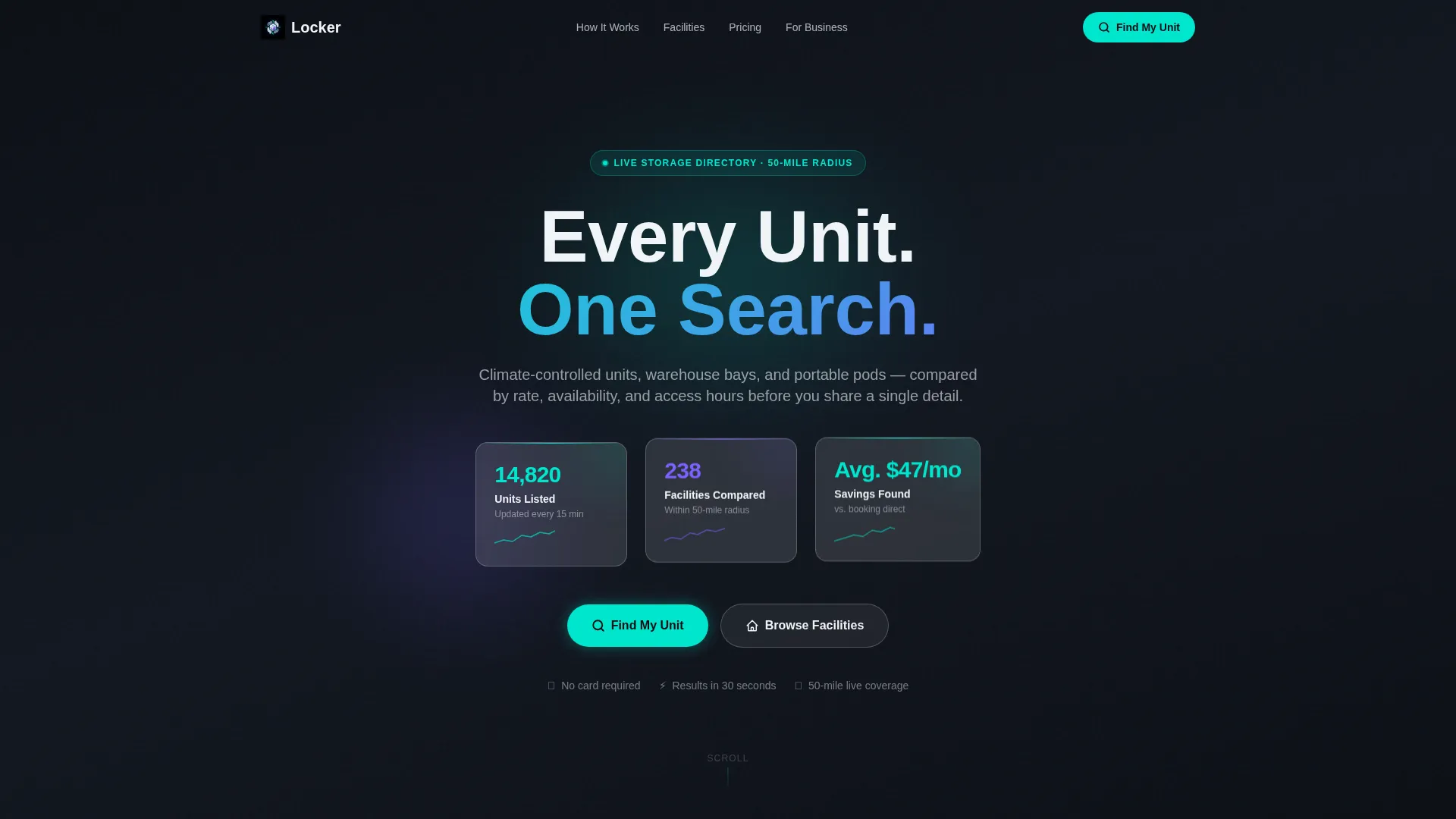
Three frosted-glass cards float over a deep dark gradient and display ticking counters for units listed, facilities compared, and average monthly savings. Tiny sparkline graphs pulse beneath each number. A subtle parallax effect follows the cursor so the cards feel physically suspended in space.
Interactive Unit-Size Estimator
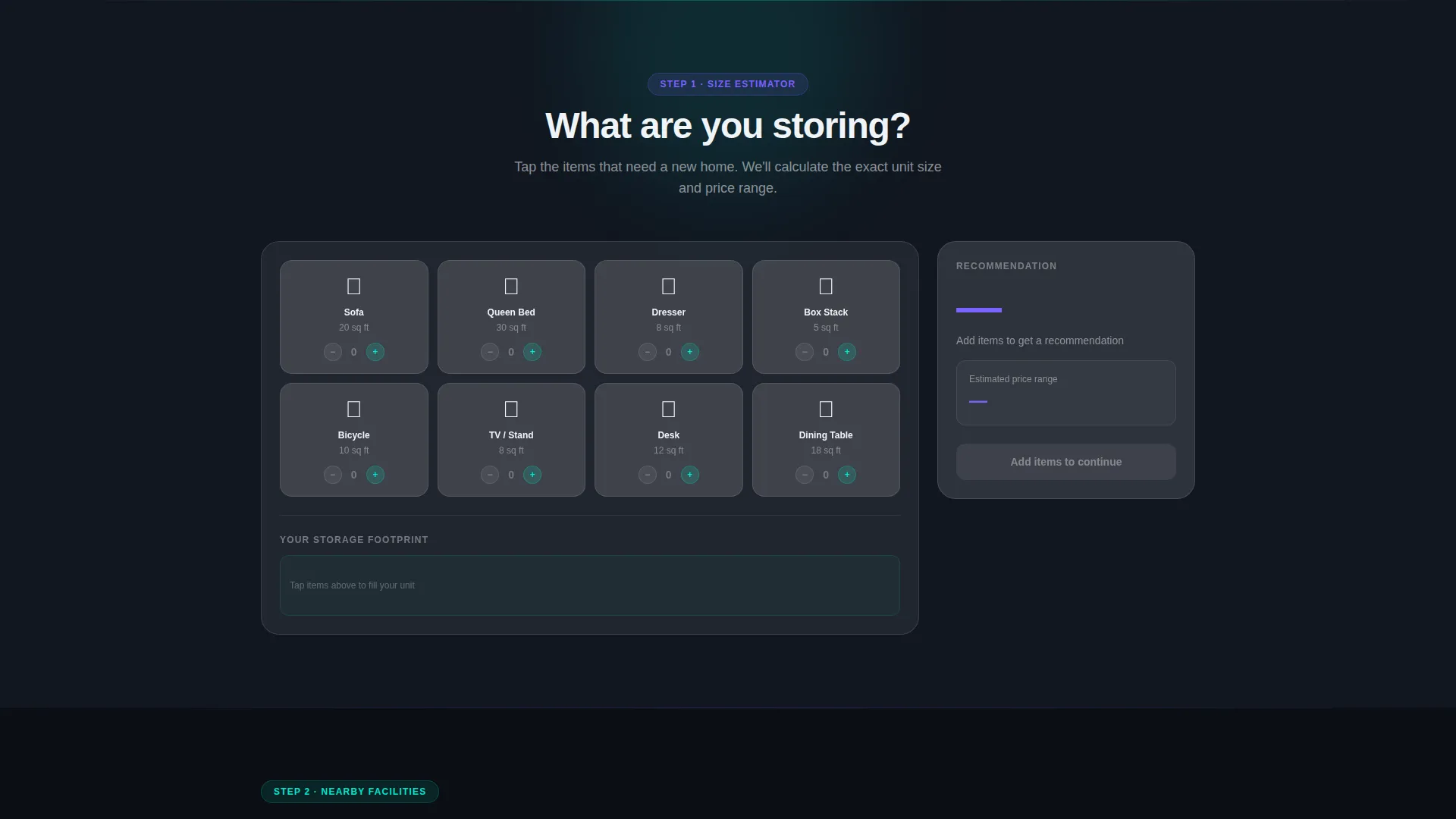
Visitors drag furniture icons including a couch, bed, boxes, and bicycle onto a virtual unit floor plan. The recommended square footage and price range update live inside a frosted sidebar. This tool resolves the most common reason renters leave without converting: they do not know what size they need.
Color-Coded Facility Map Layer
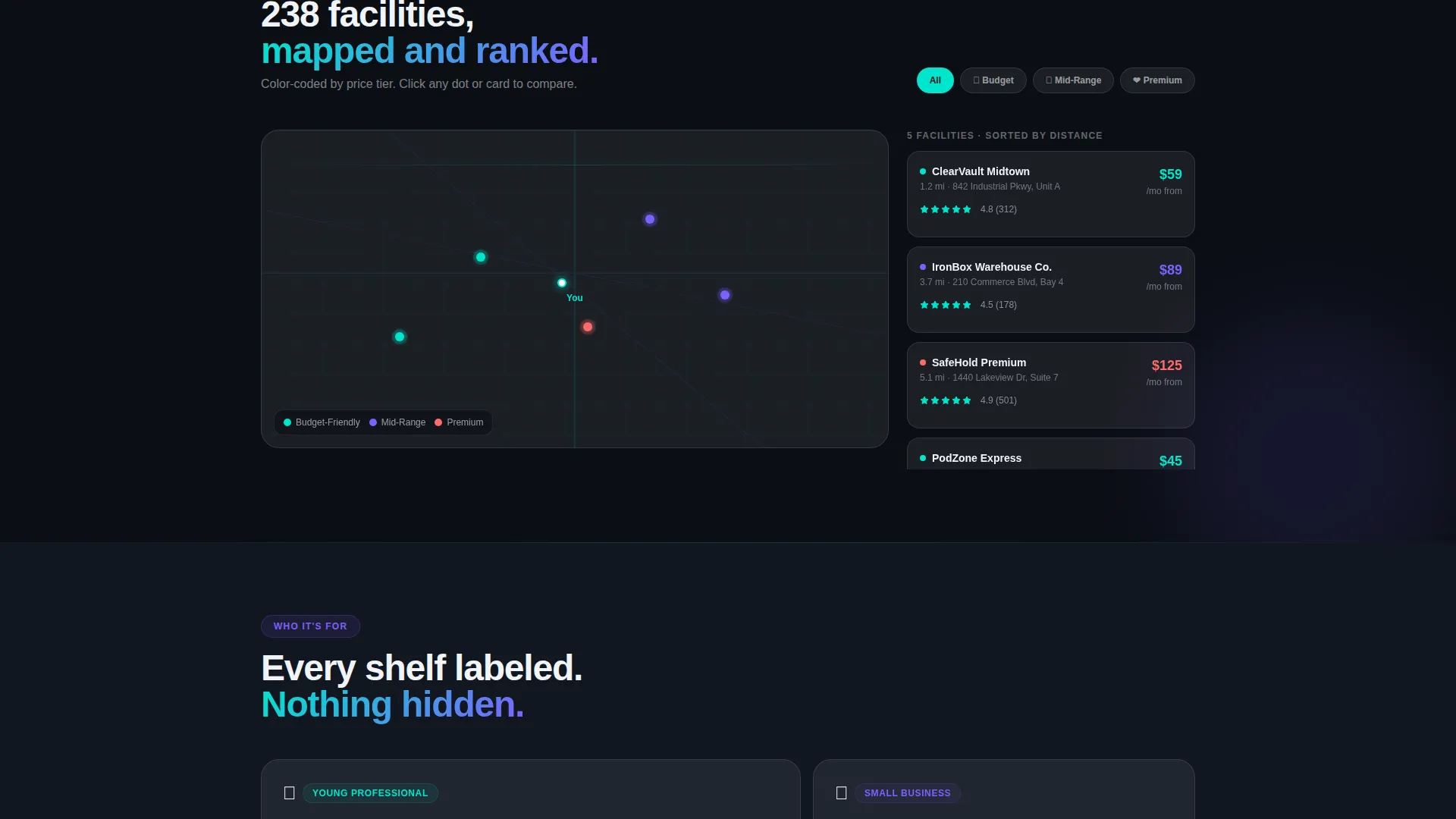
A map section fades in as the visitor scrolls, showing nearby storage facilities color-coded by price tier. This gives renters an instant geographic and financial overview without leaving the page.
Animated Comparison Cards
Facility cards slide up progressively, each showing ratings, access hours, and security features. The reveal sequence rewards continued scrolling and keeps the visitor engaged through the mid-page journey.
Animated Savings Breakdown
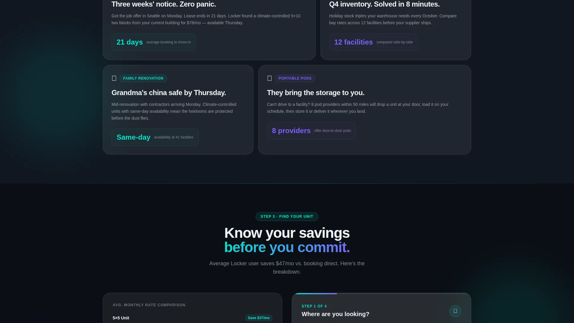
A bar-by-bar animated chart shows the visitor how much they stand to save compared to average local rates. The animation ties directly to the calculator output, making the savings figure feel personal rather than generic.
Dual-Path Lead Capture Form
After the calculator delivers a recommendation, a glowing teal primary call-to-action labeled "Find My Unit" opens the main form. A persistent floating button labeled "Compare All Facilities Near Me" offers a secondary entry path. Both paths gate behind the same ZIP code and email fields.
Page sections overview
| Section | Purpose |
|---|---|
| Stats Dashboard Header | Display live unit counts, facility totals, and average savings with animated counters |
| Size Estimator Tool | Let visitors drag furniture icons and receive a live unit-size and price recommendation |
| Facility Map Layer | Show nearby facilities color-coded by price tier on a fading-in map |
| Comparison Cards | Slide-up facility cards with ratings, access hours, and security details |
| Savings Breakdown Chart | Animate a bar chart showing personalized savings versus local averages |
| Lead Capture Form | Collect ZIP code, unit size, move-in date, and email via a minimal multi-step form |
Design & branding system
The visual identity follows a Tech Glass theme built on a glassmorphic color system. Every layer feels translucent, with depth visible behind each panel, giving the page the atmosphere of a high-tech control interface.
- Core palette: deep void black (#0B0E14) as the base, frosted panel white at 12% opacity (#FFFFFF1F) for card surfaces, luminous teal (#00E5CC) for active states and call-to-action highlights, and soft iris purple (#7B61FF) for secondary accents and hover glows
- Visual language: beveled glass edges, translucent overlapping panels, and subtle light-catch effects that create physical depth without photography or illustration
- Motion style: eased counter animations, scroll-reveal progressions, sparkline pulses, and cursor-driven parallax on the header cards
Mobile & speed optimization
The scroll-reveal structure is designed to work smoothly across screen sizes. Each section snaps into view in sequence, keeping the experience coherent on both large monitors and smaller touch screens.
- Scroll-snap sections maintain a clear reading order on mobile, so the calculator and map layers stay usable without horizontal scrolling
- The glassmorphic panel system uses layered opacity and color rather than heavy image assets, keeping the visual richness achievable at a range of viewport sizes
- The persistent floating button for the secondary lead path stays accessible throughout the scroll on all device sizes
How this template helps you convert
The page is built around a core principle: give visitors useful information before asking for their details. By the time the lead form appears, each visitor already has a unit-size recommendation, a local price estimate, and a savings figure attached to their name.
- The interactive calculator pre-selects the unit size field in the lead form, reducing friction and making form completion feel like a natural next step rather than a cold request
- The ZIP code field is the first input in the form and can be pre-filled if the visitor grants geolocation access, cutting the perceived effort of completing the form
- The dual-path design means high-intent visitors who skip the calculator still reach the same lead gate via the persistent floating button, so no qualified visitor leaves without a conversion opportunity
Other information about this template
This template is built for the storage directory and listing site niche within the broader category of technology-driven digital presences. It is a strong fit for operators who want a modern, data-forward page that communicates credibility through live numbers rather than stock photography.
- The template style is Scroll Reveal (Progressive), meaning each section animates into view as the visitor scrolls, creating a sense of discovery and deepening engagement
- The creative direction is Calculator or Tool First, which means the interactive estimator appears immediately after the header and anchors the entire conversion flow
- The header concept is Stats or Metrics, using real-time animated data as the primary hero element instead of imagery
- The lead generation direction is embedded throughout the page structure, with the form appearing only after the visitor has received measurable value from the tool and comparison layers
- This template suits a fifty-mile-radius directory model, where renters need to filter by proximity, price tier, and unit type before committing to a facility
Theme
Tech Glass
Creative direction
Calculator/Tool First
Color system
Glassmorphic
Style
Scroll Reveal (Progressive)
Direction
Lead Generation
Page Sections
Animated Stats Dashboard Header
Interactive Unit-size Estimator
Color-coded Facility Map
Slide-up Comparison Cards
Animated Savings Breakdown
Dual-path Lead Capture Form
Related questions
Can I customize the unit types shown in the size estimator?
Does the template include the facility map as a built-in component?
Is this template suitable for a single city or a multi-region directory?
What happens when a visitor skips the calculator?
Can the animated counter numbers in the header be updated to reflect real data?



