Specialist Logistics Software Comparison Website Template
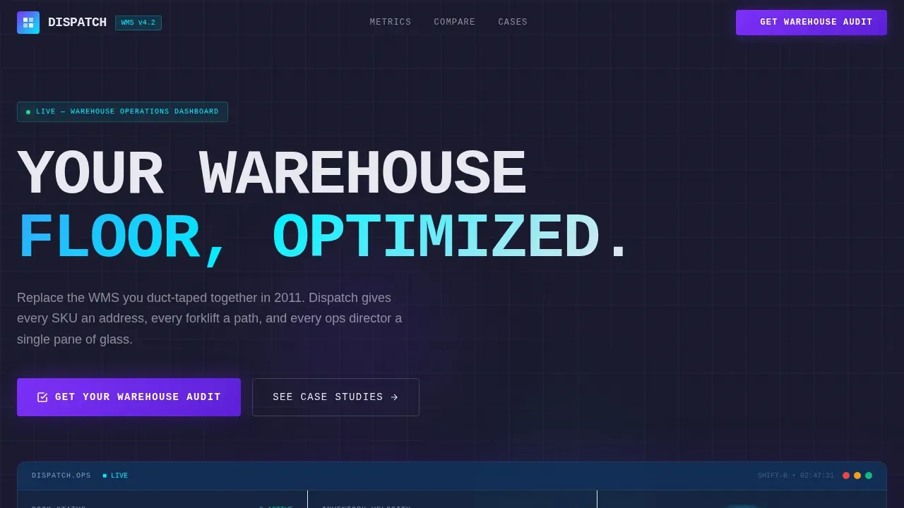
Dispatch is a bold brutalist landing page template built for logistics warehouse management platforms. It combines a full-viewport live dashboard, a head-to-head comparison table, and a lead generation form into one high-impact, data-first layout. The design uses raw industrial aesthetics, monospaced typography, and an AI Iridescent color system to turn visitor skepticism into qualified audit requests.
by Rocket studio
Quick summary
Dispatch is a single-page brutalist landing page template designed for warehouse management software companies. It opens with a live operations dashboard, drops three massive stat blocks, and walks visitors through a row-by-row comparison table that exposes every weakness in legacy systems. The layout drives one outcome: a booked warehouse audit.
Who this template is for
This template speaks directly to the people who live inside broken warehouse workflows. It is built for B2B logistics software teams that need a landing page capable of earning trust from operations leaders who distrust marketing gloss.
- Operations Directors at third-party logistics firms who manage dock schedules across multiple sites and still rely on spreadsheets
- Supply Chain Vice Presidents at mid-market e-commerce brands where mispick rates are eating into fulfillment margins
- Regional Distribution Managers who inherited an outdated warehouse management system and need a credible reason to change
What problem this template solves
Most logistics software landing pages look like every other enterprise site. They feature smiling workers, vague benefit statements, and call-to-action buttons that feel like a cold sales call. That approach fails with operations-focused buyers who distrust polished, cookie-cutter design and demand proof before they engage.
- No direct comparison to legacy pain: visitors cannot see where their current system fails without a side-by-side table
- Weak lead capture: generic contact forms do not segment visitors by order volume or current system, making follow-up inefficient
- Zero urgency: standard landing page design does not show live metrics or real throughput data, so the gap between old and new never feels real
What you get with this template
Dispatch gives your team a complete, production-ready brutalist landing page that is focused entirely on converting operations professionals into audit leads. Every design decision, from background color to typography size, reinforces the industrial-strength concept of the platform it promotes.
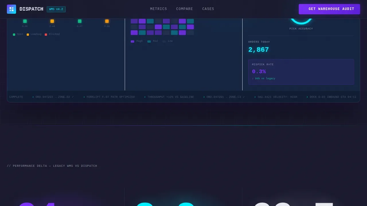
- A full-viewport dashboard hero section with animated dock status indicators, a picking accuracy gauge, and an order throughput ticker
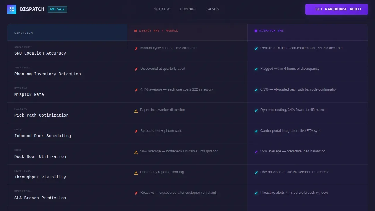
- A legacy-versus-platform comparison table with iridescent-highlighted capability columns that let visitors watch their current system lose every round
- A three-field lead generation form gated to capture current warehouse management system type, daily order volume, and work email, plus a secondary PDF download path for early-stage visitors
Feature list
The following features describe what this template delivers as a ready-to-use landing page design.
Full-Viewport Dashboard Hero
The header is a live operations panel rendered at full viewport width. It displays inventory velocity heatmaps, dock door status indicators cycling green, amber, and red, a picking accuracy gauge fixed at 99.7 percent, and an order throughput ticker that climbs visibly on scroll. Oversized monospaced fonts render key numbers at 120 pixels, creating bold typography that reads like figures projected on a warehouse wall. There is no lifestyle photography. Just data performing.
Brutalist Stat Impact Section
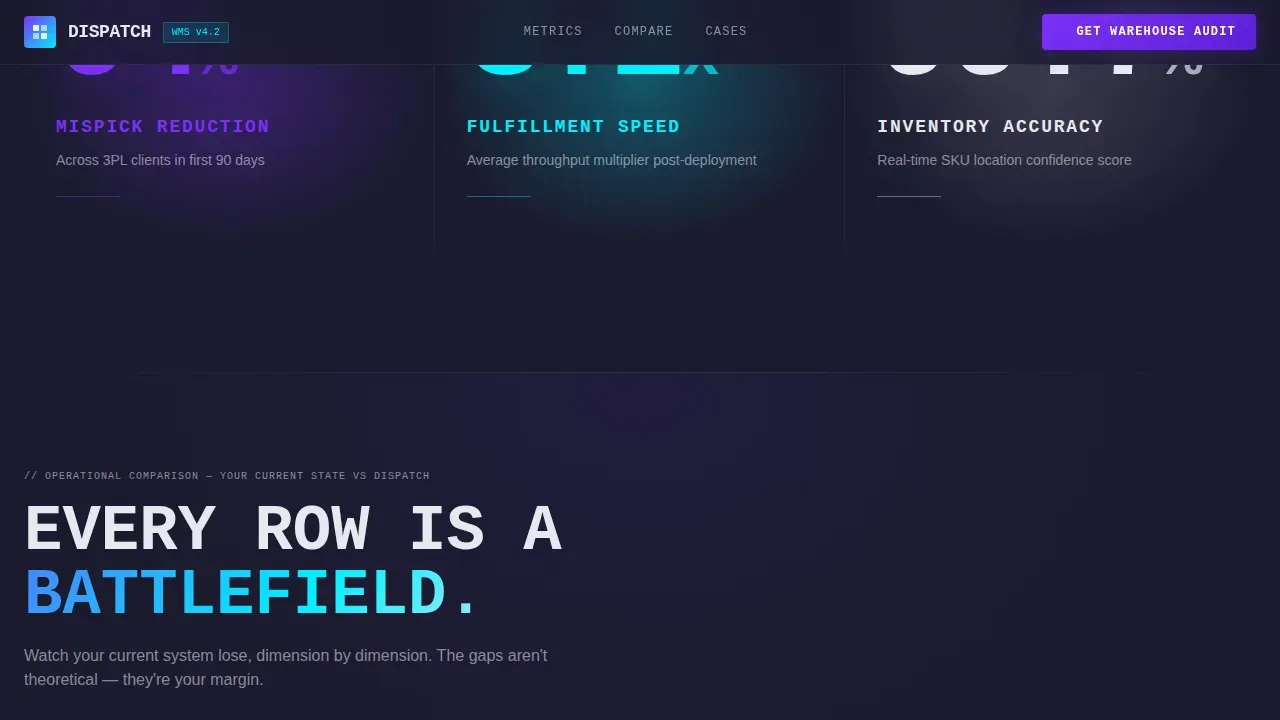
Immediately below the dashboard, three massive stat blocks land in isolated negative space. Each block presents a single metric: mispick reduction percentage, average fulfillment speed improvement, and inventory accuracy delta. The layout uses stark, visible grid containers and solid borders to divide content into easily scannable sections. This approach follows the brutalist design principle that key performance indicators should be highlighted using large, bold numbers with zero decorative distraction.
Legacy versus. Platform Comparison Table
The comparison table is the core persuasion engine of this landing page. Each row is a direct battlefield: the visitor's current pain, shown in muted titanium columns, sits beside the platform's capabilities in iridescent violet-highlighted columns. The table covers receiving, put-away, picking, and shipping workflows, integrating the full operational process a warehouse management system must address. Harsh, visible grids and solid borders divide every row, making the gap impossible to ignore.
Lead Generation Form with Dual Conversion Paths
The primary call-to-action, labeled "Get Your Warehouse Audit," is a brutalist button in iridescent violet. It appears first anchored to the dashboard hero, then repeats after the comparison table. The form collects three fields: current warehouse management system from a dropdown that includes spreadsheets or none, average daily order volume via a range selector, and work email. A secondary path offers a downloadable PDF benchmarking report gated behind email only, catching visitors who are not ready to book a call but are ready to compare numbers.
Case Study Cards Section
Below the comparison table, named case study cards from third-party logistics and e-commerce operations anchor every claim in specific metrics and named verticals. These cards provide social proof grounded in real outcomes, giving skeptical operations leaders the evidence they need before they fill out the audit form.
Animated Metric Counters and Interactive States
The template includes counter animations on stat blocks, fade-up staggered reveals on content sections, shimmer effects on brutalist buttons, and hover states across the comparison table rows. Dock status indicators cycle independently. These smooth animations are implemented using CSS animations and Intersection Observer, keeping the page dynamic without heavy third-party libraries.
Page sections overview
| Section | Purpose |
|---|---|
| Dashboard Hero Panel | Opens at full viewport with live ops metrics, dock status cycling, and the primary audit call-to-action |
| Brutalist Stats Block | Three isolated 120px stat blocks showing mispick, speed, and accuracy proof points |
| Comparison Table | Row-by-row legacy versus. platform breakdown with iridescent column highlights |
| Case Study Cards | Named 3PL and e-commerce outcome cards anchoring claims in vertical-specific metrics |
| Lead Gen Form | Three-field audit form plus secondary PDF download gated behind email |
| Footer Strip | Single-row linear footer following Pattern 1 layout |
Design & branding system
The design concept for this template is a warehouse at midnight lit only by autonomous systems. It rejects polished, corporate aesthetics in favor of raw, industrial functionality. This brutalist design direction signals to the visitor that the software it promotes is industrial-strength and built for real operations, not demos.
- Color system: deep slab charcoal (#1A1A2E) for the background that evokes raw concrete, iridescent violet (#7B2FF7) for data highlights and brutalist button shimmer, electric cyan (#00F0FF) for live metric pulses and toggle switches, and raw titanium white (#E8E8F0) for typography
- Typography system: JetBrains Mono serves as the monospaced industrial font for all headlines and data figures, creating the oversized, unpolished impact that brutalism in web design demands; DM Sans handles body copy and descriptions
- Layout and graphics: asymmetrical grid containers, repeating geometric shapes, and block-based visuals create a structure that feels engineered rather than designed; the ceiling of each section is defined by a hard visible border, not a gradient fade
Mobile & speed optimization
The template is built desktop-first to serve operations directors working on large monitors. The layout scales responsively for mobile access, which is important because mobile functionality including scanner and app support is essential for floor staff who may view reports or approve actions from a handheld device.
- CSS animations and Intersection Observer handle all movement effects, keeping loading light without heavy JavaScript libraries
- The comparison table and dashboard hero are structured so each element remains visible and readable on smaller screens, with stacked layout boxes replacing side-by-side columns on narrow viewports
- The device breakpoint strategy prioritizes data density on wide screens and scannability on mobile, ensuring every user can read the key metrics regardless of screen size
How this template helps you convert
This brutalist landing page is engineered to move a skeptical operations professional from cold awareness to a completed audit form. The scroll architecture follows a deliberate process: prove the gap, show the evidence, then offer the fix.
- The dashboard hero creates immediate credibility by showing live warehouse operations data before a single word of marketing copy appears, establishing that this platform understands the visitor's world at a glance
- The comparison table does the heavy persuasion work mid-page, making the visitor's current system lose every row before the primary call-to-action reappears, so the audit request feels like a logical next step rather than a sales pitch
- The dual conversion paths, the audit form for ready buyers and the PDF download for early-stage researchers, capture leads at two different stages of the decision process, maximizing the return from every ad campaign or traffic source that brings visitors to this landing page
Other information about this template
This template is part of a broader movement in web design toward brutalist landing pages that prioritize honesty and transparency over visual beauty. Web brutalism is a direct reaction against the lightness and frivolity of mainstream website design, and this template captures the essence of that concept for a logistics software context. When you explore examples of brutalist web design, this landing page stands as a clear reference for how industrial aesthetics and modern functionality can coexist.
- The dispatch bold brutalist warehouse management landing page template is crafted for agencies and in-house teams that need to redesign an underperforming logistics management site quickly and efficiently
- Designers can use the template as a portfolio piece or as a starting point for a broader project, adapting the color system, fonts, and layout containers to match their company or client brand
- Teams running ad campaigns to operations decision-makers will find the landing page design effective because the comparison table creates a focused, high-signal environment that speaks directly to the user's pain before asking for any commitment
- The template can serve as one of the stronger real-world examples of how web brutalism and modern logistics software marketing can share the same page without compromise
- Builders who want to explore brutalist landing page design patterns will find the CSS structure, visible grid boxes, and raw typographic scale valuable reference materials for their own production work; the layout concept can also inform how other business services websites approach data-heavy landing page design
Theme
Bold Brutalist
Creative direction
Stats-First Impact
Color system
AI Iridescent
Style
Comparison Table
Direction
Lead Generation
Page Sections
Full-viewport Brutalist Dashboard Hero
Isolated Brutalist Stat Blocks
Legacy Versus. Platform Comparison Table
Dual-path Lead Generation Form
Named Case Study Cards
CSS Animation and Interaction Layer
Related questions
Can I adapt this template for a different logistics software brand?
Does this template include the actual dashboard data or just the visual design?
Is this landing page template suitable for running paid ad campaigns?
How does the brutalist style affect user trust with enterprise buyers?
Can the comparison table rows be edited to reflect different features?



