Brutalist Textile Mill Management Software Landing Page
Loom is a brutalist-styled landing page template built for textile mill management software. It pairs live-data dashboard components with relentless comparison tables, helping production managers and operations directors see exactly how modern monitoring stacks up against spreadsheets and legacy systems. The Void and Violet color system makes every number pop against heavy black backgrounds.
by Rocket studio
Quick summary
Loom is a single-page landing page template designed for textile mill vertical software. It leads with a logo bar, escalates through four brutalist comparison tables, and closes with a floating audit call to action. The design feels like a UV inspection lamp switched on inside a dark warehouse, raw, specific, and built to earn trust through data.
Who this template is for
This template is built for software teams and marketers selling industrial-grade tools to textile operations professionals. If your buyers are skeptical and data-driven, this page speaks their language directly.
- Production managers at mid-size spinning and weaving mills who currently track output on whiteboards
- Quality inspectors and operations directors managing multiple factory floors across different locations
- Vertical SaaS teams targeting mill operators who are ready to move beyond manual logs and basic monitoring tools
What problem this template solves
Mill operators are drowning in fragmented data. Shift schedules live on whiteboards. Defect counts sit in spiral notebooks. Downtime happens before anyone sees it coming. A generic software landing page does not address any of that, this one does.
- It replaces vague value propositions with granular comparison tables that mirror how mill operators actually evaluate tools
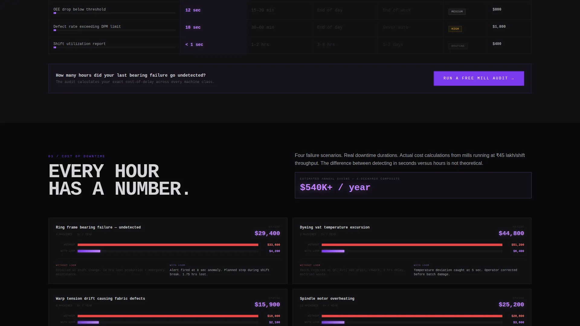
- It shows the cost of inaction through real downtime scenarios, not abstract claims
- It captures leads through two conversion paths built for buyers at different stages of trust
What you get with this template
You get a fully structured, single-page layout that uses data density and brutalist design to move skeptical industrial buyers toward a clear action. Every section is built around escalation, each scroll reveals a harder, more specific argument.
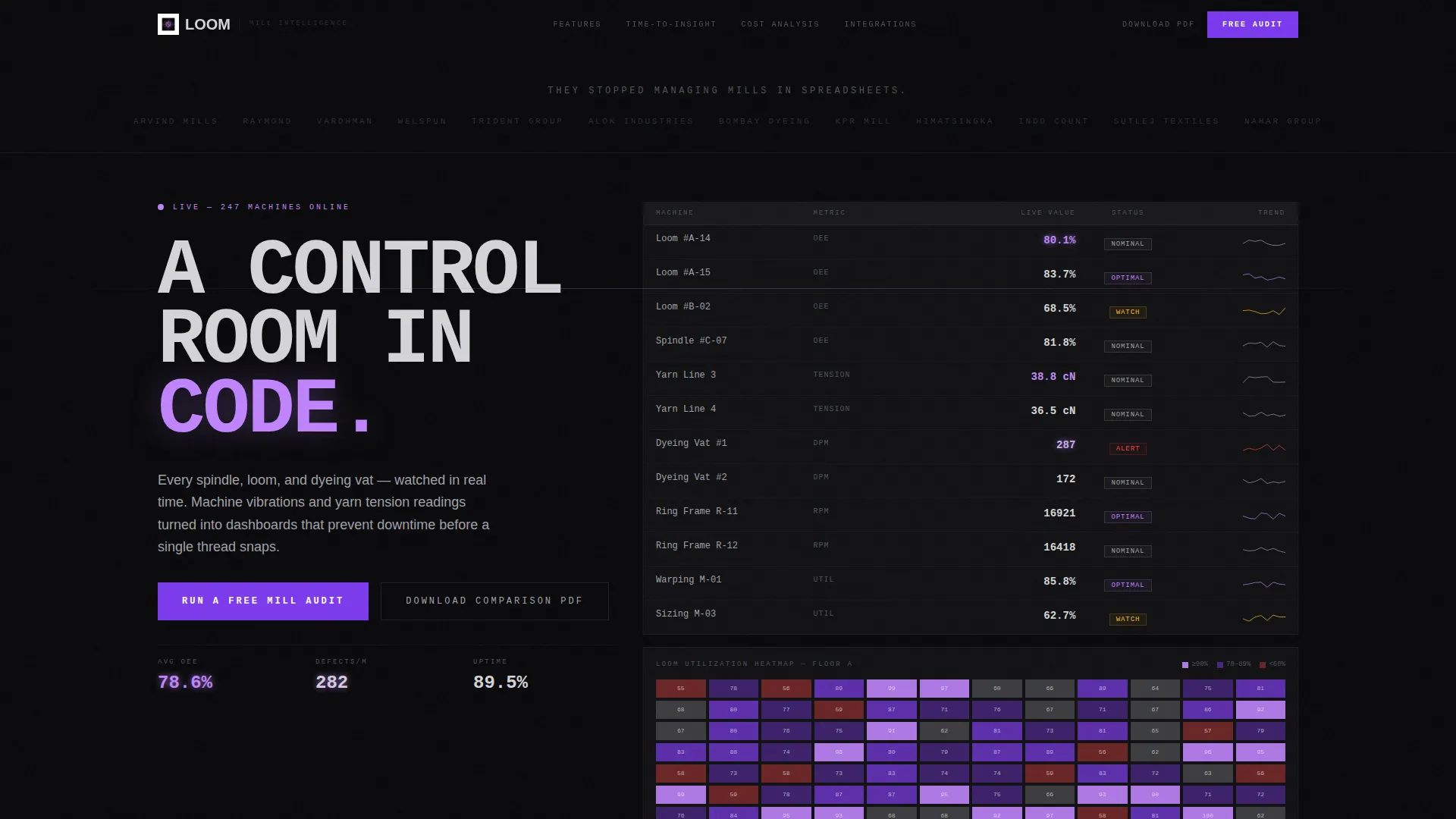
- A functioning dashboard user interface section with ticking OEE percentages, loom utilization heatmaps, and defect-per-million counters
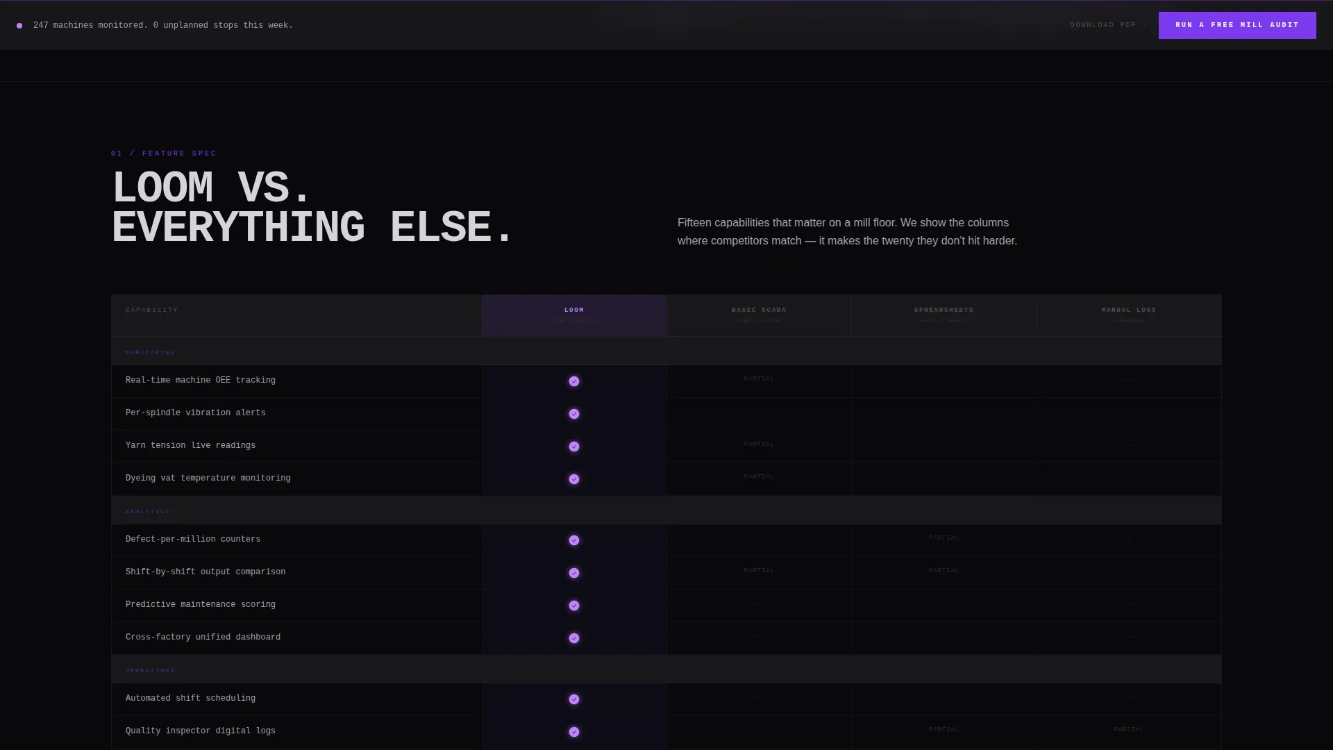
- Four comparison table sections covering features, time-to-insight, downtime cost, and integration compatibility
- A three-step audit form and a mid-page PDF gated download as dual conversion paths
Feature list
This template includes purpose-built components that reflect the way textile operations buyers read and decide.
Live Dashboard Data Grid
The hero section shows a working data grid, not a static mockup. Real-time figures for Overall Equipment Effectiveness (OEE) percentages, loom utilization, and defect counts tick visibly, establishing credibility before a single scroll.
Four-Section Comparison Architecture
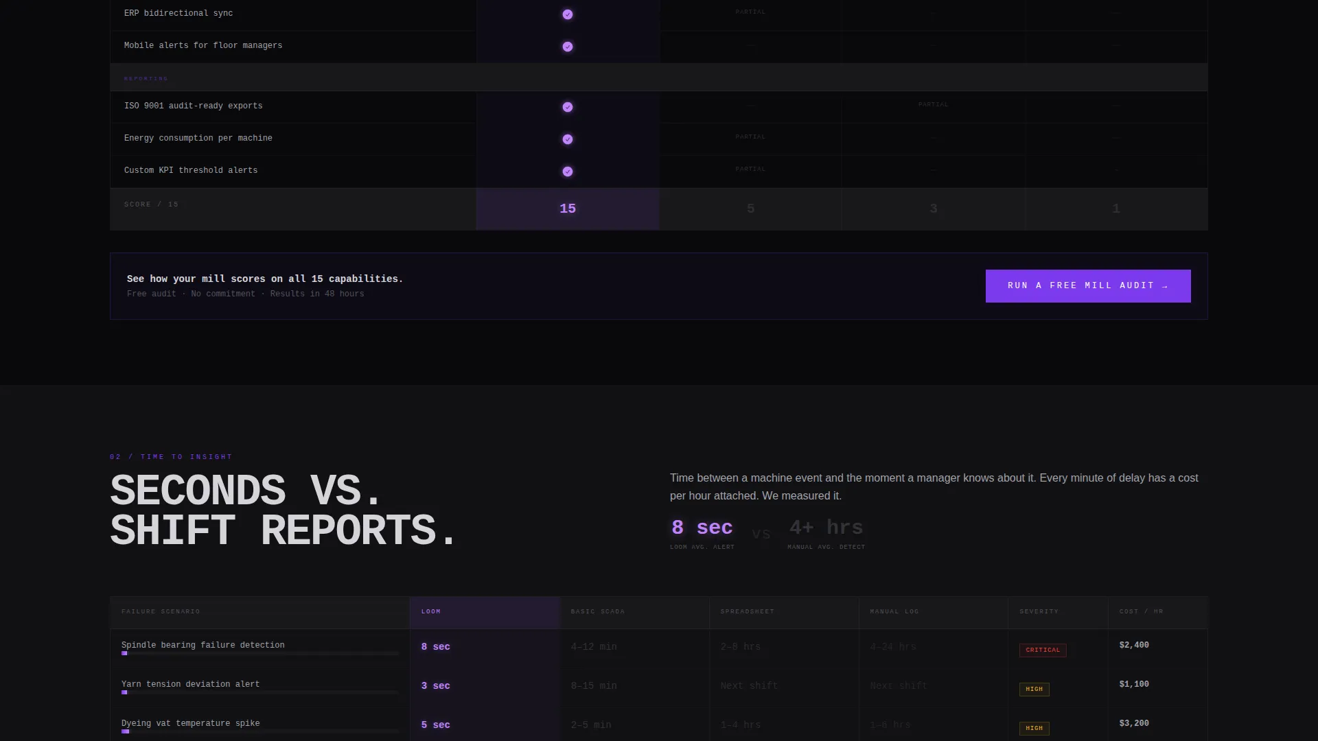
Each of the four main content sections presents a comparison table. The tables cover feature counts, time-to-insight with stopwatch metrics, cost-of-downtime scenarios, and integration compatibility. Each table is designed to be brutally honest, including the rare columns where competitors match, which makes the gaps hit harder.
Floating Audit call to action Bar
A "Run a Free Mill Audit" call-to-action bar is pinned to the bottom of the viewport at all times. It also appears at the end of every comparison table, so the prompt to act is never more than a glance away.
Three-Step Audit Form
Clicking the audit call to action opens a focused three-step form. Step one asks for mill type (spinning, weaving, dyeing, or composite). Step two captures machine count and current monitoring method via dropdown. Step three collects work email and plant location.
Gated PDF Download Path
A secondary conversion option sits mid-page. Visitors can download the full comparison document by submitting their email only. This lower-commitment path captures leads from buyers who are not yet ready for a full audit conversation.
Brutalist Logo Bar Header
The header opens with a horizontal strip of textile brand client logos rendered in monochrome ash on void black. Above them, a single line in oversized monospaced type reads: "They stopped managing mills in spreadsheets." No animation, no carousel, just names the visitor already recognizes from trade shows and sourcing directories.
Page sections overview
| Section | Purpose |
|---|---|
| Logo Bar Header | Establishes credibility with known brand names and a single punchy headline |
| Live Dashboard Grid | Shows real-time mill data ticking to prove the software works |
| Feature Comparison Table | Pits feature counts against legacy systems and manual tracking |
| Time-to-Insight Table | Compares how fast each approach surfaces actionable data |
| Downtime Cost Table | Shows financial impact of reactive versus predictive monitoring |
| Integration Compatibility Table | Maps support across ERP systems mills actually use |
| PDF Download Gate | Captures mid-funnel leads with a low-commitment document offer |
| Floating Audit Bar | Keeps the primary call to action visible at every scroll position |
Design & branding system
The visual identity uses a Bold Brutalist theme built on the Void and Violet color system. Black dominates in massive unbroken slabs. Violet owns every interactive element and data highlight. The effect is precise: everything recedes into shadow except what demands your attention.
- Four-color palette: absolute void black (#09090B) for backgrounds, bruised violet (#7C3AED) for interactive elements, ash concrete (#A1A1AA) for body text and table borders, and searing ultraviolet (#C084FC) firing on calls to action and hover states
- Typography uses oversized monospaced type for headlines, reinforcing the spec-sheet and data-terminal aesthetic throughout
- Ultraviolet accent activates only on live data points, primary call to action buttons, and comparison-winning checkmarks, keeping its visual weight meaningful
Mobile & speed optimization
The template is structured with a layout hierarchy that scales from large operations-room displays down to tablet and mobile viewports. Data grids and comparison tables reflow cleanly so inspectors and directors can reference the page from any device on the floor.
- Comparison tables use responsive column behavior so key data remains readable on smaller screens
- The floating audit bar remains fixed and accessible regardless of scroll position or device size
- Dashboard data grid elements are designed to maintain visual clarity without requiring a widescreen to interpret
How this template helps you convert
The page earns the click rather than asking for it. By the time a visitor reaches the audit call to action, they have already processed four layers of specific, honest data. The conversion architecture matches how industrial buyers actually move through a decision.
- The logo bar and live dashboard grid build immediate credibility, so visitors stay long enough to engage with the comparison data
- Each comparison table ends with the audit call to action, giving buyers a clear next step right when the evidence is freshest in their minds
- The mid-page PDF download captures leads from visitors who are still in research mode, keeping them in the funnel without pressure
Other information about this template
This template is part of a broader Bold Brutalist design family and works particularly well for vertical SaaS products targeting industrial or operations-heavy buyers. A few additional details worth noting:
- The integration compatibility section is pre-structured to reference the ERP systems that textile mills commonly use, giving your sales team a credible starting point for technical conversations
- The Spec Sheet creative direction means every section is designed to reward careful reading, which suits buyers who are accustomed to evaluating machinery and software through detailed documentation
- The Comparison/Versus landing page direction makes this template a strong fit for paid search campaigns targeting buyers who are actively comparing monitoring solutions
- The template style is Dashboard and Data Grid, meaning the visual language of real operations software is baked into the layout from the first visible section
Theme
Bold Brutalist
Creative direction
Spec Sheet
Color system
Void & Violet
Style
Dashboard/Data Grid
Direction
Comparison/Versus
Page Sections
Live Dashboard Data Grid Hero
Four Escalating Comparison Tables
Floating Viewport Call to Action Bar
Three-step Audit Form
Gated PDF Lead Capture
Brutalist Monochrome Logo Bar
Related questions
Who is the primary audience for this landing page template?
Can I adapt the comparison tables for my specific software feature set?
What are the two conversion paths included in this template?
Does the dashboard section display live data from my system?
Is this template suitable for bottom-of-funnel paid advertising campaigns?



