Millcrm Landing Page Template for Textile Mill CRM
Loom is a Bold Brutalist landing page template built for textile mill CRM platforms. It follows a Hub and Spoke anchor navigation structure, walking mill owners and production managers through five pain-specific content blocks before asking for a single detail. The design uses deep mill teal, carbon black, and a sharp catalyst orange to signal industrial confidence and urgency.
by Rocket studio
Quick summary
Loom is a single-page CRM landing page template designed for textile mill software. It opens with a live-looking CRM dashboard screenshot, then walks visitors through five brutalist content blocks tied to real mill pain points. Every section earns trust before the lead form appears. The sticky anchor navigation keeps the experience grounded in mill vocabulary from the first scroll.
Who this template is for
This template is built for SaaS founders and product teams selling vertical CRM software to the textile manufacturing industry. It speaks the language of the mill floor, not the boardroom.
- Mill owners managing 200 or more active buyers who need order visibility at a glance
- Production managers balancing dyeing schedules against live delivery commitments
- Sales heads who need documented rate conversations to resolve commission disputes
What problem this template solves
Textile mills run on relationships, memory, and improvised tools. WhatsApp threads replace order books. Excel files replace dispatch systems. When a buyer calls about a rate quoted four months ago, there is no record to check. This template addresses that specific environment directly, rather than using generic SaaS landing page patterns that feel unfamiliar to mill-floor decision-makers.
- Buyers do not trust abstract software promises; they need to see the tool solving their exact daily problem
- Generic CRM landing pages lose textile audiences because they use the wrong vocabulary and show the wrong scenarios
- Lead forms placed before trust is established get ignored by an audience that operates on WhatsApp, not email funnels
What you get with this template
You get a fully structured Hub and Spoke landing page with a sticky anchor navigation bar and five dedicated content spokes. Each spoke targets one specific operational pain point and pairs a bold problem statement with a product screenshot moment. The page builds stakes progressively from daily annoyance to business-threatening loss, then resolves everything in a unified dashboard view.
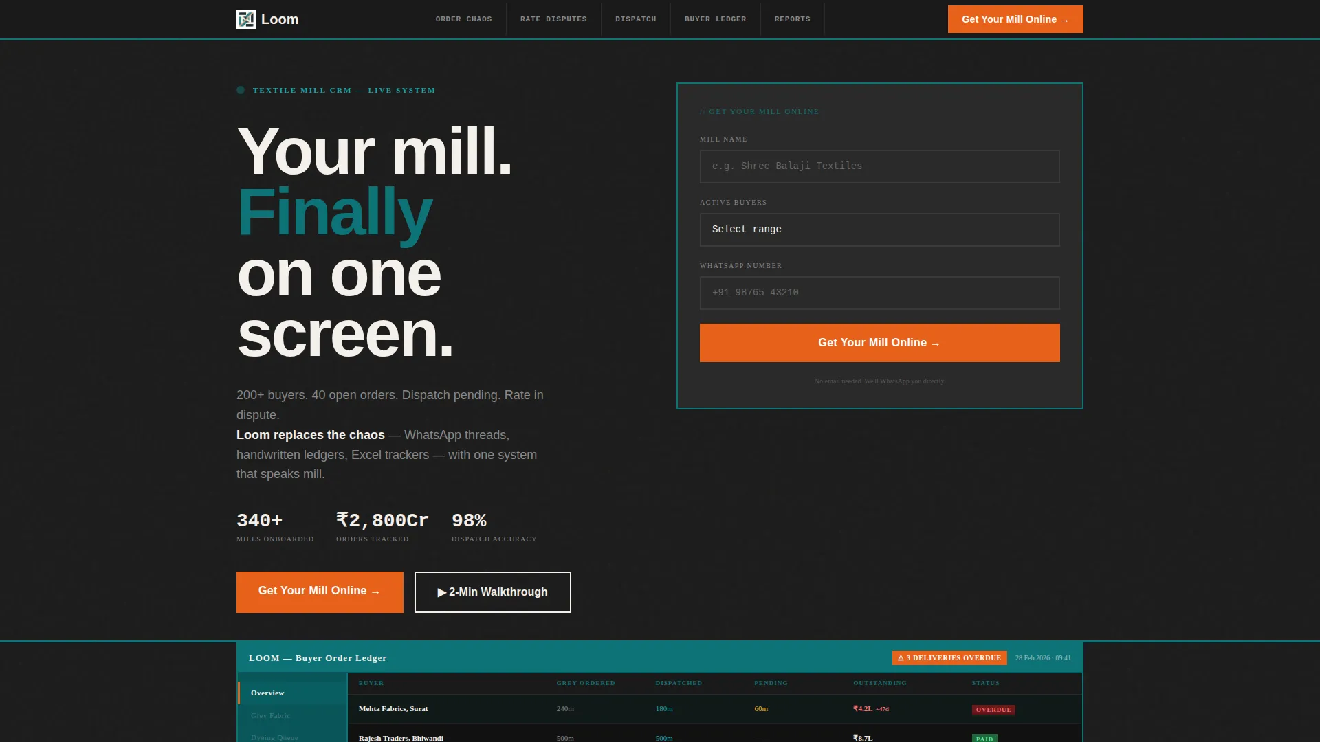
- A full-width CRM dashboard header showing a real buyer ledger with grey fabric pending, dispatch status, and outstanding payments
- Five brutalist content blocks covering order chaos, rate disputes, dispatch tracking, buyer ledger management, and reports
- A lead generation form collecting mill name, active buyer count, and WhatsApp number, plus a secondary video walkthrough path
Feature list
This template ships with purpose-built components matched to the textile CRM sales context. Every element reflects the source brief with no speculative additions.
Sticky Hub Navigation Bar
A fixed anchor navigation sits at the top of the page with spoke labels written in mill language: Order Chaos, Rate Disputes, Dispatch Tracking, Buyer Ledger, and Reports. Visitors can jump directly to the section that matches their immediate pain point without scrolling past unrelated content.
Problem-to-Solution Content Spokes
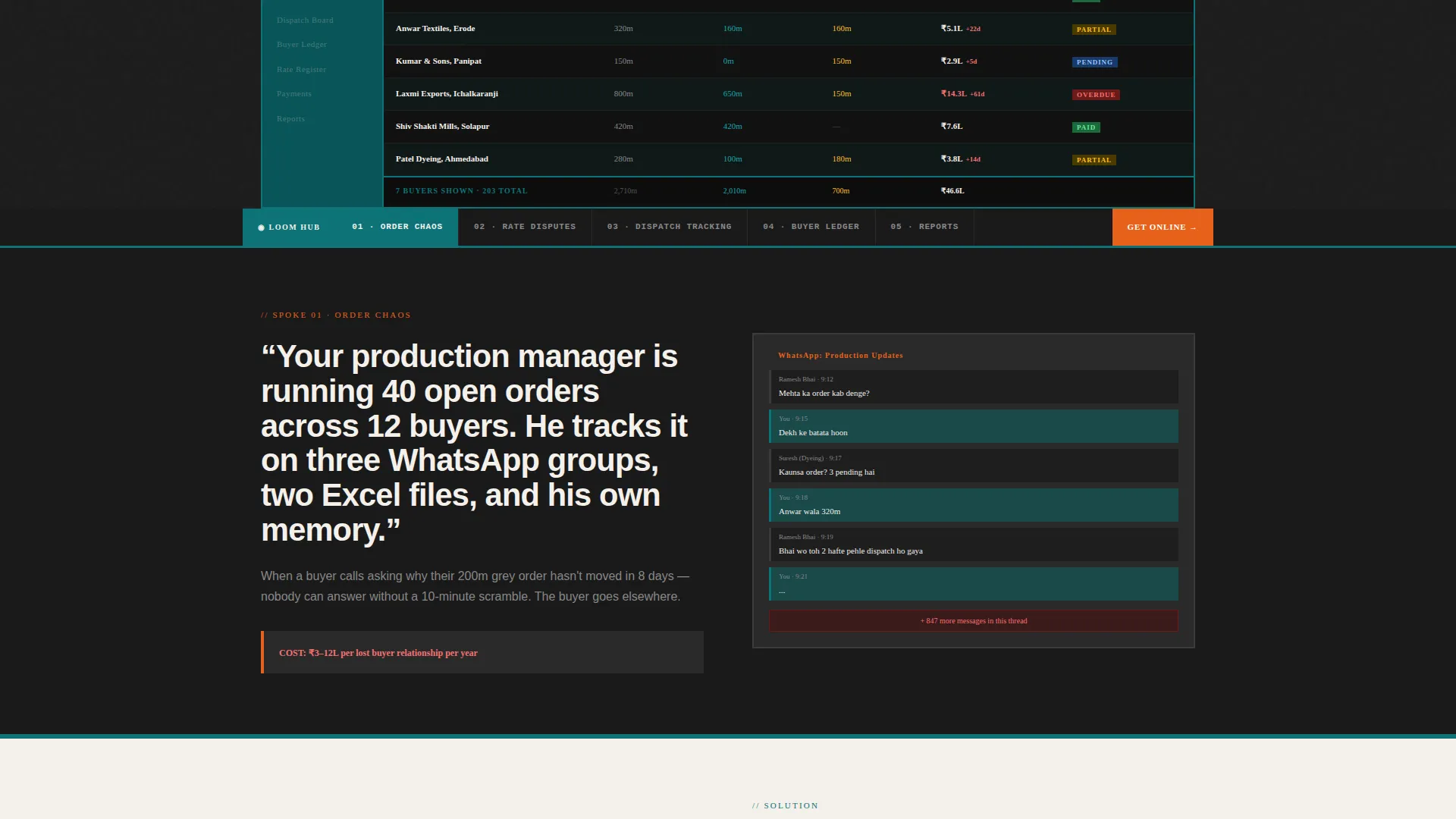
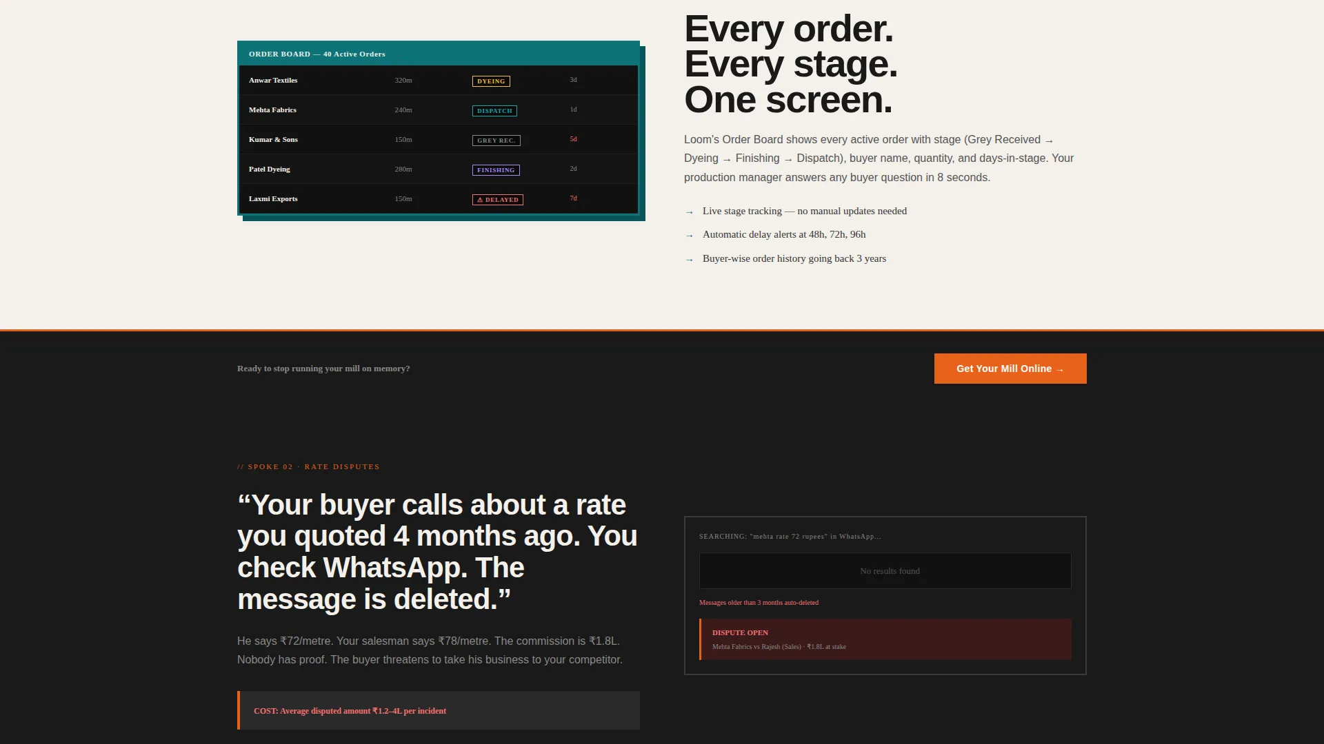
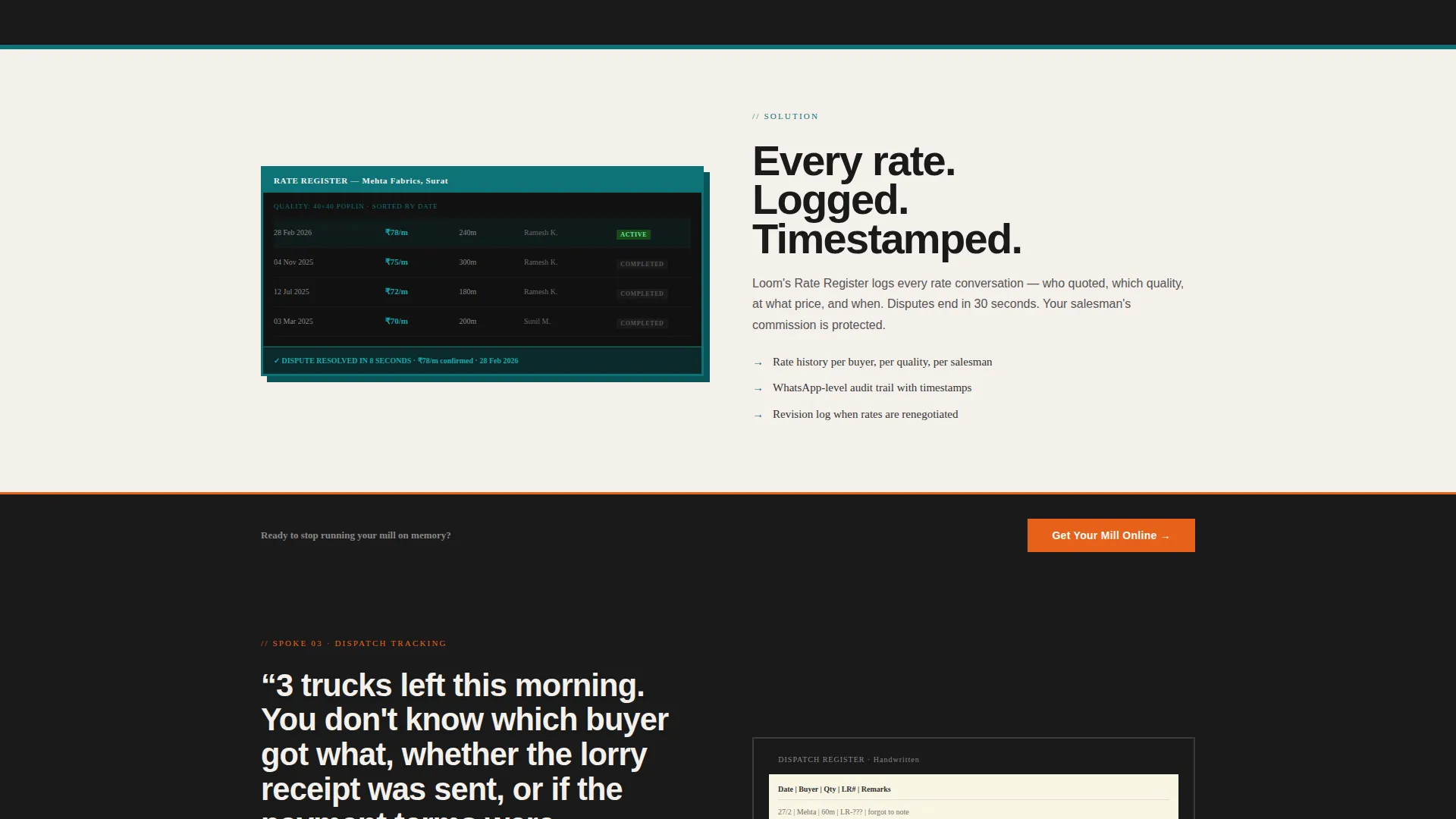
Each of the five spokes opens with a bold white-on-black problem scenario written in specific, operational language. A hard-cut product screenshot immediately follows, showing the CRM resolving that exact moment. Stakes escalate across spokes from daily friction to disputed payments and missed shipments.
CRM Dashboard Header Screenshot
The header uses a full-width product screenshot of the CRM mid-use. The dashboard shows a buyer ledger with columns for grey fabric pending, dispatch status, and outstanding payments in lakhs. A teal sidebar lists mill departments. An orange notification badge reads "3 deliveries overdue."
WhatsApp-First Lead Form
The lead generation form asks three fields in a deliberate sequence: mill name, number of active buyers via dropdown (50 to 100, 100 to 300, 300 or more), and WhatsApp number. There is no email field. The form reflects how this audience actually communicates and reduces friction at the most critical conversion point.
Gated Video Walkthrough Path
A secondary conversion path offers a two-minute video walkthrough of the platform. Access requires only a phone number. This gives hesitant visitors a lower-commitment route to product understanding without abandoning the page.
Repeating call to action Architecture
The primary call to action, "Get Your Mill Online," appears in the header, after every content spoke, and in a fixed bottom bar on mobile. Repetition at natural decision points keeps the conversion path visible without feeling pushy.
Page sections overview
| Section | Purpose |
|---|---|
| Full-Width Header | Show CRM dashboard screenshot with live buyer ledger and overdue badge |
| Sticky Nav Hub | Anchor navigation with five mill-language spoke labels |
| Order Chaos Spoke | Problem statement plus screenshot resolving fragmented order tracking |
| Rate Disputes Spoke | Deleted WhatsApp scenario paired with rate-log product view |
| Dispatch Tracking Spoke | Missed shipment scenario paired with live dispatch status view |
| Buyer Ledger Spoke | Payment dispute scenario paired with outstanding ledger view |
| Reports Spoke | Unified dashboard screenshot showing all operations in one view |
| Lead Generation Form | Three-field WhatsApp-first form with active buyer count dropdown |
| Video Walkthrough call to action | Secondary path gated behind phone number only |
| Mobile Bottom Bar | Fixed call to action bar anchoring lead action on smaller screens |
Design & branding system
The visual identity follows a Bold Brutalist theme built around the Teal Catalyst color system. The palette was chosen to feel like a freshly painted factory sign against soot-darkened brick: industrial confidence with one flash of urgency. Typography is oversized and monospaced where data appears, set tight like stencil lettering on a shipping crate.
- Deep mill teal (#0D7377) for primary interface elements and the sidebar, carbon black (#1A1A1A) and raw loom white (#F4F0EB) for alternating hard-block section backgrounds, and catalyst orange (#E8611A) reserved strictly for call-to-action buttons and alert states
- No lifestyle photography, no abstract gradients; visual proof comes entirely from product screenshots caught mid-use
- Section backgrounds alternate between carbon black and raw loom white in hard, unpadded blocks with no soft transitions between them
Mobile & speed optimization
The template is structured with mobile mill-floor users in mind. The audience checks orders and buyer statuses on their phones between production runs, not at a desktop workstation. The layout accounts for that context directly.
- A fixed bottom bar on mobile keeps the "Get Your Mill Online" call to action permanently visible without interrupting content reading
- The anchor navigation hub collapses cleanly for smaller screens so spoke labels stay reachable without horizontal scrolling
- The WhatsApp number field replaces email as the primary contact mechanism, reducing mobile form friction for an audience that already uses WhatsApp for business communication
How this template helps you convert
The page is structured to earn the lead before requesting it. Trust is built through product evidence and operational specificity, not marketing claims. By the time a visitor reaches the form, they have already seen the tool solving five versions of their own problem.
- The header screenshot establishes product credibility instantly by showing a real-looking buyer ledger with textile-specific data columns, so visitors recognize their own workflow before reading a single line of copy.
- Each brutalist content spoke presents a painful, specific scenario the audience has personally experienced, then immediately resolves it with a product screenshot, making the solution feel concrete rather than promised.
- The three-field WhatsApp form and the secondary video walkthrough path offer two commitment levels, so both ready-to-talk buyers and cautious researchers have a clear next step matched to their readiness.
Other information about this template
This template is part of the Loom product family within the Millcrm platform ecosystem. It is categorized under Technology, with a vertical SaaS focus on textile mill operations. The intersection match context aligns the Hub and Spoke template style, Bold Brutalist theme, Teal Catalyst color system, Problem to Solution Arc creative direction, Product Screenshot header concept, and Lead Generation landing-page direction into a single cohesive build.
- The template is designed for a Textile Mill Vertical SaaS product context and can support similar industrial or manufacturing SaaS use cases where buyer ledgers, dispatch tracking, and rate documentation are central workflows
- The Millcrm naming and Loom branding are specific to the source template identity; the layout and spoke structure can be adapted for adjacent vertical CRM products in related manufacturing niches
- The intersection match score of 13 reflects a high specificity alignment between the template style, theme, creative direction, and niche, meaning the design decisions are tightly reasoned for this exact audience rather than borrowed from a general SaaS template library
Theme
Bold Brutalist
Creative direction
Problem→Solution Arc
Color system
Teal Catalyst
Style
Hub & Spoke (Anchor Nav)
Direction
Lead Generation
Page Sections
Sticky Hub Anchor Navigation
Problem-to-solution Content Spokes
Live CRM Dashboard Header
Whatsapp-first Lead Form
Gated Video Walkthrough Path
Repeating Mobile-first Call to Action System
Related questions
Who is the primary audience for this landing page template?
Why does the lead form ask for a WhatsApp number instead of email?
Can this template be used for CRM products outside the textile industry?
How many call-to-action placements does the template include?
What makes the design feel credible to a textile mill audience?



