Bold Brutalist Membership Management Landing Page
Maintain is a bold brutalist membership management landing page template built for home services operators who need recurring revenue, not more spreadsheets. It combines an interactive revenue calculator, a side-by-side comparison table, a live dashboard preview hero, and a direct app download call to action into one industrial, no-nonsense single-page layout.
by Rocket studio
Quick summary
Maintain is a single-page template designed for home services membership management platforms. It leads with a full-viewport dashboard preview, runs visitors through a live revenue calculator, then closes the case with a feature comparison table and an app download call to action. Every element serves a purpose. Nothing decorates. Everything converts.
Who this template is for
This template is built for operators and teams in the home services space who are ready to move from manual billing to automated membership revenue. The design speaks directly to people who work with numbers every day and expect a website to do the same.
- Owner-operators running small to mid-size plumbing or HVAC businesses who need revenue proof before they commit to new software
- Office managers tired of chasing expired credit cards every Monday morning and looking for a simple system that handles renewals automatically
- Regional franchise managers currently juggling hundreds of active memberships in spreadsheets who need a professional upgrade
What problem this template solves
Most membership management platforms sell themselves with lifestyle photography and vague promises. Maintain takes the opposite approach. The core philosophy here is content-first, no-frills design: show the numbers, prove the value, earn the download. Balancing raw visuals with high-conversion needs is exactly what this template is built to do.
- Operators land on a page that shows real metrics instantly, skipping past generic marketing copy that fails to build confidence
- Visitors interact with the revenue calculator before reading a single sales paragraph, so the value proposition lands through arithmetic, not emotion
- The comparison table removes every objection by stacking spreadsheets and generic customer relationship management tools against the platform's full feature set in one clear layout
What you get with this template
You get a complete, section-led landing page that covers every stage of a buyer's decision process. The template supports a logical scroll journey from awareness through calculation to commitment, all inside one cohesive brutalist design system.
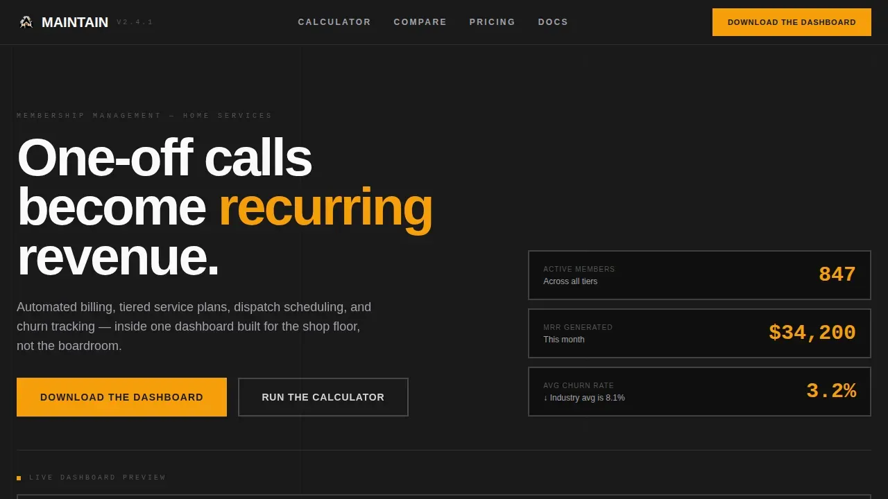
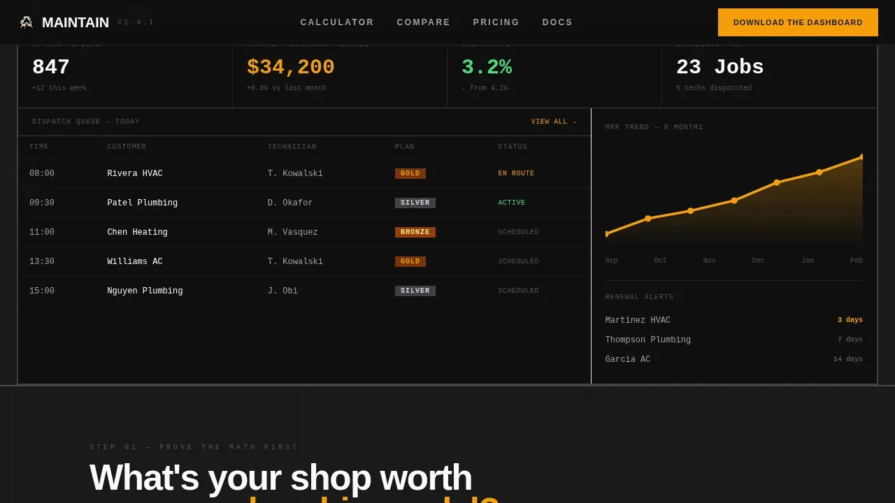
- A full-viewport hero section with live-style key performance indicator cards showing member count, monthly recurring revenue, churn rate, and a color-coded dispatch calendar
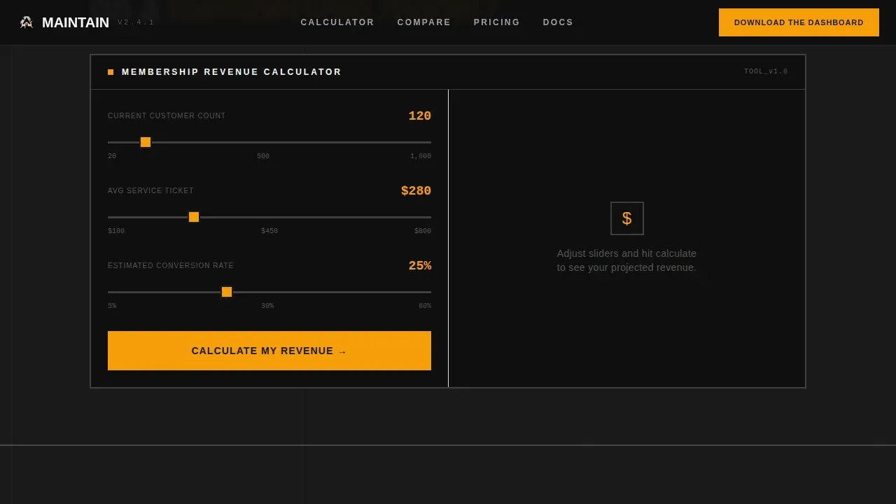
- An interactive membership revenue calculator where users input their customer count, average service ticket, and estimated conversion rate to generate projected revenue and time savings
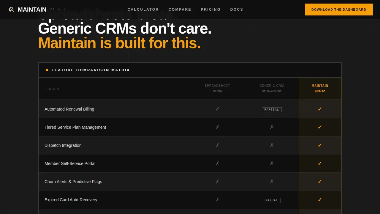
- A three-column comparison table pitting spreadsheets and generic tools against the platform, with amber checkmarks and muted gray marks that make the winner immediately obvious
Feature list
The template delivers six tightly scoped sections, each with a distinct job. Every component was designed to advance the visitor toward one action: downloading the app.
Full-Viewport Dashboard Hero
The hero section renders the platform dashboard at full browser width against a forge-black background. Live-style key performance indicator cards display 847 active members, $34,200 in monthly recurring revenue, and a 3.2% churn rate with a downward indicator. A color-coded dispatch calendar rounds out the preview, showing bronze, silver, and gold service tiers at a glance. No photography, no stock imagery, just the tool doing the math.
Interactive Revenue Calculator
Before visitors read a line of copy, they interact with a membership revenue calculator. They input their current customer count, average service ticket value, and estimated conversion rate. The tool returns projected monthly recurring revenue, annual retention value, and estimated time saved on manual billing. Real-time output transitions keep the experience fluid and immediate.
Side-by-Side Comparison Table
The comparison table sits directly below the calculator and delivers the final argument. Three columns cover spreadsheet tracking, a generic customer relationship management tool, and the platform. Rows compare automated renewals, dispatch integration, member self-service portal, churn alerts, and a branded member app. Amber checkmarks mark the wins. Muted gray marks the gaps. The layout makes the decision obvious without a single persuasive sentence.
Social Proof Marquee
An infinite-scroll marquee showcases real operator metrics: members managed, monthly recurring revenue generated, and churn rates reduced. Customer name pills sit alongside the numbers to connect the data to real businesses. Social proof through actual operator results is far more persuasive than testimonial quotes alone.
App Download Section
The page closes with a direct download call to action. The primary button reads "Download the Dashboard" and is paired with monochrome-steel App Store and Google Play badges that match the overall design system. A "Free for your first 50 members" guarantee sits directly above the buttons to reduce commitment friction. A secondary "Try the Calculator Again" link loops visitors back to the interactive tool.
Monochrome Steel Footer
A single-row linear footer completes the page. It keeps navigation links clean and minimal, consistent with the overall brutalist aesthetic. Nothing in the footer competes with the download call to action above it.
Page sections overview
| Section | Purpose |
|---|---|
| Dashboard Hero | Opens with full-viewport KPI preview |
| Revenue Calculator | Converts interest into projected numbers |
| Comparison Table | Proves feature superiority side by side |
| Social Proof Marquee | Builds trust through real operator data |
| App Download call to action | Drives the primary conversion action |
| Linear Footer | Closes the page with minimal navigation |
Design & branding system
The visual identity follows a Bold Brutalist theme built on a Monochrome Steel color system. The aesthetics are industrial and unapologetic, inspired by the look and feel of powder-coated equipment racks and steel toolboxes. Heavy borders, sharp corners, and zero shadows define every element on the page. Nothing floats. Everything is bolted down.
- Color system: forge black (#1A1A1A) as the primary background, brushed aluminum (#D4D4D8) for card surfaces and table rows, arc-weld white (#FAFAFA) for all body typography, and caution amber (#F59E0B) reserved exclusively for calls to action and active-state indicators
- Typography system: DM Sans handles all headings and body copy with bold typography and unapologetic sans-serif weight; JetBrains Mono renders all numbers, data outputs, and code-style labels to reinforce the mechanical, utilitarian feel
- Layout logic: the page uses asymmetrical, unconventional layouts and high-contrast shapes to break away from polished, traditional web design conventions; white background panels are used for contrast inside comparison table rows to keep data legible against the dark overall field
Mobile & speed optimization
The template is built desktop-first to match how operators actually use membership dashboards, but it includes a responsive mobile fallback so the page holds up on any screen. The brutalist approach to web design naturally limits decorative overhead, which keeps the layout lean.
- Static sections use server components to reduce client-side processing; the interactive calculator is isolated as a client component so it does not slow down the rest of the page
- Animation includes blur-plus-translateY entrance effects, noodle SVG beam connectors, marquee scroll, and calculator output transitions, all scoped to avoid layout shift on mobile
How this template helps you convert
The conversion strategy in this template is sequential and arithmetic. Each section removes a specific objection before the visitor reaches the download button. Direct calls to action are emphasized through size and the singular caution amber accent color, making the path to joining unmistakable.
- The revenue calculator runs first, so visitors arrive at the comparison table already holding their own projected numbers; the emotional case is already made before any feature list appears
- The comparison table closes the logical case by showing exactly which capabilities spreadsheets and generic tools cannot match, removing the need for persuasive copy
- The "Free for your first 50 members" guarantee placed directly above the download buttons removes the final friction point, letting visitors commit with confidence
Other information about this template
This template is a strong portfolio piece for developers and designers who want to showcase advanced brutalist web design work in a business-to-business context. The concept draws on brutalism's roots in architecture, where the French term "béton brut" (meaning raw concrete) inspired a design trend that prioritizes honesty of materials over surface polish. That same philosophy applies here: the template based approach means every section is pre-assembled, but the system is fully open for teams to customize to match their brand identity.
- The template supports teams who want to experiment with unconventional layouts without building from scratch, giving developers a professional starting point for creative web design projects
- Designers looking for inspiration will find the brutalist style useful beyond home services; the page layouts and design elements translate well to any high-stakes software product that needs to prove value fast
- The brutalist website concept showcased here demonstrates that brutalism as a design trend is not just an aesthetic choice but a functional one: by stripping away unnecessary elements, the final product keeps website visitors focused on a single action
- Notable examples of successful brutalist websites in adjacent industries prove the concept works at scale; this template brings those same brutalist elements into a structured, template-based format that teams can deploy without writing code from scratch
- The minimalist approach to color, the use of stark white background panels inside data rows, and the reliance on bold typography over decorative shapes all reflect the core benefits of brutalism for high-conversion membership site design
- Forums and communities focused on web design often cite brutalist websites as some of the most memorable examples of digital design; this template gives professionals a way to connect that creative energy directly to measurable business outcomes
- The overall design supports a personal brand or business brand that wants to stand apart from competitors and print a clear, authoritative impression on every visitor who lands on the page
Theme
Bold Brutalist
Creative direction
Calculator/Tool First
Color system
Monochrome Steel
Style
Comparison Table
Direction
App Download
Page Sections
Full-viewport Dashboard Hero Section
Interactive Membership Revenue Calculator
Three-column Feature Comparison Table
Operator Social Proof Marquee
App Download Call to Action Section
Bold Brutalist Visual Design System
Related questions
Does this template require coding knowledge to use?
Can I customize the colors and typography to match my brand?
Is the revenue calculator interactive out of the box?
Who is this landing page designed for?
Does the template include the app download section with store badges?



