Serverless Enterprise Software Directory Website Template
Uptime is a split-screen landing page template built for serverless enterprise asset management platforms. It combines a Tech Glass visual identity with interactive, section-by-section exploration, letting visitors click a building cross-section, search a live asset registry, and toggle maintenance views before they ever reach a signup form. Designed to convert facilities directors, plant managers, and IT leads on the first visit.
by Rocket studio
Quick summary
Uptime is a single-page landing page template for serverless enterprise asset management (EAM) software. It uses a 50/50 split-screen layout, a Tech Glass visual identity, and interactive section-by-section exploration to move visitors from curiosity to sign-up. Every section hands control to the visitor, letting them experience the product before committing to anything.
Who this template is for
This template is built for teams launching or marketing a serverless EAM platform to industrial and facilities audiences. The layout and copy direction speak directly to the people who carry the day-to-day weight of keeping physical assets running.
- Facilities directors managing aging building portfolios across multiple sites
- Plant managers tracking hundreds or thousands of rotating parts across shifts
- IT leads who have been handed asset management responsibilities on top of existing workloads
What problem this template solves
Most enterprise software landing pages describe features without letting visitors feel the product. Maintenance and operations audiences are skeptical by default, they have seen too many dashboards that look good in a demo and fail in the field. This template removes that barrier.
- Visitors interact with a live-feeling EAM dashboard before they read a single bullet point
- Each scroll reveals a new interactive proof point, replacing feature claims with hands-on evidence
- The signup flow is frictionless: no credit card, no server setup, no lengthy onboarding gate
What you get with this template
You get a fully structured, interactive landing page with four distinct content sections, a sticky navigation bar, and a two-path conversion flow. Every component is scoped to the serverless EAM use case and ready to customize with your own brand copy and mock data.
- A frosted-glass sticky navigation bar with a primary call-to-action pinned at every scroll depth
- Four interactive split-screen sections covering asset discovery, maintenance scheduling, anomaly alerts, and architecture proof
- A two-path signup flow: a quick-start form and a guided CSV import modal for visitors who want to preview their own portfolio
Feature list
This template's interactive components are its core selling tool. Each feature below is built into the layout as described in the design brief.
Interactive Building Cross-Section Header
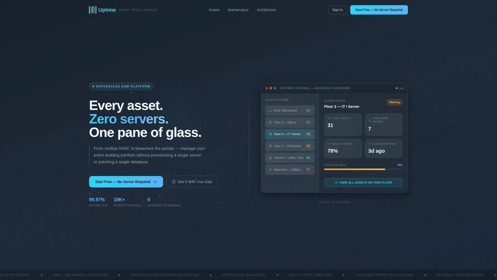
The header splits 50/50. The left side carries the headline and an animated mesh of connected nodes that dissolves to represent serverless abstraction. The right side renders a building cross-section with clickable floors. Each floor reveals asset counts, open work orders, and a health score badge that pulses in sky blue or amber. Visitors engage with the product before they scroll a single pixel.
Searchable Asset Registry Table
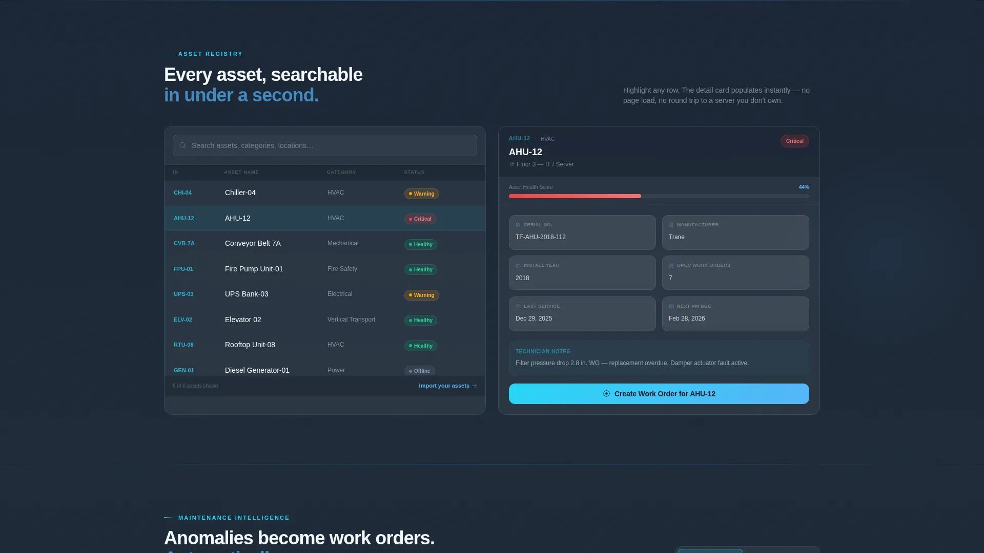
Section two splits a mock asset registry table on the left against a live detail card on the right. Visitors can highlight any row, Chiller-04, Conveyor Belt 7A, AHU-12, and watch the detail card populate instantly. This interaction demonstrates asset lookup speed without requiring a live backend.
Maintenance Calendar and Anomaly Feed Toggle
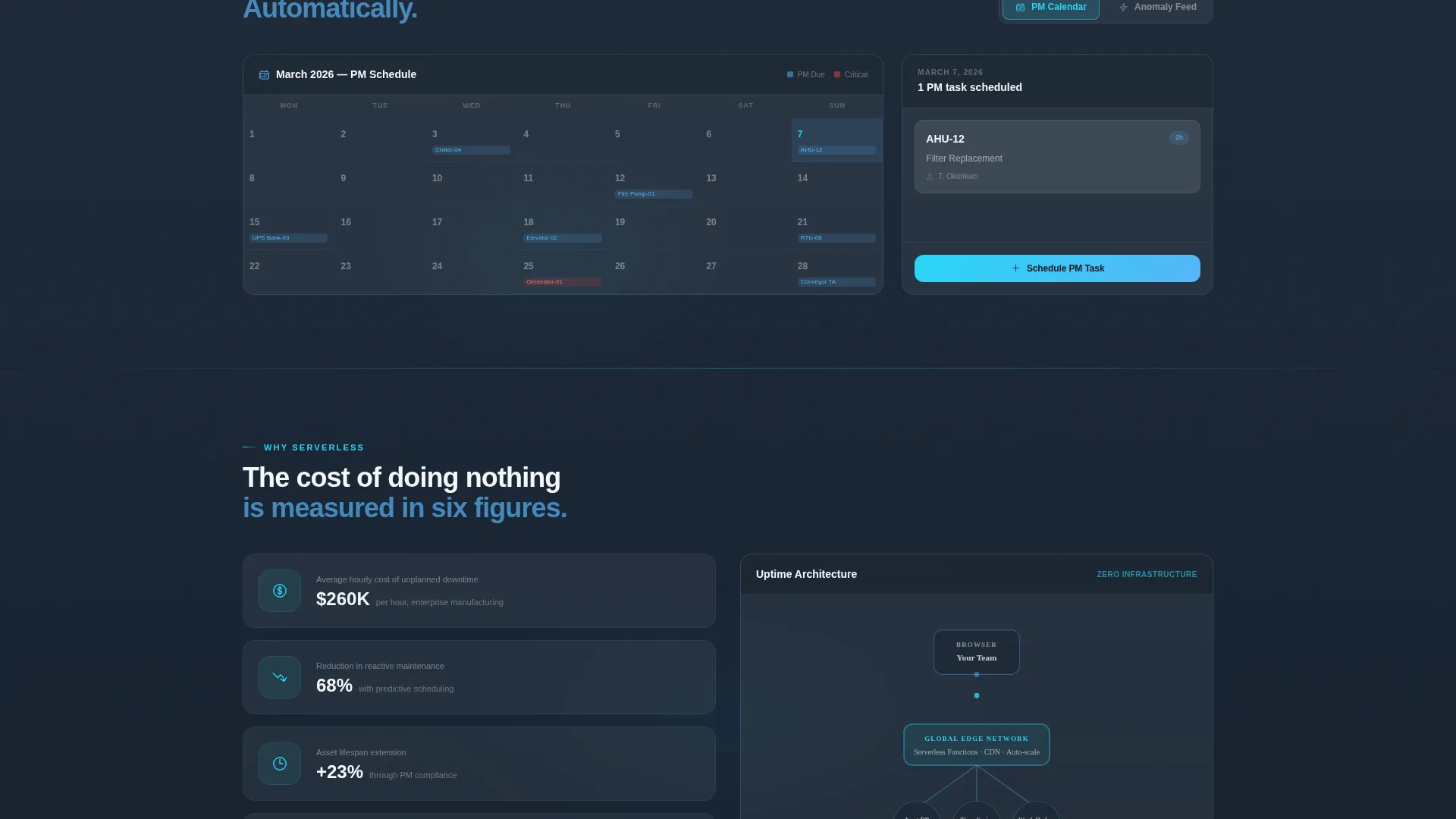
Section three lets visitors switch between a preventive-maintenance calendar and a real-time anomaly feed. The toggle shows how the platform auto-generates work orders when an alert fires. Two views, one toggle, one clear proof of reactive and proactive maintenance in the same screen.
Cost-of-Downtime and Architecture Split
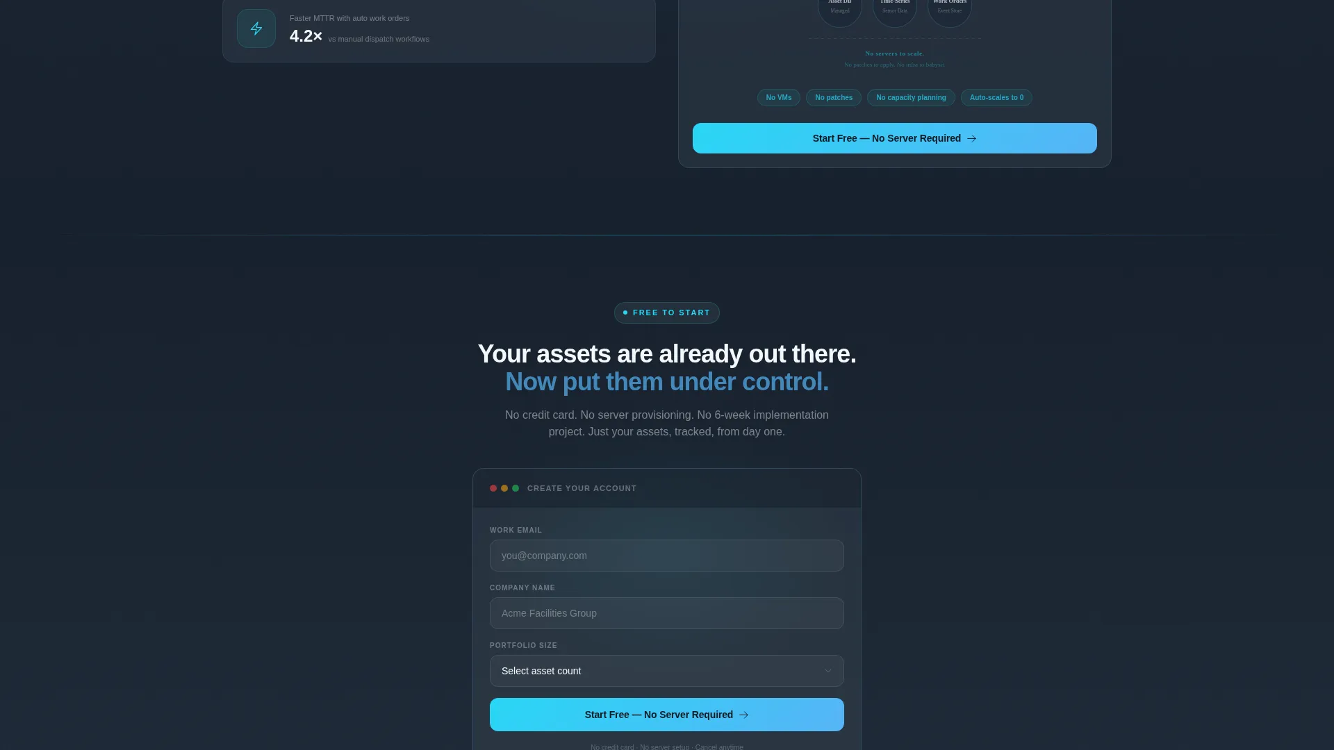
Section four places cost-of-downtime statistics on the left and a serverless architecture diagram on the right. The diagram uses a single glowing line from browser to data, with the caption: "No servers to scale. No patches to apply. No infrastructure to babysit." This section answers the infrastructure question directly for IT leads and procurement reviewers.
Frosted-Glass Sticky Navigation
The navigation bar uses a frosted-glass treatment that floats above every section as visitors scroll. The primary call-to-action, "Start Free - No Server Required," stays pinned and visible at all times, reducing the distance between intent and action.
Two-Path Conversion Flow
The primary path is a single-step signup: work email, company name, and a portfolio-size dropdown (1-50 assets, 51-500, or 500 plus). No credit card field. The secondary path, "See It With Your Data," opens a guided import modal where visitors paste a CSV of asset names to preview their own portfolio inside the dashboard.
Page sections overview
| Section | Purpose |
|---|---|
| Interactive Header | Headline, animated mesh, clickable building cross-section with floor-level asset data |
| Asset Registry Explorer | Searchable mock asset table with a live-populating detail card on the right |
| Maintenance Mode Toggle | Preventive-maintenance calendar and real-time anomaly feed with auto-work-order preview |
| Downtime versus. Architecture | Cost-of-downtime stats paired with a serverless architecture diagram and proof caption |
| Sticky Nav Bar | Frosted-glass navigation with pinned primary call to action visible across all scroll depths |
| Freemium Signup Flow | Single-step form and CSV import modal for two-path frictionless conversion |
Design & branding system
The visual identity is built on a Tech Glass theme using a Slate & Sky color system. The palette feels like looking through the tinted glass wall of a server room, cool, frictionless, and clean without feeling cold.
- Background and typographic weight use deep graphite slate (#1E2A38) and polished mid-slate (#3B4F65); altitude sky blue (#56B4F7) and clear-pane white (#F4F7FA) fill card surfaces and open space
- Interactive states, hover, toggle, and active filter moments, fire in electric cyan (#29D6F5), making every responsive element feel like light refracting through glass
- Slate dominates structure; sky blue and cyan appear only where elements move or respond to touch, preserving visual hierarchy and keeping the dashboard feel calm under complexity
Mobile & speed optimization
The split-screen layout is designed to reflow cleanly on smaller screens. Interactive sections stack vertically on mobile so every proof point remains usable without horizontal scrolling.
- Each 50/50 split collapses to a single-column stack on mobile, preserving the interaction sequence in the correct top-to-bottom order
- The frosted-glass navigation bar remains pinned on mobile, keeping the primary call-to-action reachable at any scroll position
How this template helps you convert
The conversion strategy is built on earned trust rather than pushed urgency. Visitors interact with the product at every stage before they are asked for anything in return.
- The clickable header dashboard gives visitors an immediate hands-on moment, they experience product value before they read a headline
- Interactive sections replace static feature lists with direct product proof, so by the time visitors reach the signup form they have already seen the value in action
- The no-credit-card, single-step form and the CSV import path lower commitment friction at both ends of the buyer spectrum, capturing quick-start users and evaluation-stage buyers in the same flow
Other information about this template
This template is designed specifically for the serverless EAM niche, where buyers are skeptical of infrastructure promises and need direct proof before engaging with a sales process.
- The template style is Split Screen (50/50), the theme is Tech Glass, the creative direction is Interactive Explorer, and the header concept is Interactive Preview
- The landing page direction is Freemium/Trial, making it well suited for platforms offering a no-cost entry point with a clear upgrade path
- The color system (Slate & Sky), typography weight distribution, and interaction palette are all pre-configured and described in the design brief for straightforward implementation
Theme
Tech Glass
Creative direction
Interactive Explorer
Color system
Slate & Sky
Style
Split Screen (50/50)
Direction
Freemium/Trial
Page Sections
Interactive Building Cross-section Header
Searchable Asset Registry with Live Detail Card
Maintenance Calendar and Anomaly Feed Toggle
Cost-of-downtime and Serverless Architecture Split
Frosted-glass Sticky Navigation Bar
Two-path Frictionless Signup Flow
Related questions
Who is this landing page template designed for?
Does this template require a real backend to display the interactive sections?
Can I replace the mock asset data with my own examples?
What does the two-path conversion flow include?
Is the sticky navigation bar customizable?



