Manage — Property Platform Landing Page Template
Ledger is a split-screen landing page template built for property management firms that handle rent collection, expense tracking, reserve fund management, and owner disbursements. It pairs a Tech Glass visual identity with an interactive dashboard header, a spec-sheet scroll structure, and a comparison table layout designed to move serious buyers from research to action.
by Rocket studio
Quick summary
Ledger is a single-page template for financial services property management companies. It combines a live-dashboard hero, a metronomic spec-sheet scroll, and a side-by-side comparison table into one confident landing page. The Electric Indigo color system and Tech Glass theme signal precision software to landlords, regional managers, and real-estate syndicators from the first scroll.
Who this template is for
This template is designed for property finance businesses that need to communicate technical depth and financial credibility at a glance. It works equally well for early-stage products and established platforms.
- Independent landlords managing multiple properties across separate legal entities who want a polished, trust-building web presence
- Regional property management companies whose accounting teams still rely on spreadsheets and need a tool that signals a smarter alternative
- Real-estate syndicators who produce monthly investor-ready reporting and must convey that capability clearly to prospective clients
What problem this template solves
Property management finance software is hard to explain quickly. Visitors arrive skeptical, compare multiple tools, and leave if they cannot immediately see how the product handles their specific workflow. Generic landing pages fail here because they prioritize aesthetics over proof.
- Buyers cannot visualize abstract financial features like reconciliation or reserve tracking without seeing real data in context
- Comparison shopping is the default behavior in this niche, yet most pages ignore it and lose visitors to competitors
- Research-mode visitors need a low-commitment path to stay engaged, or they leave without converting
What you get with this template
You get a fully structured, single-page layout that puts the product itself front and center. Every section is purpose-built for financial services property management, so you spend time customizing, not rebuilding from scratch.
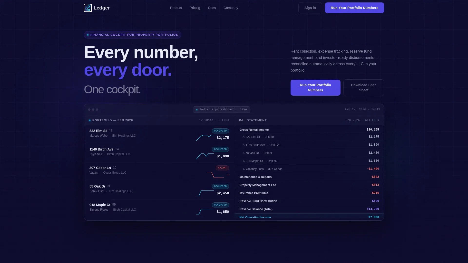
- A split-screen (50/50) interactive header that acts as a live mini-dashboard, showing property lists with occupancy badges and monthly cash-flow sparklines alongside a highlighted profit and loss statement
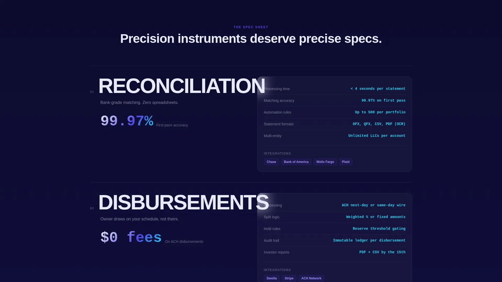
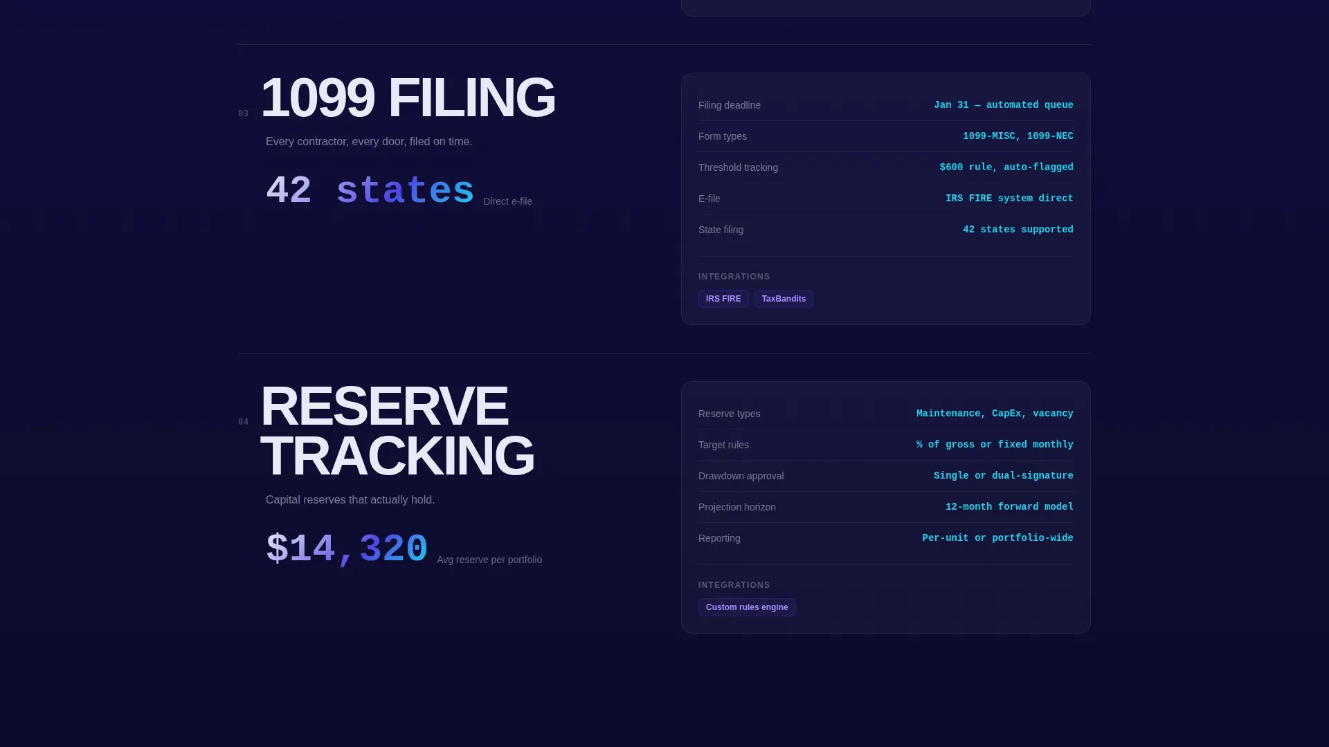
- A spec-sheet scroll body where oversized typography names each financial capability on the left and precise feature details fill the right column
- A mid-page comparison table with toggling competitor columns, a sticky "See How We Compare" bar, and an inline portfolio calculator tied to the primary call to action
Feature list
This section covers the core built-in components that make Ledger distinct from a general-purpose template.
Interactive Dashboard Header
The header splits the viewport 50/50. The left pane shows a property list with occupancy status badges and cash-flow sparklines. The right pane displays a profit and loss statement whose rows highlight on hover when a visitor moves between properties. Real-looking figures (unit 4B at 822 Elm, a $14,320 maintenance reserve, a scheduled owner draw) replace stock photography entirely.
Spec-Sheet Scroll Layout
Each content section divides the screen: the left side carries a single oversized capability label such as RECONCILIATION, DISBURSEMENTS, 1099 FILING, or RESERVE TRACKING. The right side presents supporting detail at the same level of specificity. The rhythm is deliberate and builds confidence as the visitor scrolls deeper.
Persistent Sticky Comparison Bar
A sticky bar at the top of the page reads "See How We Compare" and anchors to the comparison table further down. This keeps the competitive framing visible at every scroll depth without interrupting the reading flow.
Interactive Comparison Table
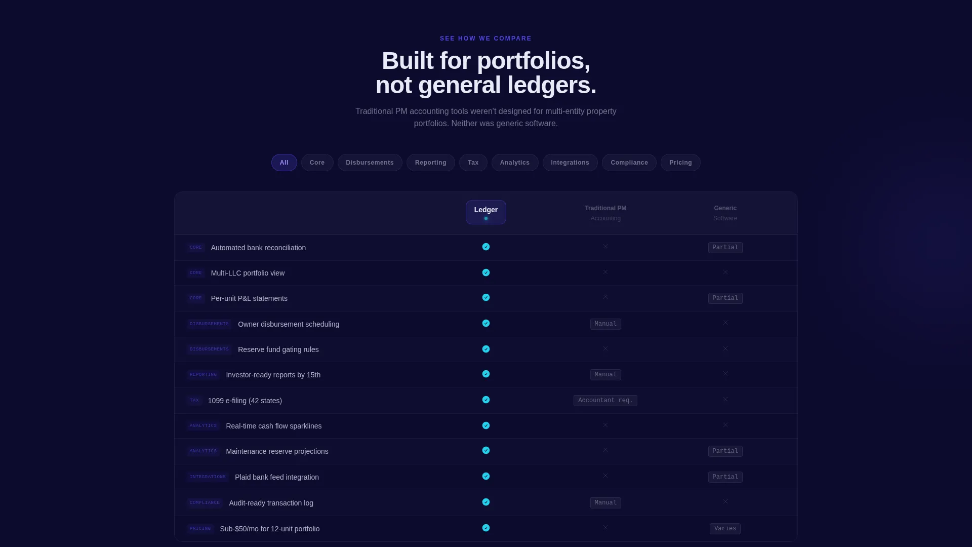
The mid-page table lets visitors toggle between Ledger and two grayed-out competitor columns labeled "Traditional PM Accounting" and "Generic Software." The layout is built for the comparison-minded buyer who arrives ready to evaluate options side by side.
Inline Portfolio Calculator
The primary call-to-action section includes a short calculator. Visitors enter their number of units, current monthly revenue, and management fee percentage. The template instantly displays projected time saved and projected fee reduction, giving a concrete reason to act rather than continuing to browse.
Dual Conversion Paths
The primary path is "Run Your Portfolio Numbers," anchored to the inline calculator. The secondary path is a quieter "Download the Full Spec Sheet" link that asks only for an email address. Together they serve both decision-ready buyers and visitors still in research mode.
Page sections overview
| Section | Purpose |
|---|---|
| Split-screen header | Show live dashboard as the product hero |
| Occupancy and sparklines | Display property list with real financial data |
| Profit and loss pane | Highlight row-level figures on hover |
| Sticky comparison bar | Keep competitive anchor visible while scrolling |
| Spec-sheet scroll | Present each financial capability with supporting detail |
| Comparison table | Let visitors toggle between Ledger and competitor columns |
| Portfolio calculator | Convert visitors with a personalized numbers preview |
| Spec sheet download | Capture research-mode visitors via email |
Design & branding system
The Tech Glass theme uses an Electric Indigo color system that reads like a Bloomberg terminal rebuilt by a Scandinavian design house. Every surface carries slight translucency and intentional depth.
- Four-color palette: deep dashboard navy (#0D0B2E) dominates backgrounds, luminous indigo (#4F46E5) carries buttons and section dividers, frosted glass panel white (#E8EAF6) fills cards and data containers, and live-wire cyan (#22D3EE) fires only on hover, toggle, and active comparison states
- No stock photography and no illustration; the product interface is the hero, rendered in glass-card user interface with subtle depth-of-field blur on background layers
- Typography uses stark, oversized labels for capability names on the left column and clean readable type for specification detail on the right, creating a metronomic visual rhythm throughout the scroll
Mobile & speed optimization
The split-screen layout is designed to restack gracefully on smaller viewports so the dashboard header, spec rows, and comparison table remain legible without horizontal scrolling.
- The 50/50 column structure shifts to a single-column stacked flow on mobile, keeping the property list, sparklines, and profit and loss pane in logical reading order
- Interactive states such as hover highlights and toggle columns adapt to tap interactions on touch devices, preserving the core comparison experience
How this template helps you convert
Ledger is built around the conversion behavior of financial software buyers, who compare before they commit and need proof before they trust.
- The interactive dashboard header eliminates abstract claims by showing real data in a live-feeling interface, so visitors understand the product in seconds rather than paragraphs
- The comparison table and sticky bar meet the side-by-side evaluation mindset directly, reducing the chance a visitor leaves to find a comparison elsewhere
- The inline portfolio calculator makes the value personal and immediate, turning a number the visitor already knows (their unit count and revenue) into a projected outcome that motivates action
Other information about this template
Ledger is a Webflow-compatible template suited for financial services software brands that need to communicate analytical credibility alongside visual polish. The design system and section structure are fully customizable to match your product's real feature set and data.
- The template is categorized under Technology and Financial Services Software, making it a strong fit for property finance platforms, real-estate accounting tools, and portfolio management dashboards
- The spec-sheet creative direction is deliberately borrowed from precision instrument data sheets, a convention that financial and technical audiences recognize as a trust signal
- The dual call-to-action model (active calculator plus passive spec-sheet download) reflects a documented best practice for software landing pages serving both decision-ready and research-mode buyers
- Color tokens and interactive state rules are clearly defined in the design system, making it straightforward to hand off to a developer or customize inside a visual editor
Theme
Tech Glass
Creative direction
Spec Sheet
Color system
Electric Indigo
Style
Split Screen (50/50)
Direction
Comparison/Versus
Page Sections
Interactive Split-screen Dashboard Header
Metronomic Spec-sheet Scroll
Sticky Comparison Bar and Toggle Table
Inline Portfolio Calculator
Dual Conversion Path Design
Related questions
Who is this template best suited for?
Can I replace the placeholder financial data with my own figures?
Does the comparison table support fewer than two competitor columns?
Is the inline portfolio calculator functional out of the box?
Can I use this template for a product that is not yet launched?



