Specialist Government Software Comparison Website Template
Mandate is a bold brutalist government survey and feedback landing page template built on a bento grid layout. It turns civic opinion into structured, visual data by showcasing live dashboards, real-time sentiment heatmaps, and comparison metrics. Designed for municipal, state, and federal teams, it makes the case for modern civic engagement software with stats-first urgency and a striking electric indigo identity.
by Rocket studio
Quick summary
Mandate is a single-page bento grid landing page template built for government survey and feedback platforms. It leads with a live product screenshot header and drives conversion through a comparison-versus layout that stacks irrefutable data points before every call to action. The visual identity is bold brutalist, using electric indigo against deep charcoal for a look that feels institutional yet urgent.
Who this template is for
This template is built for teams that collect structured civic feedback and need to prove its value to decision-makers and procurement officers. It speaks the language of public-sector accountability without sacrificing design credibility.
- Municipal program managers measuring constituent satisfaction after permit and service processes
- Federal agency leads running mandated public comment periods under tight Office of Management and Budget deadlines
- State-level civic engagement officers who need to demonstrate that collected feedback drove real policy outcomes
What problem this template solves
Legacy government feedback tools often look dated and fail to communicate impact. Teams struggle to justify platform upgrades to procurement committees because they lack a compelling, data-driven comparison format.
- Visitors leave without converting because the value case is buried in text rather than shown in metrics
- Procurement reviewers cannot quickly compare a modern platform against older tools on measurable dimensions
- Civic engagement teams have no ready-made page that visually proves response rates, accessibility compliance, and deployment speed
What you get with this template
You get a fully structured bento grid landing page that front-loads performance data and builds a case file of evidence before the primary call to action ever appears. Every section is designed to reduce friction for government buyers.
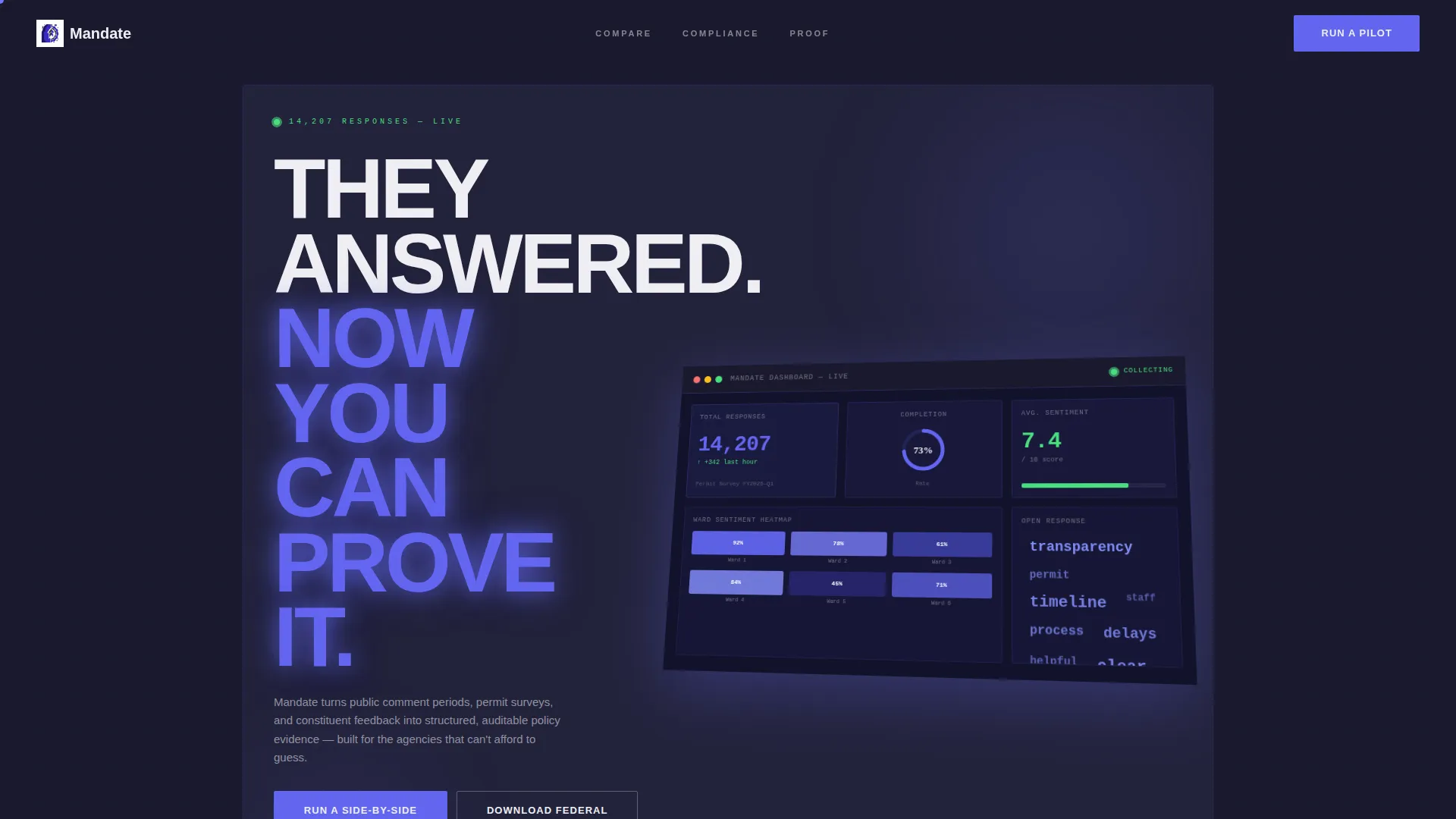
- A hero bento cell with a blown-up isometric product screenshot showing a live survey dashboard, including response counts, a sentiment heatmap, a completion rate ring, and word clouds
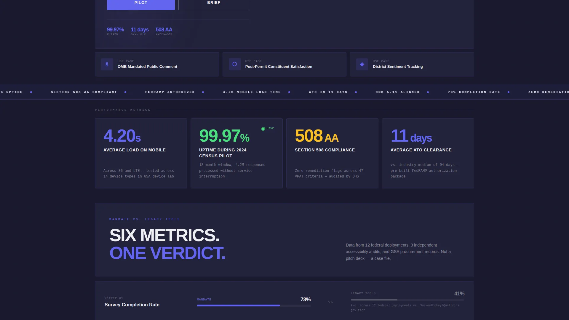
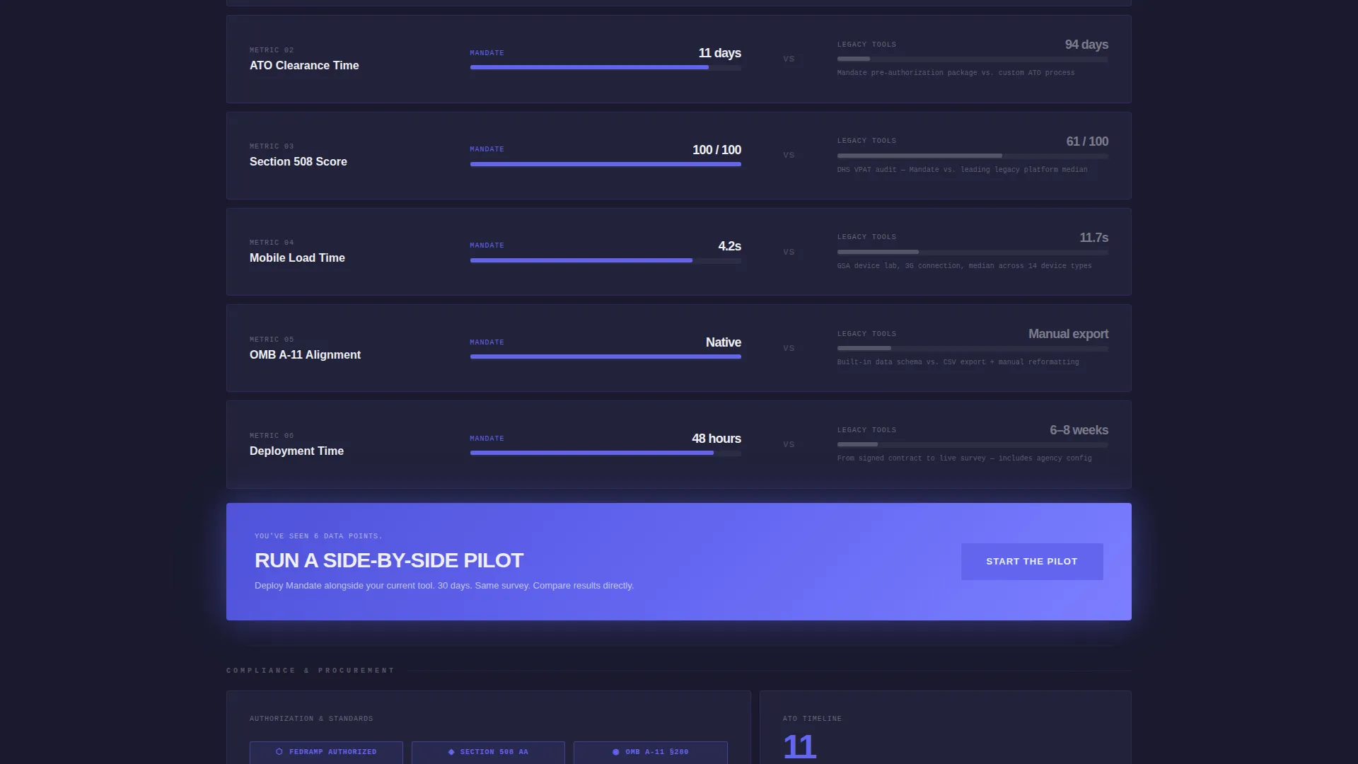
- A stats-first comparison grid where each row pairs a Mandate metric against a legacy-tool equivalent across response rates, accessibility scores, deployment timelines, and clearance speed
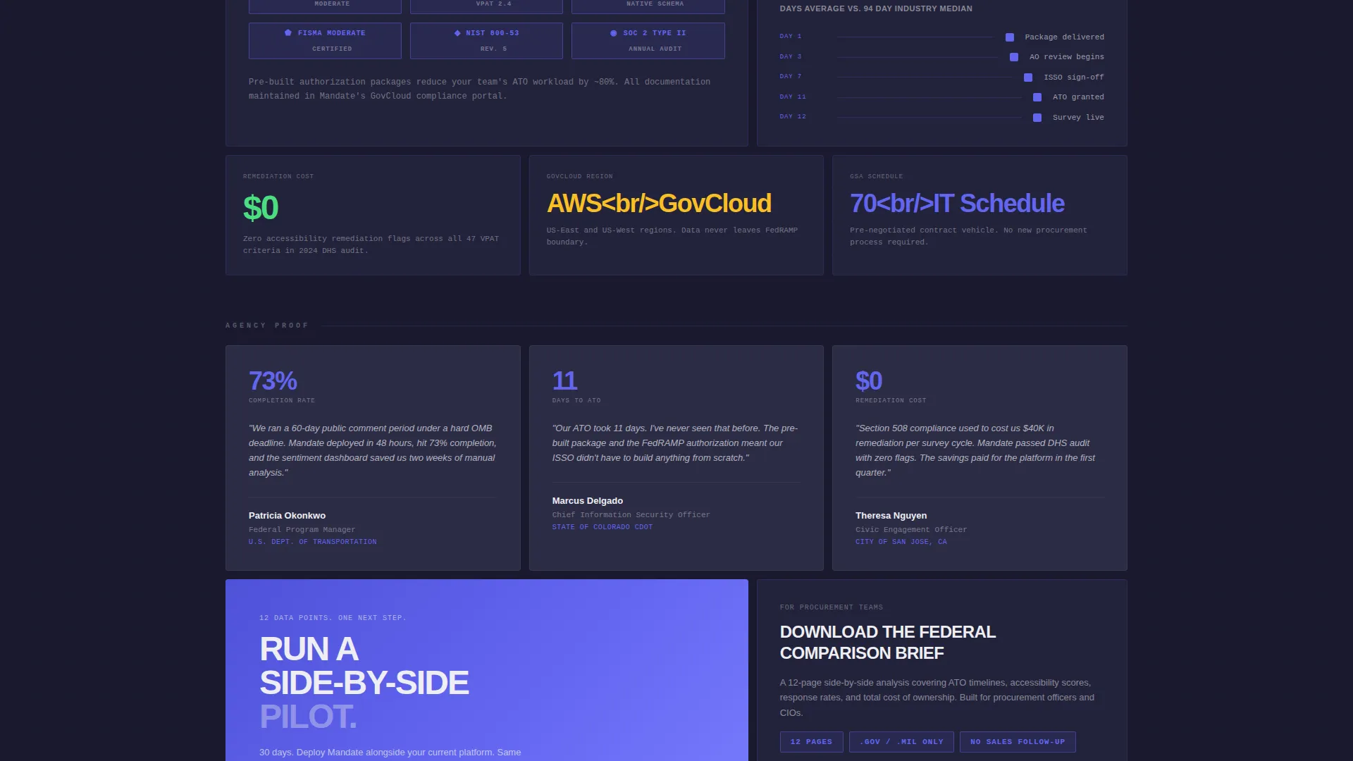
- Two conversion paths: a primary call to action for a side-by-side pilot and a gated secondary path for a federal comparison brief requiring only a.gov or.mil email address and agency name
Feature list
This template is purpose-built for government software positioning. Each component below reflects a deliberate structural choice from the source brief.
Bold Brutalist Bento Grid Layout
The page is organized into a modular bento grid where cells vary in size, density, and visual weight. The layout tightens as users scroll, giving the page a sense of mounting evidence rather than a standard marketing scroll.
Stats-First Comparison Rows
Every data row leads with a number before any explanation. Cells split into a versus frame, placing the platform's metric on the left and a legacy tool equivalent on the right. This format is designed for procurement-minded readers who need fast, side-by-side proof.
Isometric Product Screenshot Header
The top bento cell features a large product screenshot on a slight isometric tilt. It shows a real survey in progress, complete with response counts, a sentiment heatmap across city wards, a completion rate ring, and three open-response word clouds mid-render.
Dual Conversion Path Design
The primary call to action, "Run a Side-by-Side Pilot", appears after the third comparison row and again pinned at the bottom of the grid. A secondary gated path offers a downloadable federal comparison brief, capturing high-intent leads who are not yet ready to commit.
Electric Indigo Visual Identity
Interactive elements, data highlights, and heatmap gradients all use electric indigo (#6366F1) against a deep slab charcoal background (#1A1A2E). Civil white typography (#EEEEF2) cuts through the dark palette with projected-text clarity, reinforcing institutional authority with visual urgency.
Sentiment Heatmap Dashboard Display
The header screenshot includes a sentiment heatmap rendered across six city wards in indigo gradients. This visual communicates the platform's real-time geographic data capability at a glance, without requiring a live demo.
Page sections overview
| Section | Purpose |
|---|---|
| Hero Dashboard Cell | Anchors credibility with a live product screenshot and headline |
| Stat Highlight Row | Leads each scroll unit with a single bold metric |
| Comparison Versus Grid | Pairs platform data against legacy tool equivalents side by side |
| Primary call to action Block | Prompts visitors to run a side-by-side pilot after three comparison rows |
| Gated Brief Download | Captures.gov and.mil leads with a lightweight two-field form |
| Pinned Bottom call to action | Repeats the primary call to action at page close for late deciders |
Design & branding system
The template uses a Bold Brutalist visual theme built around four specific colors that work together to feel both governmental and electric. Typography is set in heavy grotesque type that commands attention without decoration.
- Background uses deep slab charcoal (#1A1A2E); card surfaces use raw concrete mid-gray (#4A4A5A) to create depth within the bento grid
- Electric indigo (#6366F1) runs through every interactive element, data highlight, and heatmap gradient, acting as the page's pulse
- Civil white (#EEEEF2) handles all body and headline typography, punching through the dark palette with high contrast and readability
Mobile & speed optimization
The bento grid layout is structured to reflow cleanly on smaller screens, maintaining the visual hierarchy of the stats-first design even on compact viewports. The template avoids heavy lifestyle imagery in favor of a single product screenshot, which keeps the asset footprint lean.
- Cells are sized and spaced to remain readable and tappable on mobile without horizontal scrolling
- The absence of stock photography and decorative illustration reduces render load across the page
- Heavy grotesque headline type is set at sizes that scale proportionally, preserving the monumental weight of the design on any screen
How this template helps you convert
Mandate is built as a conversion engine for procurement-ready government buyers. The page earns its calls to action by the time they appear.
- The page front-loads twelve or more data points across comparison rows before the primary call to action appears, so the ask feels like the obvious next procurement step rather than a sales pitch
- The dual conversion path captures both pilot-ready decision-makers and research-phase buyers, using the gated federal comparison brief to qualify high-intent leads with minimal friction
Other information about this template
This template was designed specifically for the government survey and feedback software category. It is a strong fit for teams positioning a civic engagement platform in competitive procurement environments.
- The template style is a Bento Grid, which suits data-dense government software pitches where multiple metrics need to coexist without feeling cluttered
- The creative direction is Stats-First Impact, meaning the page is engineered to overwhelm hesitation with evidence before any request is made of the visitor
- The header concept is a Product Screenshot, deliberately avoiding lifestyle imagery or illustrated metaphors in favor of showing the actual software at work
- The landing page direction is Comparison/Versus, a format well suited to public-sector buyers who must justify platform selection to oversight committees
- The color system is Electric Indigo, chosen to signal institutional credibility while creating the visual urgency that static government pages typically lack
- The theme is Bold Brutalist, which draws on the aesthetic language of government architecture to make the page feel authoritative rather than corporate
Theme
Bold Brutalist
Creative direction
Stats-First Impact
Color system
Electric Indigo
Style
Bento Grid
Direction
Comparison/Versus
Page Sections
Bold Brutalist Bento Grid Layout
Stats-first Comparison Rows
Isometric Product Screenshot Header
Dual Conversion Path Design
Electric Indigo Visual Identity
Sentiment Heatmap Dashboard Display
Related questions
Who is this landing page template designed for?
Can I customize the comparison metrics in the bento grid?
What makes the bento grid format a good fit for government software pages?
Does the template include two separate calls to action?
Is this template suitable for a federal agency procurement page?



