Education Software Directory Website Template
The Ledger District Asset Tracking Comparison Table landing page template is built for K-12 education software teams that need to convert district CFOs, facilities directors, and IT coordinators into qualified leads. It uses a dark Data Command visual style, animated comparison tables, and a stats-first content rhythm to prove platform value before asking for a commitment.
by Rocket studio
Quick summary
This template gives EdTech and GovTech software teams a ready-to-deploy landing page for district-level asset management platforms. It opens with a glowing SVG district map, escalates through data-driven comparison tables, and closes with a lead capture form. Every section is built around the real pain points of district stakeholders who need full control over taxpayer-funded resources.
Who this template is for
This asset tracking template was designed with a precise audience in mind. If your software helps public school districts manage equipment from purchase to surplus, this template speaks directly to the people who sign contracts and book demos.
- District CFOs who reconcile bond-funded purchases and face audit deadlines
- Facilities directors hunting for missing equipment across multiple campuses
- IT coordinators managing computer hardware lifecycles and fielding teacher requests
What problem this template solves
District asset management is a high-stakes responsibility. Missing assets, failed audits, and unreconciled bond purchases are not just administrative headaches, they carry financial and fiduciary consequences. This template gives your platform a page that proves it understands those pressures better than a generic software brochure ever could.
- Manual spreadsheets cannot provide real-time asset information across an entire district
- Annual physical counts leave asset status unknown for months at a time
- Without proper tracking, organizations lose money, miss audit windows, and struggle with financial reporting
What you get with this template
This template delivers a complete, section-led landing page structured around conversion. Every component is grounded in the brief and built to move a skeptical district buyer from problem awareness to form submission.
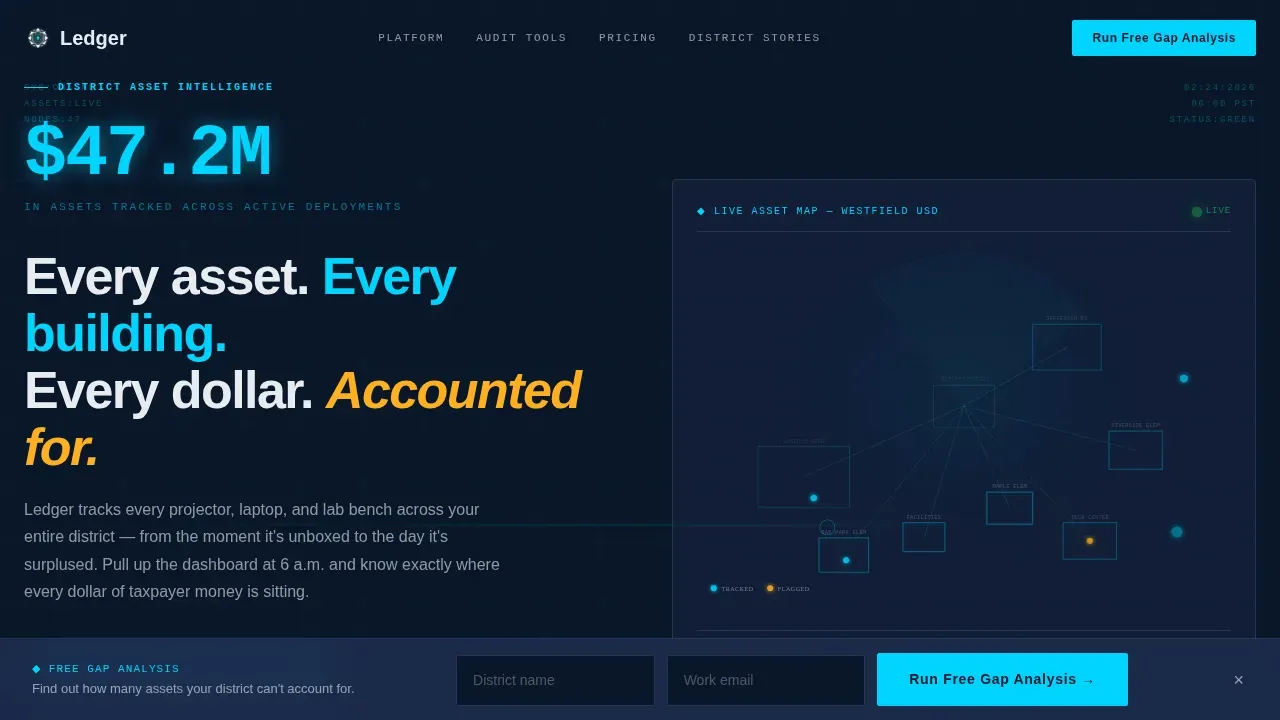
- A full-bleed hero with an animated SVG district map, a count-up dollar figure, and a headline
- Two side-by-side comparison tables: one for process differences, one for district size tiers
- A sticky call-to-action bar with a lead capture form and a secondary gated PDF download path
Feature list
This template includes purposeful, conversion-focused components. Each one reflects a real design or functional decision described in the source brief.
Animated District Map Hero
The hero section opens with a dark full-bleed viewport soaked in deep navy. An SVG visualization of a school district fades in, with building outlines rendered in thin cyan lines and pulsing amber and cyan dots representing tracked assets across each campus. A counter animates upward to display a total dollar figure of assets tracked. This opening section immediately communicates data density and operational control to any user who arrives at 6 a.m. before the school day begins.
Stats-First Impact Sections
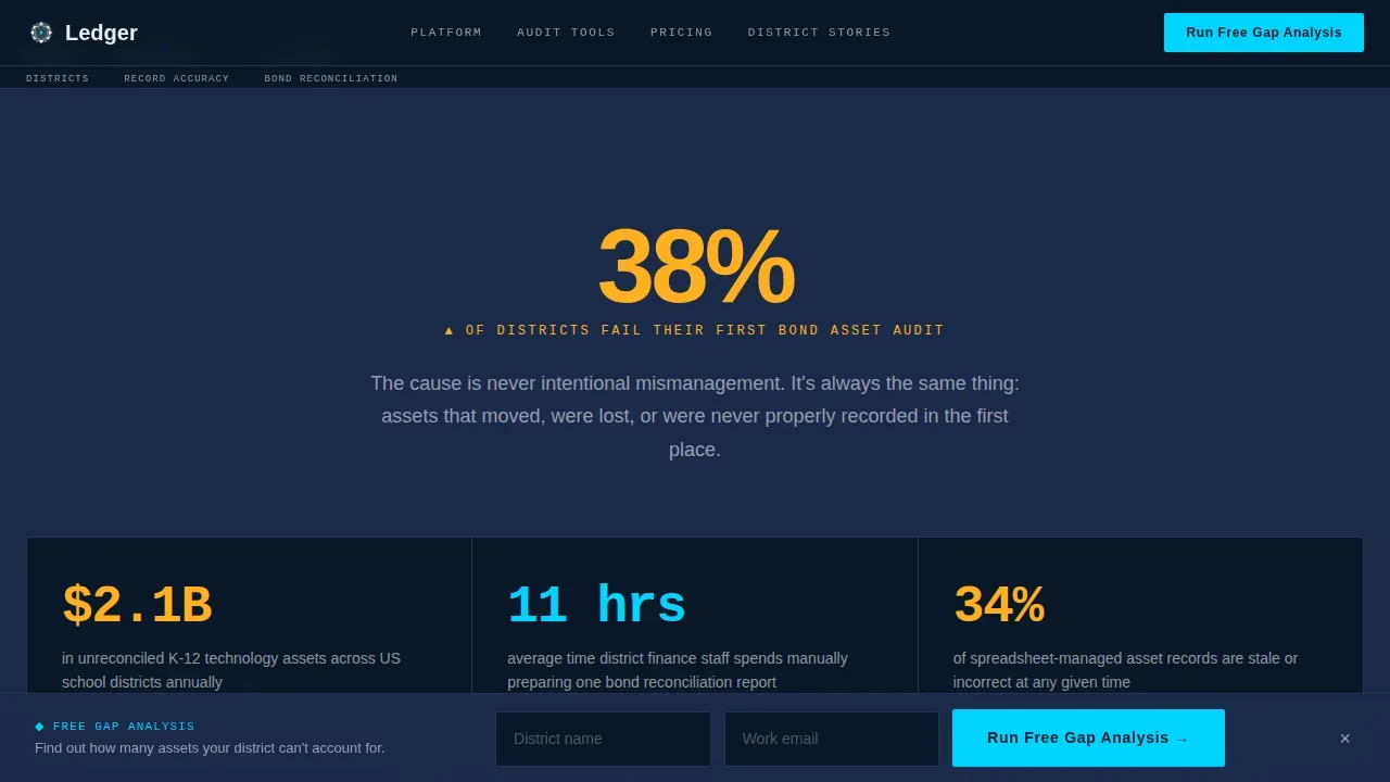
Each content section opens with a single oversized statistic before any explanatory copy appears. The rhythm creates a deliberate pause, the data makes the argument, and the explanation follows. This structured approach guides CFOs and facilities directors through the problem before presenting the solution, making the page feel like a well-organized asset repository rather than a marketing brochure.
Side-by-Side Process Comparison Table
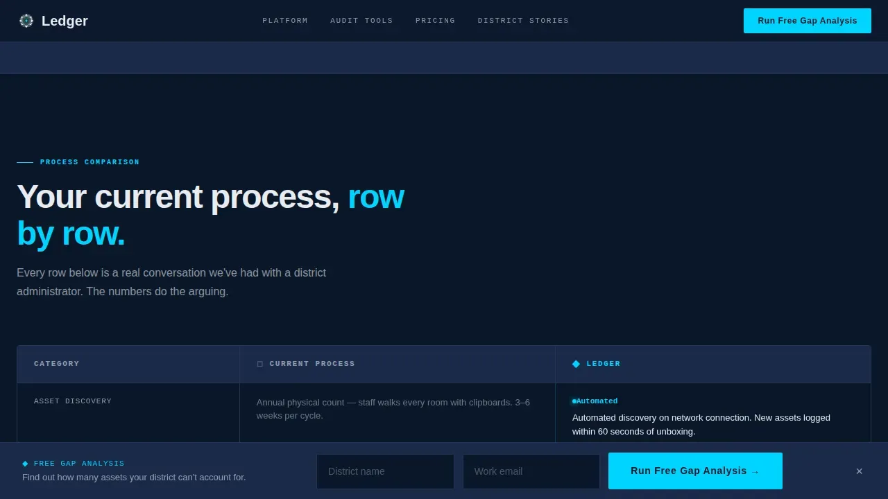
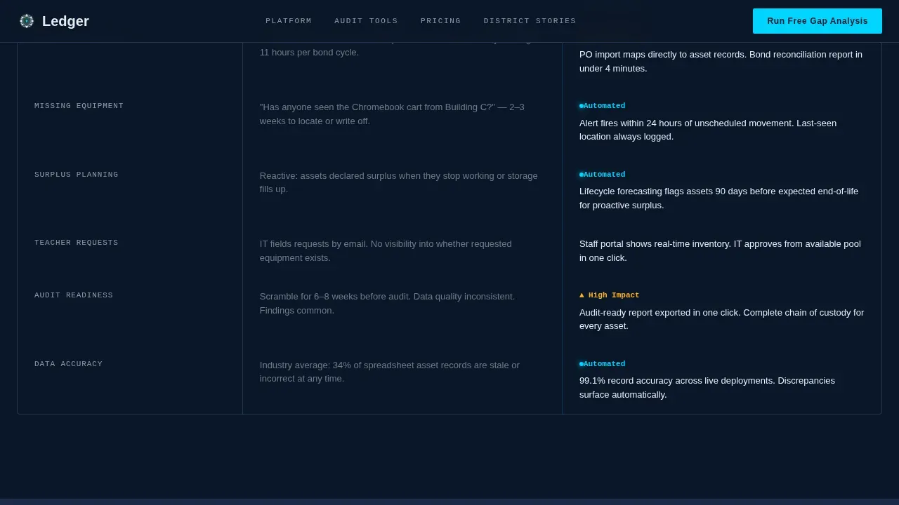
The first comparison table places manual spreadsheet tracking against the platform's automated asset tracking row by row. Rows cover areas including maintenance scheduling, physical inventory counts versus real-time location data, and reactive surplus planning versus lifecycle forecasting. Table rows use staggered scroll-reveal animations and hover states. The asset details and asset status visible in each row help stakeholders identify gaps in their current approach instantly.
District Tier Scale Table
A second table compares features across district sizes, showing which asset management capabilities scale with an organization's specific needs. This table helps buyers self-qualify and helps the sales team receive better-informed leads. It covers key components like depreciation tracking, maintenance schedules, and financial reporting by tier.
Lead Generation Form with Sticky Bar
The primary call-to-action reads "Run Your Free Asset Gap Analysis." The form collects district name with autocomplete from the National Center for Education Statistics database, number of campuses, current tracking method via dropdown, and work email. The form appears after the first comparison table and again as a sticky bar triggered on the second scroll. A secondary path offers a gated PDF download for visitors not yet ready to convert directly.
Social Proof Section
Named district testimonials with role titles and specific outcome metrics appear before the footer. Social proof elements like these build trust quickly with buyers who are evaluating multiple software options. Client context and role-specific outcomes make each testimonial directly relevant to other district stakeholders reading the page.
Page sections overview
| Section | Purpose |
|---|---|
| Hero Map Counter | Open with data-first visual impact and animated asset count |
| Stats Impact Block | Lead with audit failure statistic before showing comparison |
| Process Comparison Table | Show manual versus. automated asset tracking side by side |
| Sticky call to action Bar | Capture lead after first comparison table scroll |
| District Tier Table | Compare feature access across small, mid, and large districts |
| Social Proof Block | Reinforce trust with named testimonials and outcome metrics |
| Secondary call to action | Offer gated audit checklist PDF as lower-friction conversion |
| Minimal Footer | Close with single-row developer-minimal footer pattern |
Design & branding system
The visual identity follows a Data Command theme. The palette is built for dark environments where data must glow, not disappear. Every color choice has a functional role tied to the asset tracking context.
- Deep navy (#0A1628) dominates all backgrounds and table rows; interface steel (#1B2A4A) layers depth into panels
- Status-glow cyan (#00D4FF) traces borders, active table states, and the animated counter digits
- Alert amber (#FFB020) fires only on data callouts and hover states; crisp white (#E8ECF1) keeps all labels readable against dark backgrounds
Mobile & speed optimization
The template is desktop-first, reflecting the real behavior of district CFOs and facilities directors who access dashboards early in the morning from office workstations. Mobile fallback is included so the page remains functional across devices.
- Server Components handle all static sections to reduce unnecessary rendering overhead
- Client Components manage animations, the sticky call to action bar, and the lead capture form independently
How this template helps you convert
Effective asset tracking software needs a landing page that earns trust through demonstrated understanding. This template is structured to move a cautious district buyer through three stages: pain recognition, platform proof, and conversion.
- The stats-first rhythm and comparison tables make the case before a single marketing claim appears, so visitors arrive at the form already convinced the platform understands their asset management problem.
- The dual conversion path, direct form submission for ready buyers and the gated PDF for researchers, means the page captures leads at two different levels of intent without losing either group.
Other information about this template
This template is a practical starting point for any EdTech or GovTech team that needs to track assets across a complex public-sector organization. Below are additional details worth noting before you build or customize.
- The asset tracking template supports customizable fields, so teams can customize asset details like condition, location, purchase date, and purchase price to match their specific requirements
- The comparison table layout uses sample data rows to illustrate the contrast between legacy and modern asset tracking; teams can update asset status labels and swap in real figures before launch
- Custom fields can be added for depreciation tracking, current value calculations, and inventory list entries to align with fixed asset management and financial reporting workflows
- The template is designed to serve as a single source of truth for a district's full asset inventory, combining asset information from every campus into one central location
- Regularly updating asset records through the platform helps organizations maintain accurate records, automatically calculate total value across the district, and make informed decisions about surplus and procurement
- Organizations looking to streamline their asset repository should rank their specific needs around accuracy and compatibility before migrating existing data into a new asset tracking system
- Other tools in the asset tracking software space, including those that provide a structured approach to project management and maintenance scheduling, can serve as references when adapting this template to other use cases beyond K-12 education
- The template is delivered as a web file type compatible with modern front-end frameworks, making it straightforward to integrate into existing project management workflows
Theme
Data Command
Creative direction
Stats-First Impact
Color system
Midnight Blue
Style
Comparison Table
Direction
Lead Generation
Page Sections
Animated SVG District Map Hero
Process Comparison Table
District Tier Scale Table
Sticky Lead Capture Form
Stats-first Content Rhythm
Social Proof with Role Outcomes
Related questions
What kind of organization is this template designed for?
Can I adapt the comparison tables for a different industry?
What does the lead generation form collect?
Does the template include animations and interactive elements?
How does this template support financial reporting and audit readiness?



