Supply Chain Visibility Landing Page Template
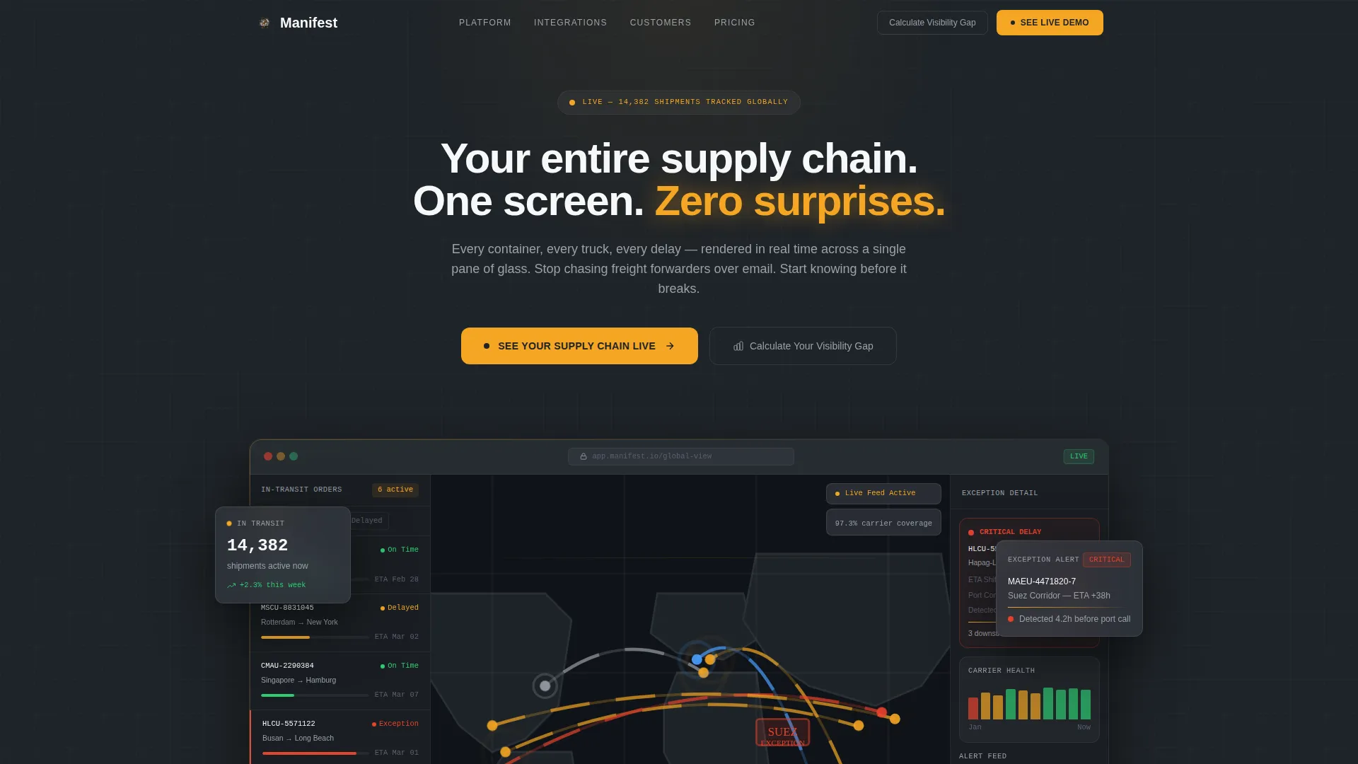
Manifest is a dashboard-style supply chain visibility landing page built for logistics and procurement teams. It uses a dark Charcoal and Amber color system, a live-data product screenshot hero, and three bold stat blocks above the fold. Every section is structured as a data grid card, guiding visitors from awareness to a self-serve demo click without a single form field.
by Rocket studio
Quick summary
Manifest is a single-page, click-through landing page template for supply chain visibility platforms. It opens with a full-width product screenshot, follows with stat-first data grid sections, and closes with a persistent mobile call-to-action bar. The entire layout is built around one goal: earn the demo click by showing the platform working in real time.
Who this template is for
This template is built for teams selling or presenting supply chain technology to operations-heavy buyers. It speaks directly to the people who feel the pain of poor shipment visibility every day.
- Logistics directors managing thousands of stock-keeping units (SKUs) across multiple regions
- Procurement leads who spend too much time chasing freight forwarders for status updates
- Chief Operating Officers (COOs) who need proactive exception alerts, not reactive Twitter discoveries
What problem this template solves
Supply chain software is often sold through dense whitepapers and vague benefit statements. Buyers arrive skeptical and leave unconvinced. This template solves that credibility gap head-on.
- Buyers cannot picture the platform working until they see real data on screen
- Long-form copy delays the value proposition and loses logistics buyers who scan before they read
- Generic hero images and illustration-heavy layouts signal marketing fluff, not operational depth
What you get with this template
You get a fully structured, single-page layout designed around a stat-first, screenshot-led conversion flow. Every section is ready to populate with your platform's actual data and visuals.
- A full-width product screenshot hero section with headline copy and dual call-to-action buttons
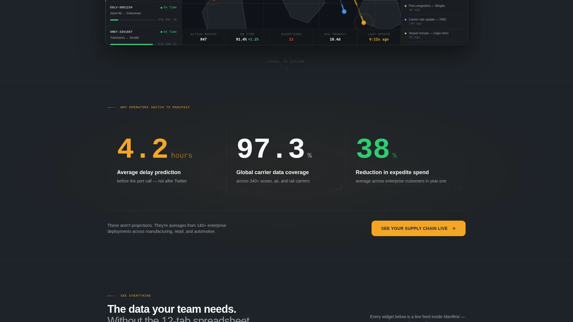
- Three above-the-fold stat blocks formatted for maximum visual impact before any paragraph text
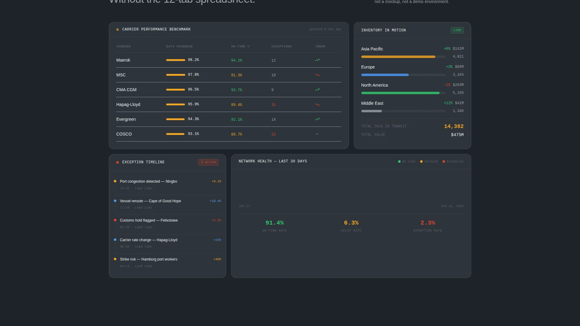
- A sequence of data grid card sections covering carrier performance, exception alerts, and inventory-in-motion
Feature list
This template is built around six core design and layout capabilities drawn directly from the source brief.
Stats-First Hero with Dual calls to action
Three oversized stat blocks sit above the fold, giving buyers hard evidence before any explanatory copy. The primary call-to-action, "See Your Supply Chain Live," and a secondary call-to-action, "Calculate Your Visibility Gap," both appear in the header section, giving visitors two meaningful next steps immediately.
Product Screenshot Header Section
The hero is a full-width, pixel-perfect product screenshot showing a global shipment map with amber pulse indicators, an in-transit order sidebar with estimated times of arrival (ETAs), and a flagged exception in the Suez corridor. The product itself is the visual argument, removing the need for decorative illustration.
Dashboard-Style Data Grid Layout
Each content section below the fold is structured as a card-based data grid widget. Sections covering carrier benchmarks, exception alert timelines, and inventory-in-motion counts are laid out like live dashboard panels, giving visitors a tactile sense of the platform's depth.
Escalating Narrative Structure
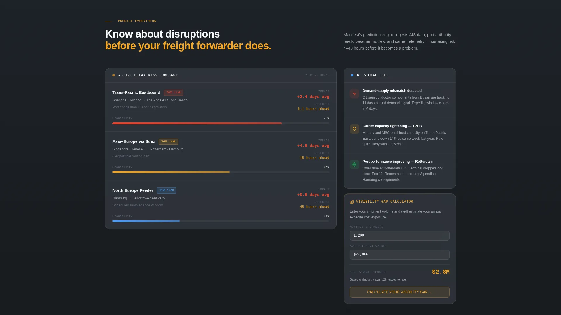
The page is organized into three tiers of platform intelligence: see everything, predict everything, and control everything. Each tier introduces a deeper capability layer. Visual density increases as the visitor scrolls, reinforcing the platform's sophistication without requiring long-form reading.
Persistent Mobile call to action Bar
On mobile viewports, the primary call-to-action persists as a fixed bottom bar so the conversion path is always one tap away. This layout decision keeps qualified traffic moving toward the demo environment regardless of where the visitor is in the scroll.
No-Form Click-Through Architecture
This template is designed as a click-through page with no embedded form. Every call-to-action routes visitors directly to a self-serve demo with pre-loaded shipment data, or to an ROI calculator that collects supplier count, shipment volume, and exception response time. The friction reduction is intentional and structural.
Page sections overview
| Section | Purpose |
|---|---|
| Hero Screenshot Header | Anchors the page with a real product view and the primary headline |
| Above-Fold Stats Row | Delivers three high-impact metrics before any descriptive copy |
| Primary call to action Block | Repeats the demo call-to-action after the stats row |
| Carrier Performance Grid | Shows benchmark data in a dashboard card layout |
| Exception Alert Timeline | Visualizes delay detection and response timing as a data widget |
| Inventory in Motion | Displays real-time SKU tracking counts as a grid card |
| ROI Calculator call to action | Links visitors to the visibility gap calculator with context |
| Mobile Persistent Bar | Keeps the primary call to action fixed at the bottom for mobile users |
Design & branding system
The visual identity follows a Service Utility theme built entirely around operational focus. Every color choice is intentional: dim the noise, amplify the signal.
- Deep operations charcoal (#1E2328) as the primary page background, mid-gray steel (#3A3F47) for card surfaces and data containers, signal amber (#F5A623) for live indicators and key metrics, and clean dispatch white (#F7F8FA) for all typography and chart lines
- The palette is described as a control tower at 2 AM: dark, focused, and stripped of anything decorative so the data that matters stands out immediately
- No illustrations or abstract hero graphics; the product screenshot and data grid cards carry all the visual weight
Mobile & speed optimization
The template is structured for fast, focused delivery on mobile screens without sacrificing the data-dense visual language.
- The persistent bottom call-to-action bar ensures the primary conversion path is always visible on mobile without requiring scroll-back
- Data grid cards reflow cleanly into single-column stacks on smaller viewports, keeping each widget readable and tappable
- The hero product screenshot is framed on a #1E2328 canvas, which keeps the layout visually grounded even when image loading varies by connection speed
How this template helps you convert
This template is engineered around a specific conversion philosophy: show the product working, then ask for the click.
- The above-the-fold stat blocks (4.2 hours average delay prediction, 97.3% carrier data coverage, 38% reduction in expedite spend) establish credibility before the visitor reads a single sentence of marketing copy, making the page feel earned rather than pitched.
- The escalating narrative structure moves visitors from awareness through confidence by the time they reach the final call-to-action, so the demo click feels like a natural next step rather than a sales ask.
Other information about this template
This template fits within the supply chain technology subcategory under Logistics and Supply Chain. It is designed for platforms where real-time shipment visibility is the core product differentiator.
- The Intersection Match Score for this template is 13, reflecting strong alignment between the Dashboard and Data Grid template style, the Stats-First Impact creative direction, and the Supply Chain Visibility Platform niche
- The click-through landing page direction means there is no embedded lead capture form; conversion measurement depends on click tracking to the demo and calculator destinations
- This template works well for platforms positioning against legacy freight forwarding workflows and email-based exception management processes
Theme
Service Utility
Creative direction
Stats-First Impact
Color system
Charcoal & Amber
Style
Dashboard/Data Grid
Direction
Click-Through
Page Sections
Stats-first Hero with Dual Ctas
Product Screenshot Hero Section
Dashboard-style Data Grid Cards
Three-tier Escalating Narrative
Persistent Mobile Call to Action Bar
No-form Click-through Architecture
Related questions
Does this template include a lead capture form?
Can I replace the product screenshot with my own platform visuals?
Who is the ideal visitor for a page built with this template?
How does the escalating narrative structure work?
Is this template suitable for a product still in early access or beta?