Privacy-First Warehouse Management Landing Page
Manifest is a privacy-first warehouse management system landing page template built for ops leaders who refuse to share their data with anyone. The design channels a control-tower aesthetic in deep graphite and sky blue, with a live dashboard widget, competitor comparison grid, architecture diagram, and a "Live in 9 days" deployment timeline driving visitors straight to a self-serve sandbox.
by Rocket studio
Quick summary
Manifest is a single-page landing page template for a zero-knowledge warehouse management system. It targets operations leaders who demand full data sovereignty. The layout accelerates section by section, moving from a live dashboard header through a competitor comparison grid, a data architecture diagram, and a deployment timeline, all pushing visitors toward a self-serve sandbox entry point.
Who this template is for
This template is built for software and enterprise technology teams selling a privacy-first warehouse management platform to operations professionals who have already been burned by vendor data exposure.
- Mid-market third-party logistics (3PL) directors who want inventory data to stay on their own infrastructure.
- Direct-to-consumer (DTC) brand operators who have scaled past spreadsheets and need a vendor they can trust.
- Compliance officers at pharmaceutical distributors who require chain-of-custody audit trails that never touch third-party cloud systems.
What problem this template solves
Most warehouse management landing pages lead with feature lists and pricing tiers. This template leads with proof. Visitors arrive already skeptical, so the page must earn trust before asking for any commitment.
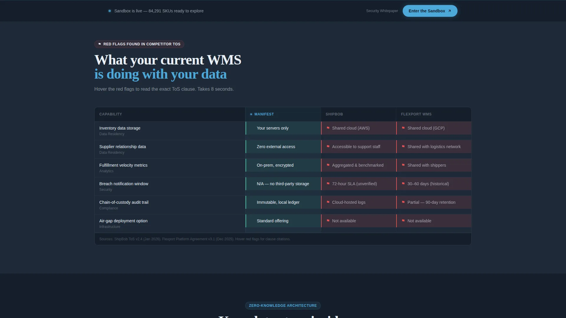
- Competing platforms bury data-sharing clauses in their terms of service, and ops leaders rarely have time to find them.
- Standard landing pages cannot show the security architecture visually, so compliance officers stay stuck in a research loop.
- Without a live interface preview, qualified buyers hesitate to click through to a demo environment.
What you get with this template
You get a complete, conversion-focused single-page layout that shows the product working before it asks for anything. Every section is sequenced to build confidence and accelerate the scroll toward the primary call to action.
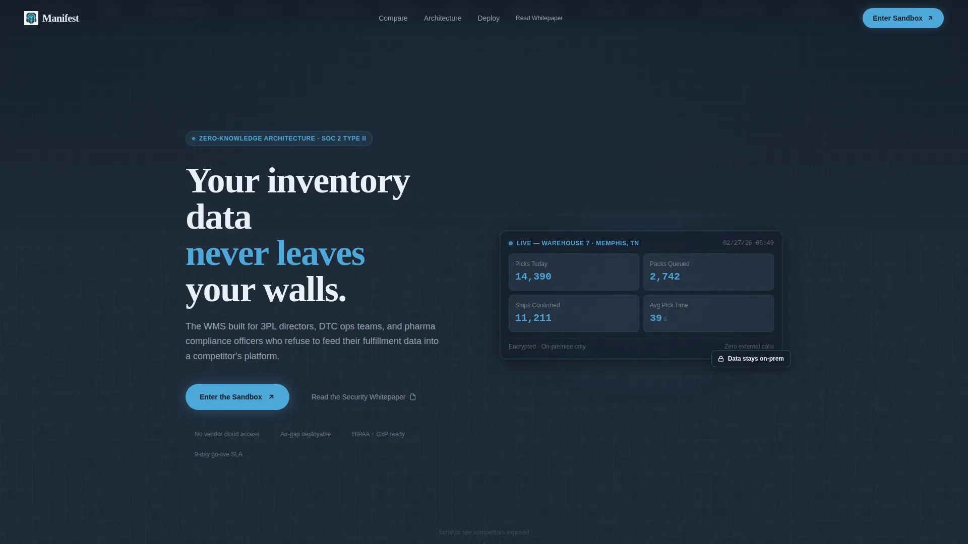
- A slim logo bar header with integration partner marks, a headline statement, and a live pick-pack-ship metrics widget with animated sky-blue counters.
- A three-column competitor comparison data grid, a zero-knowledge architecture diagram with animated data flow, and a scrolling nine-day deployment timeline progress bar.
- Two conversion touchpoints: a primary "Enter the Sandbox" call-to-action button and a secondary "Read the Security Whitepaper" text link for compliance-led buyers.
Feature list
This template is built around a set of tightly integrated visual components. Each one serves a specific role in moving a skeptical ops leader toward a confident click.
Live Dashboard Metrics Widget
A miniature dashboard widget sits beneath the header headline and shows anonymized pick-pack-ship metrics ticking upward in real time. Numbers render in sky blue with trailing motion blur, signaling that the system is already running in a live environment.
Competitor Comparison Data Grid
A three-column data grid places the featured platform side by side with two competing warehouse management systems. Red flag indicators appear in the competitor columns wherever data-sharing clauses exist in their terms of service, letting a buyer absorb the privacy risk story in under ten seconds.
Animated Architecture Diagram
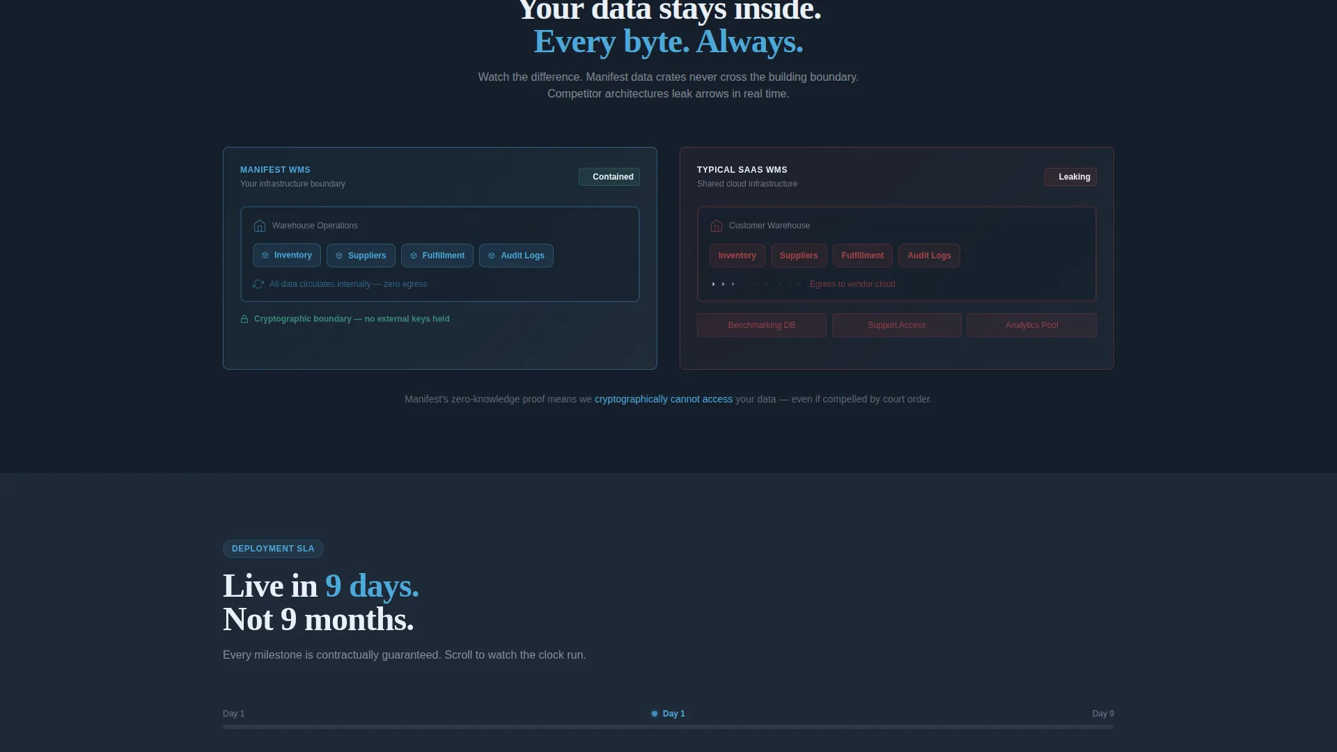
A visual diagram shows crates of data remaining inside a single building outline while competitor diagrams display arrows leaking outward. The animation makes the zero-knowledge architecture argument without a single line of technical copy.
Scrolling Deployment Timeline
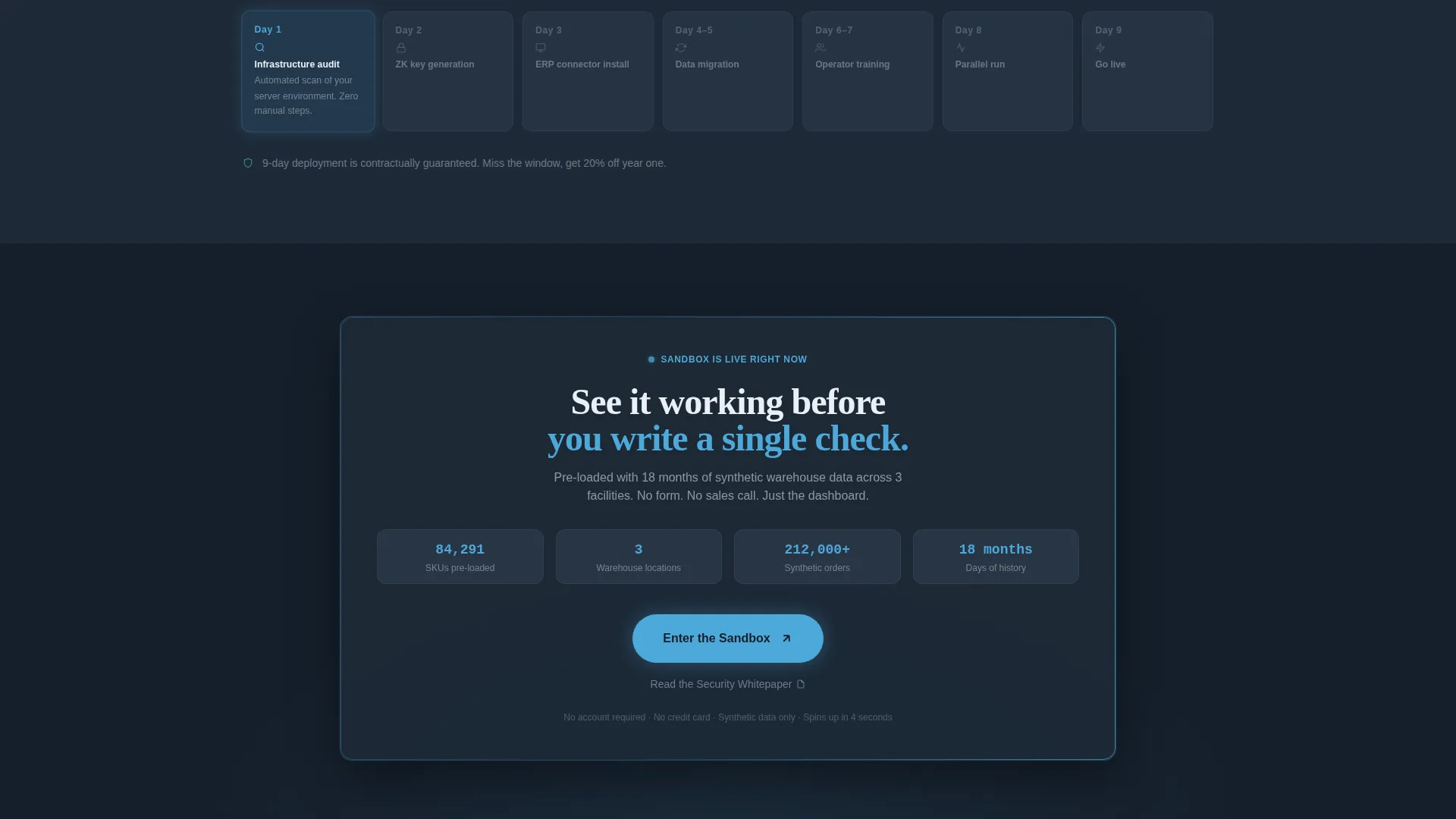
A "Live in 9 days" progress bar snaps each daily milestone into place as the visitor scrolls. The animation adds velocity to the page and makes the onboarding commitment feel concrete and achievable.
Persistent Call-to-Action Bar
After the architecture diagram, a sticky bottom bar repeats the "Enter the Sandbox" call to action. This keeps the primary conversion point visible without interrupting the reading flow of the sections above.
Monochrome Integration Logo Bar
A slim ribbon of integration partner logos floats on the graphite header background. Each logo is rendered in ice-white and pulses to sky blue on hover, confirming platform compatibility at a glance before the visitor reads a single word of body copy.
Page sections overview
| Section | Purpose |
|---|---|
| Integration logo bar | Establish platform compatibility and credibility instantly |
| Header headline widget | State the core privacy promise and show live metrics |
| Competitor comparison grid | Expose data-sharing risks across rival platforms |
| Architecture diagram | Visualize zero-knowledge data containment in motion |
| Deployment timeline bar | Make a nine-day go-live feel tangible and fast |
| Persistent sandbox call to action | Reinforce the primary conversion action after proof sections |
Design & branding system
The visual identity is built around a Slate & Sky color system that signals operational seriousness without sacrificing clarity. Deep graphite slate dominates the canvas, and sky blue appears only where data is live, interactive, or moving, so every blue accent reads like an active indicator rather than decoration.
- Core palette: deep graphite slate (#1E2A38) for background, gunmetal (#3B4A5C) for card surfaces and data grid rows, open-sky blue (#4DA8DA) for live-state indicators and interactive elements, and ice-white (#EAF0F7) for all typography and negative space.
- Typography: the hero headline runs at 56px in ice-white, creating an immediate focal point that reads like an instrument panel in a control tower before sunrise.
- Motion language follows a Dynamic Motion theme, with number counters trailing motion blur, logos pulsing on hover, animated data-flow arrows, and scroll-triggered milestone snaps that accelerate the pacing from section to section.
Mobile & speed optimization
The template is structured with a lean component hierarchy designed to translate the dense data-grid layout cleanly onto smaller screens without losing the motion-driven pacing.
- Data grid rows and competitor comparison columns reflow for narrow viewports so the red-flag privacy indicators remain legible on mobile devices.
- Scroll-triggered animations are sequenced to fire at natural reading breakpoints, keeping the Launch Energy pacing intact whether the visitor is on a desktop workstation or a phone.
How this template helps you convert
The conversion strategy is built into the page architecture itself. Visitors encounter proof before they encounter any ask, so by the time the call-to-action appears, the case has already been made.
- The live dashboard widget and competitor data grid deliver the core value argument before the first scroll, so qualified buyers are already engaged when the primary "Enter the Sandbox" button appears.
- The persistent bottom bar after the architecture diagram keeps the sandbox entry point visible across the longest section of the page, capturing buyers who paused to study the diagram before committing.
- The secondary "Read the Security Whitepaper" text link gives compliance officers a lower-friction next step, broadening the page's reach across the full buying committee without diluting the primary conversion path.
Other information about this template
This template sits at the intersection of enterprise privacy software and high-velocity product marketing. A few additional details worth noting before you deploy it.
- The template is designed for a click-through landing page flow with no form fields on the page itself; the conversion event is the click into the sandbox, not a lead capture.
- The sandbox destination is pre-loaded with synthetic warehouse data so that first-time visitors can interact with a realistic interface without supplying any real operational information.
- The Dashboard and Data Grid template style makes it especially relevant for any privacy-first enterprise software product that needs to demonstrate a live interface before asking for sign-up commitment.
- The Launch Energy creative direction means the page is intentionally paced to accelerate as the visitor scrolls, with tighter grid lines and faster animations in the lower sections.
Theme
Dynamic Motion
Creative direction
Launch Energy
Color system
Slate & Sky
Style
Dashboard/Data Grid
Direction
Click-Through
Page Sections
Live Pick-pack-ship Metrics Widget
Competitor Privacy Comparison Grid
Zero-knowledge Architecture Diagram
Scroll-triggered Deployment Timeline
Persistent Sandbox Entry Bar
Monochrome Integration Logo Bar
Related questions
Who is this landing page template designed for?
Does this template include a lead capture form?
Can I adapt the competitor comparison grid for my own platform?
What does the nine-day deployment timeline represent?
Does the page still communicate clearly without the animations?



