Margin - Powerful Restaurant Landing Page Template
Margin is a modular card-grid landing page template built for food and beverage AI price optimization platforms. It pairs a Tech Glass visual identity with a stats-first creative direction, opening with a live-style code snippet header and carrying visitors through a wall of proof-point cards. The result is a single-page click-through built to convert skeptical restaurant operators into demo requests.
by Rocket studio
Quick summary
Margin is a single-page, card-grid landing page template designed for an AI-powered menu pricing platform. It opens with a terminal-style code snippet and delivers proof through oversized stat cards. Every element points to one call to action. The layout earns the click before asking for it.
Who this template is for
This template is built for founders and operators who need to convince a technically savvy, margin-obsessed audience fast. It speaks the language of restaurant finance without slowing down for explanation.
- Multi-unit restaurant operators running fifteen or more locations who track margin by SKU
- Beverage directors at hotel groups repricing wine lists and needing a credible, data-led pitch
- Ghost kitchen founders managing tight delivery-app margins who live inside spreadsheets
What problem this template solves
Most SaaS landing pages for food-tech tools lead with features. Restaurant operators do not care about features. They care about the number at the bottom of the shift report. This template flips the script by putting the financial outcome first on every card.
- Visitors lose trust when claims appear before proof, so this layout leads with verified metrics on every scroll stop
- Operators with multiple locations have no time to read, so the stats-first card grid lets them absorb value in seconds
- A cluttered page with forms and long copy kills conversion for high-intent buyers who already know their problem
What you get with this template
You get a complete, modular landing page ready to present an AI menu pricing platform with confidence. Every section is purpose-built for conversion and styled to signal precision and credibility.
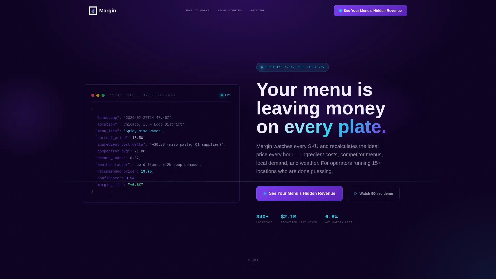
- A live-style code snippet header block that renders a real pricing decision character by character with a cyan cursor blink
- A full card grid with oversized lead metrics, three anchor case study cards (brewpub, fast-casual chain, hotel food and beverage), and a sticky header call-to-action button
- A bottom-of-page secondary conversion path with a "Download the Pricing Playbook" link for visitors not yet ready to request a demo
Feature list
This template is built around a small number of high-impact design and layout decisions, each one chosen to reduce friction and increase conviction for a price-sensitive audience.
Terminal Code Snippet Header
The header renders a pseudo-API output block showing a live pricing decision in action. Fields like menu_item, recommended_price, confidence, and margin_lift appear character by character. The effect signals technical precision before a single word of marketing copy appears.
Stats-First Card Grid
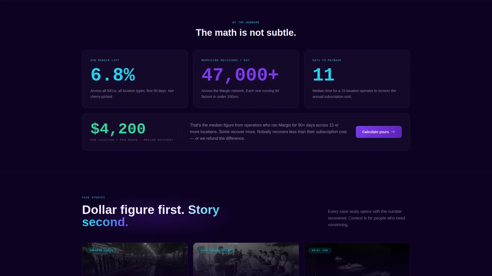
Every card in the modular grid leads with a single oversized metric. The first row surfaces three aggregate stats: average margin lift, daily repricing decisions, and payback period in weeks. This layout creates momentum by making every scroll feel like a reveal.
Case Study Proof Cards
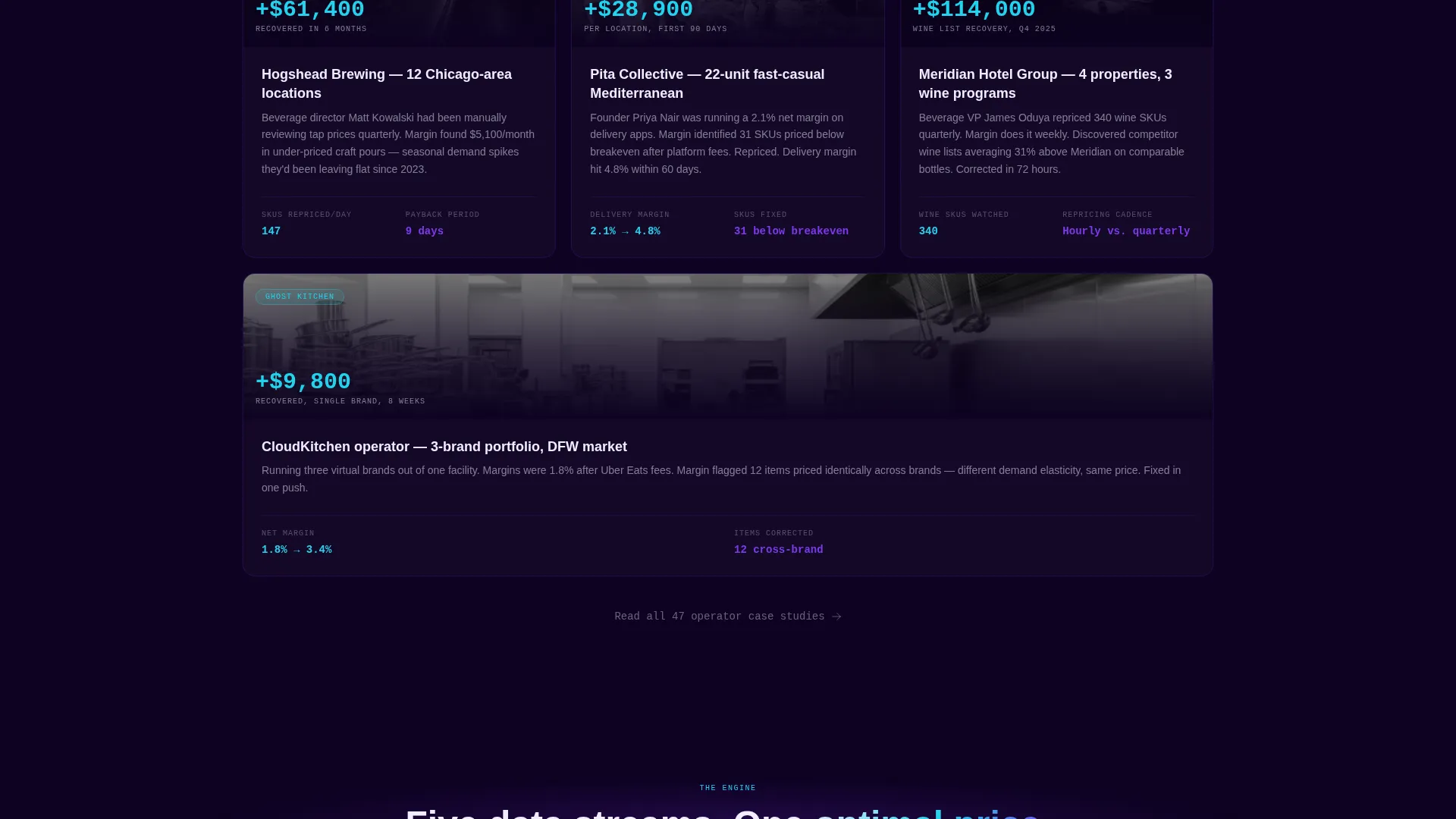
Three scenario cards shift the page from aggregate data to specific operator stories. Each card opens with the dollar figure saved or earned before explaining the context. The brewpub, fast-casual chain, and hotel food and beverage cards cover the three core buyer profiles directly.
Single-Destination Click-Through Flow
Every card, button, and sticky header call to action points to one destination. The button text "See Your Menu's Hidden Revenue" is consistent across the page. There is no form on this page; the click leads to a personalized demo calculator on the next step.
Secondary Conversion Path
A bottom-of-page "Download the Pricing Playbook" link captures visitors who are not yet ready for a demo. This gives the page two conversion outcomes without cluttering the primary flow or diluting the main call to action.
Tech Glass Visual System
Frosted-glass card borders float on a deep terminal black background. Indigo gradients run behind headlines. Signal cyan activates on interactive elements and live data accents. The palette is consistent, dark, and precise, designed to feel like a kitchen analytics dashboard rather than a generic SaaS page.
Page sections overview
| Section | Purpose |
|---|---|
| Code Snippet Header | Opens with a live-style pricing decision to establish technical credibility instantly |
| Headline Block | Delivers the core value statement in chalk white below the code output |
| Aggregate Stats Row | Three oversized metric cards for margin lift, daily decisions, and payback period |
| Brewpub Case Study | Dollar-first proof card showing margin recovery in a high-SKU bar environment |
| Fast-Casual Chain Card | Operator-level proof for multi-unit chains focused on delivery and in-store mix |
| Hotel F&B Card | Credential card for beverage directors managing seasonal and event-driven pricing |
| Sticky Header call to action | Persistent call-to-action button visible throughout the scroll journey |
| Playbook Download Link | Secondary conversion anchor at the bottom for early-stage research visitors |
Design & branding system
The visual identity uses a Tech Glass theme built on an Electric Indigo color system. The palette is intentionally dark and data-forward, evoking the glow of a tablet running overnight analytics rather than a bright marketing site.
- Core colors: deep terminal black (#0D0221) as the base field, electric indigo (#5B21B6) and phosphor violet (#7C3AED) for gradients and card depth, signal cyan (#22D3EE) for interactive states and live data accents, chalk white (#F0EDFF) for card surfaces and body text
- Cards use frosted-glass borders and float on the black field, each one styled as a self-contained proof point
- Typography follows the precision of a POS interface: tight, legible, and built to display numbers prominently
Mobile & speed optimization
The modular card grid is built to reflow cleanly across screen sizes. A restaurant operator checking the page between shifts on a phone should get the same impact as a desktop viewer.
- Cards stack vertically on smaller screens, keeping the stats-first hierarchy intact and the oversized metrics readable at any size
- The sticky header call-to-action button remains accessible throughout the scroll on both desktop and mobile viewports
- The terminal code snippet header is styled to render legibly on narrow screens without breaking the character-by-character animation effect
How this template helps you convert
The page is architected to build overwhelming evidence before asking for anything. By the time a visitor has scrolled past eight stat cards, the psychological question shifts from "does this work" to "how much am I losing right now."
- The code snippet header establishes technical credibility in the first three seconds, qualifying the visitor as someone who understands pricing data before they read a single headline
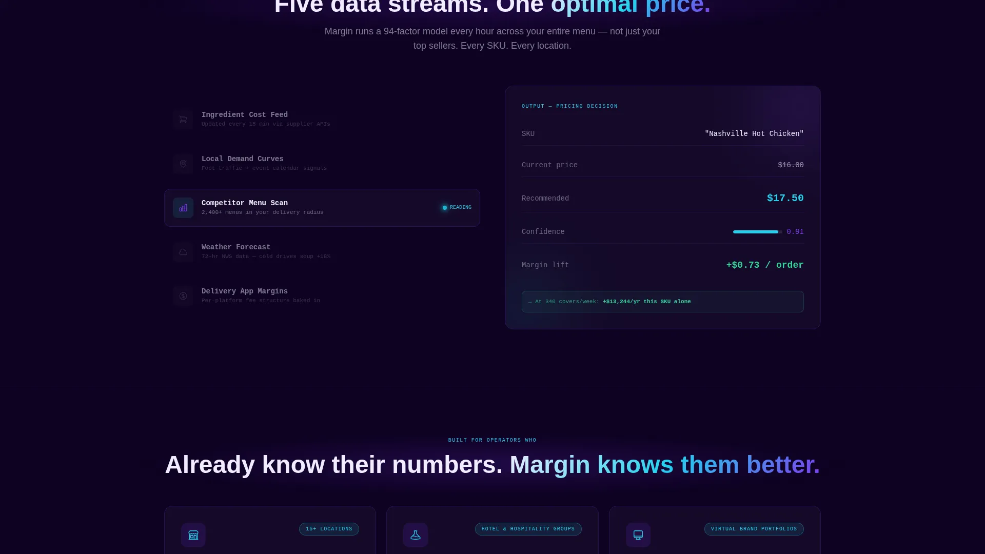
- The stats-first card grid stacks proof point after proof point in a rhythm that builds conviction naturally, with case study cards adding specific operator context to the aggregate numbers
- The single-destination click-through structure removes decision fatigue by eliminating all choices except one, and the secondary playbook download captures the remainder without disrupting the primary conversion flow
Other information about this template
This template is categorized under Technology, specifically within the AI for Food and Beverage subcategory, targeting the Food and Beverage AI Price Optimization niche. It is designed for use as a standalone click-through landing page with no embedded form.
- The template style is Card Grid (Modular), meaning individual sections can be reordered, removed, or duplicated to fit a specific platform's proof points or case study library
- The header concept is a Code Snippet block, which can be updated with real or representative API output to reflect the actual pricing engine output of the platform using the template
- The creative direction is Stats-First Impact, a layout philosophy that prioritizes numerical proof over narrative explanation throughout the entire scroll journey
- The page is designed to connect to a second page (a personalized demo calculator) via the primary call-to-action button, making it one half of a two-step conversion funnel
Theme
Tech Glass
Creative direction
Stats-First Impact
Color system
Electric Indigo
Style
Card Grid (Modular)
Direction
Click-Through
Page Sections
Terminal Code Snippet Header
Stats-first Modular Card Grid
Operator Case Study Cards
Sticky Header Call to Action
Secondary Playbook Download Path
Tech Glass Visual Identity
Related questions
What type of business is this landing page template built for?
Can I update the code snippet header with my platform's real pricing data?
Does this template include a lead capture form on the page?
How many conversion paths does this template support?
Can the card grid be customized for different case studies or metrics?



