Data & Analytics Specialist Professional Website Template
Pulse is a bento grid landing page template built for market research and data providers. It puts a live interactive dashboard front and center, letting visitors experience real-time data before they read a single paragraph. With a Monochrome Steel visual identity, interactive bento cells, and a click-through conversion path, Pulse communicates serious analytical depth the moment the page loads.
by Rocket studio
Quick summary
Pulse is a single-page bento grid template designed for market intelligence and data analytics providers. It skips the hero image entirely and drops visitors straight into a live-feeling dashboard grid. Every scroll reveals deeper interactivity, building confidence in the product's data depth while guiding users toward one clear action: exploring the full platform demo.
Who this template is for
Pulse is built for B2B data and analytics companies that need to communicate serious intelligence capability at a glance. If your audience makes high-stakes decisions and expects financial data to justify every claim, this template speaks their language.
- Strategy directors at consumer packaged goods brands evaluating product line refreshes and brand positioning
- Private equity analysts sizing acquisition targets and conducting market diligence with up to date data
- Startup founders validating a total addressable market before a Series A pitch who need instant insights fast
What problem this template solves
Most market intelligence providers rely on dense white papers or generic SaaS landing pages that bury the value. Visitors leave before they feel the product. Pulse solves this by making the dashboard the hero itself, giving users a reason to stay and interact rather than scroll past a stock illustration.
- Strategy-focused buyers need to see actionable insights immediately, not read about them three paragraphs down the page
- Data-driven decisions require trust, and trust comes from experiencing real data behavior, not from reading feature lists alone
- Generic templates fail to communicate the density and precision that enterprise buyers expect when evaluating business intelligence tools
What you get with this template
Pulse delivers a fully structured bento grid landing page with five distinct content sections, an interactive header, and a clear conversion path leading to a demo environment. The layout is designed to escalate in data complexity as the visitor scrolls, moving from surface-level metrics at the top to cross-referenced multi-source intelligence at the bottom.
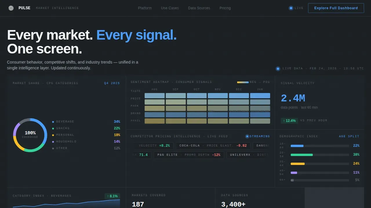
- A live interactive header grid featuring a market-share donut chart, a sentiment heatmap, a competitor pricing ticker, and a demographic bar chart with hover tooltips
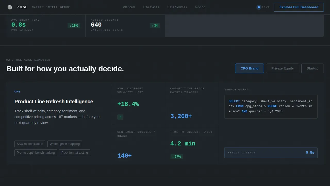
- Persona-driven ICP Explorer section with a category selector that reshuffles a sample dataset for CPG, private equity, and startup use cases
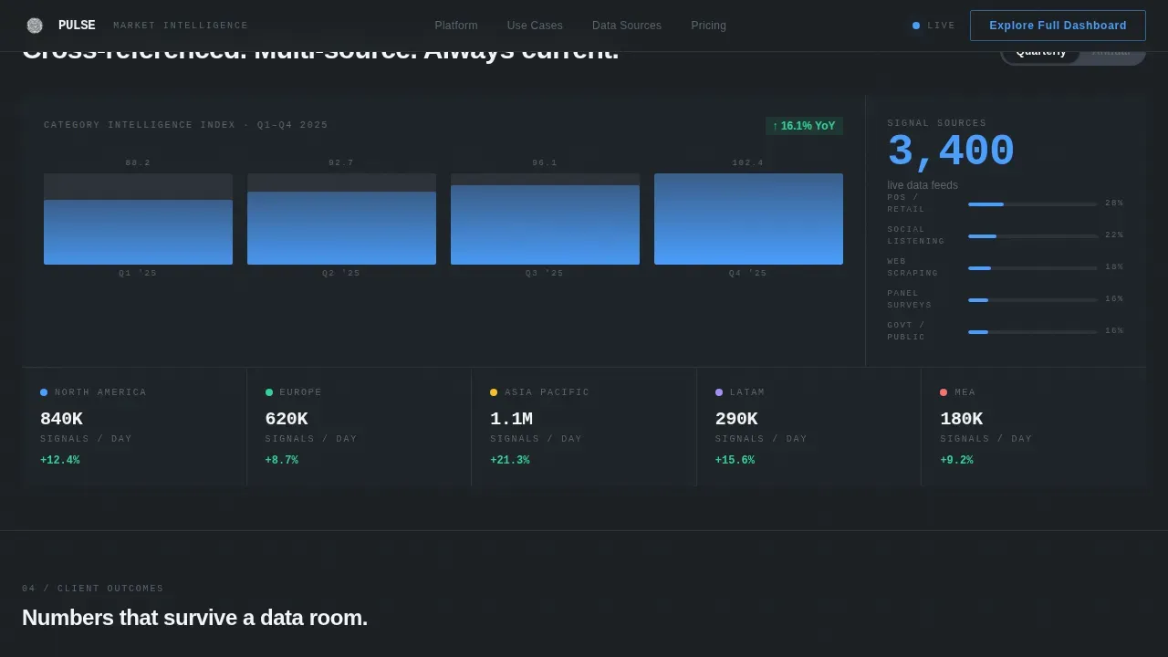
- A Data Depth Grid with an asymmetric bento layout, a quarterly and annual trend line toggle, and a clickable map that drills from continent to country to city
Feature list
The key features of this template are grounded in its interactive architecture, visual language, and conversion-focused structure. Each component is designed to help data-driven companies demonstrate depth before asking visitors to commit.
Live Interactive Dashboard Header
The header is a functional bento grid populated with anonymized data tiles. A donut chart spins mid-animation, a sentiment heatmap shifts color states, a pricing ticker scrolls in real time, and a demographic breakdown bar chart responds to hover events. Visitors land inside the product experience, not above it. This approach delivers real time insights before any copy asks for attention.
Persona-Driven ICP Explorer
A category selector reshuffles a sample dataset based on the selected persona: CPG brand, private equity analyst, or startup founder. This section gives each visitor type personalized insights relevant to their role. An account executive demoing the platform can switch personas live to show how the dashboard adapts to different business goals.
Asymmetric Data Depth Grid
The bento grid rearranges section to section, two wide cards becoming four narrow ones, a full-width row breaking into asymmetric thirds. This keeps the eye moving and the brain in discovery mode. The layout supports a deep dive into time series data, a trend line toggle between quarterly and annual views, and a clickable map drill-down from continent to city level.
Engagement-Triggered Call-to-Action State
The primary call to action starts as a ghost button in the header grid. After the visitor toggles at least one interactive element, it upgrades visually to a solid electric blue filled button. This rewards exploration and signals to users that engaging with the data is the path forward. A secondary download link lives in the final bento card for visitors who need a report to share upstairs.
Credibility Rail and Signal Sources Sections
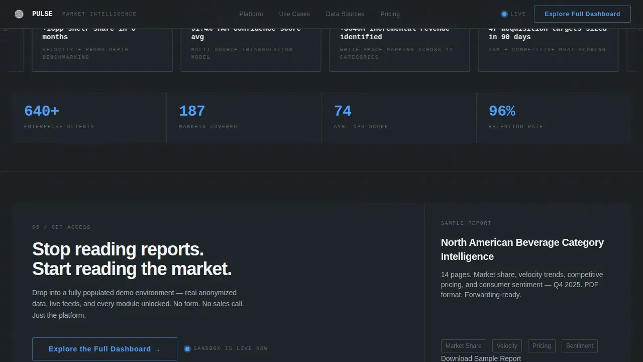
A dedicated credibility section displays client outcome metrics and specific numbers to reinforce trust. Below it, a methodology proof section shows data source count and a coverage map. These sections address issues buyers typically raise around data quality and coverage without requiring a separate white paper.
Monochrome Steel Visual System
The entire template runs on a disciplined color palette: deep gunmetal backgrounds, silver-bordered card surfaces, and a single electric accent reserved for interactive states and primary calls to action. Typography uses two weights only, medium for labels and bold for metrics, creating a strong visual hierarchy that makes key metrics scannable at speed.
Page sections overview
| Section | Purpose |
|---|---|
| Interactive Header Grid | Drops visitors into a live bento dashboard with animated data tiles and the primary ghost call to action |
| ICP Explorer | Reshuffles sample dataset by persona so each visitor sees relevant metrics for their role |
| Data Depth Grid | Escalates complexity with trend toggles, asymmetric bento layout, and a drillable map |
| Credibility Rail | Displays specific client outcome numbers and named client categories to build trust |
| Signal Sources | Shows methodology proof, data source count, and a geographic coverage map |
| Linear Footer | Single-row footer with a clean, minimal link structure |
Design & branding system
Pulse follows a Dashboard Pro theme built on a Monochrome Steel color system. The palette is designed to feel like the inside of a server environment: precise, functional, and free of decorative noise. Every color choice serves a data communication purpose rather than an aesthetic one, reinforcing a data driven identity from the first pixel.
- Color palette: deep gunmetal (#1B1F23) backgrounds, brushed steel mid-tone (#3D4450) for borders, cool silver (#A8B2BD) for muted labels, clinical white (#F4F5F7) for card surfaces, and electric blue (#4A9EFF) reserved exclusively for interactive states and primary calls to action
- Typography: DM Sans in medium weight for labels and bold weight for metrics, with JetBrains Mono used for all data values, creating a clear visual hierarchy between narrative text and live numbers
- Layout behavior: the bento grid rearranges subtly across sections, shifting between two-wide and four-narrow configurations and breaking rows into asymmetric thirds to keep users visually engaged as they scroll
Mobile & speed optimization
Pulse is built desktop-first to match the Bloomberg terminal aesthetic its target audience expects. Dense information grids perform best on larger screens. However, the layout is designed to degrade gracefully on mobile viewports so that key content and calls to action remain accessible to users on smaller devices.
- Animations use CSS keyframes and Intersection Observer only, avoiding heavy JavaScript libraries to keep the page light and load times competitive
- Spotlight mouse tracking, scroll scrub effects, marquee animations, and chart transitions are all CSS-driven, ensuring users on mid-range hardware can still experience the interactive states without lag
- The layout's bento structure collapses into readable stacked cards on mobile, preserving the visual logic of the dashboard without requiring a complex user interface rebuild for smaller screens
How this template helps you convert
Pulse is structured around a single conversion goal: moving visitors into the full platform demo environment. Every interactive element on the page serves that one destination. The page avoids forms entirely, using UTM-contextual clicks to drop visitors into a guided sandbox with progressive profiling on the other side.
- The header grid puts real data in front of visitors immediately, delivering real time data that creates product confidence before any copy asks for commitment, reducing the gap between arrival and interest
- The engagement-triggered call to action upgrade rewards users who interact with bento elements, turning a ghost button into a solid filled button that is visually unmissable and contextually earned
- The secondary "Download Sample Report" text link inside the final bento card provides an alternative path for visitors who need to share a PDF with decision-makers before committing, capturing buyers at a different stage of the pipeline
Other information about this template
The Pulse real time market intelligence dashboard landing page template is designed for data providers who need to earn trust fast and guide informed decisions without friction. Below are additional details relevant to buyers evaluating this template for production use.
- Pulse ensures that all interactive elements, including the ICP toggle, trend line toggle, and map drill-down, are self-contained within the page and require no external data infrastructure to function in their demo state
- Pulse ensures the call to action upgrade behavior, ghost button to solid button transition, is triggered by CSS class changes tied to user interaction events, keeping the implementation straightforward for developers
- The template supports multiple dashboards in concept by organizing the ICP Explorer, Data Depth Grid, and header grid as distinct functional environments within a single page scroll
- Users who want to define key metrics for their specific niche can adapt each bento card's placeholder data to reflect real financial data, cost metrics, total sales, net sales, lead volume, conversion rate, click through rate, campaign roi, and other important KPIs relevant to their vertical
- Common filters, such as date range selectors and category toggles, are built into the interactive bento cells so users can spot trends without needing separate bi tools or a dedicated data analyst
- The template's credibility rail is designed to display specific outcome metrics, such as "+34% faster deal close" or "47 acquisition targets sized," giving social proof sections the quantifiable weight that enterprise buyers require
- Real time alerts can be represented visually using the pulsing dot indicator and the live data tile animations, reinforcing the sub-second update narrative that builds confidence in real time monitoring capability
- The template's data sources section is structured to communicate methodology and coverage, supporting deeper analysis for buyers who want to understand how the product handles data from multiple sources
- The northeast region example in the clickable map drill-down serves as a practical example of how geographic segmentation works within the Data Depth Grid
- The page is structured to help users identify trends across time series data, moving from surface-level metrics at the top to cross-referenced, multi-source intelligence at the bottom, allowing for deeper insights as visitors scroll further
- Visitors who engage with the ICP Explorer will see how natural language labels and natural language insights can guide non-technical users through complex data without requiring advanced analytical skills
- The design avoids cluttering any single bento card with more than one data story, ensuring each card communicates one clear idea and supports smarter decisions through focused visual communication
- Website traffic, lead generation metrics, customer lifetime value, and inventory levels are among the data stories that individual bento cards can be configured to display, making the template adaptable across verticals
Theme
Dashboard Pro
Creative direction
Interactive Explorer
Color system
Monochrome Steel
Style
Bento Grid
Direction
Click-Through
Page Sections
Live Interactive Dashboard Header
Persona-driven ICP Explorer
Asymmetric Data Depth Grid
Engagement-triggered Call to Action Upgrade
Credibility Rail with Outcome Metrics
Monochrome Steel Design System
Related questions
Does this template include real live data connections?
Can I adapt the bento grid layout for a different data niche?
How does the engagement-triggered call to action work technically?
Is this template suitable for a marketing team without developers?
What makes Pulse different from a standard SaaS landing page template?



