Skilled Masonry Landing Page Template
Hardhat is a split-screen construction membership landing page built for contractors, estimators, and project managers who need real jobsite tools fast. It leads with a working cost estimator, layers in bid calculators and takeoff previews, and drives sign-ups through a value-first flow. The glassmorphic dark design feels sharp, focused, and built for people who work with their hands.
by Rocket studio
Quick summary
Hardhat is a single-page membership site template designed for the construction industry. It puts a live, interactive cost estimator front and center, then layers in bid calculators, takeoff template previews, and member testimonials as visitors scroll. Every section earns trust before asking for a sign-up, making it ideal for construction professionals who want tools, not theory.
Who this template is for
This template is built for construction professionals who need practical tools delivered in a polished digital package. It speaks to people who learned the trade on the jobsite and now need the business math to match.
- Contractors and one-truck framing crews pricing their first commercial job
- Estimators at mid-size general contractors tired of rebuilding formulas every bid cycle
- Owner-operators who need bid calculators, takeoff templates, and cost estimators in one place
What problem this template solves
Most construction membership pages lead with a sales pitch. Visitors arrive, see a price, and leave before understanding the value. Hardhat flips that sequence entirely.
- The template removes friction by letting visitors use a working estimator before they ever see a sign-up form
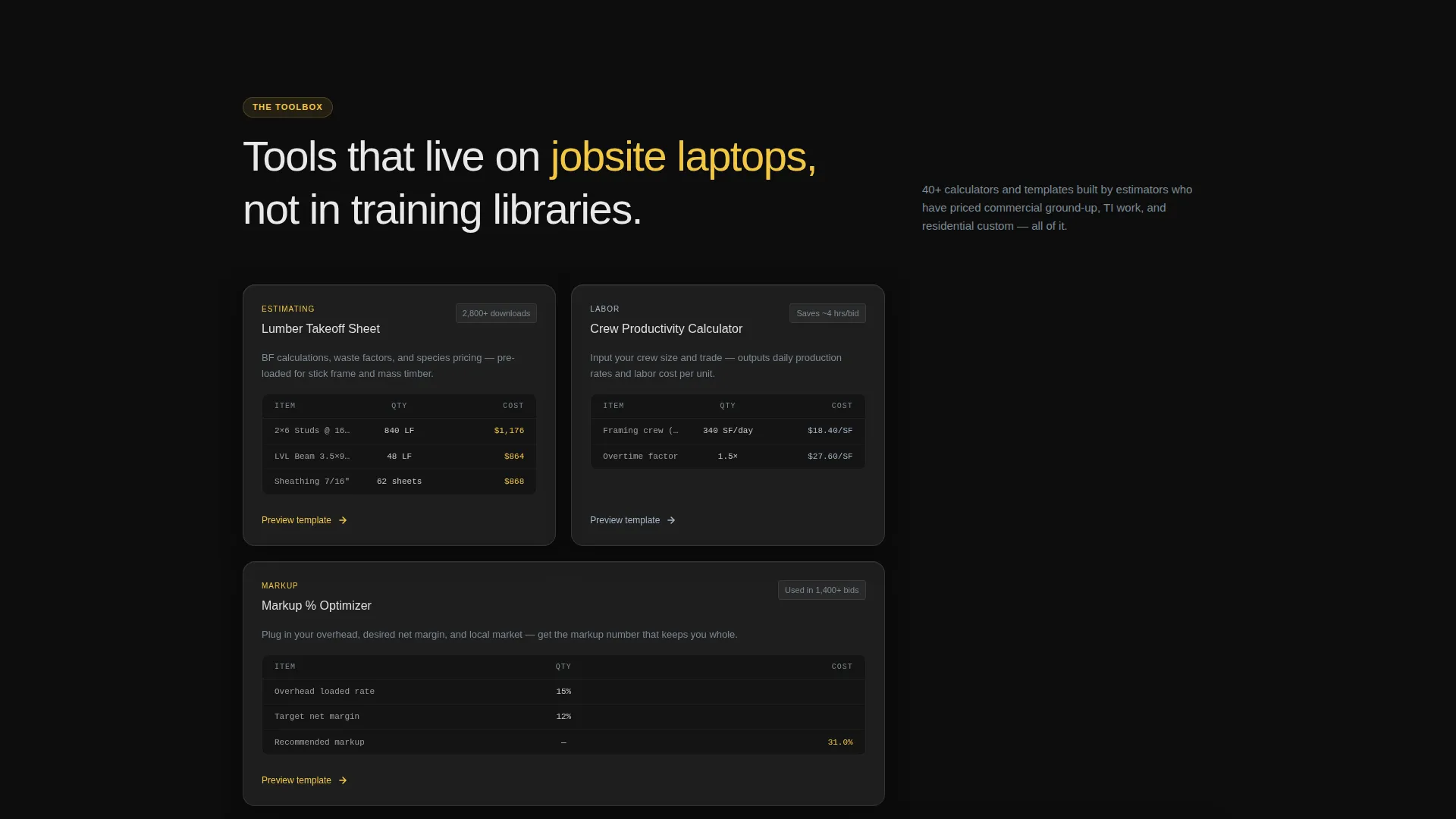
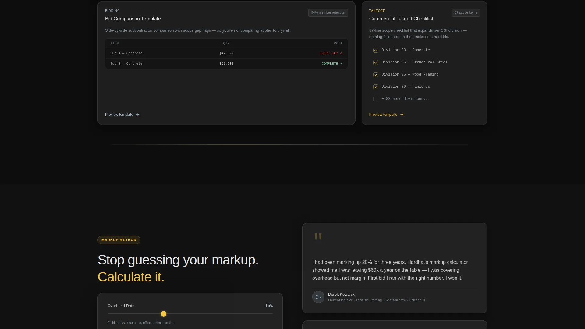
- It removes the "is this actually useful?" doubt by showing real tool previews, a bid comparison template, and a takeoff checklist
- It solves the conversion problem of visitors who are interested but not yet ready, by offering a free estimator download as a secondary lead capture path
What you get with this template
This template delivers a fully designed, section-led landing page layout ready to represent a construction membership site. Every visual and interactive element is described and structured within the design system.
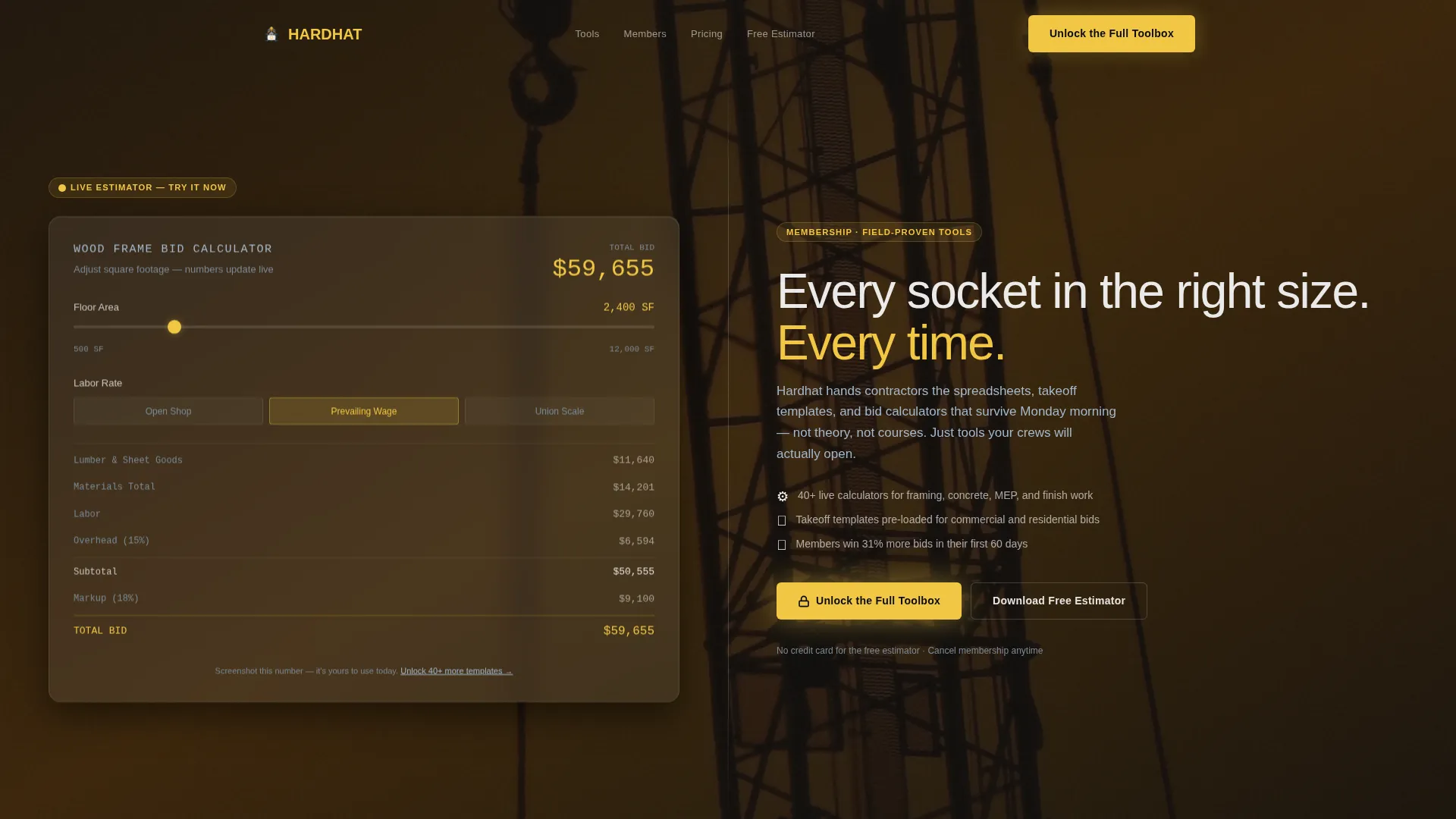
- A 50/50 split-screen layout with dark glass panels, a live cost estimator on the left, and the membership value proposition on the right
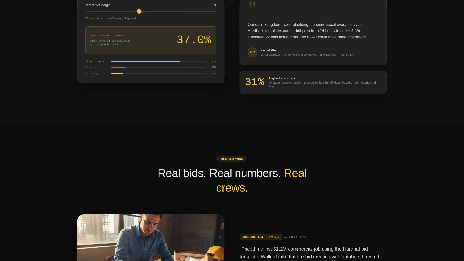
- Interactive sections featuring a markup percentage calculator, a bid comparison template preview, and an expandable takeoff checklist
- Two conversion paths: a primary "Unlock the Full Toolbox" call to action with a four-field sign-up form, and a secondary "Download the Free Estimator" email lead magnet
Feature list
This template packs a focused set of high-impact components into a single, scrollable layout. Each feature is grounded in what construction professionals actually need when evaluating a membership offer.
Live Interactive Cost Estimator
The header left panel contains a working cost estimator pre-loaded with sample data including lumber quantities, labor rates, and a material subtotal. A square-footage slider lets visitors adjust inputs and watch a rough bid number calculate in real time. Visitors can screenshot the output and use it the same day.
Split-Screen Header Layout
The 50/50 header splits the viewport into two dark glass panels. The left panel holds the interactive estimator. The right panel carries the headline and a three-line membership value proposition in frosted white type. Subtle parallax depth separates the panels from a barely-visible construction site photograph in the background.
Scroll-Triggered Section Animations
As visitors scroll, each new tool section slides into frame. Numbers animate upward, glass panels stack and reorder with eased transitions, and the rhythm mimics swiping through app screens. Motion is constant but controlled, never distracting from the content.
Dual Conversion Path Design
The primary call to action, "Unlock the Full Toolbox," appears first beneath the working calculator and repeats as a sticky bottom bar after the third section. A secondary path offers "Download the Free Estimator" for visitors not yet ready to commit, capturing just an email address.
Bid and Markup Tool Previews
A markup percentage calculator sits on the left of a mid-page section, paired with a methodology explanation on the right. A bid comparison template preview sits beside member testimonials. These previews demonstrate tool quality before a visitor signs up.
Expandable Takeoff Checklist
A takeoff checklist section expands on hover, giving visitors a tangible preview of what membership delivers. It sits alongside member win-rate statistics to reinforce credibility through real-world proof.
Page sections overview
| Section | Purpose |
|---|---|
| Split-Screen Header | Deliver the live cost estimator and membership value prop side by side |
| Markup Calculator Section | Show the markup percentage tool with a methodology explanation |
| Bid Comparison Preview | Display the bid comparison template beside member testimonials |
| Takeoff Checklist Section | Expand the checklist on hover and show member win-rate stats |
| Primary call to action Block | Present the "Unlock the Full Toolbox" form with four input fields |
| Sticky Bottom Bar | Repeat the primary call to action after the third section as a persistent prompt |
| Lead Magnet Block | Offer the free estimator download for email-only capture |
Design & branding system
The visual identity follows a Dynamic Motion theme built on a glassmorphic color system. The palette is intentionally dark and industrial, evoking the look of glowing instruments seen through a rain-streaked truck windshield at night.
- Core colors: deep asphalt black (#0D0D0D) for backgrounds, translucent panel white at 12% opacity (#FFFFFF1F) for frosted glass cards, frosted steel blue (#A3B8CC) for secondary text and borders, and high-vis accent yellow (#F2C744) reserved for calls to action and interactive states
- Glass card treatment: frosted panels with soft blur, thin 1-pixel borders that catch light like condensation on metal, and content floating above near-black backgrounds
- Background depth: a barely-visible construction site photograph (crane boom, steel framing, dusk sky) shifts on scroll with a parallax effect, adding layered depth without competing with foreground content
Mobile & speed optimization
The template is designed with a motion-led layout that scales across screen sizes. The parallax effects and animated transitions are structured to feel intentional on smaller displays rather than overwhelming.
- The split-screen 50/50 header stacks vertically on smaller viewports so the estimator and value proposition each get full-width presentation
- Scroll-triggered animations use eased transitions that maintain the app-like rhythm on touch devices without requiring hover states
- The sticky bottom bar call to action remains accessible on mobile, keeping the primary conversion path visible throughout the scroll journey
How this template helps you convert
This template is built around a value-first conversion strategy. Visitors receive something genuinely useful before they are asked for anything in return.
- The working cost estimator in the header gives visitors a real bid output they can use immediately, establishing trust before any form appears on screen.
- Each scrolled section reveals another tool preview, compounding the perceived value of the membership and reducing hesitation at the sign-up step.
- The dual call to action structure captures two audience segments: visitors ready to join through the full sign-up form, and visitors who are not yet committed through the free estimator email lead magnet.
Other information about this template
This template is a strong fit for anyone launching or relaunching a construction-focused membership site or digital tool product. A few additional details worth noting before you get started.
- The template style is a 50/50 split screen, meaning both columns carry equal visual weight throughout the layout
- The creative direction is Calculator/Tool First, so the interactive estimator is intentionally the first element a visitor engages with
- The four-field sign-up form collects name, email, company size (solo, 2 to 10 employees, or 10 and above), and primary trade from a dropdown selector
- The lead magnet path captures email only, making it a low-friction secondary conversion option for undecided visitors
- This template suits a construction membership business model where the value is in recurring access to practical tools rather than one-time course content
Theme
Dynamic Motion
Creative direction
Calculator/Tool First
Color system
Glassmorphic
Style
Split Screen (50/50)
Direction
Lead Generation
Page Sections
Live Interactive Cost Estimator
50/50 Split-screen Header
Scroll-triggered Motion Sections
Dual Conversion Path Structure
Bid and Markup Tool Previews
Expandable Takeoff Checklist
Related questions
Does the cost estimator in the header actually work?
What conversion paths does this landing page include?
Who is this landing page template designed for?
What makes the design feel different from a typical construction website?
Can this template support a membership with tools beyond estimating?



