Master — Course Discovery Education Landing Page Template
The Upskill Smart Course Comparison Continuing Education Landing Page Template is a dark-themed, card-grid landing page built for mid-career professionals who need to find and compare accredited courses fast. It combines a live course catalog, a side-by-side comparison engine, an ROI calculator, and filterable social proof into one focused, decision-ready page.
by Rocket studio
Quick summary
This template is a single-page continuing education portal designed for busy professionals. It opens with a live, sortable course card grid and guides every visitor through a tight Problem-to-Solution Arc until choosing a course feels effortless. Clean lines, a dark cockpit palette, and electric teal interactive surfaces make the page visually appealing and immediately trustworthy.
Who this template is for
This landing page serves online educators, training directors, and continuing education platforms that need to convert visitors into enrolled learners without relying on admissions counselors. It is built for teams where the audience already knows it wants to upskill but needs a fast, credible way to compare options.
- Registered nurses and project managers chasing credentials on tight schedules
- Corporate learning and development directors vetting a platform for department training budgets
- Online educators and edtech teams who need a high-converting course landing page ready to launch
What problem this template solves
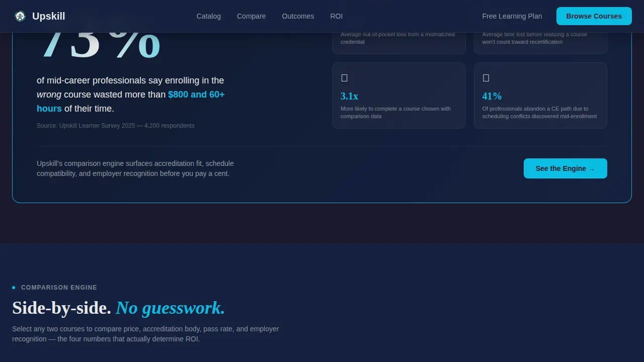
Choosing the wrong course wastes real money and time. A bold stat card on the page surfaces that pain directly: 73% of professionals say a poor course choice cost them over $800 and 60-plus hours. The template turns that anxiety into action by giving potential students the comparison tools they need before they ever reach a sign-up form.
- Professionals struggle to compare course price, accreditation, pass rate, and employer recognition in one place
- Generic catalog pages bury the details that matter, forcing users to visit multiple websites to find answers
- Without social proof filtered by role, potential students cannot tell whether a course fits their specific career path
What you get with this template
You get a complete, ready-to-customize landing page built around the Comparison/Versus conversion goal. Every section earns the click by doing the homework first, so visitors arrive at the call to action already informed and confident.
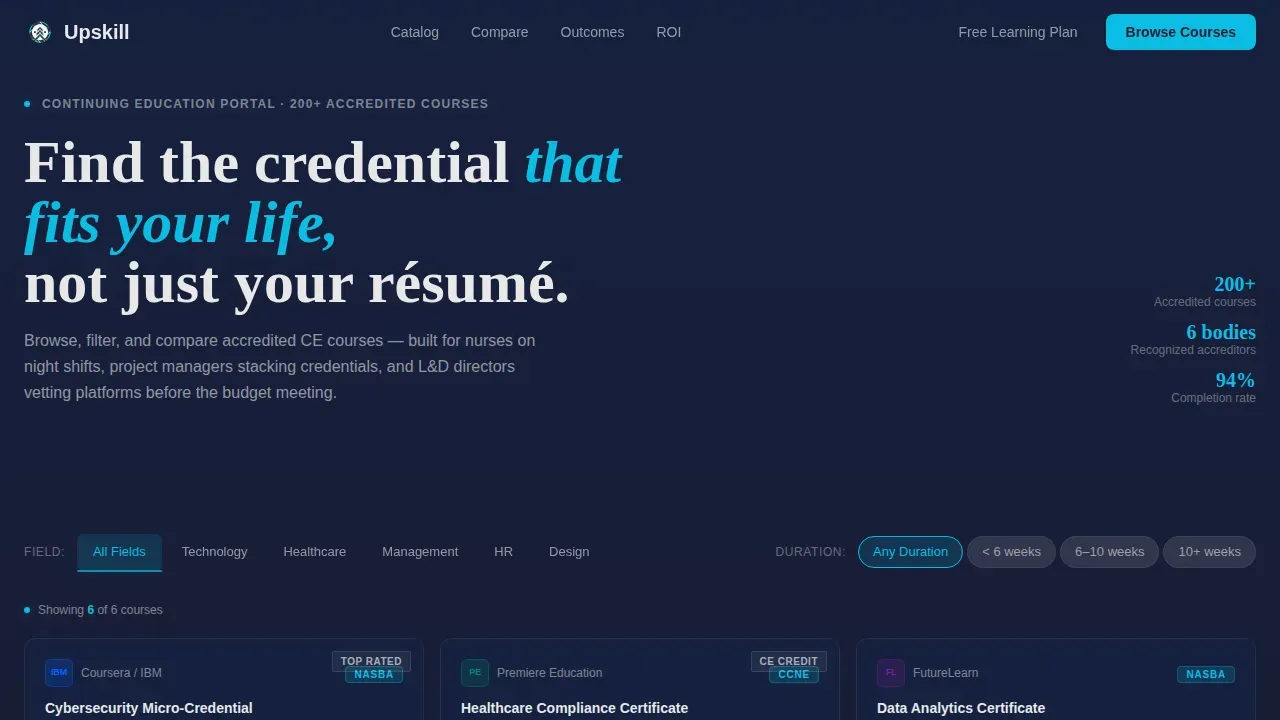
- A six-tile interactive course card grid with sort tabs, provider logos, credit hours, completion time, and star ratings displayed in the header
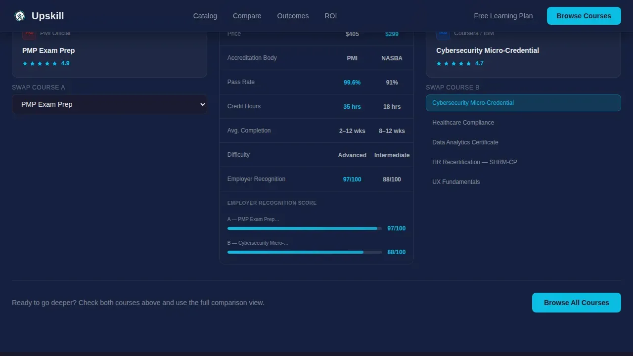
- A side-by-side comparison engine with a specs table covering price, accreditation body, pass rate, and employer recognition score, plus a card-swap toggle
- A filterable testimonials section, an ROI calculator that estimates salary uplift per credential, and a trust bar of accreditation seals
Feature list
This template presents six tightly integrated sections, each adding a layer of clarity to the enrollment journey.
Live Sortable Course Card Grid
The header section is an interactive preview populated with six real course tiles spanning cybersecurity, healthcare compliance, data analytics, PMP prep, human resources recertification, and user experience fundamentals. Each tile displays the provider logo, credit hours, average completion duration, and a star rating. Visitors can sort by field or course length before scrolling a single pixel. A teal underline pulses beneath the active sort tab to highlight the current selection.
Side-by-Side Comparison Engine
Two course cards are displayed side by side with a full specs table. Users can swap the right card for any catalog alternative using a toggle. This section makes it simple to navigate price, accreditation body, pass rate, and employer recognition score without leaving the page.
ROI Calculator and Trust Bar
An embedded ROI calculator estimates potential salary uplift per credential so visitors can quantify their commitment before they sign up. Accreditation seals are displayed directly below, reinforcing credibility. Both tools enhance confidence at the moment decisions happen.
Filterable Testimonials Section
Verified completer testimonials are filterable by profession. Visitors browse reviews from people in their exact role, whether that is nursing, project management, or corporate learning. Social proof displayed this way builds trust faster than generic quote blocks.
Sticky Compare Bar with Multiple calls to action
A sticky bottom bar appears once two or more course cards are checked. It anchors the primary call to action, "Compare Your Top Picks," without interrupting the browsing experience. Multiple calls to action are supported: a secondary path, "Get a Free Learning Plan," opens a three-step progressive form collecting current role, target credential, and weekly hours available.
Pain Point Stat Card Section
A bold stat card opens the persuasion arc immediately after the hero. It names the problem in plain numbers, then hands visitors the solution on the same page. The rhythm of problem, tool, proof, tool, and proof repeats until choosing feels like the obvious next step.
Page sections overview
| Section | Purpose |
|---|---|
| Interactive Card Hero | Display six sortable live course tiles with ratings and credit details |
| Pain Point Stat | Highlight the cost and time wasted by poor course choices |
| Comparison Engine | Side-by-side course specs with card-swap toggle |
| Filterable Testimonials | Social proof filtered by professional role |
| ROI Calculator | Estimate salary uplift per credential before enrollment |
| Trust Bar | Accreditation seals to reinforce platform credibility |
| Footer | Linear single-row links and legal content |
Design & branding system
The visual identity follows a Directory and Discovery theme using a Carbon Fiber color system. Every surface feels like a cockpit dashboard at cruise altitude: dark, calm, and information-dense, with bright telemetry that draws the eye exactly where decisions happen.
- Background layers use deep graphite (#1A1A2E) and woven charcoal (#16213E); text lives in signal white (#E8E8E8)
- Electric teal (#0ABDE3) appears only on clickable surfaces: buttons, toggles, active filter chips, comparison checkboxes, and progress indicators
- Typography pairs DM Sans for interface and body copy with Fraunces for display headings, keeping clean lines throughout
Mobile & speed optimization
The template is built desktop-first to serve learning and development directors on workstations and nurses on tablets during night shifts. A strong mobile fallback ensures the page remains fully usable on smaller screens, so no lead is lost because of device size.
- Card hover lifts, the teal pulse underline, sticky compare bar slide-up, and filter chip animations are scoped to medium intensity to keep interactions smooth
- Client components power the interactive sections; server components handle static content, keeping the page load practical for users on varied connections
- The mobile layout reflows the card grid, comparison table, and testimonials into single-column stacks so all content stays readable without pinching or horizontal scrolling
How this template helps you convert
This landing page is engineered to shift from a brochure style to a result-oriented sales pitch. Every scroll adds a layer of clarity rather than more content to wade through.
- The header proves catalog depth in the first three seconds, so visitors trust the platform before reading a single line of copy, removing hesitation early in the journey
- The comparison engine and ROI calculator do the analytical work for visitors, so by the time they reach the sticky compare bar, they have already seen head-to-head data and estimated real financial value
- Filterable testimonials and accreditation seals deliver social proof tied to specific roles, making the page credible for both individual learners and corporate customers evaluating a platform for their teams
Other information about this template
This template is listed in the Training and Certification marketplace under the Documentation and Support category. It is purpose-built for continuing education portals operating in the edtech and business-to-business or business-to-consumer space.
- The Upskill Smart Course Comparison Continuing Education Landing Page Template comes with 10 unique homepage design options tailored for various educational fields, giving online educators flexibility to match their brand
- The template is designed for educational institutions, instructors, and e-learning platforms that want to create a visually appealing course landing page without building from scratch
- Step-by-step animations built into the template help users grasp complex catalog information more efficiently, and the user-friendly interface enhances the overall learning experience from the first page load
- Upskilling through AI-driven, on-demand courses is a critical strategy for career growth; this template supports platforms offering micro-credentials, lessons in emerging tech fields such as AI Strategy and Cybersecurity Risk Management, and stackable paths from single courses to full degrees
- Modern platforms use AI to identify skill gaps and recommend tailored learning paths; this template's structure is ready to showcase those personalized services and portfolio projects that enhance employability
- Courses featured can include both self-paced modules and live video webinars, quizzes, and project-based learning examples, with payments handled through the platform of your choice
- Offering a money-back guarantee or free trial leads to lower enrollment barriers; the three-step "Get a Free Learning Plan" form built into this template supports that approach without adding complexity

Theme
Directory & Discovery
Creative direction
Problem→Solution Arc
Color system
Carbon Fiber
Direction
Comparison/Versus
Page Sections
Interactive Sortable Course Card Grid
Side-by-side Comparison Engine
ROI Calculator and Accreditation Trust Bar
Filterable Verified Testimonials
Sticky Compare Bar with Multiple Ctas
Problem-to-solution Arc Page Structure
Related questions
Who is this landing page template designed for?
Can I customize the course tiles and comparison table?
Does the template support both individual learners and corporate buyers?
How does the sticky compare bar work?
What animations are included in this template?



