Smart Statistics Learning Landing Page Template
Quartile is a warm, focused statistics flashcard landing page template built for intro stats students who panic at notation. It pairs a multi-step header form with a spaced-repetition-driven scroll experience, guiding visitors from exam anxiety to a free personalized starter deck. The botanical color system and conversational copy make studying feel approachable, not clinical.
by Rocket studio
Quick summary
Quartile is a single-column landing page template designed for a statistics flashcard and review app. It opens mid-action with a three-step form, walks visitors through a problem-to-solution narrative, and closes with a clear call to action. The warm botanical aesthetic keeps the experience focused and encouraging without feeling like a textbook.
Who this template is for
This template was built for EdTech founders, indie developers, and educators who want to launch a statistics flashcard app with a high-converting landing page. It works equally well for course creators and study tool builders targeting students preparing for exams.
- College sophomores, AP Stats juniors, and adult learners returning to mathematics after a break
- Parents and instructors looking for supplemental tools to support students through statistics and probability concepts
- Builders who want to create flashcards, flashcard sets, and free flashcard decks without starting from a blank canvas
What problem this template solves
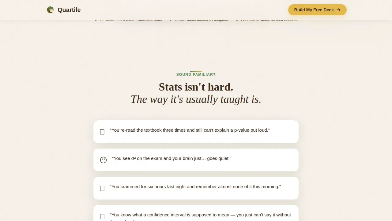
Students re-read their notes three times and still freeze when they see σ² on a practice test. The gap between passive reading and active memory recall is exactly where exam grades slip. This template gives your product a landing page that names that pain directly, then shows how spaced repetition and well-structured flashcards close the gap.
- Traditional study pages dump information without guiding a visitor toward a clear next step
- Generic templates ignore the emotional context of exam stress and notation panic in mathematics
- Most layouts do not demonstrate product value before asking for a sign-up or email address
What you get with this template
You get a fully structured, single-column landing page built around a problem-to-solution narrative arc. Every section is designed to build trust before the call to action appears, so visitors feel ready to flip through free flashcard samples before they commit.
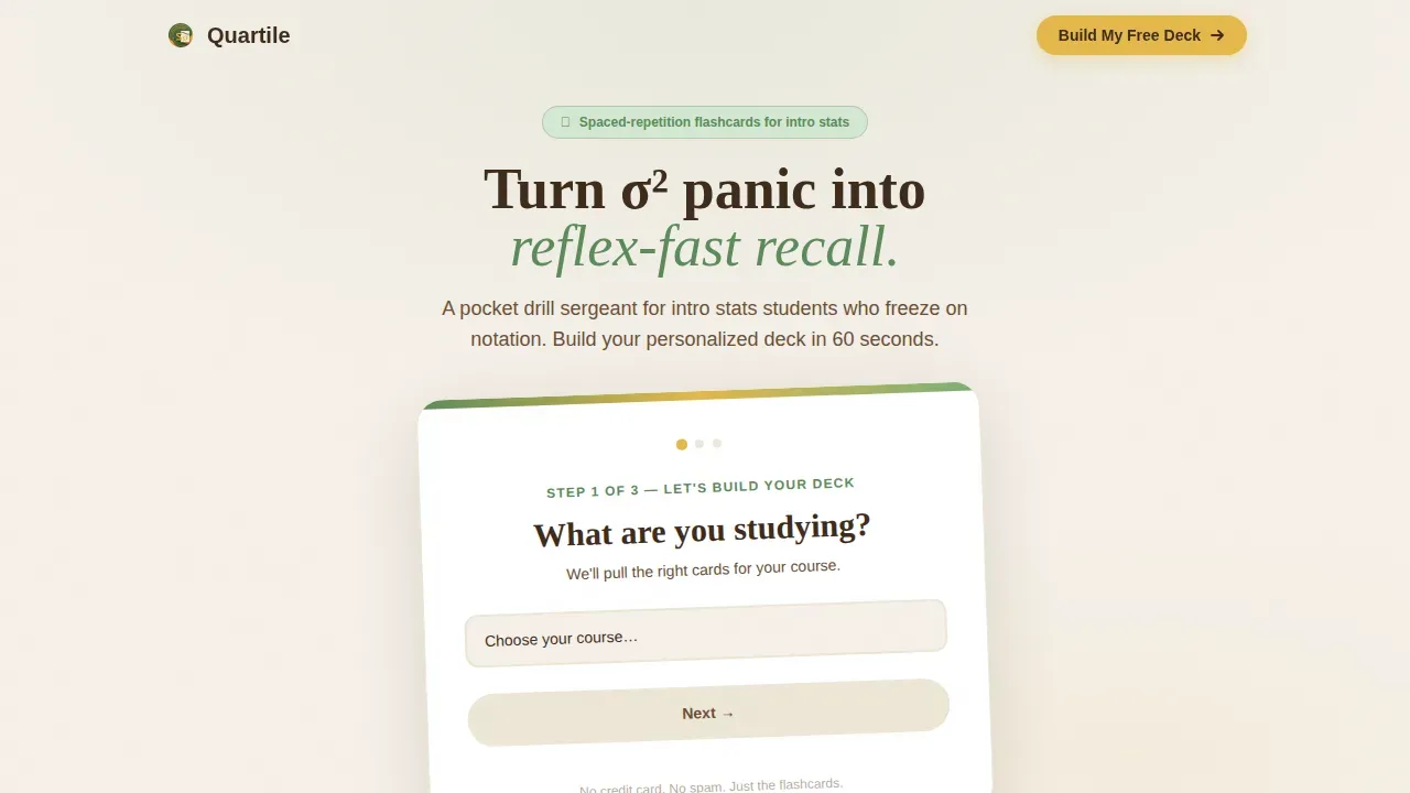
- A three-step multi-step header form on an oversized tilted flashcard graphic with soft drop shadow
- Five content sections: hero form, problem statement, spaced repetition mechanism, sample card gallery, and social proof with a repeat call to action
- A sticky mobile bottom bar and a secondary path offering a downloadable stats formula reference sheet
Feature list
This template includes the following built-in features drawn directly from the design brief.
Three-Step Confidence Form
The header opens with a multi-step form asking visitors what they are studying, when their exam is, and how confident they feel. The emoji-scale confidence question (from anxious to confident) makes the form feel personal rather than administrative. Visitors land inside the experience before they realize they are filling out a form.
Problem-to-Solution Scroll Arc
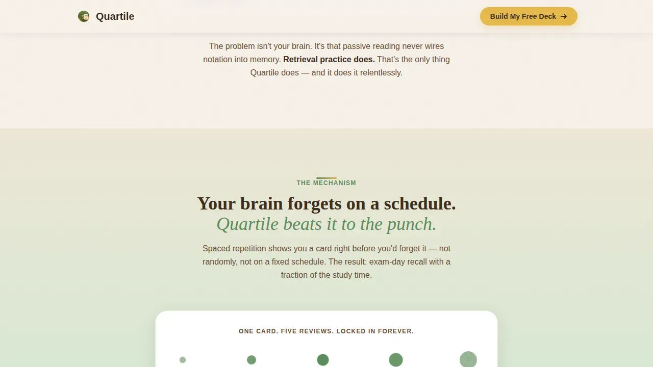
Each scroll section deepens the narrative. The first section names the pain in the student's own voice. The second introduces spaced repetition through an animated interval timeline. This structure helps learners move from recognizing their problem to trusting your solution in a single, uninterrupted flow.
Interactive Sample Card Gallery
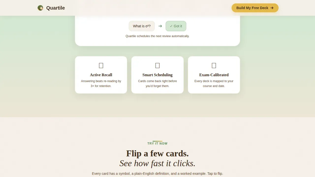
The card gallery fans out three flippable flashcards showing statistical symbols on the front and plain-language definitions with a worked micro-example on the back. Flip animations reveal the answer when a visitor taps or clicks, giving them immediate feedback before any sign-up is required.
Social Proof Counter and Testimonial
A live-style counter displays "2,400+ cards across 14 chapters" and a parent testimonial sits beside an exam countdown that reflects the visitor's own selected date back to them. Including social proof this way builds credibility without inflated promises.
Dual Call-to-Action System
The primary call to action, "Build My Free Study Deck," appears inside the completed form, again after the card gallery, and once more in a sticky mobile bar. A secondary path, "Grab the Stats Survival Sheet," captures visitors who want printable flashcards or a free formula reference before committing to the full app experience.
Botanical Visual Identity
Pollen-gold buttons draw the eye to every tap point. Fern-green borders frame section transitions and card edges. Cream backgrounds keep the page readable and calm. This color system uses distinct tones to create visual rhythm across the page without needing diagrams or extra graphic elements.
Page sections overview
| Section | Purpose |
|---|---|
| Hero Form | Three-step card selector capturing study context and confidence level |
| Problem Statement | Names student pain in their own language to build immediate recognition |
| Spaced Repetition Mechanism | Animated timeline showing how card review intervals widen over time |
| Sample Card Gallery | Interactive flippable flashcards with symbols, definitions, and micro-examples |
| Social Proof and call to action | Testimonial, stats counter, exam countdown, and repeat primary call to action |
| Footer | Horizontal flow footer with secondary links and formula sheet offer |
Design & branding system
The template follows a Family First theme expressed through a Botanical color system. Every visual choice points back to the feeling of studying at a warm, well-lit table with a mug of tea and index cards spread out beside you.
- Colors: warm linen cream (#F5F0E8) for backgrounds, soft fern green (#5B8C5A) for card borders and section transitions, deep soil brown (#3E2C1C) for body text, pollen gold (#E4B94B) for buttons and progress indicators
- Typography: DM Sans for body text readability and Fraunces as the display serif to add warmth and character to headlines
- The oversized tilted flashcard graphic in the hero, soft drop shadows, and staggered card entrance animations create a sense of depth without heavy development overhead
Mobile & speed optimization
The template is designed mobile-first, recognizing that students study flashcards on their phones at kitchen tables and during late-night sessions. The layout is a single-column flow so flashcard sections stack correctly on small screens without reflow issues.
- Interactive islands use client-side components only where needed (the multi-step form, card flip, emoji scale), keeping the rest of the page static for fast initial load
- The sticky bottom bar surfaces the primary call to action on mobile without interrupting scroll, ensuring the free deck offer stays within reach at every point in the page
How this template helps you convert
This template converts by demonstrating value before making any ask. The visitor interacts with the product before they ever see an input field for their email address.
- The three-step header form personalizes the experience immediately, reflecting the visitor's chosen exam date and confidence mode back to them, which creates a positive sense of being understood
- The sample card gallery lets visitors flip three interactive flashcards and experience the plain-language answer format firsthand, building trust in the learning approach before the call to action reappears
- The dual call-to-action system captures visitors at two readiness levels: those ready to build a free personalized deck and those who want a printable reference sheet first, so no motivated visitor leaves empty-handed
Other information about this template
This template is a strong starting point for anyone building or marketing a statistics flashcard app or study tool website. It can support a range of flashcard subjects beyond statistics, including mathematics, science, and language learning, because the section structure is content-agnostic.
- The quartile build your free statistics flashcard study deck landing page template organizes its narrative using a box-plot-inspired flow from problem minimum to solution maximum, mirroring how Q1, Q2 (median), Q3, and interquartile range (IQR, calculated as Q3 subtract Q1) structure a data set
- Platforms like Genially and Knowt offer free flashcard maker tools with spaced repetition algorithms, flip animations, and the ability to create online flashcards for any subject; the Quartile template is designed to complement and market tools in this category as an ai flashcard generator or ai flashcard maker product landing page
- Template.net's ai powered flashcard generator and similar ai flashcards tools can convert lecture notes into organized digital flashcards automatically; this template's copy and structure align with how those tools are marketed to students preparing for exams and quizzes
- The page removes top navigation to maintain focus on the offer, which is a best practice for high-converting landing pages; other elements like the sticky mobile bar and secondary PDF path follow the same principle of removing friction at every scroll point
- Builders who want to start designing a similar page from scratch can draw on tools like Canva for visual templates or Carrd for fast one-page site development; this template accelerates that process significantly by providing a pre-built, themed foundation
Theme
Family First
Creative direction
Problem→Solution Arc
Color system
Botanical
Direction
Content/Resource
Page Sections
Three-step Multi-step Header Form
Spaced Repetition Timeline Animation
Interactive Flippable Card Gallery
Dual Call-to-action System
Social Proof and Exam Countdown Block
Botanical Color and Typography System
Related questions
What subjects can this flashcard landing page support?
Does the template include the actual flashcard app or just the landing page?
Can I customize the colors and fonts?
How does the spaced repetition section work visually?
Is a free account required to use this template?



