Tutoring Digital Presence Careers & Recruitment Website Template
Matchboard is a split-screen tutoring job board landing page built on a Data Command theme. It pairs tutors with families using a stats-first layout, live-updating counters, and a side-by-side comparison engine. The AI Iridescent color system and mono-weight typography make every number feel urgent, actionable, and alive.
by Rocket studio
Quick summary
Matchboard is a high-impact tutoring job board landing page template. It uses a 50/50 split-screen layout to speak to two audiences at once: tutors hunting better-paying gigs and families searching for qualified help fast. Live counters, a comparison table, and audience-toggle controls make the page feel like a live leaderboard rather than a static brochure.
Who this template is for
This template is built for anyone running or launching a tutoring marketplace, staffing platform, or subject-specialist job board. It handles both sides of the market from a single page.
- Freelance tutors who want a profile-claiming flow and clear earnings data
- Tutoring agency owners who need to fill last-minute subject slots quickly
- Parents searching late at night for a verified tutor before an upcoming exam
What problem this template solves
Most tutoring platforms lose visitors because they try to speak to everyone with the same generic pitch. Matchboard solves that with a self-selecting toggle and mirrored data panels that reframe every stat for whoever is reading.
- Tutors leave platforms that bury earnings data and slow down profile approvals
- Families abandon searches when verification depth and response times are unclear
- Generic landing pages cannot show both sides of a two-sided marketplace at once
What you get with this template
You get a fully structured single-page layout designed to convert two distinct audiences from one URL. Every section is pre-built and ready to populate with your platform's real numbers.
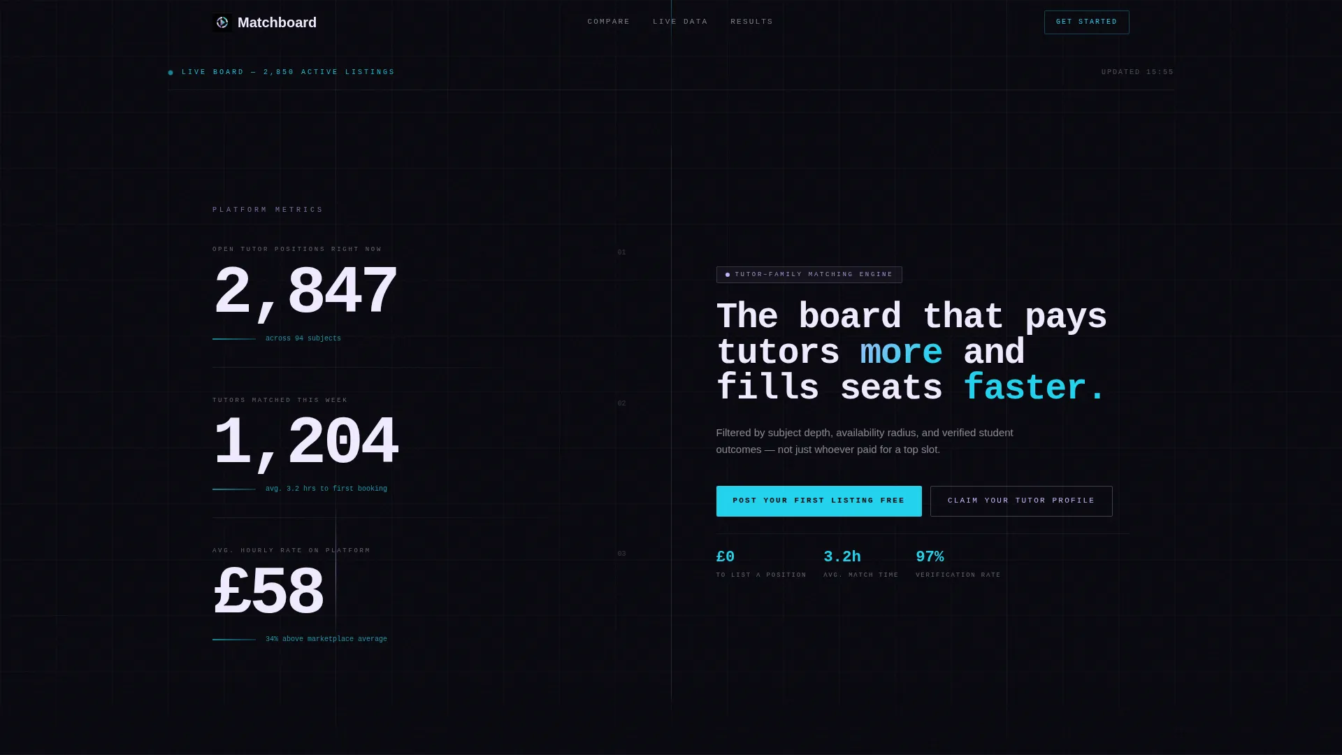
- A stats-driven hero section with three animated live counters and a bold mono headline
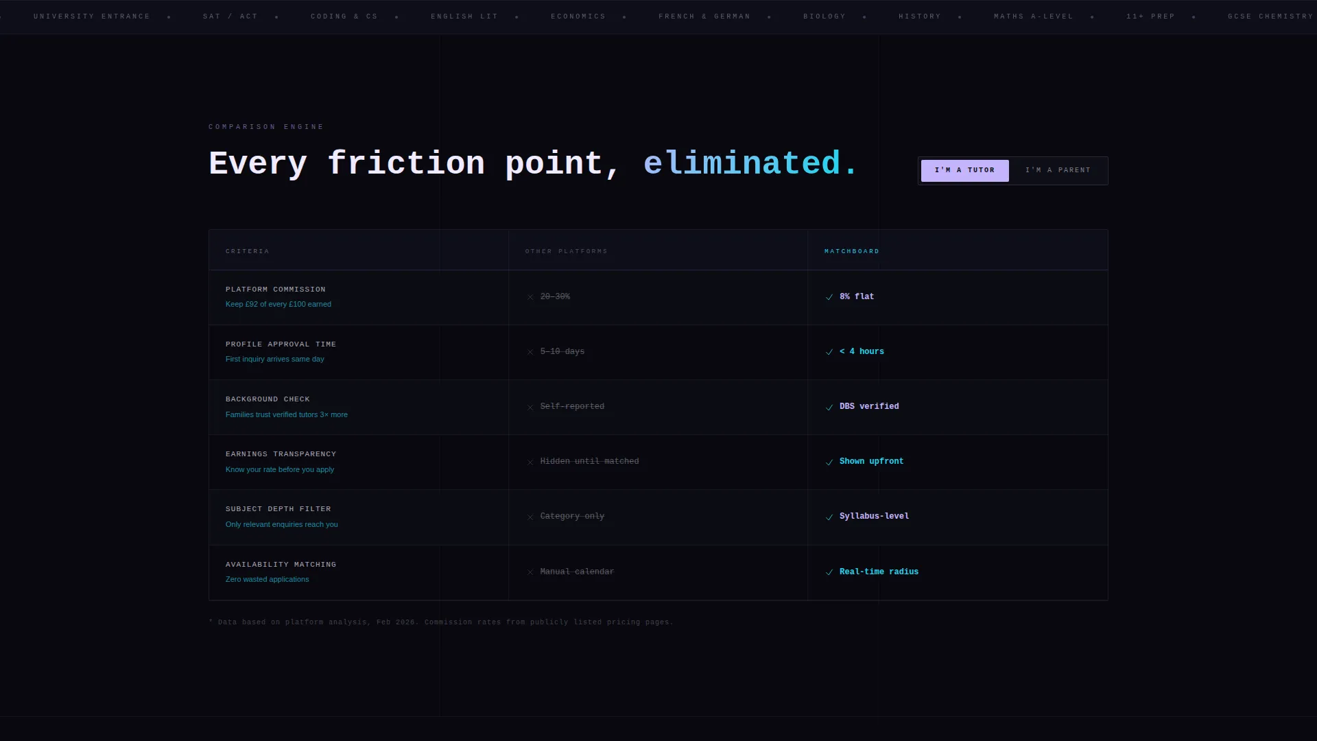
- A side-by-side comparison engine showing your platform against generic alternatives
- Dual call-to-action buttons sharing a center gutter, one for families and one for tutors
Feature list
This template is built around data display and audience segmentation. Each feature works together to create a scrolling experience that builds confidence with every section.
Animated Stats Hero
The header splits 50/50: the left side stacks three large live-updating counters covering open positions, weekly matches, and average hourly rate. The right side holds an oversized mono-weight headline. Each counter animates upward like a departures board refreshing in real time.
Audience Toggle Control
A toggle at the top of the page lets visitors self-select as a tutor or a parent. Once selected, the page reweights its stats, copy, and call-to-action buttons to match that reader's perspective directly.
Split-Screen Comparison Engine
The comparison section runs as a left-versus-right table. The left column shows friction points on other platforms. The right column shows Matchboard's position on each row, covering commission rates, profile approval time, background check depth, and earnings visibility.
Mirrored Data Panels
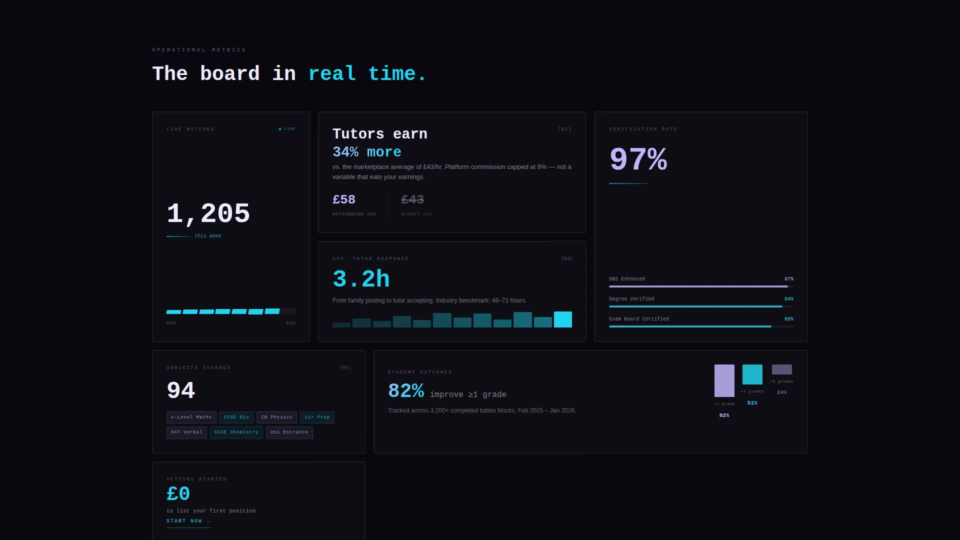
As visitors scroll, alternating panels show tutor-facing metrics on the left and family-facing metrics on the right. Each pair is linked by a micro-animation that draws the eye across the center divide, simulating a live match engine weighing both sides.
Dual Center-Gutter calls to action
Two primary calls to action share the center gutter of the page. "Post Your First Listing Free" targets families. "Claim Your Tutor Profile" targets tutors. Both buttons are styled in neural cyan for maximum contrast against the void black background.
Stats-First Scroll Flow
Every scroll step reveals a comparative data point before any paragraph explains it. The sequence moves from small proof to bigger proof, building undeniable confidence by the time a visitor reaches the bottom of the page.
Page sections overview
| Section | Purpose |
|---|---|
| Stats metrics header | Launches with live counters and a bold platform headline |
| Audience toggle bar | Lets visitors self-select tutor or parent view |
| Tutor metrics panel | Shows earnings percentile and time to first booking |
| Family metrics panel | Shows tutor response time and verification rate |
| Comparison versus table | Contrasts this platform against generic alternatives |
| Dual call to action gutter | Delivers separate calls to action for each audience |
Design & branding system
The template uses an AI Iridescent color system built on four core values. Void black dominates backgrounds, holographic lilac fills data visualizations and hover states, neural cyan fires on live counters and call-to-action elements, and shimmer white keeps body text readable against the dark canvas.
- Typography uses oversized mono weight for headlines and counters, creating a data-terminal aesthetic
- Neural cyan underlines beneath counters animate with a slow breathing pulse to signal live data
- Card surfaces and text use shimmer white, shifting between cool violet and electric blue tones depending on context
Mobile & speed optimization
The split-screen layout is designed to restack gracefully on smaller screens, keeping both audience panels readable without horizontal scrolling. The stats-first scroll logic translates naturally to a vertical mobile feed.
- Counter animations and breathing underlines are built to work on touch devices
- The audience toggle remains prominent at the top of the mobile layout for immediate self-selection
- Dual call to action buttons restack into a vertical pair on narrow screens so neither action is buried
How this template helps you convert
The template is structured as a confidence-building funnel. It leads with proof, narrows by audience, then closes with action.
- The animated counter hero establishes platform credibility before a visitor reads a single word of copy, anchoring trust with real numbers from the first second on the page.
- The audience toggle and mirrored data panels ensure every visitor sees stats and calls to action that match their specific role, removing the friction of irrelevant content.
- The comparison engine makes the platform's advantages visible and specific, so the decision to click a call to action feels logical rather than impulsive.
Other information about this template
This template is categorized under Technology with a Tutoring Digital Presence subcategory, making it well-suited for tutoring job board products that operate in competitive digital markets. The Data Command theme and Stats-First Impact creative direction give it a distinct visual identity that stands apart from softer, illustration-heavy education templates.
- The template style is Split Screen (50/50), following a Comparison/Versus landing-page direction
- The header concept is Stats/Metrics, using animated counters as the primary hero element
- The AI Iridescent color system and Data Command theme can be adapted to other two-sided marketplace niches beyond tutoring
- The intersection match score for this template's category, subcategory, and niche alignment is 13
Theme
Data Command
Creative direction
Stats-First Impact
Color system
AI Iridescent
Style
Split Screen (50/50)
Direction
Comparison/Versus
Page Sections
Animated Live Counter Hero
Audience Toggle and Page Reweighting
Split-screen Comparison Engine
Mirrored Scroll Data Panels
Dual Center-gutter Call to Action Buttons
Related questions
Can I use this template for a tutoring marketplace that covers multiple subjects?
Do I need to write separate pages for tutors and for families?
Can the live counters be connected to real platform data?
Is the comparison table easy to edit for my own platform details?
What makes this template different from a standard education landing page?



