Matchlock - Velocity Staffing Landing Page Template
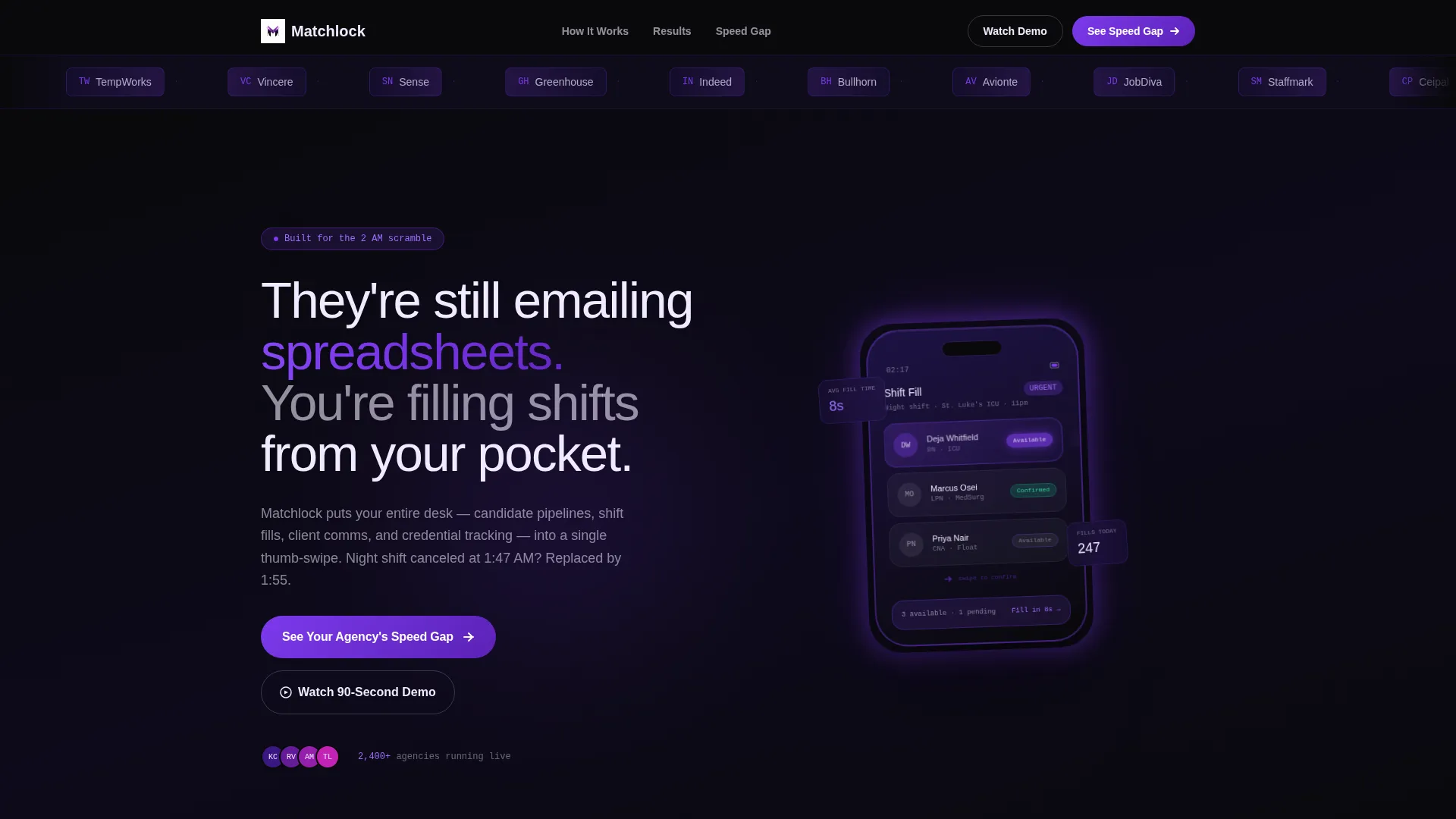
Matchlock is a split-screen landing page template built for staffing and recruiting mobile apps. It uses a bold Void and Violet color system, a side-by-side comparison layout, and launch-energy scroll pacing to show recruiters exactly how much faster their workflow could be. The template includes a logo ticker bar, animated phone mockup, and a qualifier-driven primary call to action.
by Rocket studio
Quick summary
Matchlock is a single-page landing page template designed for staffing and recruiting mobile apps. It pairs a high-contrast Void and Violet color system with a 50/50 split-screen layout that builds urgency through direct comparison. Every section contrasts the old way against the app-native way, pushing visitors toward a personalized speed-gap call to action.
Who this template is for
This template is built for teams that fill roles under pressure and need a landing page that earns trust fast. It speaks directly to the people living inside the hiring chaos, not just observing it.
- Staffing agency owners running lean coordinator teams across high volumes of open requisitions
- Travel nurse recruiters working remotely and filling urgent overnight shift gaps
- Light-industrial operations managers who staff warehouse floors by the hour and cannot afford a no-show
What problem this template solves
Most staffing app landing pages look like product brochures. They list features but fail to make the visitor feel the urgency that drives the buying decision. Matchlock solves that gap.
- Legacy workflow friction is invisible until you see it side by side with a faster alternative
- Visitors leave without acting because a generic call to action does not connect to their specific pain
- Trust is hard to establish quickly when the app is new and the visitor is skeptical
What you get with this template
You get a fully structured single-page layout that takes a visitor from skepticism to curiosity to action. Every section is pre-wired for a specific job in the conversion sequence.
- A scrolling logo ticker bar at the top of the page for instant ecosystem credibility
- A 50/50 split-screen hero with a bold headline and a floating phone mockup showing a live candidate card interaction
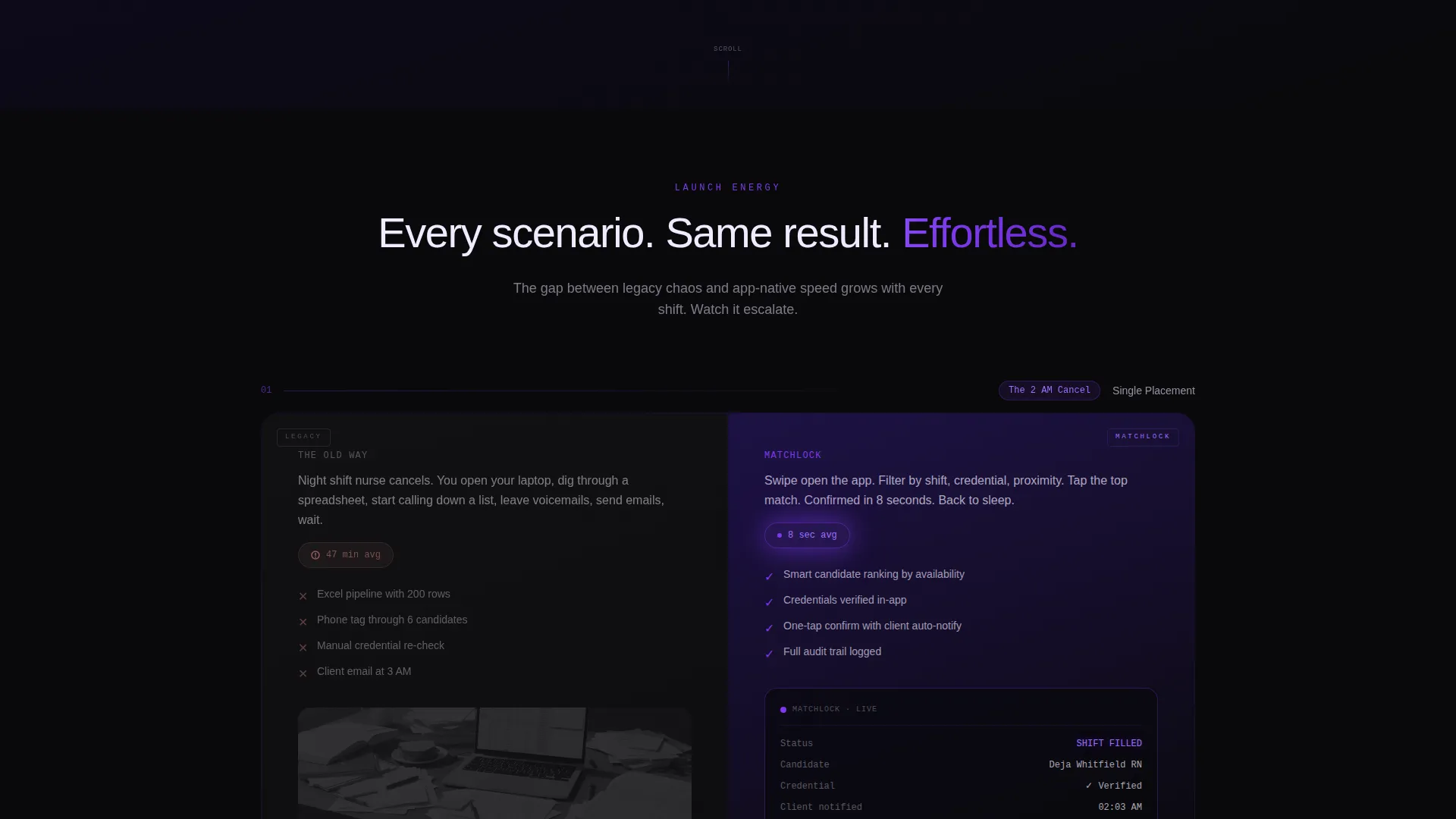
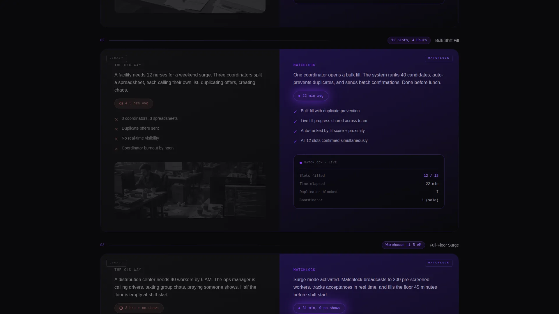
- Three escalating comparison splits showing a single placement, a bulk shift fill, and a full-floor staffing surge
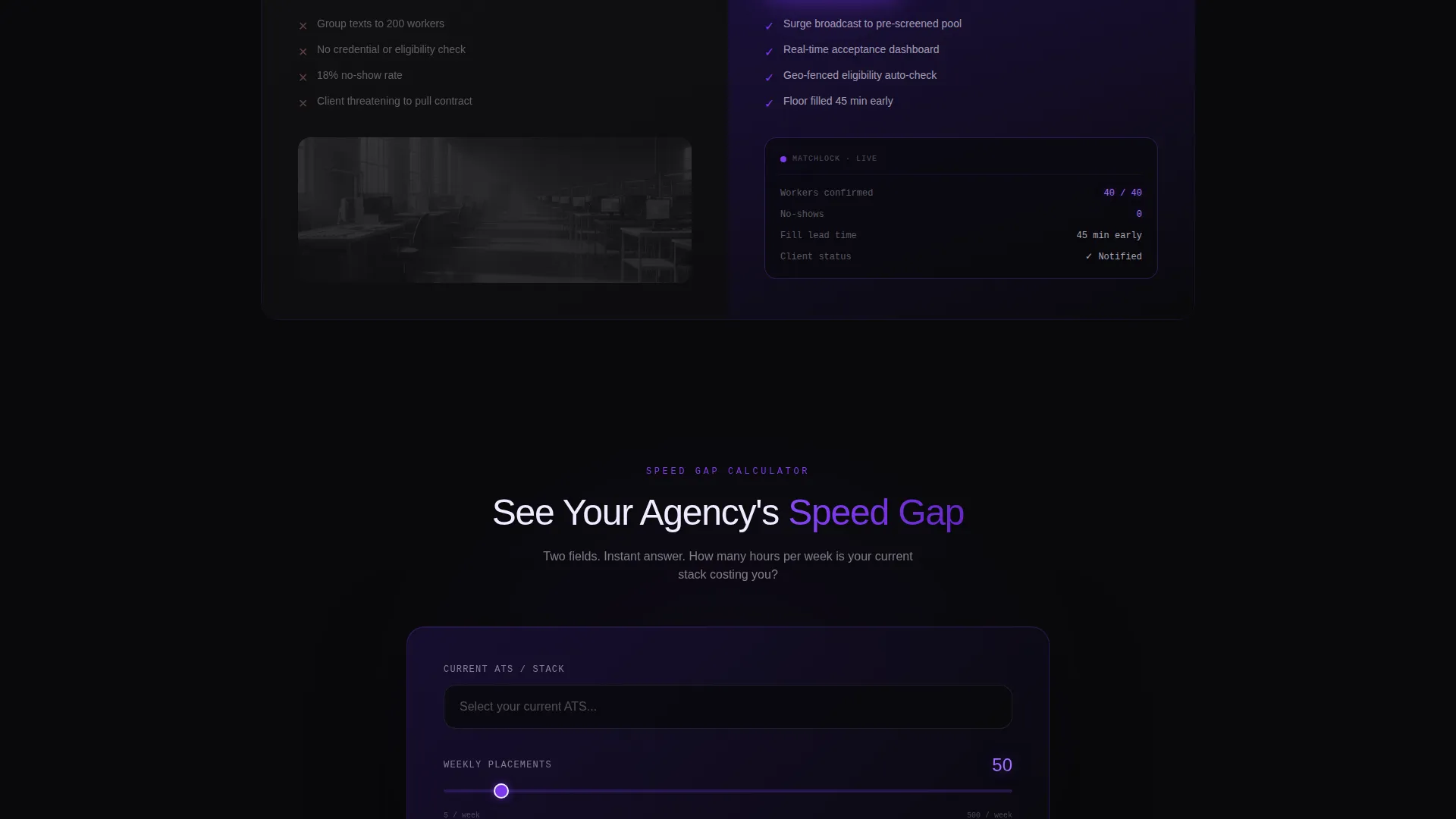
- A qualifier-driven primary call to action that generates a personalized time-saved snapshot after two inputs
- An inline secondary video path with an auto-pausing demo and an overlay call to action
Feature list
This section covers the core built-in capabilities that make Matchlock work as a conversion tool for staffing app marketing.
Split-Screen Comparison Layout
Each scroll section places the old workflow on the left in muted grayscale and the app workflow on the right in full color. The visual contrast does the persuasion work before the visitor reads a single word.
Qualifier-Driven Primary Call to Action
The main call to action, labeled "See Your Agency's Speed Gap," triggers a two-field form. Visitors select their current applicant tracking system from a dropdown and choose their average weekly placements on a range slider. Submitting instantly surfaces a personalized comparison snapshot showing estimated time saved per fill.
Inline Demo Video with Overlay
A secondary path invites visitors to watch a 90-second demo. The video auto-pauses at the shift-fill moment and surfaces the primary call to action as an overlay, keeping momentum inside the page rather than losing the visitor to a separate tab.
Logo Ticker Bar Header
A horizontal scrolling bar across the top eighth of the viewport displays recognizable staffing agency logos and applicant tracking system integration marks. It scrolls at a calm, confident pace, establishing credibility before a word is read.
Escalating Scroll Energy
The three comparison splits are deliberately sequenced to build intensity. Each scenario is more operationally chaotic on the left and more effortlessly resolved on the right, creating a visceral sense of the gap between legacy processes and app-native speed.
Floating Phone Mockup with Interaction Animation
The hero section features a phone mockup mid-interaction. A thumb drags a candidate card from "Available" to "Confirmed," and the violet accent color pulses on the status change animation, making the app feel alive rather than static.
Page sections overview
| Section | Purpose |
|---|---|
| Logo ticker bar | Establish ecosystem credibility instantly |
| Split-screen hero | Headline and phone mockup anchor the value promise |
| Single placement split | Show first comparison: one fill, two approaches |
| Bulk shift fill split | Escalate the contrast with a multi-role scenario |
| Full-floor surge split | Peak contrast: high-volume staffing chaos versus. app ease |
| Speed gap qualifier | Capture input and deliver a personalized snapshot |
| Inline demo video | Demonstrate the app in 90 seconds with overlay call to action |
Design & branding system
The Void and Violet color system is designed to feel like a phone screen glowing in a dark room at 2 AM. Every color choice serves both the mood and the information hierarchy.
- Void black (#09090B) dominates full-bleed backgrounds, indigo (#1E1245) anchors section dividers and navigation, and electric violet (#7C3AED) pulses through calls to action and progress indicators
- Plasma white (#F0EAFF) carries body copy with enough warmth to feel human against the dark backgrounds
- Grayscale treatment on the left panels and full-color treatment on the right panels create an immediate visual before-and-after without any additional explanation
Mobile & speed optimization
The layout is designed with mobile-first recruiter behavior in mind. The people this template speaks to are often working from phones in airports, break rooms, and hospital corridors.
- The split-screen structure collapses gracefully for smaller viewports so the comparison remains clear on a phone screen
- The floating phone mockup and card-drag animation are built to reinforce the mobile-native story the app is telling
- Inline video playback and the qualifier form are positioned to remain functional and visible without horizontal scrolling
How this template helps you convert
The conversion strategy in this template is built on making the visitor feel the cost of their current workflow before they are ever asked to act.
- The escalating comparison sequence builds a psychological gap between the visitor's current pain and the app-native alternative, so the call to action lands with context rather than as a cold ask.
- The qualifier form personalizes the outcome. A visitor who sees their own estimated time savings is far more motivated to move forward than one who reads a generic statistic.
- The inline demo video catches hesitant visitors and re-surfaces the call to action at the exact moment of highest engagement, the shift-fill scene, rather than at the end of the page.
Other information about this template
This template sits inside the Technology category, under the Staffing and Recruiting Digital Presence subcategory. It is purpose-built for the Staffing and Recruiting Mobile App niche.
- The Startup Velocity theme and Launch Energy creative direction give the page a momentum-forward feel that mirrors the urgency staffing professionals experience daily
- The Comparison/Versus landing page direction is a proven structure for app marketing because it externalizes the cost of not switching
- The template is compatible with common applicant tracking system integration messaging, making it easy to reference tools like Bullhorn, Avionte, and JobDiva inside the logo bar and dropdown qualifier without rebuilding the layout
Theme
Startup Velocity
Creative direction
Launch Energy
Color system
Void & Violet
Style
Split Screen (50/50)
Direction
Comparison/Versus
Page Sections
Split-screen Comparison Layout
Qualifier-driven Primary Call to Action
Inline Demo Video with Overlay
Logo Ticker Bar Header
Floating Phone Mockup with Animation
Escalating Scroll Sequence
Related questions
Can I customize the logo ticker bar with my own partner logos?
Does the qualifier form connect to a backend or data service?
Can this template support both healthcare and light-industrial staffing messaging?
How does the inline demo video overlay work?
Can I reduce the number of comparison splits if my app targets one staffing niche?



