Interactive Forum Comparison Landing Page Template
The Signboard Data Command Community Forum Comparison Table Landing Page Template is built for sign and banner professionals who need real answers fast. It uses an industrial Data Command style with a three-tier comparison layout, expandable demo rows, and a freemium sign-up flow. Visitors explore substrate data and job costing tools before ever creating an account. No credit card required to join free.
by Rocket studio
Quick summary
This landing page template puts a working sign-maker forum front and center. Visitors land on a control-terminal search field, scroll through live community stats, and reach an interactive three-column comparison table showing Free, Pro, and Shop tiers. Each expandable row is a micro-demo. The page earns the sign-up before asking for it.
Who this template is for
This template is built for sign and banner industry operators who make purchasing and production decisions daily. It speaks to people who have real questions and no time for vague answers.
- One-truck wrap installers pricing their first fleet job and needing substrate specs now
- Production managers running flatbed printers at full capacity who compare material data quickly
- Old-school painted-sign artists transitioning to dimensional aluminum lettering who want to learn job costing
What problem this template solves
Most forum landing pages describe what a community offers. This one lets visitors use it. The difference between reading about a tool and actually touching one is felt immediately here. A great landing page will only go as far as a great strategy will take it, and this template is built around a single, focused conversion goal.
- Visitors leave generic forum pages without joining because the value is described, not demonstrated
- Sign professionals need substrate comparison data and cost estimates before they trust any platform enough to sign up
- Generic comparison pages fail to show the difference between tiers in a way users can feel hands-on
What you get with this template
This template delivers a fully structured, single-page landing layout designed around the sign and banner trade. Every section has a clear purpose, and nothing is decorative for its own sake. The layout is modular, so each block can be adapted for different campaigns without rebuilding the full page.
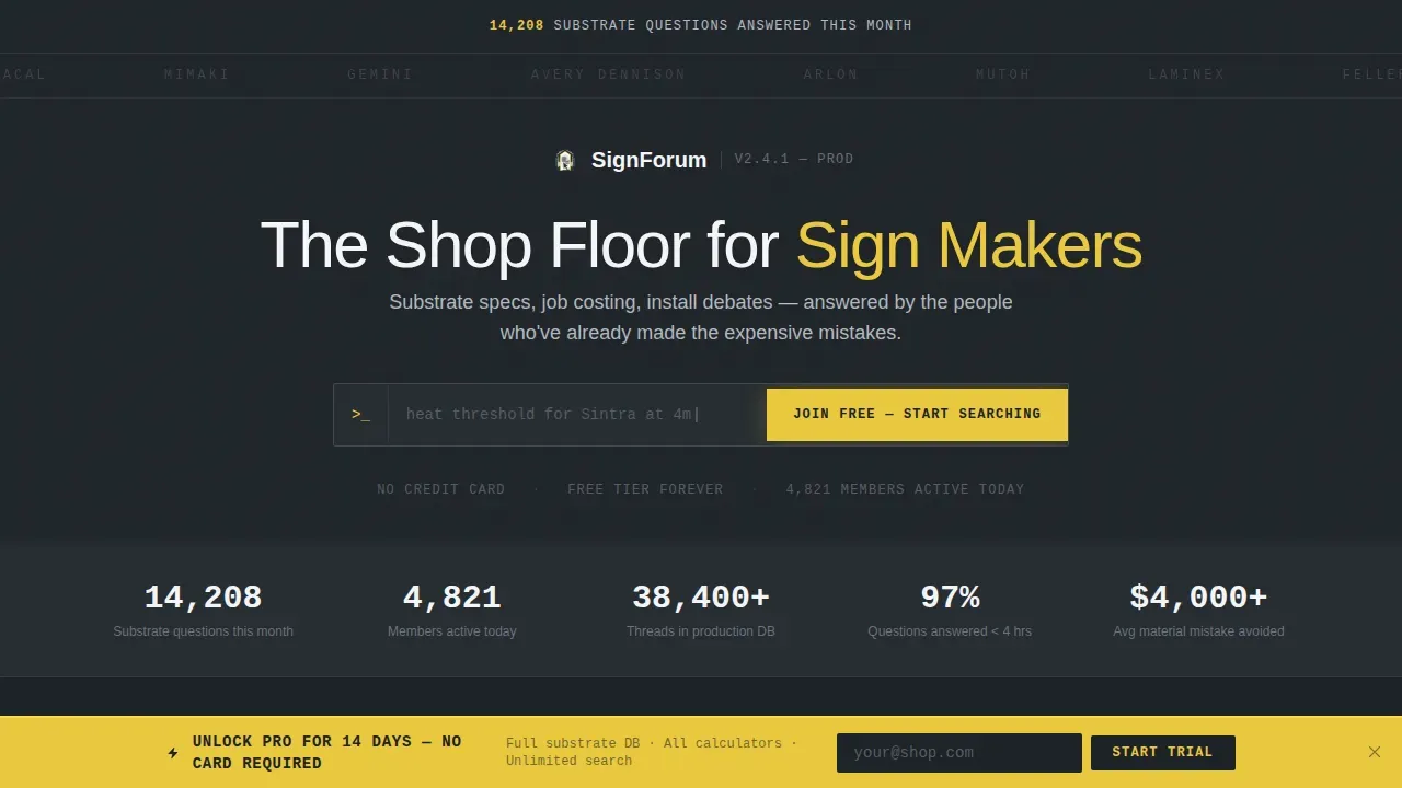
- A hero section with a scrolling brand ticker, live stat headline, and a blinking-cursor search terminal
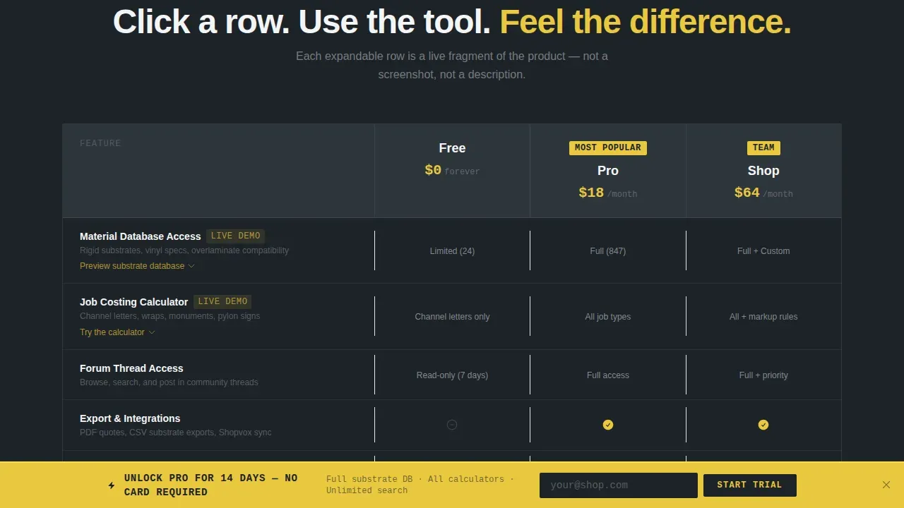
- A three-column interactive comparison table with expandable live demo rows for Free, Pro, and Shop tiers
- A freemium conversion flow with a minimal sign-up form and a persistent signal-yellow trial bar that appears after sixty percent scroll depth
Feature list
This template ships with purpose-built components shaped around sign-trade users. Each feature reflects a specific decision point in the sign-maker's workflow.
Interactive Tier Comparison Table
The comparison table lets visitors compare Free, Pro, and Shop tiers side by side. Each row is clickable and expands into a live mini-demo. For example, the Material Database row opens a substrate card showing thickness, outdoor rating, and printer compatibility. The Job Costing row loads a pre-filled channel letter estimator. The table does not just list features; it lets users feel the difference between tiers before signing up.
Blinking-Cursor Search Terminal Hero
The hero section opens with a stat headline in monospaced type and a live search field. Ghost text cycles through real sign-trade queries as examples: overlaminate questions, Sintra heat thresholds, and LED module specs. The call to action inside the field submits a free sign-up, making the terminal itself the first conversion point on the landing page.
Scrolling Industry Brand Ticker
A horizontal logo bar scrolls slowly above the search terminal. It displays recognizable industry brands in desaturated steel tones. This element functions as immediate social proof, signaling to visitors that the platform speaks their language before they read a single line of copy.
Freemium Sign-Up Form with Shop Selector
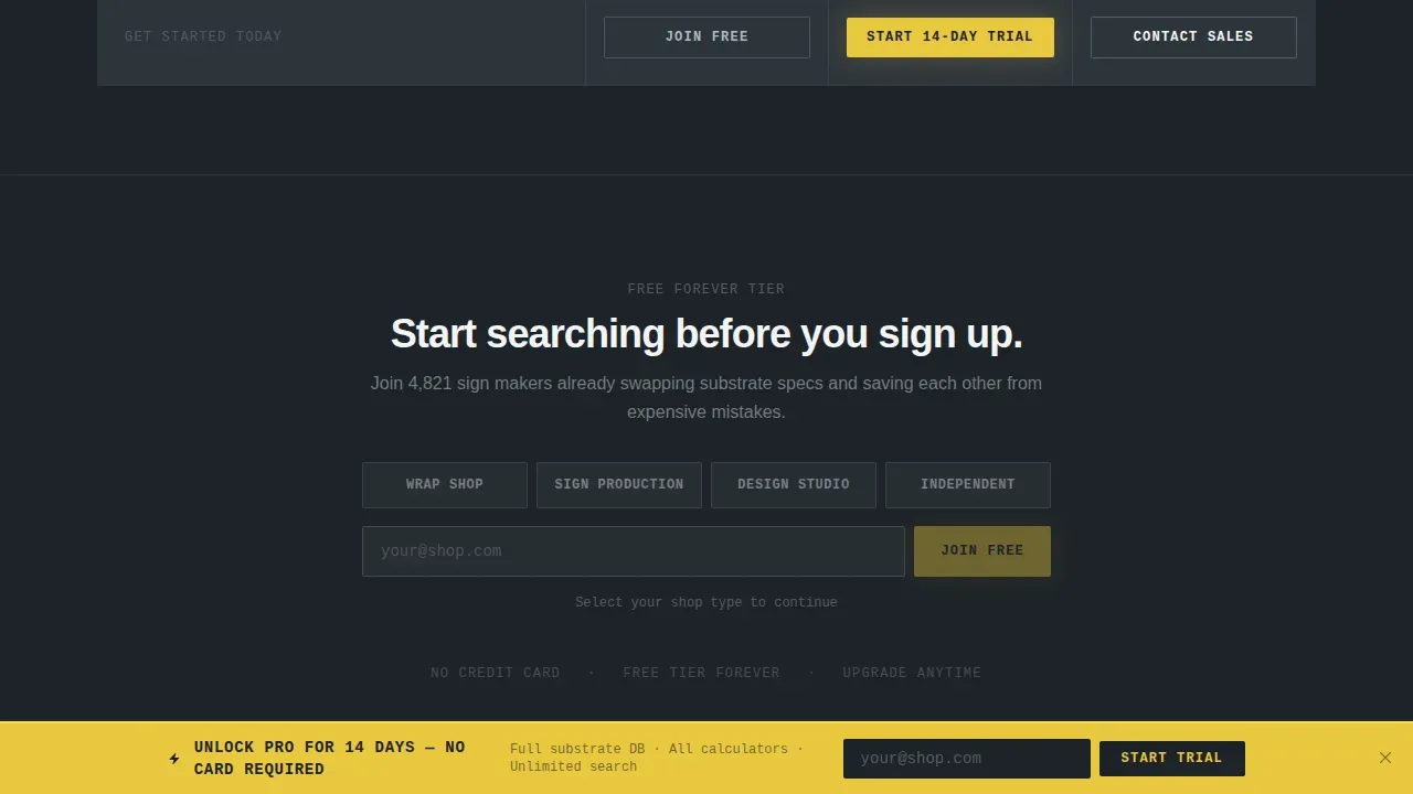
The sign-up form asks for only two inputs: an email address and a shop type selector. Options include wrap shop, sign production, design studio, and independent. Fewer form fields lead to higher conversions, and this structure keeps the barrier as low as possible. No credit card required at the free tier.
Persistent Sixty-Percent Scroll Trial Bar
After a visitor scrolls sixty percent of the page, a signal-yellow bottom bar appears. It promotes a fourteen-day Pro trial with a single email field. This secondary call to action catches prospects who explored the comparison table but did not act on the primary form. The bar uses button contrast and a benefit-oriented message to increase conversions without interrupting the scroll experience.
Live Community Stat Trust Bar
Below the hero, a trust bar displays real-time community metrics. Example counters include substrate questions answered this month, active members, and open threads. Using real-time counters demonstrates the community's activity and value to potential members, which strengthens credibility before visitors reach the comparison table.
Page sections overview
| Section | Purpose |
|---|---|
| Hero Search Terminal | Engages visitors with stat headline, ghost-text search field, and primary sign-up call to action |
| Brand Ticker Bar | Delivers instant industry social proof through a scrolling logo strip |
| Live Stats Trust Bar | Shows community activity metrics to build credibility before comparison |
| Interactive Comparison Table | Lets visitors compare tiers and expand rows into live substrate and cost demos |
| Persistent Trial Bar | Captures scroll-depth prospects with a single-field Pro trial offer |
| Footer Row | Provides essential links and closes the single-page layout |
Design & branding system
The visual style follows a Data Command theme built on a Monochrome Steel palette. Every surface is functional. The aesthetic reads like a CNC router table under fluorescent bay lights: industrial, zero-decoration, and slightly reflective.
- Core colors are mill-finish aluminum (#B0B8BF), dark shop-floor charcoal (#1E2328), and bright inspection white (#F4F5F6), with signal yellow (#E8C840) used only for interactive highlights, hover states, and upgrade badges
- Typography uses JetBrains Mono for monospaced terminal headings, DM Sans for body text, and Plus Jakarta Sans for section headings, keeping each layer visually distinct
- Graphics, icons, and charts use the same restrained steel style; a different color appears only when a user action or upgrade path demands attention
Mobile & speed optimization
The template is built desktop-first, reflecting the reality that production managers work at shop workstations. Mobile devices are fully supported as a fallback, because many users access forum resources on-site while handling hardware.
- Interactive components such as the comparison table, ticker, and scroll-depth detection use client-side rendering, while static sections use server-side components for faster initial load
- The layout adapts cleanly across each device size, keeping the comparison table readable and the sign-up form usable on smaller screens
- Fast loading speed is critical for landing pages; the template separates heavy interactive elements from static content to keep the page responsive
How this template helps you convert
The page is structured around a single primary conversion goal: free sign-up. The fewer the conversion goals, the higher the conversion rates. Every section builds toward that moment, using social proof, live demos, and benefit-driven copy instead of feature lists alone.
- Visitors interact with expanded comparison table rows before hitting any sign-up wall, so the value of paid tiers is felt rather than read; this approach mirrors the trend of embedding live demos directly in landing pages to increase engagement and trust
- A minimal two-field sign-up form and a no-credit-card-required free tier remove friction at the decision point, while testimonials and community metrics serve as social proof that keeps prospects moving toward action
- The persistent trial bar at sixty percent scroll depth catches visitors who explored the page but did not convert on the primary call to action, giving the landing page a second conversion path without adding a new page or a disruptive overlay
Other information about this template
This template is a strong starting point for any sign or banner company that wants to launch a community forum landing page quickly. It is built with a modular structure, meaning teams can adapt individual sections for different campaigns or swap in own design elements without rebuilding from scratch. Builders using Notion or Airtable as a back-end data layer will find the layout accommodates dynamic data display patterns. The template also supports the kind of user-friendly community portal experience where clients and authorized users access gated content after sign-up.
- The template can support integration with analytics tools such as Google Analytics to track scroll depth, row expansion events, and form completions across the landing page
- Comparison pages built on this template are well-suited for campaigns targeting sign-trade prospects who search comparison terms, and the layout can be extended to serve Google Ads traffic arriving on a dedicated landing page
- Social media promotion is an effective way to drive visitors to the landing page; the open graph title and description fields are included so the page previews cleanly when shared across social media channels
- The template is available as a free template tier to explore the layout and components; Pro and Shop upgrade pages unlock additional functionality
- Security badges and privacy policy links can be added to the sign-up form area to reassure users about data handling, a recognized best practice for technical community forums
- For teams evaluating two platforms before committing, this template functions as a working proof-of-concept that can be downloaded and customized with your own design before launch
- Items found in the comparison table rows, such as substrate cards and cost estimators, represent the kind of dynamic data that can be bound to live data sources as the community grows
- The download and deploy process is straightforward; no-code builders can launch quickly while self-hosted teams have full access to adapt the structure
Theme
Data Command
Creative direction
Interactive Explorer
Color system
Monochrome Steel
Style
Comparison Table
Direction
Freemium/Trial
Page Sections
Interactive Expandable Comparison Table
Blinking-cursor Search Terminal
Scrolling Industry Logo Ticker
Freemium Sign-up Form
Sixty-percent Scroll Trial Bar
Live Community Metrics Trust Bar
Related questions
Does the free tier require a credit card?
Can I customize the comparison table rows for my own forum tiers?
How does the persistent trial bar work?
Is this template suitable for a small business launching its first community forum?
What design style does this template follow?



