Retro Fashion Professional Website Template
Threads is a full-width immersive landing page built for a retro clothing brand rooted in 1970s workwear and 1980s skate culture. The page uses a Bold Brutalist design with an Ink and Paper color system, scroll-linked unboxing animations, parallax letter-mask typography, and a conversion-focused capsule drop upgrade flow built for vintage-obsessed creative audiences.
by Rocket studio
Quick summary
Threads is a single-page landing page template built for direct-to-consumer retro clothing brands. It combines brutalism with a tactile unboxing scroll experience to sell a full capsule drop upgrade. The bold brutalist design uses heavyweight slab typography, garment-texture letter masks, and a rubber-stamp red accent to drive visitors toward a bundled collection purchase.
Who this template is for
This landing page is built for independent clothing brands and creative studio teams launching a premium capsule drop. It is especially well-suited for vintage-inspired fashion labels that want their web page to feel as crafted as the garments themselves.
- Retro clothing brand founders running a direct-to-consumer capsule drop
- A graphic designer, art director, or creative studio building a fashion brand web presence
- Streetwear labels and vintage-inspired fashion projects targeting design-literate, culturally aware buyers
What problem this template solves
Most fashion landing page designs fail at the critical moment after a visitor adds one item to their cart. The page either goes quiet or retreats to a generic upsell banner. Visitors leave without upgrading, and the brand loses its best conversion window.
This landing page solves that problem by turning the post-add scroll into a story. The design keeps users on the page, shows them how individual pieces layer into a complete wardrobe, and earns the upgrade before asking for it.
- Visitors who added one item see no clear reason to buy the full collection
- Standard web design approaches offer no scroll-linked narrative to build desire
- Brands lack a landing page that proves a capsule is a wardrobe, not a single impulse buy
What you get with this template
You get a full-width immersive landing page with every section, animation, and conversion element already designed and structured. The page is desktop-first with a graceful mobile fallback built in.
- A parallax letter-mask hero, a scroll-linked unboxing sequence, and styled wardrobe pairing sections
- An upgrade call-to-action block with a rubber-stamp red badge showing per-piece savings, plus a sticky bottom bar for the essentials kit upsell
- Typography set in Fraunces for display, DM Sans for body text, and JetBrains Mono for price labels and product codes
Feature list
This landing page template is built around a tightly defined set of features drawn directly from the creative brief. Every feature serves the upgrade conversion goal.
Parallax Letter-Mask Hero
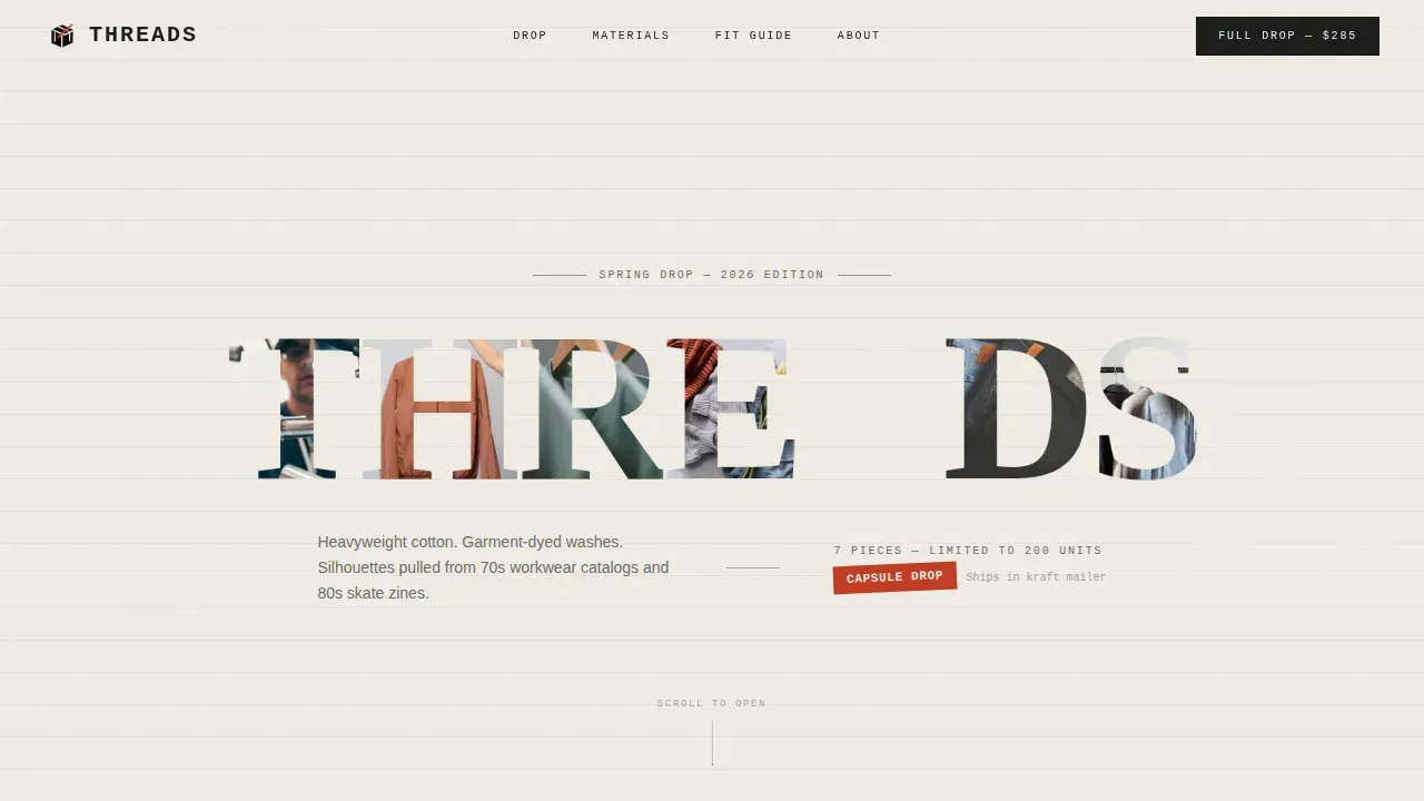
The hero section spans the full viewport. Each letterform of the brand name acts as a clipping mask that reveals a different garment texture inside: raw selvedge denim, sun-faded canvas, and ribbed thermal knit. The letters parallax at different speeds on scroll, making the fabric feel alive inside the typography without showing a single product photograph.
Scroll-Linked Unboxing Sequence
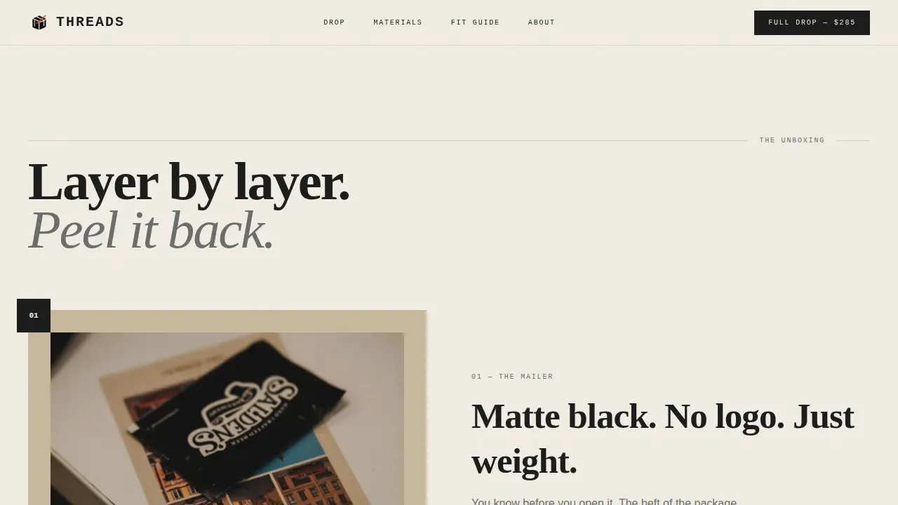
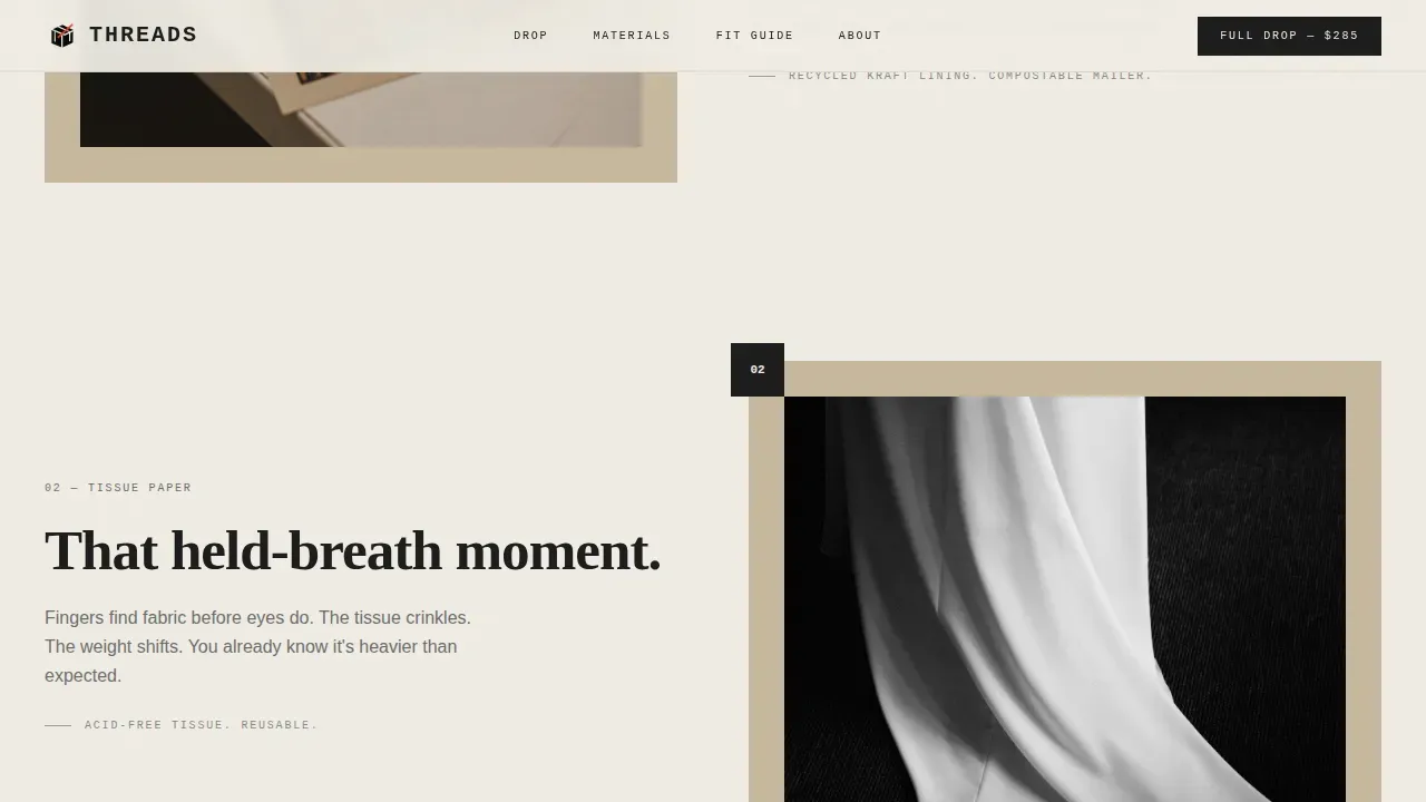
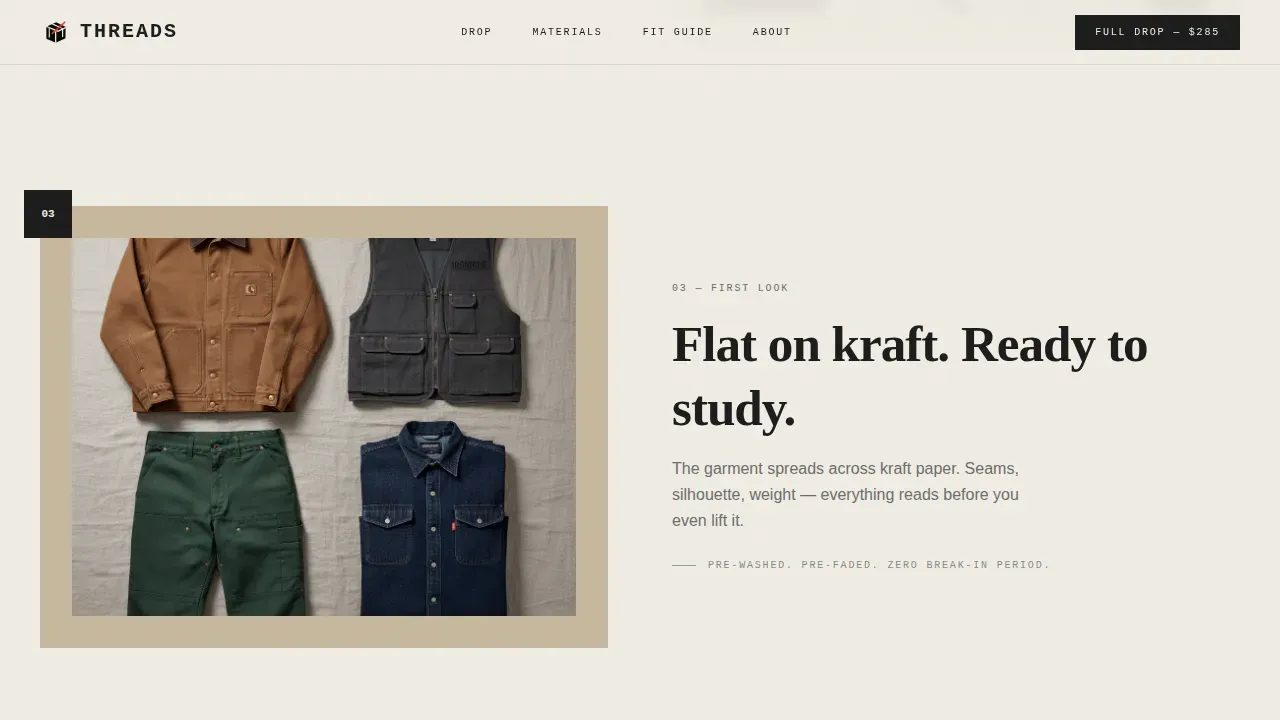
Scrolling mimics opening a real package layer by layer. The outer mailer tears away to reveal a lookbook card. Tissue paper peels back to expose a hero garment flat-laid on kraft paper. Detail crops then zoom into stitching, label typography, and hardware. Each stage strips another layer and builds anticipation until the full collection fans out across the viewport.
Styled Wardrobe Pairing Section
The wardrobe section shows visitors how individual pieces work together. Styled pairings demonstrate how garments layer, proving the collection is a complete wardrobe rather than disconnected items. Hover reveals on garment cards add an interactive layer that rewards curious visitors and keeps them on the page longer.
Upgrade Call-to-Action Block
After the third garment reveal, the primary call-to-action offers the full capsule drop at a bundled price. A rubber-stamp red badge displays the per-piece savings clearly. The call-to-action button uses a magnetic interaction that responds to cursor movement, making the upgrade feel deliberate and premium rather than pressured.
Sticky Essentials Kit Bar
A secondary sticky bar sits at the bottom of the page throughout the scroll experience. It reads "Add the Essentials Kit" and presents care products plus a branded garment bag as a low-friction add-on. The bar stays visible without interrupting the main narrative flow of the landing page.
Social Proof Integration
The page includes worn-by editorial credits, a piece count sold display, and handwritten-style testimonial pull quotes. These social proof elements are woven into the scroll sequence rather than isolated in a single block, so they reinforce trust at every stage of the unboxing story.
Page sections overview
| Section | Purpose |
|---|---|
| Hero Letter Mask | Full-viewport parallax typography revealing garment textures inside each letterform |
| Material Reveal | Scroll-linked unboxing sequence moving from mailer to flat-lay to detail crops |
| The Wardrobe | Styled pairings showing how pieces layer into a complete capsule wardrobe |
| Upgrade Call-to-Action | Bundle offer block with rubber-stamp red savings badge and magnetic button |
| The Essentials | Sticky bottom bar for care kit and branded garment bag upsell |
| Minimal Footer | Single-row footer with minimal link set |
Design & branding system
The design system draws directly from lo-fi print culture: zine layouts, Risograph printing, and letterpress typography. Every visual decision reinforces the feeling that the page was printed, not generated. The brutalist aesthetic here is not decorative; it is structural. Bold, ink-heavy type bleeds to the edges. Space is deliberate. Nothing is centered for comfort.
- Ink and Paper color system: newsprint off-white (#F0EDE5) background, letterpress black (#1A1A1A) for all primary typography, mimeograph gray (#6B6B6B) for secondary text and dividers, and rubber-stamp red (#C23B22) reserved exclusively for price callouts and upgrade badges
- Typography trio: Fraunces serif for oversized display headings, DM Sans for readable body text, and JetBrains Mono for price labels and garment codes
- Grain overlay texture, asymmetrical layout logic, and cursor-reactive hero elements complete the raw, tactile web design identity
Mobile & speed optimization
This landing page is designed desktop-first, with the full visual intensity of the parallax hero, unboxing scroll sequence, and magnetic call-to-action button optimized for large screens. A graceful mobile fallback is built into the template so the page remains functional and readable on smaller devices without stripping the character out of the design.
- Server Components handle all static sections for faster initial loading, while Client Components manage scroll and cursor effects separately
- The grain overlay, sticky bar, and wardrobe hover reveals are structured to degrade gracefully on mobile without breaking the conversion flow
- The minimalist footer and single-row link set keep the bottom of the page clean and fast across all screen sizes
How this template helps you convert
This landing page is built around a single conversion goal: getting a visitor who has already added one item to upgrade to the full capsule drop. Every design decision, every scroll stage, and every piece of copy earns that upgrade before the call-to-action appears.
- The scroll-linked unboxing sequence builds desire incrementally, so by the time visitors reach the upgrade block they have already experienced the brand's craft through five distinct visual stages
- The wardrobe pairing section reframes the collection as a complete system, removing the "I only need one piece" objection before the bundled price is revealed
- The rubber-stamp red savings badge, magnetic call-to-action button, and sticky essentials bar work together to create a layered, non-aggressive upsell experience that feels earned rather than forced
Other information about this template
This template sits at the intersection of brutalism in web design and tactile fashion brand storytelling. Understanding the broader context of brutalist web design helps explain why this approach works so well for a brand like Threads.
Brutalism originates from the French architectural term béton brut, meaning raw concrete. In architecture, this meant exposed materials and honest construction. In the digital world, brutalist web design translates that honesty into raw appearance, bold typography, and a refusal to hide structure behind polish. Brutalist websites often incorporate simple geometric shapes and high-contrast color schemes to communicate information at a glance rather than through decoration.
Brutalist web design emphasizes raw, unpolished aesthetics and often incorporates bold typography and high-contrast color schemes. This approach creates a great visual impact for brands that want to stand out. Brutalism is often seen as a reaction to the lightness and optimism of contemporary web aesthetics, a push against the white background sameness of modern brand sites.
There are many examples of brutalist websites that show how this style functions across industries. Craigslist has maintained a brutalist aesthetic for over 20 years, focusing on functionality over design. Balenciaga's online shop exemplifies brutalism with its simplified interface and focus on functionality over aesthetics. Ksenia Schnaider is a reference for effective e-commerce design utilizing a brutalist style with raw visual elements. Studio Push uses a brutalist style to convey a strong sense of personality, inviting visitors to interact with the site. Kurt Champion's portfolio website exemplifies brutalist design with its use of individual cards for content organization. Jeremy Baxter's website features a black-and-white color scheme and bold typography, embodying the punk rock atmosphere of his work. Teacherie.how uses solid color backgrounds and minimal decorations to improve visual hierarchy in its brutalist design. Derek McKechnie's website showcases interactive geometric components, enhancing user experience through microinteractions. Ryan Haskins' portfolio website employs vibrant colors and large geometric objects to create a striking brutalist design. Aurelio De Anda's website effectively uses brutalism to give visual weight to individual elements, attracting attention as users scroll. H. Lorenzo's website uses interactive elements that can be moved around, creating a chaotic yet engaging user experience. The Restart Page is designed as a tribute to early operating systems, featuring interactive elements that evoke nostalgia for the early days of computing. Delirium Magazine's website allows users to interact with article windows, embodying a chaotic yet playful brutalist design.
Brutalist website templates can help users focus on core content by stripping away unnecessary visual distractions, which is especially useful for portfolio website projects and creative agency website builds. Templates that embody brutalist design principles can be particularly useful for personal or portfolio websites where personality and directness matter more than conventional polish. The Threads template is a perfect example of how brutalism design applies directly to fashion e-commerce, combining the raw interactions of brutalist websites with the warmth of garment-dyed textiles.
Brutalist websites often strip away unnecessary visual distractions, allowing users to focus on core content. Fast loading is a recognized benefit of brutalist design due to its minimal graphics and simpler layouts. An asymmetrical grid layout with visible gridlines can create a sense of intentional incompleteness, which this template uses throughout the wardrobe section and unboxing stages.
Using high-intensity colors in combination with monochromatic schemes can enhance the retro vibe of a website. This landing page leans into that principle by reserving bright colors exclusively for the rubber-stamp red accent while keeping everything else in a tight monochromatic range. Raw photography in web design often features unfiltered and unpolished imagery that evokes nostalgia for the 90s and 00s; this template's stark imagery without filters highlights fashion products within a brutalist design framework.
Blunt copywriting that is concise and direct is a characteristic of brutalist web design. Every text element on this landing page is written to be immediate. The page uses divided screens and left side anchoring to structure visual weight across the garment reveal stages.
Brutalist design can improve accessibility for users with visual impairments through the use of bold typography and high-contrast color schemes. Brutalist design also attracts younger generations who appreciate bold and unconventional styles, making it especially effective for a retro clothing brand targeting creatives in their mid-twenties to late thirties.
This template also draws from the creative energy found in projects like the Werkleitz Festival site and the writing sensibility of Lucy Ives, both of which represent the kind of art-forward, anti-commercial web energy that brutalist websites channel at their best. The modern art references embedded in the brutalist style give this landing page a sense of purpose beyond commerce.
The template combines brutalism with a scroll-driven narrative in a way that feels intentional in the digital world, not like a design trend applied for its own sake. Raw concrete aesthetics meet soft garment textures, and that tension is the whole point of the Threads brand landing page. Brutalist elements here are not obstacles; they are the story.
- The Threads bold brutalist retro clothing brand landing page template is available for immediate use on the platform
- Designers, creative agency teams, and independent studio founders can adapt the color system, typography, and layout to any retro or zine-inspired fashion project
- All animation logic, scroll stages, and interactive components are included in the template as delivered
- The page uses USA localization by default, including USD currency formatting and US date conventions
Theme
Bold Brutalist
Creative direction
Unboxing Experience
Color system
Ink & Paper
Style
Full-Width Immersive
Direction
Upsell/Upgrade
Page Sections
Parallax Letter-mask Hero Section
Scroll-linked Unboxing Experience
Styled Wardrobe Pairing Display
Upgrade Call-to-action with Savings Badge
Sticky Essentials Kit Upsell Bar
Social Proof and Editorial Credits
Related questions
What kind of brand is this landing page template designed for?
Does this template include the scroll animations and parallax effects described in the brief?
Can the color palette and typography be changed to match a different brand?
Who typically builds and customizes a landing page like this?
Is this template suitable for a portfolio website or creative agency project?



