Immersive Maximalist Lifestyle Blog Landing Page
Maximal is a dark, immersive landing page template built for maximalist lifestyle blogs. It pairs a full-bleed editorial header with a staggered masonry card grid, a Lavender Dream color palette, and a persistent newsletter call-to-action. The result is a visually rich, click-through experience that feels less like a webpage and more like a curated space worth exploring.
by Rocket studio
Quick summary
Maximal is a single-page landing page template for maximalist lifestyle content creators. It opens with a full-bleed editorial photograph and a bold serif headline, then unfolds into a modular card grid that guides readers toward your deepest content. Every design choice, from the deep aubergine background to the rose gold typography, is built to feel intentional, immersive, and unmistakably editorial.
Who this template is for
This template speaks directly to lifestyle content creators who reject the minimal and embrace the layered. It is designed for people who treat their blog like a curated space, not a list of posts.
- Maximalist lifestyle bloggers covering interiors, fashion, and object-obsessed culture
- Creative directors and independent editors building editorial moodboards and content archives
- Design-forward renters and thrift-store devotees who want their online presence to match their aesthetic
What problem this template solves
Most blog landing pages treat content as a list. This template treats it as a collection. The standard grid layout fails readers who want to browse, linger, and discover, not just scan and click away.
- Readers bounce from flat, uniform grids because nothing earns their attention or rewards curiosity
- Generic templates offer no personality, leaving rich visual content buried behind bland layouts
- Newsletter sign-up prompts get ignored when they feel like interruptions rather than invitations
What you get with this template
You get a fully structured, single-page landing page with every visual component pre-built and ready to populate with your content. The layout is designed to make browsing feel as deliberate as walking through a well-dressed room.
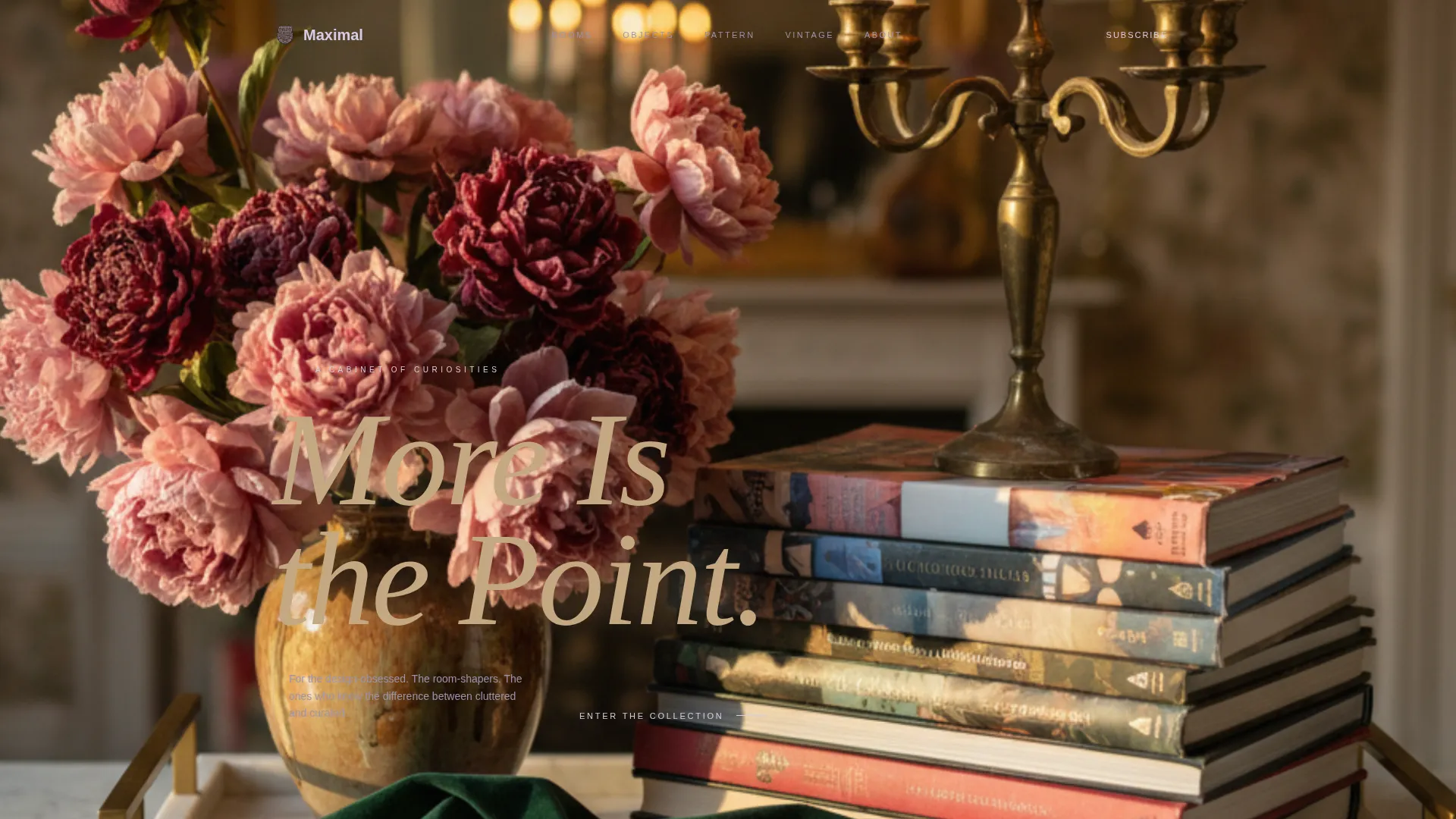
- A full-bleed photo header with a serif headline overlay in antique rose gold
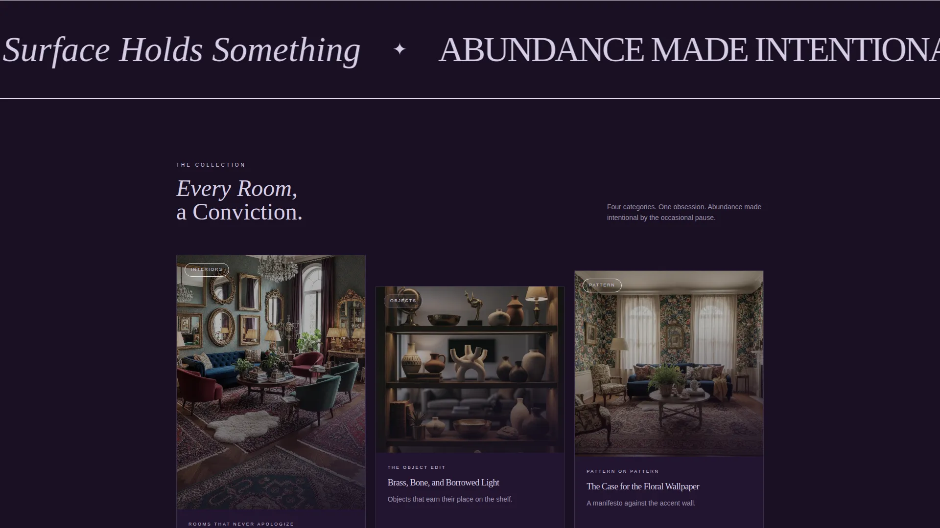
- A staggered masonry card grid with parallax hover effects and category-led content portals
- A floating rose gold "Subscribe to the Cabinet" button and a newsletter signup modal
Feature list
This template delivers a focused set of components, each one designed around the maximalist editorial experience described in the brief.
Full-Bleed Editorial Header
The header fills the entire viewport with an overhead tablescape photograph. Low, directional golden lighting makes each object, stacked art books, a brass candle holder, dried peonies, a velvet ribbon on a marble tray, feel sculptural. The serif headline "More Is the Point" bleeds across the image in antique rose gold (#C4A882), setting the tone immediately.
Staggered Masonry Card Grid
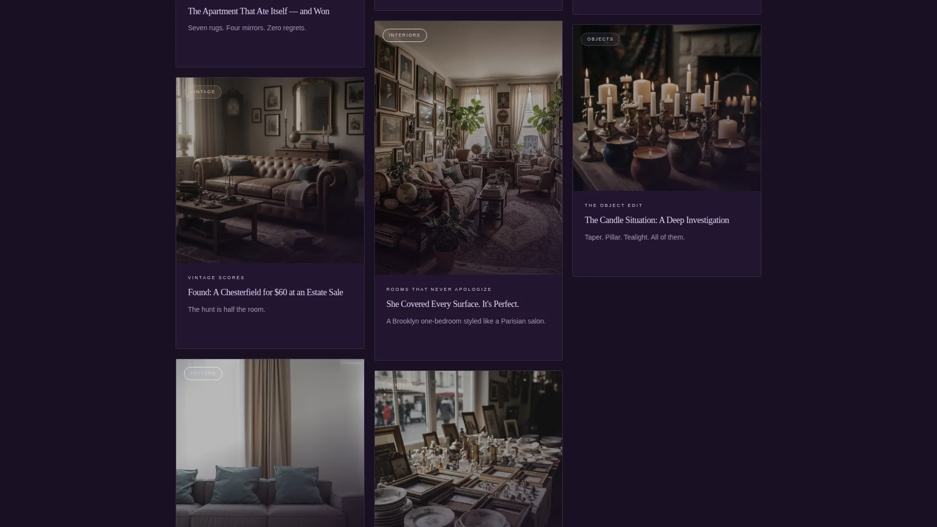
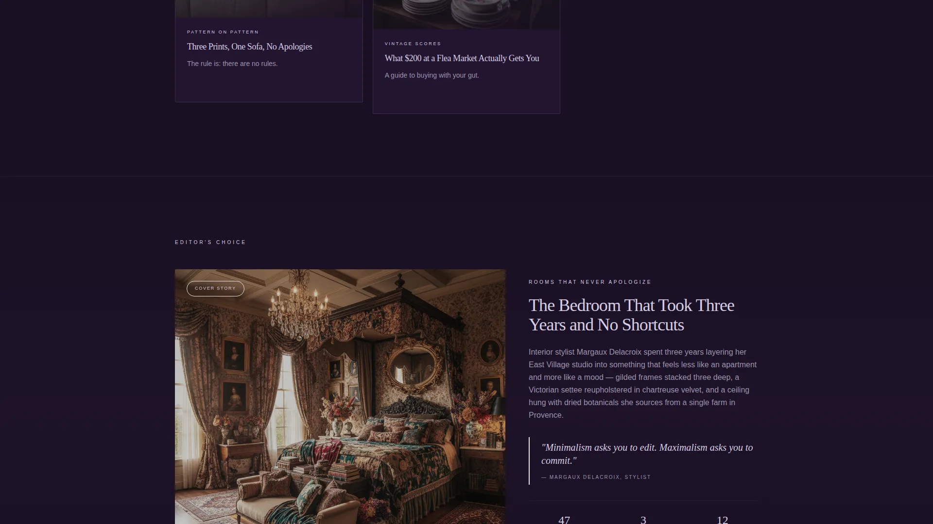
Below the header, modular cards of varying heights and widths build a browsable gallery feel. The grid alternates between dense clusters and open breathing space, reflecting the maximalist principle of abundance made intentional by an occasional pause. Each card represents a content category such as "Rooms That Never Apologize" or "The Object Edit."
Parallax Hover Card Reveal
On hover, each card shifts its background image through a subtle parallax effect. A dusty lavender overlay (#9B8FB4) fades in alongside a single-line teaser, pulling readers toward the full article without giving too much away. The effect rewards curiosity and keeps scroll momentum alive.
Floating Newsletter Call-to-Action
A persistent rose gold button labeled "Subscribe to the Cabinet" follows the reader down the page. Clicking it opens a newsletter signup modal that asks only for a first name and an email address. The modal copy frames the invitation as: "A weekly letter for people who believe bare walls are a missed opportunity."
Click-Through Card Actions
Every card carries a primary call-to-action reading "Step Inside," routing readers to the corresponding full article or content collection. The click-through architecture keeps each card as a visual promise, a preview that earns the deeper read.
Page sections overview
| Section | Purpose |
|---|---|
| Full-Bleed Header | Sets editorial tone with a styled tablescape photograph and serif headline |
| Masonry Card Grid | Displays content categories as modular, browsable portals |
| Card Hover Reveal | Surfaces a teaser line and lavender overlay on each card interaction |
| Floating Subscribe Button | Persists across scroll as a secondary newsletter conversion path |
| Newsletter Signup Modal | Collects first name and email with an editorial invitation framing |
Design & branding system
The Lavender Dream color system grounds every element of this template in a palette that feels like a vintage perfume bottle catching lamplight. Dark, warm, and layered, it avoids both the clinical coolness of minimalist design and the chaos of uncurated excess.
- Deep aubergine black (#1A1023) serves as the primary background, creating depth and contrast across all surfaces
- Dusty lavender (#9B8FB4) defines card borders and hover states, while antique rose gold (#C4A882) anchors headlines and accent typography
- Soft lilac mist (#D6CEE6) is used for body text on dark surfaces, keeping reading comfortable without breaking the atmospheric mood
Mobile & speed optimization
The template's layout is built to translate its editorial density into a clear, scrollable experience on smaller screens. The masonry grid reflows gracefully so card content remains legible and visually distinct on mobile viewports.
- Modular card components are designed to stack predictably, preserving visual hierarchy on narrow screens
- The floating newsletter button remains accessible across scroll positions without obstructing card content on mobile
How this template helps you convert
The conversion architecture in this template is woven into the browsing experience itself. Readers are never pushed toward a click, they are drawn in by what they see.
- The staggered card grid with hover reveals builds sustained scroll engagement, giving each content category a chance to earn its own click before a reader leaves the page.
- The persistent floating subscribe button keeps the newsletter path visible throughout the entire scroll journey, capturing readers at the moment they feel most immersed in the content world.
Other information about this template
This template is part of a Fashion and Lifestyle category, nested within the Maximalist Fashion subcategory and the Maximalist Lifestyle Blog niche. It is designed around a Dark Immersive theme and a Curated Collection creative direction, making it well suited for editorial projects that prioritize atmosphere and visual storytelling over functional utility.
- The template style is Card Grid (Modular), following a Click-Through landing page direction
- The Lavender Dream color system and Full-Bleed Photo header concept are matched intersection context fields that define the template's visual identity
- This is a single landing page, not a multi-page website, and is optimized for scroll-driven content discovery within one continuous view
Theme
Dark Immersive
Creative direction
Curated Collection
Color system
Lavender Dream
Style
Card Grid (Modular)
Direction
Click-Through
Page Sections
Full-bleed Editorial Header
Staggered Masonry Card Grid
Parallax Hover Card Reveal
Persistent Floating Subscribe Button
Click-through Card Actions
Related questions
Can I change the card categories to match my own blog topics?
What kind of images work best in the masonry card grid?
Is the newsletter modal connected to an email platform?
Can this template work for niches beyond interior styling?
Does the floating subscribe button stay visible while scrolling on mobile?