Government Software Portfolio Website Template
Triage is a government patient management landing page template built for public health administrators who need clarity under pressure. It presents a command-and-control aesthetic with live-looking health metrics, modular flip cards, and case study rows that build trust through data. The template drives pilot deployment signups from state, county, and federal agency decision-makers.
by Rocket studio
Quick summary
Triage is a card grid landing page template designed for government health technology platforms. It combines a dim situation-room visual identity with an industry-report scroll structure. Each section progressively builds the case for a patient management platform, moving administrators from crisis recognition to pilot deployment signup.
Who this template is for
This template speaks directly to public health operations leaders who manage patient flow across large, compliance-heavy networks. It is built for decision-makers who already understand the problem and need a platform that proves it has solved it elsewhere.
- State Medicaid directors and county health department administrators managing intake backlogs
- Veterans Affairs hospital operations chiefs handling referral handoff gaps
- Federal compliance officers and health information technology procurement leads evaluating new platforms
What problem this template solves
Government health agencies run patient management on fragmented, paper-driven processes. Missed appointments, referral leakage, and compliance gaps pile up while administrators wait on reports that are already out of date. This template addresses that operational gap directly.
- No single view of patient intake, waitlist status, and discharge coordination across facilities
- Audit readiness suffers when data lives on clipboards and disconnected spreadsheets
- Procurement stakeholders lack a concise, evidence-backed case to move forward with a new platform
What you get with this template
This template delivers a complete, single-page layout structured like a federal briefing document. Every section is purposeful and ordered to move a skeptical government buyer from problem awareness to confident action.
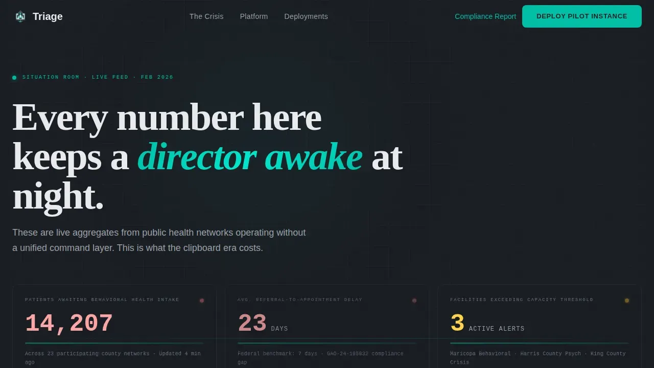
- A hero section with dark glass metric panels showing live-looking government health data
- A modular card grid with flip interactions that pair crisis statistics against platform countermeasures
- An executive summary case study row with before-and-after key performance indicators
- A pilot deployment call to action with a structured intake form and a gated secondary asset
Feature list
This template includes purpose-built components designed for the government health technology audience. Each element reinforces operational credibility and moves the visitor toward a conversion decision.
Dark Glass Hero Panels
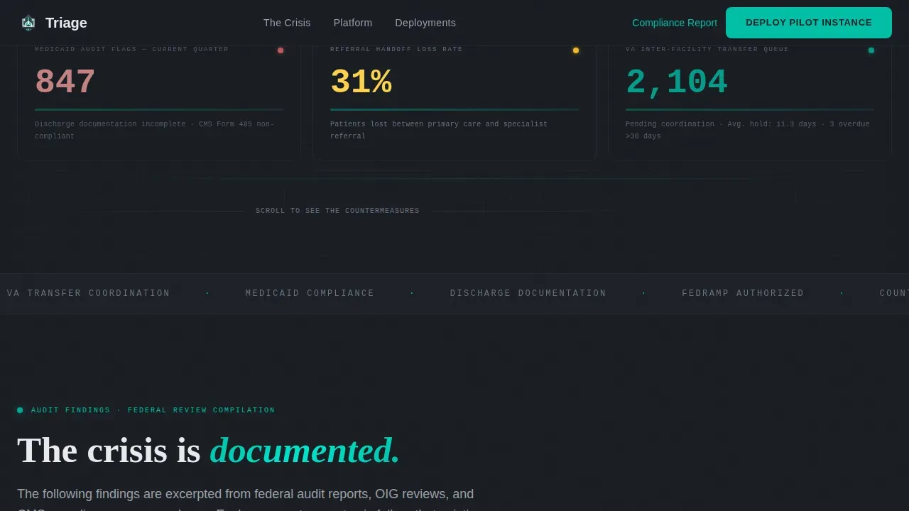
The header presents a grid of semi-transparent, frosted-glass cards against a near-black background. Each panel displays a live-looking government health metric rendered in monospaced typography, creating immediate situational urgency without a single stock photo.
Crisis Quantification Card Row
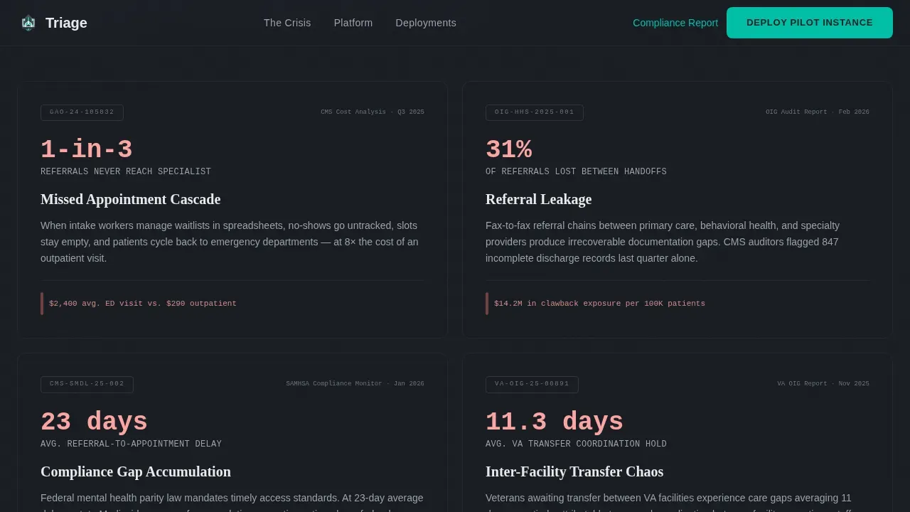
The first content row formats missed appointments, referral leakage rates, and compliance gap data as audit-report style cards. This section speaks directly to the numbers administrators already know, establishing instant credibility.
Flip Card Module Row
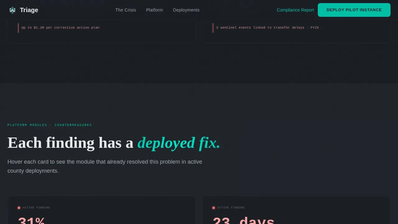
Each platform module is presented as an interactive flip card. The front face shows a problem statistic; the back face reveals the corresponding product countermeasure with a supporting screenshot-style layout.
Case Study Executive Cards
Anonymized county-level deployments are presented as executive summary cards. Each card shows a before-and-after key performance indicator pairing, formatted like a page pulled from a government accountability report.
Pilot Deployment Intake Form
The primary call to action captures agency name, state, estimated patient volume via dropdown, and a dot-gov or dot-mil email address. A secondary path offers a gated compliance readiness report download for stakeholders still building internal buy-in.
Sticky Navigation with Persistent Call to Action
The navigation bar stays pinned as the visitor scrolls. The primary action button remains visible at all times, reducing friction for a decision-maker who is ready to act partway through the page.
Page sections overview
| Section | Purpose |
|---|---|
| Hero Metric Panels | Open with live-looking crisis data to establish immediate operational context |
| Crisis Quantification Row | Frame the scope of the problem using audit-report card formatting |
| Platform Module Row | Introduce product capabilities as direct countermeasures to each crisis card |
| Case Study Row | Prove deployment success through anonymized before-and-after KPI cards |
| Pilot Deployment call to action | Capture agency details and drive freemium trial signups with a structured form |
| Footer | Close with a linear single-row layout for navigation and secondary links |
Design & branding system
The visual identity follows a Data Command theme built around a Carbon Fiber color system. Every color choice serves legibility and urgency, not decoration. The palette reads like the instrument panel of an armored vehicle: matte, non-reflective, and built to be scanned at speed.
- Deep graphite (#1A1D23) for the page body, carbon mid-tone (#2E3239) for card backgrounds, and surgical white (#E8EAED) for elevated card surfaces
- Status-alert teal (#00BFA5) reserved for active metrics, interactive states, and pulse animations to direct attention without visual noise
- DM Sans for interface body text, JetBrains Mono for metric and data values, and Fraunces for section headers that carry institutional weight
Mobile & speed optimization
The template is built desktop-first to match the workstation environment of government operations chiefs. It remains fully responsive on tablet-sized screens for administrators reviewing data away from a primary workstation.
- Scroll-triggered reveal animations and parallax depth layers are structured to perform cleanly as the visitor moves down the page
- Server-rendered components handle static sections while client-rendered components manage animated metric counters and form validation
How this template helps you convert
The page is structured to earn the conversion rather than demand it. Every scroll step adds evidence before asking for commitment.
- The hero section leads with crisis data the visitor already recognizes as true, building immediate trust and removing the need for introductory persuasion.
- The flip card row and case study section prove the platform has already resolved the same problems at peer agencies, reducing procurement risk perception.
- The sticky navigation call to action and the secondary gated asset give both ready-to-act decision-makers and internal buy-in builders a path forward at any point in the scroll.
Other information about this template
This template is part of a government health technology category and is designed for Business-to-Government software platforms operating in regulated public health environments. It uses English (United States) language conventions and federal and state government terminology throughout.
- Template style is Card Grid (Modular), supporting a flexible layout that can be adapted as platform modules expand
- Animation intensity is set to medium, with scroll-triggered reveals, teal pulse effects on live metrics, and card flip interactions on hover
- The footer follows a linear single-row pattern, keeping the close of the page clean and navigation-focused
- This template is suitable for platforms serving state Medicaid networks, county behavioral health departments, and Veterans Affairs operations teams
Theme
Data Command
Creative direction
Industry Report
Color system
Carbon Fiber
Style
Card Grid (Modular)
Direction
Freemium/Trial
Page Sections
Dark Glass Hero Metric Panels
Flip Card Module Layout
Before-and-after Case Study Cards
Pilot Deployment Intake Form
Sticky Navigation with Persistent Call to Action
Scroll-triggered Reveal Animations
Related questions
Who is this landing page template designed for?
What conversion paths does this template include?
Can I adapt the metric panels and card content to my platform's data?
What form fields does the pilot deployment form capture?
Is this template suited for desktop or mobile use?



