Advanced Pharmacy Software Comparison Website Template
Dispense is a bold brutalist pharmacy workflow automation landing page template built for B2B SaaS platforms targeting independent and chain pharmacy operators. It presents a modular card grid with snap-tab hero, competitor-aware comparison badges, and a Time Audit call to action. The design is desktop-first, clinical, and conversion-focused from the first scroll.
by Rocket studio
Quick summary
The Dispense template is a single-page pharmacy landing page built around a Feature Tab Switcher hero, a brutalist card grid feature matrix, and a sticky comparison bar. It targets pharmacy owners and technicians who need to see their operational cost before they consider switching platforms.
Who this template is for
This template is perfect for teams launching a pharmacy workflow automation platform to a professional B2B audience.
- Independent pharmacy owners managing prior authorizations manually
- Regional chain operators losing revenue to expired or untracked stock
- SaaS founders presenting a clinical operations product to pharmacy decision-makers
What problem this template solves
Manual pharmacy workflows are slow, fragmented, and expensive. This landing page makes that cost visible and specific before asking for any contact information.
- Technicians toggling between multiple screens to process a single prescription
- Owners with no clear view of inventory expiry or insurance adjudication status
- Operators who cannot present automation ROI in a format buyers trust
What you get with this template
You get a fully structured pharmacy landing page with interactive sections and evidence-stacked design. Effective pharmacy landing page templates drive conversions, and this one is built to do exactly that.
- A snap-tab hero showing Fill, Verify, and Dispense workflow previews
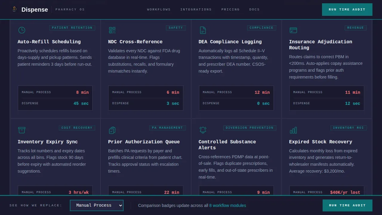
- A modular card grid with Manual-to-Automated comparison badges per feature
- A sticky bottom bar with a competitor dropdown and a three-field Time Audit form
Feature list
This template's design puts automation evidence in every section. Each card, tab, and action element earns its place.
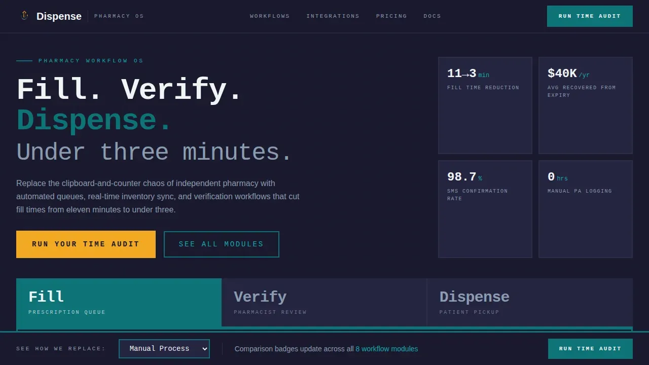
Snap-Tab Hero with Workflow Previews
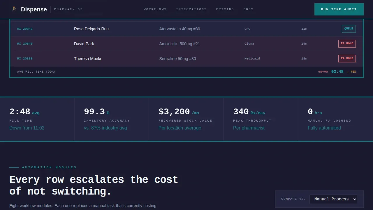
Three brutalist tabs labeled Fill, Verify, and Dispense snap-switch panel content instantly. Each tab reveals a dense, data-rich interface preview with live queue states and key metrics.
Competitor-Aware Comparison Badges
A dropdown on the sticky bar lets visitors select their current system. Every card badge across the page updates dynamically to reflect that specific comparison, turning the landing page into a personalized teardown.
Operational Cost Counter Section
A scroll-triggered counter escalates live cost figures as the visitor reads. It pairs with social proof metrics to make the cost of inaction concrete.
Time Audit Call to Action Form
The primary action element is a three-field form: pharmacy name, current system, and daily script volume. It earns the click by surfacing the visitor's own inefficiency first.
Testimonials with Specific Metrics
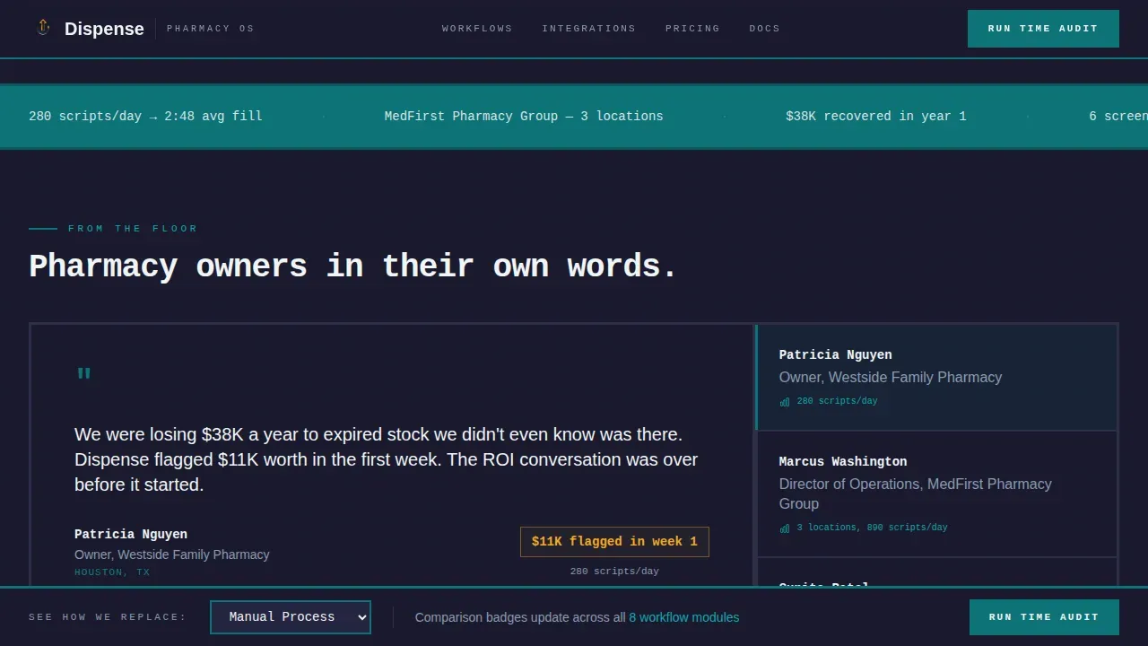
Pharmacy owner quotes include real numbers: scripts per day, fill time saved, and inventory accuracy gains. This section supports trust without generic endorsement language.
Page sections overview
| Section | Purpose |
|---|---|
| Tab Switcher Hero | Present Fill, Verify, Dispense workflow previews |
| Feature Matrix Grid | Stack automation evidence per capability card |
| Operational Cost Counter | Visualize live cost of manual process |
| Testimonials Block | Anchor trust with specific pharmacy metrics |
| Time Audit Form | Capture leads through a three-field action form |
| Sticky Comparison Bar | Persist competitor context across full page |
| Footer | Linear single-row navigation and legal links |
Design & branding system
The design follows a Bold Brutalist visual language. No gradients, no decorative elements, no stock imagery. Every color signals a state change.
- Deep pharmaceutical teal (#0D7377) as the primary brand surface for headers and key labels
- Raw slab charcoal (#1A1A2E) for card backgrounds and section dividers
- Reactive amber (#F2A922) fires on hover states, toggles, and active comparison highlights
Mobile & speed optimization
The template is desktop-first, built for pharmacy staff at workstations. It scales responsively to tablet viewports without breaking the card grid layout.
- Snap tab transitions and scroll-triggered counters load only as client components where interactivity is needed
- Card grid reflows cleanly on tablet without losing comparison badge context
How this template helps you convert
High conversion landing pages for pharmacies need clear calls to action and services highlighted effectively. This template builds toward the click through cumulative operational evidence.
- The tab hero presents workflow proof before any feature copy appears
- Each card in the grid escalates the cost of not switching, row by row
- The Time Audit form converts only after the visitor's inefficiency is already visible
Other information about this template
This pharmacy landing page template can enhance online presence for any pharmacy SaaS product entering a competitive market. Striking calls to action appear throughout, from the sticky bar to the form section. The template includes a well-defined services-equivalent feature matrix and a shop-style comparison layer that highlights platform value over legacy stacks. Automation tools represented in the card grid cover auto-refill scheduling, NDC cross-referencing, DEA compliance logging, and insurance adjudication routing. AI automation can streamline pharmacy workflows, and this template is designed to present that case persuasively. The Dispense bold brutalist pharmacy workflow automation landing page template is perfect for teams that need a landing page built around operational proof, not marketing polish.
- Typography uses JetBrains Mono for headers and labels, and DM Sans for body copy
- US localization: USD, 12-hour time format, DEA and NDC regulatory context included
- No illustration or stock photography; every panel looks like production software
Theme
Bold Brutalist
Creative direction
Feature Matrix
Color system
Teal Catalyst
Style
Card Grid (Modular)
Direction
Comparison/Versus
Page Sections
Snap-tab Hero Switcher
Competitor-aware Badge System
Brutalist Feature Matrix Grid
Scroll-triggered Cost Counter
Time Audit Conversion Form
Testimonials with Real Metrics
Related questions
Can I customize the competitor dropdown options in the sticky bar?
Is this template suited for a pharmacy SaaS product with multiple workflow stages?
Can I add more automation capability cards to the feature matrix grid?
How does the Time Audit form support lead generation?
Does this landing page design work for independent pharmacy owner audiences?



