Specialist Consulting Firm Software Cost Estimator Website Template
Roster is a split-screen landing page template built for consulting firm membership management platforms. It opens with a live code-versus-dashboard header, walks visitors through an interactive complexity calculator, and builds a compelling case section by section. The design uses a Midnight Blue palette engineered for data-dense, mission-control clarity. The primary goal is qualified lead generation.
by Rocket studio
Quick summary
Roster is a single-page lead generation template designed for consulting firm membership management software. It pairs a syntax-highlighted code panel with a live dashboard card, then leads visitors through an interactive calculator before presenting the platform's core value. Every section escalates the stakes from everyday inconvenience to real compliance risk.
Who this template is for
This template is built for software teams and founders who sell membership operations tools to mid-market consulting firms. It speaks directly to the people who buy and champion these platforms inside those firms.
- Operations directors and COOs managing 200 to 2,000 consultants across multiple practice areas
- Membership coordinators juggling renewal dates across disconnected systems
- Compliance leads responsible for tracking certifications such as the Project Management Professional (PMP) credential and continuing education credits
What problem this template solves
Consulting firm membership management is genuinely painful. Renewals scatter across spreadsheets, certification expiration dates live in separate systems, and a single lapsed credential can trigger an audit or suspend a billable consultant. Most software landing pages explain features. This template leads with the visitor's own numbers.
- Prospects often cannot quantify their current tracking inefficiency before they evaluate a solution
- Generic software pages fail to differentiate by speaking to compliance risk in concrete, dollar-denominated terms
- The gap between "we have a problem" and "we need this tool now" requires evidence the visitor produces themselves
What you get with this template
You get a fully structured, single-page layout ready to adapt to your platform's copy, data, and brand. Every section is purposeful and sequenced to move a skeptical operations buyer from curiosity to a booked demo.
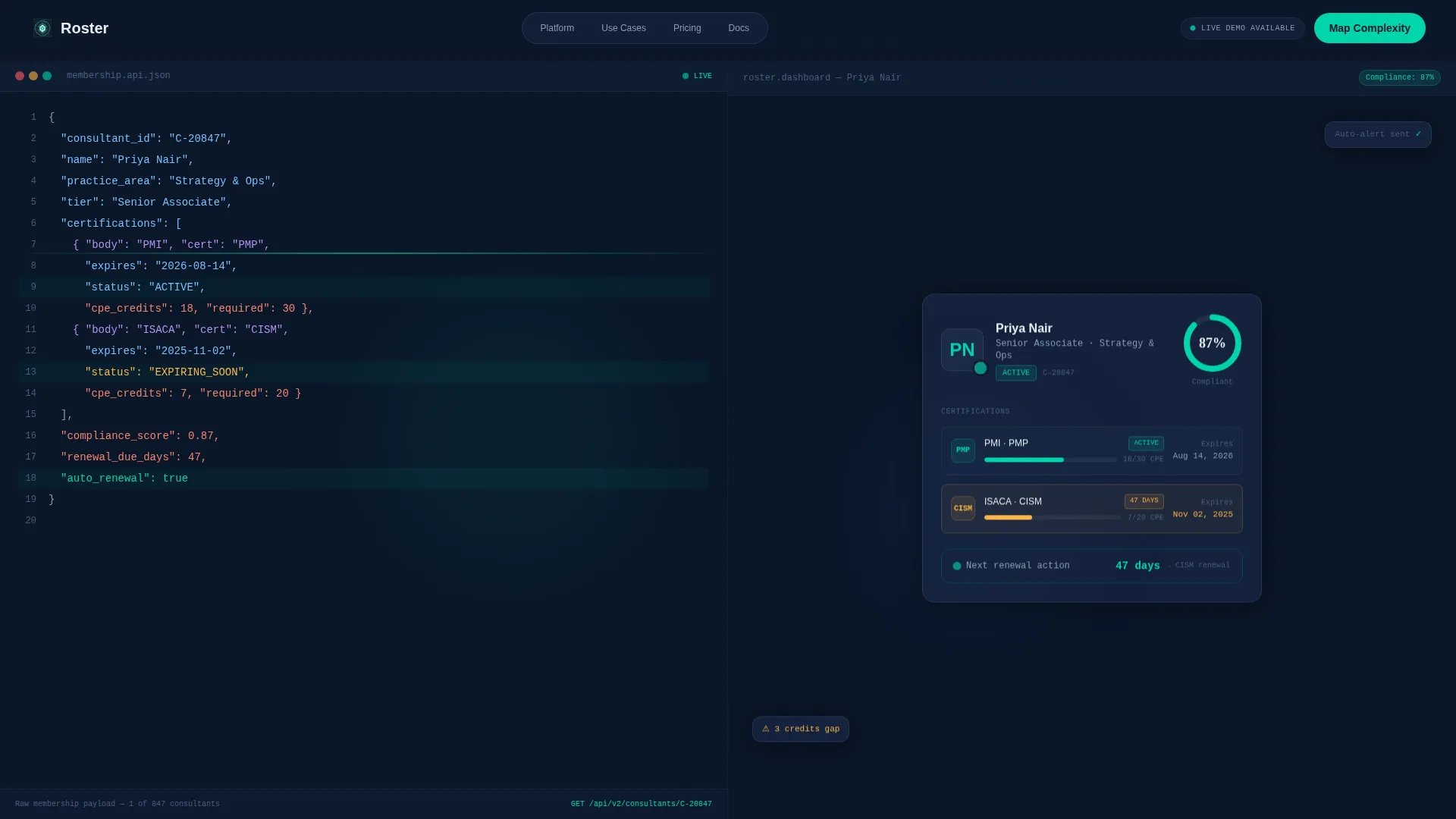
- A split-screen (50/50) header pairing a styled JSON or API code panel with a rendered dashboard card
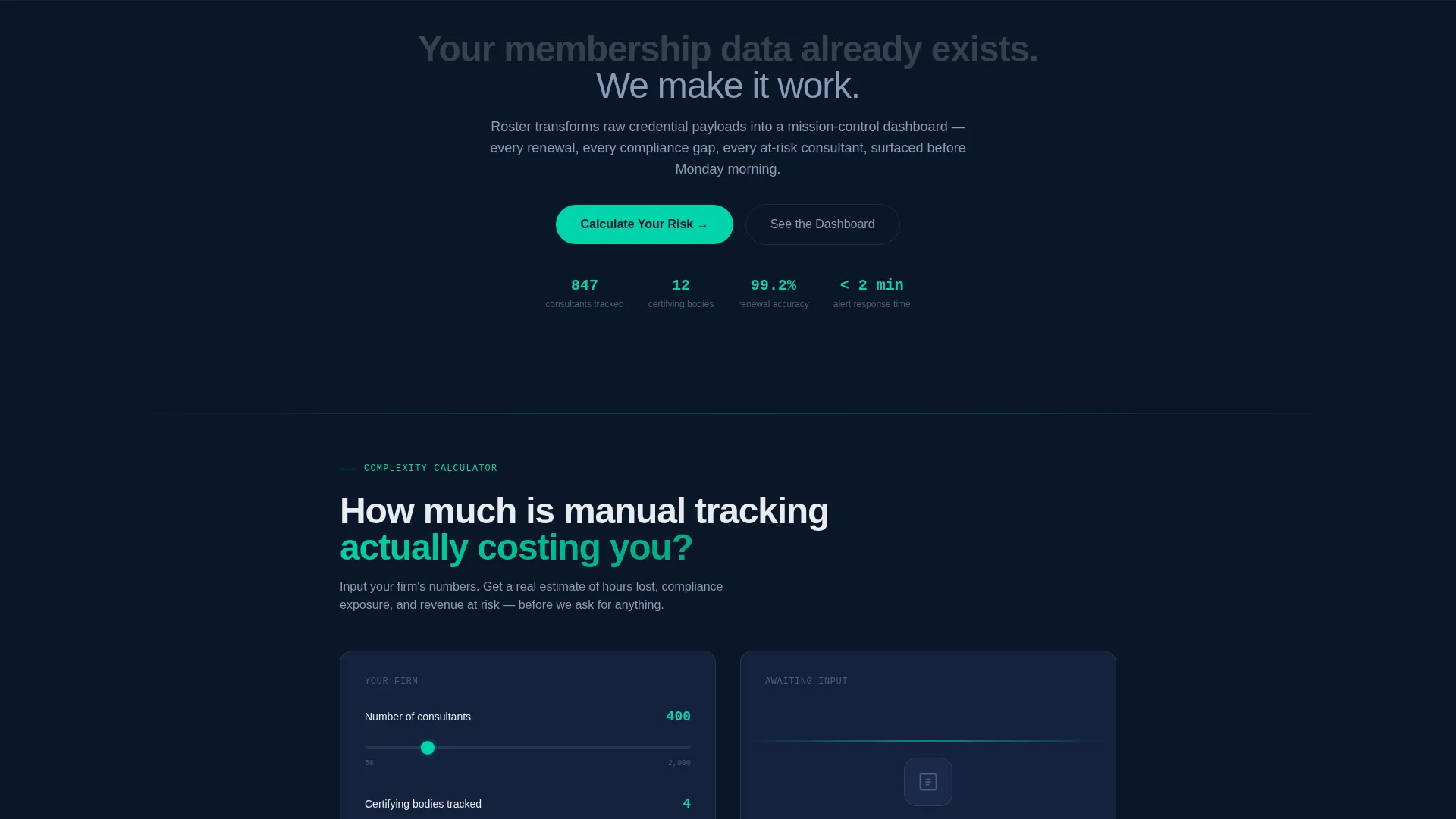
- An interactive membership complexity calculator with three inputs and three instant output metrics
- A qualification lead form with firm size, certifying body count, and a single open-text field
Feature list
This template's sections and components are drawn directly from the brief. Each one serves a specific conversion role in the buyer journey.
Split-Screen Code-to-Dashboard Header
The left half of the viewport displays a syntax-highlighted JSON membership object. Fields include consultant name, certification array, renewal dates, compliance status booleans, and tier level. The right half renders the same data as a polished dashboard card with a progress ring, a renewal countdown badge, and a consultant headshot placeholder. A headline fades in across both panels.
Interactive Membership Complexity Calculator
Visitors enter three inputs: number of consultants, number of certifying bodies tracked, and their current renewal workflow (manual, semi-automated, or automated). The tool instantly returns estimated hours lost per quarter, projected compliance risk percentage, and a cost-of-inaction figure. No contact information is required to see results.
Escalating Pain-to-Solution Section Pairs
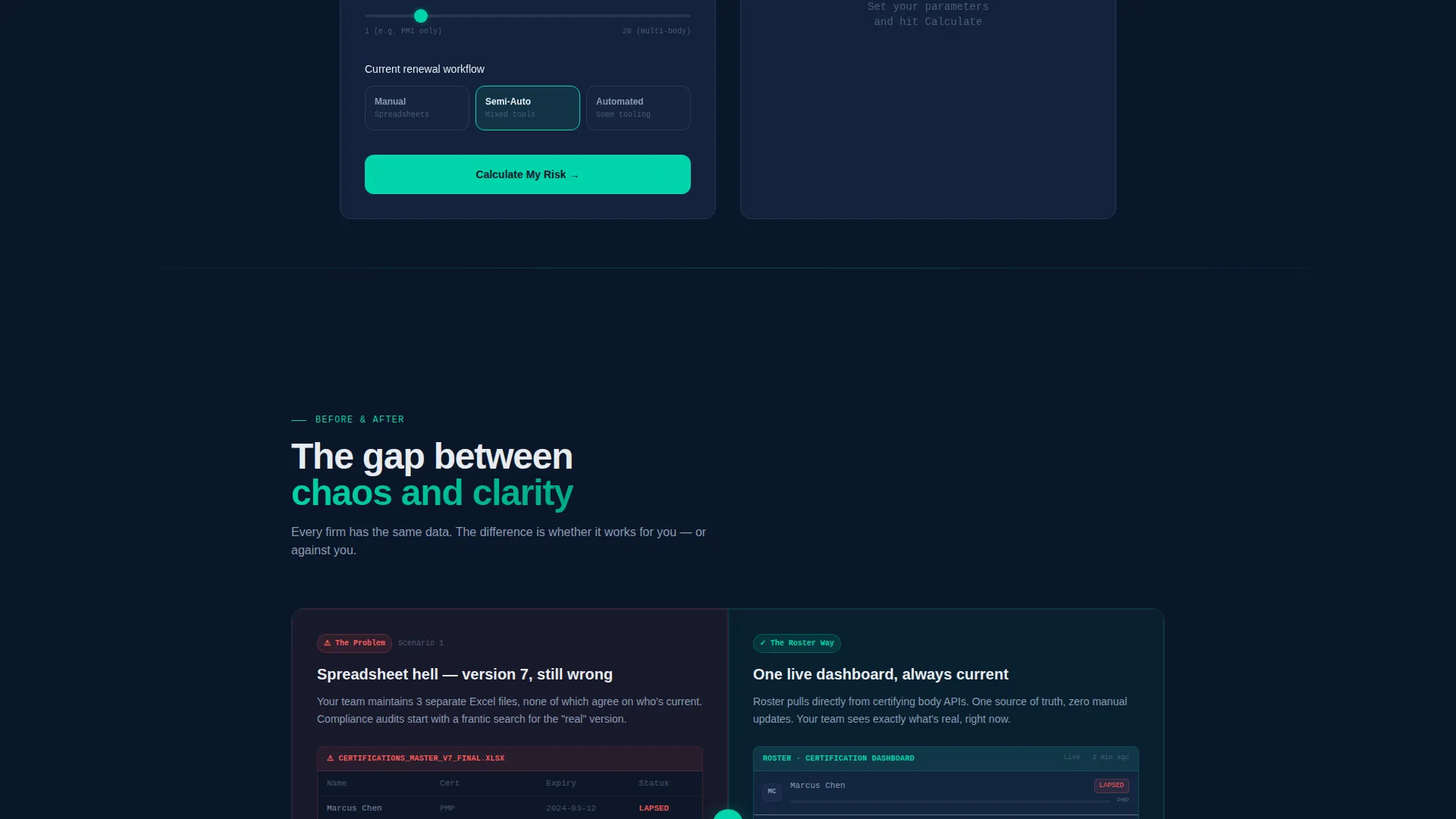
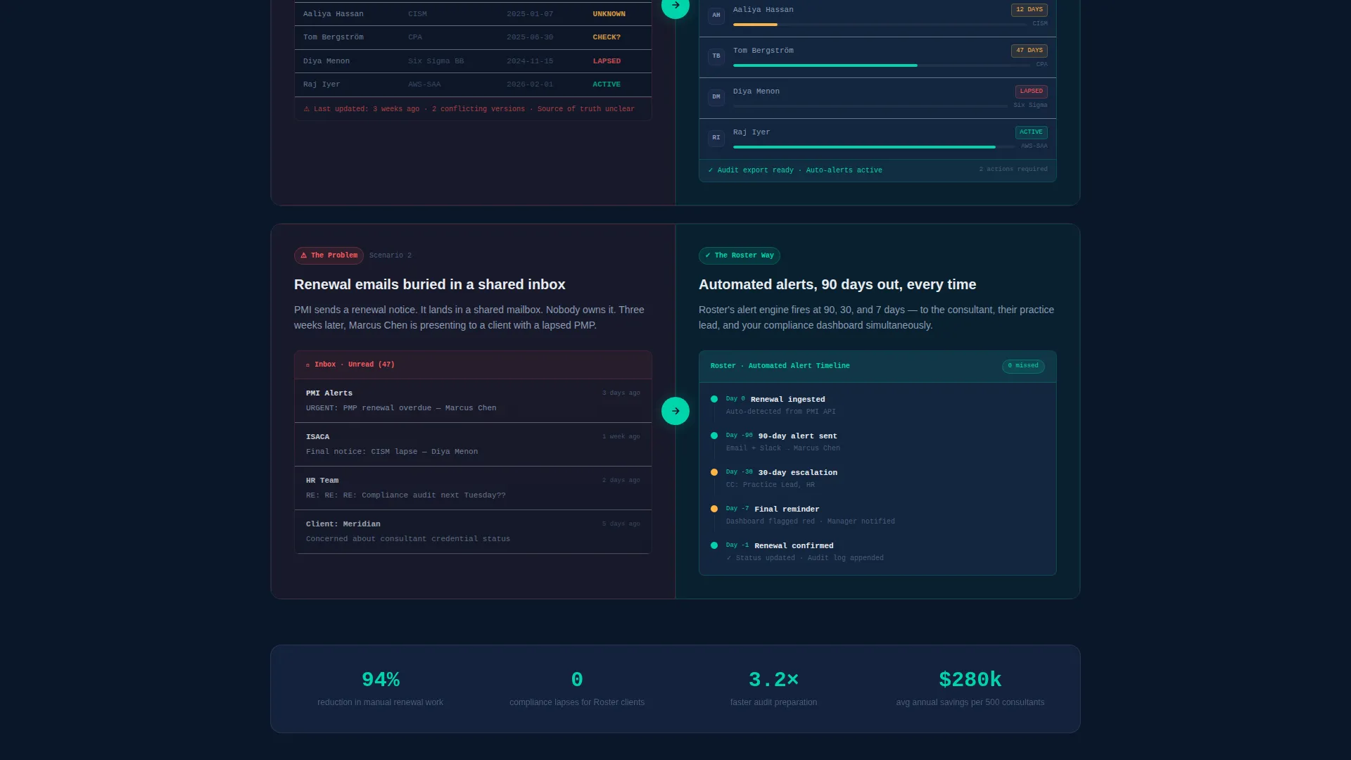
Each scroll section shows a split-screen pair. The left side presents the pain state, such as a chaotic spreadsheet screenshot, a missed renewal email chain, or a compliance audit letter. The right side shows the platform's answer, including a filtered dashboard view, an automated alert timeline, and an audit-ready export. Stakes deepen with each section.
Qualification Lead Form
The primary call to action, labeled "Map Your Membership Complexity," triggers a short form. Buyers select a firm size range, enter their number of certifying bodies, and describe their biggest membership headache in a single open field. The form appears after the calculator result, so visitors have already seen their own data before they are asked for contact details.
Secondary Demo Booking Flow
The calculator results page doubles as a secondary conversion point. A "See Your Dashboard in 15 Minutes" prompt lets qualified visitors book a live demo without navigating away. This creates two distinct conversion paths without competing for attention on the same screen.
Dashboard Pro Visual Theme
The Midnight Blue color system uses deep terminal navy as the primary background and muted slate for card surfaces. Signal teal marks active states, progress bars, and confirmation pulses. Interface white handles all typography and data labels. The combined effect is a mission-control aesthetic that feels engineered rather than decorative.
Page sections overview
| Section | Purpose |
|---|---|
| Split-screen header | Contrast raw data with dashboard intelligence and introduce the headline |
| Complexity calculator | Let visitors quantify their own tracking inefficiency before any pitch copy |
| Calculator results display | Anchor the page narrative with the visitor's own hours, risk, and cost figures |
| Pain-versus-solution panels | Escalate stakes from spreadsheet chaos to compliance risk to revenue loss |
| Feature dashboard panels | Show filtered dashboard view, alert timeline, and audit-ready export side by side |
| Lead generation form | Capture firm size, certifying body count, and biggest membership headache |
| Demo booking prompt | Convert calculator-primed visitors into live demo appointments |
Design & branding system
The Dashboard Pro theme uses a Midnight Blue color system that prioritizes cognitive clarity over decoration. Every color choice has a functional purpose rooted in data-dense interface design.
- Deep terminal navy (#0A1628) as the primary background; muted slate (#1B2A4A) for card surfaces and secondary panels
- Crisp interface white (#E8ECF1) for all typography and data labels to maintain legibility against dark surfaces
- Signal teal (#00D4AA) reserved for active states, progress bars, renewal countdown badges, and confirmation pulses
Mobile & speed optimization
The split-screen layout is designed with responsive reflow in mind. On smaller viewports, the 50/50 column structure adapts so neither the code panel nor the dashboard card loses its visual impact.
- The calculator inputs and output metrics are stacked vertically on mobile for clear interaction without horizontal scrolling
- Pain-versus-solution section pairs reflow from side-by-side columns to sequential blocks, preserving the narrative escalation on any screen size
How this template helps you convert
The page is structured so that every visitor who reaches the lead form has already invested in their own results. That self-investment dramatically reduces friction at the conversion point.
- The calculator quantifies the visitor's specific pain in hours, risk percentage, and cost before any contact information is requested, so the value exchange feels fair and earned
- The two-path conversion model (lead form and demo booking) captures buyers at different levels of readiness, reducing drop-off from visitors who are not yet ready to book but are willing to share context
Other information about this template
This template is categorized under Technology and the Consulting Firm Software subcategory, with a niche focus on consulting firm membership management. It is matched to a Calculator/Tool First creative direction, a Lead Generation landing page objective, and a Code Snippet header concept. The Dashboard Pro theme and Midnight Blue color system are intentional signals to a technical and operations-minded buyer audience. The Intersection Match Score for this template is 13, indicating strong alignment between the template style, theme, and niche context.
- Template style: Split Screen (50/50), single-page layout
- Header concept: Code Snippet with live JSON or API payload display
- Creative direction: Calculator/Tool First, with interactive complexity scoring before any pitch copy
- Landing page direction: Lead Generation with dual conversion paths
Theme
Dashboard Pro
Creative direction
Calculator/Tool First
Color system
Midnight Blue
Style
Split Screen (50/50)
Direction
Lead Generation
Page Sections
Split-screen Code-to-dashboard Header
Interactive Complexity Calculator
Escalating Pain-to-solution Panels
Qualification Lead Form
Dual Conversion Path Design
Dashboard Pro Midnight Blue Theme
Related questions
Who is this template built for?
Can I customize the calculator inputs and output metrics?
Do visitors have to give contact details before using the calculator?
What are the two conversion paths in this template?
What visual style does this template use?



