Funeral Vertical SaaS Directory Website Template
The Passage Funeral Management Software Comparison Landing Page Template is a high-impact, single-page layout built for funeral technology SaaS brands. It uses a Tech Glass visual system with a Stats Wall header, a 12-row operational comparison table, and a sticky call to action bar. The design is desktop-first, built for directors who need to see the case for switching before 8 a.m.
by Rocket studio
Quick Summary
This is the Passage funeral management software comparison landing page template. It delivers a dark, glass-panel aesthetic with animated metrics, a full competitor comparison table, and a sticky call to action bar. It is built specifically for funeral vertical SaaS brands that want high converting landing pages that move directors from skepticism to demo booking without a single stock sympathy photo in sight.
Who This Template Is For
This landing page template is designed for funeral management software companies targeting independent and regional funeral home operators. It speaks directly to the directors who are done with the clipboard-and-fax workflow and need a compelling headline to confirm the switch is worth making.
- Independent funeral home owners running two to five locations who want a cost effective way to show platform value at a glance
- Regional chain operations managers evaluating tools across state lines who need clear, essential information before committing to a demo
- SaaS marketing teams in the funeral vertical who are creating competitor comparison pages and need a ready-built, conversion-focused framework
What Problem This Template Solves
Funeral management software companies often struggle to communicate the depth of their platform to a target audience that is deeply skeptical of software sales pages. A generic landing page fails to reflect the real operational chaos these directors face every morning. Potential customers bounce because they cannot quickly grasp why switching matters.
- There is no comparison page that speaks the operational language of a funeral director juggling arrangement workflows, fleet dispatch, and grief resource automation simultaneously
- Most SaaS comparison pages rely on abstract feature bullets rather than a row-by-row side by side comparison that makes the decision making process obvious
- Funeral home landing pages rarely earn the demo click because they fail to show the visitor their own daily pain reflected in the content flow
What You Get With This Template
This template gives you a fully structured, scroll-driven landing page built around evidence and operational specificity. Every section is designed to push a skeptical director closer to clicking the call to action. The design system, layout logic, and copywriting structure are all included and ready to adapt.
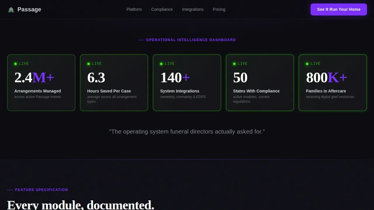
- A Stats Wall header with five animated metrics inside frosted glass cards, plus a full 12-row competitor comparison table that covers arrangement workflow, inventory tracking, fleet dispatch, and more
- A sticky bottom bar with a persistent call to action, a ghost-button secondary path for email capture, and a footer built to the Linear Single-Row pattern
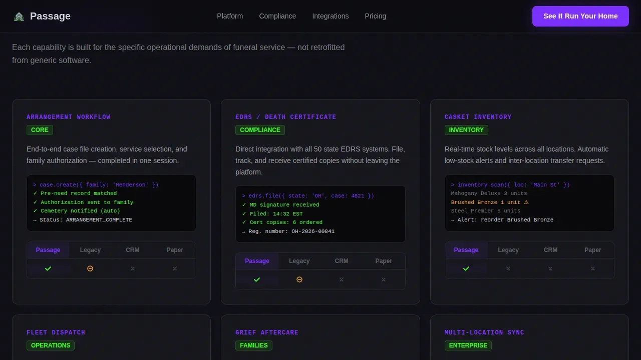
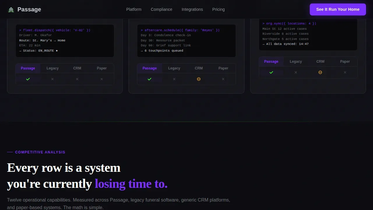
- Feature module cards styled as technical specification blocks, each with a capability name, a function description, a micro-screenshot slot, and a competitor checkmark grid
Feature List
This template ships with six core design and layout capabilities drawn directly from the source brief. Each one serves a specific conversion role in the funeral vertical SaaS context.
Animated Stats Wall Header
The header opens with five oversized numbers that animate upward against a void black background. Each metric sits inside a frosted glass card with a phosphor-green pulse border. There is no hero image. The visual layout leads with hard data, not stock photography, giving new visitors an immediate sense of platform scale.
12-Row Operational Comparison Table
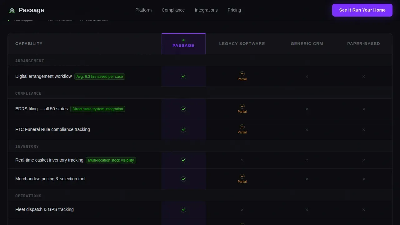
The comparison table is the structural anchor of the landing page. It runs a side by side comparison of the platform against legacy software, generic CRM tools, and paper-based systems across twelve operational rows. Rows cover arrangement workflow, Electronic Death Registration System (EDRS) filing, inventory tracking, fleet dispatch, grief resource automation, and multi-location sync, among others. Visitors can quickly grasp where competitors fall short.
Technical Specification Feature Cards
Each feature module is presented as a spec card with a capability name, a one-line function description, a micro-screenshot slot, and a checkmark grid for competitor tiers. The card format gives potential buyers a product teardown feeling rather than a marketing pitch. This user friendly design helps directors evaluate the platforms stack row by row without guesswork.
Sticky Call to Action Bar
A persistent sticky bar enters the viewport after the comparison table and stays visible during the scroll. The primary call to action, "See It Run Your Home," routes directly to a personalized demo booking page. There is no contact form on the page. This keeps the content flow clean and the path to conversion direct.
Ghost-Button Email Capture Path
A secondary ghost button labeled "Download the Full Spec Sheet" gives potential customers a lower-commitment entry point. It captures an email address before delivering a PDF. This provides a second conversion lane without cluttering the primary call to action hierarchy.
Scroll-Reveal Animation System
The template includes high-animation behavior: count-up numbers in the header, phosphor-green pulse borders on glass cards, scroll-reveal stagger on feature modules, and a sticky bar entrance animation. These design elements are built using Client Components for interactive behavior, with Server Components handling the static layout for performance balance.
Page Sections Overview
| Section | Purpose |
|---|---|
| Stats Wall Header | Opens with five animated oversized metrics inside frosted glass cards and a single tagline |
| Feature Module Cards | Presents platform capabilities as technical spec cards with competitor checkmark grids |
| Comparison Table | Delivers a 12-row operational comparison against legacy, CRM, and paper-based systems |
| Call to Action Section | Houses the primary demo call to action and secondary ghost-button email capture path |
| Sticky Bottom Bar | Keeps the primary call to action visible after the comparison table scroll |
| Linear Footer | Closes the page with a single-row footer pattern |
Design & Branding System
The visual identity follows a Tech Glass theme built on the Acid Digital color system. Every design choice reinforces the feeling of a server room running at midnight: clinical, alive, and precise. The design features frosted glass cards and neon accent borders that give the page a premium, technical authority.
- Color palette: electric violet (#7B2FFF) for primary actions and active states, deep void black (#0B0B0F) for all background panels, phosphor green (#39FF14) for live data indicators and success states, and frosted titanium (#D0D3DC) for body text and table borders
- Typography: DM Sans for body copy and interface elements, Fraunces as the display serif for moments that need emotional weight
- Borders and glass panels use phosphor-green pulse animations to signal live data, keeping the page visually appealing without relying on high quality images or photography
Mobile & Speed Optimization
The template is desktop-first by design. Funeral directors working at back-office desks in the early morning hours are the primary users. That said, the layout is structured to remain readable on mobile devices without breaking the comparison table logic.
- Server Components handle all static layout sections, reducing the JavaScript payload delivered to mobile devices and keeping the initial load lean
- Client Components are scoped to animations and sticky bar behavior, so interactive design elements do not block the page render on slower connections
- Mobile optimization considerations are built into the grid structure, ensuring the comparison table and spec cards reflow cleanly on smaller viewports
How This Template Helps You Convert
The page earns the click through accumulated evidence. Every scroll builds the case. By the time a director reaches the call to action, they have seen their own operational chaos reflected in twelve comparison rows. A compelling headline, a strong visual rhythm, and a transparent communication of platform value work together to move skeptical visitors toward action.
- The Stats Wall opens with a concise headline and five hard metrics, immediately establishing platform credibility. This gives potential customers the context they need to keep reading, rather than bouncing at the fold.
- The comparison table delivers the key benefits row by row. Each row the visitor passes adds to the evidence stack. By the time they reach the call to action section, the decision making process feels complete rather than rushed.
- The sticky call to action bar and ghost-button secondary path ensure that no matter where a visitor stops scrolling, there is always a clear next step available. This structure is what separates high converting landing pages from pages that just inform.
Other Information About This Template
This template is designed for SaaS companies operating in the funeral vertical. It draws on the broader logic of saas comparison page design to build a landing page that functions as a comprehensive guide to platform differentiation. Understanding a few additional details will help you customize and launch it effectively.
- The page is localized for USA usage: USD currency, MM/DD/YYYY date format, and U.S.-specific compliance references such as the fifty-state active compliance module count
- This template does not include a built-in online editor for funeral program production; however, its comparison rows can be adapted to cover funeral program templates and document workflow features if those are relevant to your platform
- Funeral programs are a meaningful keepsake for family members who attend a funeral service. A well-structured funeral program typically includes the order of service, an obituary, closing remarks, and personal tributes. These are common outputs that funeral management platforms help directors prepare and distribute
- A funeral program serves as both a guide for the service and a lasting tribute. Many families use funeral program templates built in tools like google docs or microsoft word when their funeral home does not offer a digital alternative. Some directors rely on a local print shop or professional printing service for the final output
- Funeral program printing and printing costs are real concerns for independent funeral home owners. Professional prints from a professional printing service can range widely in price. A platform that helps directors prepare program template content digitally can reduce printing costs and eliminate last-minute errors
- The graveside service is one context where a printed funeral program is especially valued; attendees standing outdoors need a clear order of service in hand. A program template with ample room for photos, personal touches, and closing remarks handles this well
- When comparing funeral management software, user experience is a critical factor. Platforms like Passare, which is a prominent cloud-based all-in-one funeral management solution focusing on collaboration, include a Planning Center that allows families to collaborate online, upload photos, and write obituaries. Parting Pro specializes in making the first call and initial virtual and paperless arrangements easier. Gather is often viewed as more modern and intuitive, particularly with its mobile app and digital whiteboard for scheduling. Osiris offers deeper financial and accounting integrations, while Passare focuses on the arrangement process. Passare also offers thirty or more integrations including connections with QuickBooks and other accounting software
- When customizing this template, teams can add photos to the comparison table rows, adjust the metrics in the Stats Wall to reflect their own data, and swap the feature card copy to reflect their actual platforms stack
- A memorial website can serve as a digital complement to the printed funeral program. Many funeral homes now offer a memorial website alongside printed materials to give other families and friends a space to share memories
- The template supports transparent communication by presenting every comparison row honestly. The best competitor comparison landing pages are clear, honest, and backed by useful information. Showcasing testimonials alongside the comparison table highlights customer testimonials and reinforces platform credibility
- For teams that want more inspiration on competitor comparison landing pages, the page structure here follows established best practices: a compelling headline, a structured comparison table, key features, social proof, and a strong call to action. Creating competitor comparison pages in this way is a smart way to guide potential buyers toward a decision
- Tracking tools like google analytics can be connected to the page to monitor bounce rates, scroll depth, and call to action click-through rates. Regularly reviewing these metrics can significantly improve conversion performance over time
Theme
Tech Glass
Creative direction
Spec Sheet
Color system
Acid Digital
Direction
Click-Through
Page Sections
Animated Stats Wall Header
Row Operational Comparison Table
Technical Specification Feature Cards
Sticky Call to Action Bar
Ghost-button Email Capture Path
Scroll-reveal Animation System
Related questions
What is a competitor comparison landing page?
How do you create a really good landing page for funeral management software?
How can funeral services be advertised effectively online?
What are examples of funeral program wording?



