Higher Education Digital Presence Specialist Cost Calculator Website Template
This higher education digital menu landing page template replaces static PDF course catalogs with a living, interactive program explorer. Built around a Course Path Estimator, it lets students browse degrees, minors, and certificates the way they actually think. The template follows a Dashboard and Data Grid style with a Dynamic Motion theme and an AI Iridescent color system.
by Rocket studio
Quick summary
This template turns a university's course catalog into a fully interactive digital experience. Visitors use an embedded Course Path Estimator to filter programs, compare outcomes, and simulate a four-year plan, all before ever seeing a sign-up form. It is built for higher education institutions ready to replace clunky portals with a tool that earns enrollment interest on the spot.
Who this template is for
This template is designed for higher education professionals who own the student enrollment experience. If your institution still relies on PDF catalogs or buried registration links, this template is your replacement.
- Registrars managing advising bottlenecks who need a self-service program discovery tool for students
- Provosts and academic leaders focused on reducing time-to-degree by surfacing program paths clearly
- Enrollment marketing directors losing prospective students to confusing portals before they find the right program
What problem this template solves
Universities produce enormous amounts of program information, but it is rarely organized the way a student searches for it. Prospective students bounce from portals before they find a program worth applying to. This template solves that gap directly.
- Replaces sprawling PDF course catalogs with a searchable, filterable digital menu of degrees, minors, certificates, and electives
- Eliminates registration link dead ends by placing program data, credit counts, estimated costs, and career outcomes directly in front of the visitor
- Reduces advising load by letting students self-navigate program comparisons and four-year schedule simulations without staff intervention
What you get with this template
You get a single-page landing experience structured entirely around progressive interaction. Each scroll segment deepens the visitor's query, moving them from curiosity to comparison to planning to commitment.
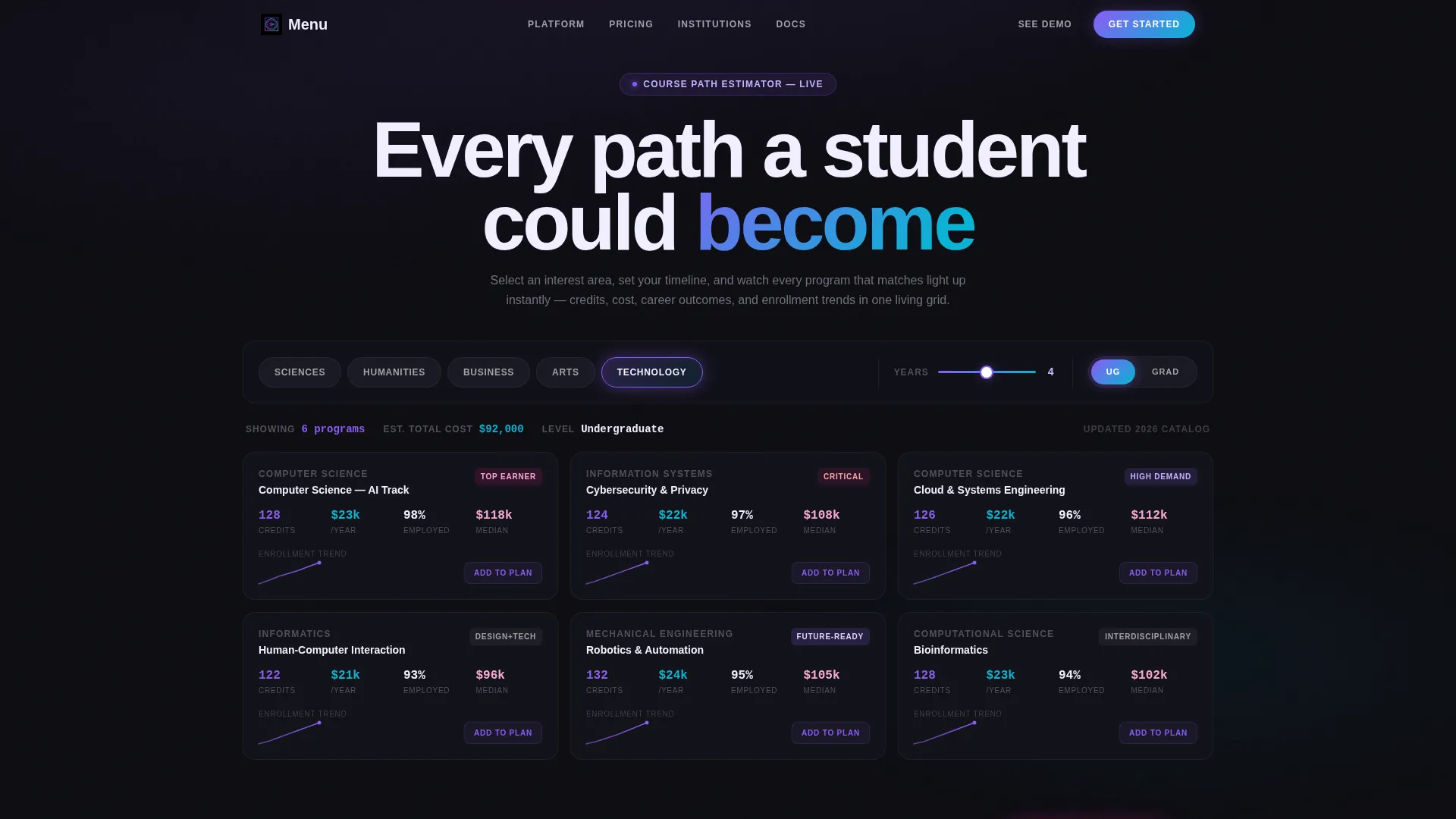
- A fully functional Course Path Estimator embedded above the fold, with a radial interest menu, a years-to-complete slider, and an undergraduate or graduate toggle
- An animated data grid that populates program names, credit counts, estimated costs, career outcome percentages, and enrollment trend sparklines with staggered easing
- A side-by-side program comparison section, a drag-and-drop four-year schedule simulator, and a financial aid recalculation overlay, all scroll-triggered and data-responsive
Feature list
This template packages its core value into four deeply interactive sections. Each feature is built to keep the visitor inside the tool, not reading about it.
Course Path Estimator Header
The header is the product. Visitors choose an interest area from a radial menu covering Sciences, Humanities, Business, Arts, and Technology. They drag a slider for years to complete and toggle between undergraduate and graduate levels. A live data grid responds instantly with matching programs.
Animated Program Data Grid
Each program card animates in with staggered easing and catches a faint iridescent edge-light as it lands. The grid displays program names, credit counts, estimated cost, career outcome percentages, and a small sparkline showing enrollment trend. No stock photography competes for attention, the data is the visual.
Side-by-Side Program Comparison
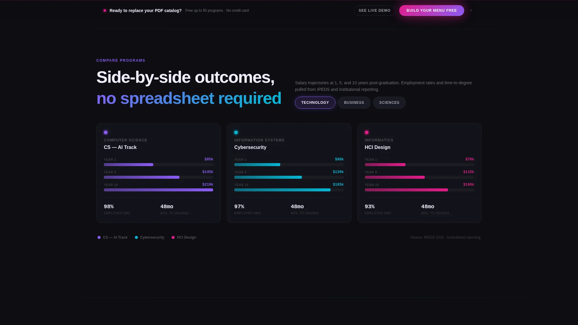
Section two lets visitors compare up to three programs at once. Animated bar charts display salary outcomes and time-to-degree side by side. The layout makes tradeoffs visible at a glance, so a student can move from curiosity to a real decision without leaving the page.
Drag-and-Drop Schedule Simulator
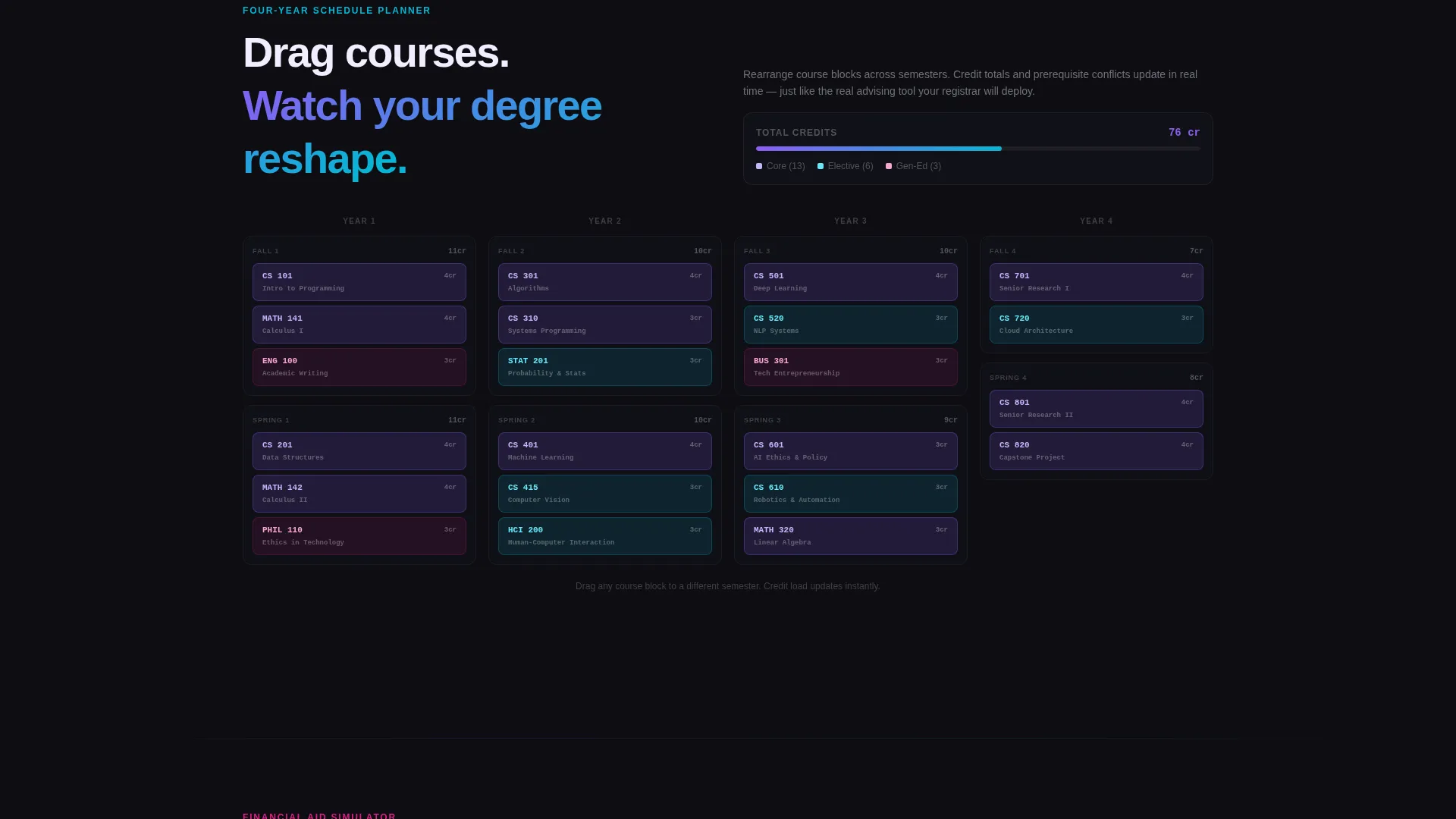
Section three renders a four-year course schedule as draggable blocks. Visitors rearrange course blocks in real time to see how their path shifts. The interaction reinforces a sense of ownership over the plan before any commitment is made.
Financial Aid Recalculator
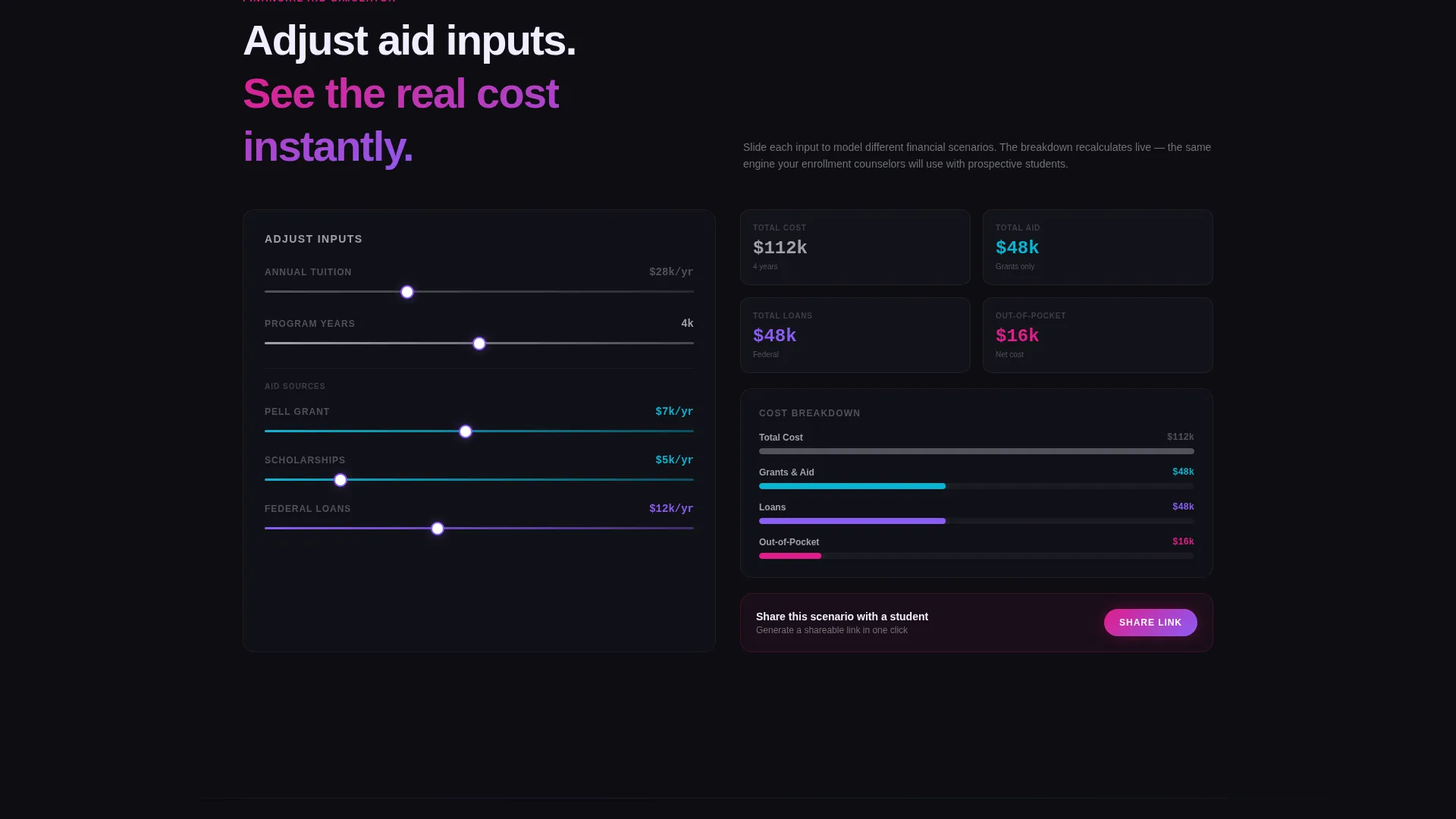
Section four overlays financial aid scenarios onto the program data. Input fields recalculate costs as values change, giving visitors a personalized affordability view. The motion stays purposeful, numbers update because the data is responding, not for visual spectacle.
Pinned Freemium Conversion Bar
After the first interaction, a signal magenta call-to-action bar pins to the bottom of the viewport. It reads "Build Your Menu Free" and stays visible through all scroll segments. The sign-up form asks only for institution name, a dot-edu email address, and estimated program count, three fields, no credit card required.
Page sections overview
| Section | Purpose |
|---|---|
| Course Path Estimator | Above-the-fold interactive header tool for filtering programs by interest, duration, and level |
| Animated Data Grid | Live program results panel showing credits, cost, outcomes, and enrollment trend sparklines |
| Program Comparison Panel | Side-by-side animated bar chart view comparing salary outcomes and time-to-degree for up to three programs |
| Schedule Simulator | Drag-and-drop four-year course block planner that rearranges in real time |
| Financial Aid Overlay | Input-driven cost recalculator that adjusts aid scenarios as visitor values change |
| Pinned Conversion Bar | Sticky signal magenta call to action bar with three-field freemium sign-up form |
| Live Demo Link | Secondary conversion path linking to a working campus menu demo instance |
Design & branding system
The visual identity follows a Dynamic Motion theme built on an AI Iridescent color system. The palette feels like light refracting through a prism onto a dark desk, accents appear only when you interact, and the background stays almost entirely dark.
- Core colors: deep obsidian (#0D0D12) for backgrounds, holographic violet (#8B5CF6) and electric cyan (#06B6D4) for interactive accent gradients, soft pearl (#F0EEFF) for card surfaces, signal magenta (#E11D8A) for conversion moments, and cool gray (#A1A1AA) for data text
- Motion principles: animations are data-responsive, not decorative; each element moves because the visitor triggered a change, giving the interface a sense of active intelligence
- No campus photography or lifestyle imagery is used; the tool itself carries all visual weight through iridescent transitions and staggered card animations
Mobile & speed optimization
The template is designed to keep the interactive experience intact across screen sizes. Heavy visual components are structured so they remain navigable on smaller viewports without losing the core tool functionality.
- The radial interest menu, program grid, and comparison charts are laid out to reflow naturally for tablet and mobile screen widths
- Staggered card animations are timed to feel fluid rather than heavy, keeping the data grid readable as it populates on any device
How this template helps you convert
The conversion strategy is built on earned trust. The visitor uses the product before they ever see a sign-up form, which removes the barrier between skepticism and action.
- The Course Path Estimator delivers immediate, personalized program results above the fold, so the visitor experiences the product's value within seconds of arriving
- The pinned "Build Your Menu Free" bar appears only after the first interaction, making the ask feel timely rather than intrusive, and the three-field form removes every friction point that typically kills freemium sign-ups
- A secondary "See a Live Campus Menu" link gives cautious registrars a fully working demo to explore before committing, bridging the gap between interest and institutional buy-in
Other information about this template
This template is part of a broader higher education digital presence category, sitting at the intersection of technology and enrollment experience design. It is well suited for institutions evaluating modern alternatives to legacy course catalog systems.
- The free tier supports uploading up to 50 programs and generates a shareable digital menu link, giving institutions a tangible deliverable before any purchase decision
- The Dashboard and Data Grid template style makes this layout transferable to other data-heavy education contexts, such as certificate program directories or continuing education catalogs
- This template is built for the higher education digital menu niche and is designed to serve the full enrollment funnel: awareness, exploration, comparison, and conversion
Theme
Dynamic Motion
Creative direction
Calculator/Tool First
Color system
AI Iridescent
Style
Dashboard/Data Grid
Direction
Freemium/Trial
Page Sections
Course Path Estimator with Radial Menu
Animated Data Grid with Sparklines
Side-by-side Program Comparison
Drag-and-drop Schedule Simulator
Financial Aid Recalculation Overlay
Pinned Freemium Conversion Bar
Related questions
What kind of institution is this template designed for?
Does the template require a credit card to get started?
Can prospective students compare programs before signing up?
What does the free tier include?
Is there a way to see the tool working before committing?



