Menu - Powerful Homeservices Landing Page Template
Menu is a dark-glass dashboard landing page built for the home services market. It replaces the chaos of scattered referrals and frantic searches with a single, organized interface. The design follows a Carbon Fiber color system, a Problem-to-Solution scroll arc, and a three-step lead capture form that earns the click before it asks for anything.
by Rocket studio
Quick summary
Menu is a Dashboard/Data Grid landing page template designed for the home services niche. It presents every service category a household needs inside a sleek, frosted dark-glass interface. The scroll arc moves from visible chaos to calm control, and the built-in three-step form converts visitors into leads without friction.
Who this template is for
This template is built for anyone who connects homeowners with reliable service providers. It works equally well as a business tool and a client-facing product.
- New homeowners who want one organized place to find vetted home service professionals
- Property managers who handle maintenance requests across multiple units
- Real estate agents who want to give buyers a practical, polished resource after closing
What problem this template solves
Finding a trustworthy home service provider under pressure is stressful. People resort to frantic searches, expired deal sites, and half-remembered referrals. This template addresses that friction head-on.
- Replaces scattered bookmarks, fridge magnets, and word-of-mouth guesses with one organized interface
- Removes the uncertainty around licensing, ratings, and response times by surfacing those details in each provider card
- Eliminates decision paralysis by grouping services into clear categories with visible availability counts
What you get with this template
You get a fully structured single-page layout with a defined visual identity, a lead generation flow, and a scroll arc designed to build trust before asking for anything.
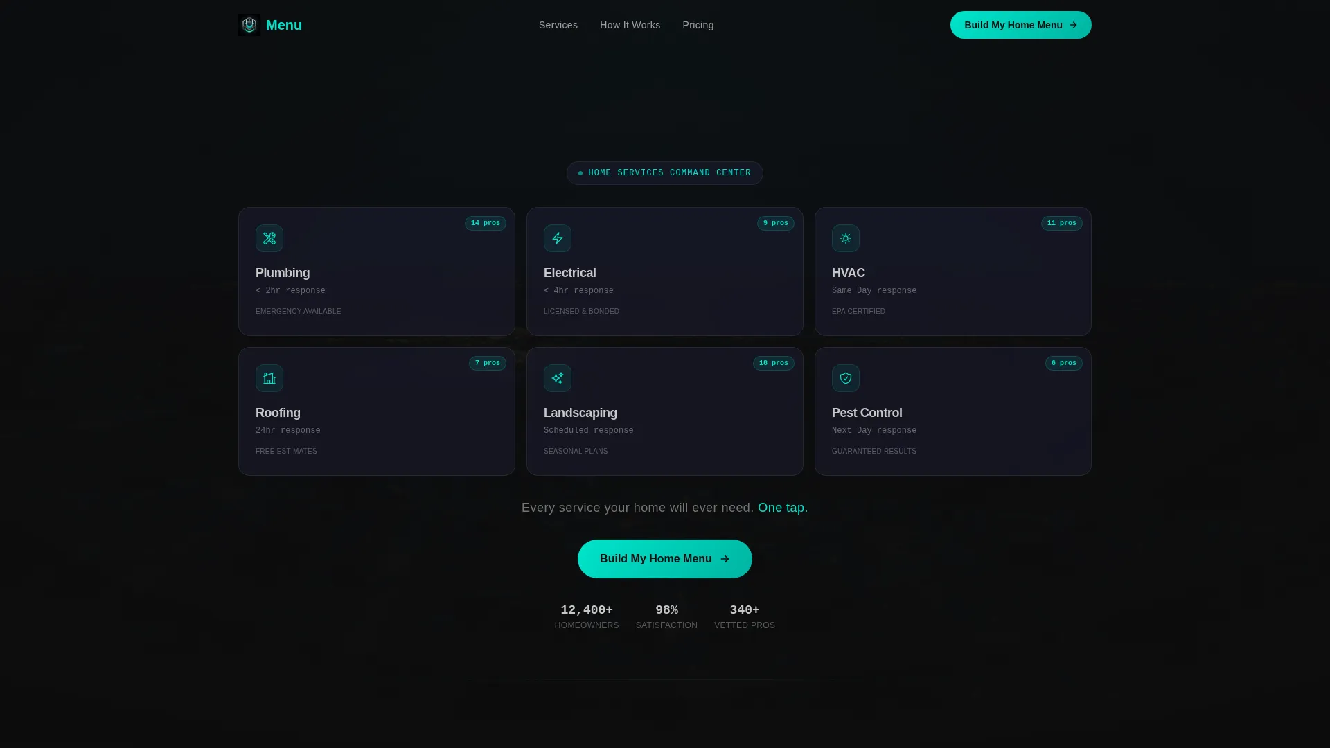
- A dark-glass header grid with six service category cards, each showing a teal line icon and a provider count badge
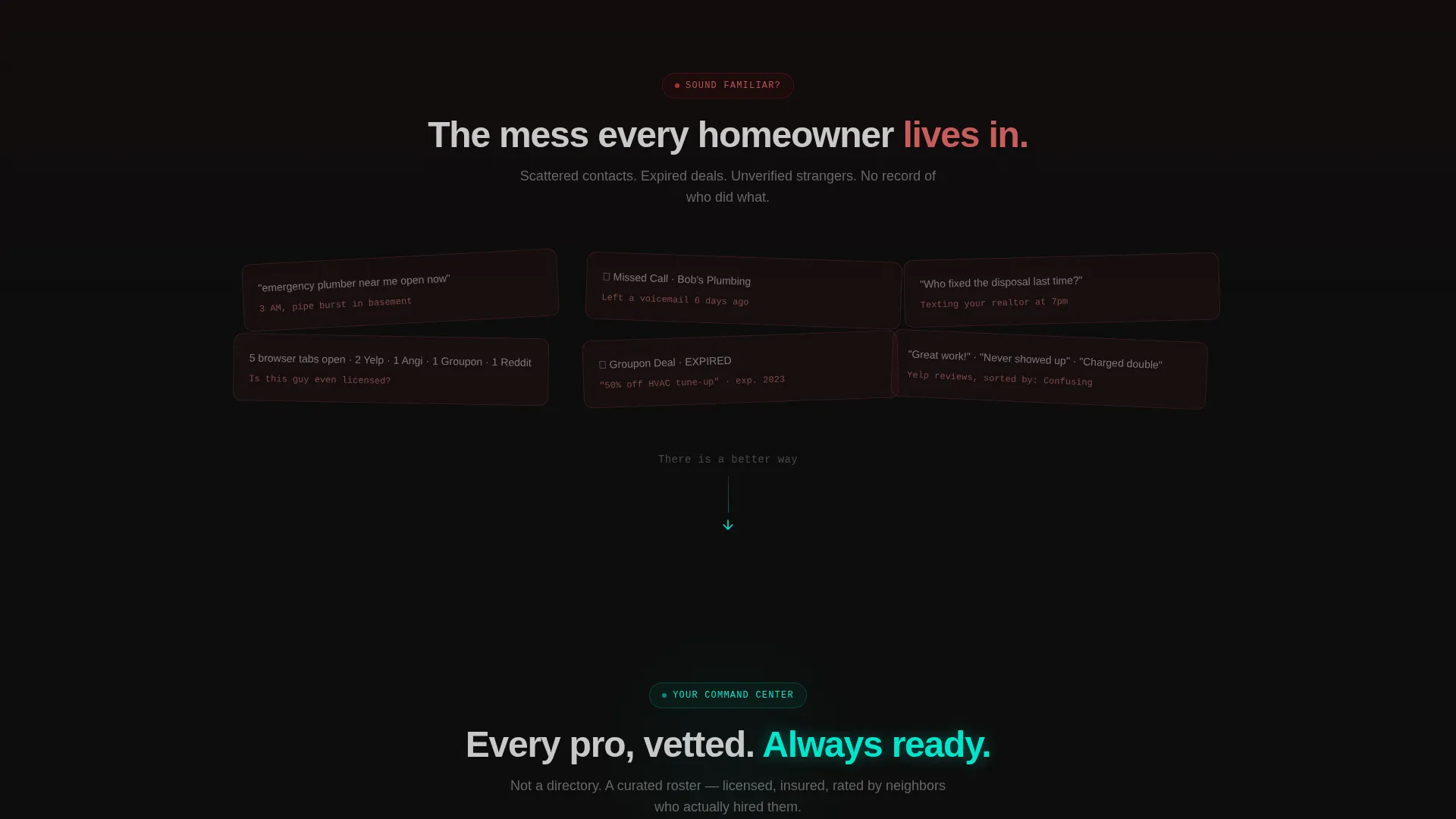
- A Problem-to-Solution scroll arc that transitions from a chaos mosaic to a clean dashboard, reinforcing the value of the product
- A three-step progressive lead capture form covering location, service needs, and contact details
Feature list
This template ships with a set of purpose-built components. Each one serves the Directory and Discovery theme and the lead generation objective.
Dark Glass Header Grid
The header presents six service category cards arranged in a dashboard-style grid. Each card carries a minimal teal line icon and a subtle badge showing available providers. The grid floats over a blurred aerial dusk photograph, and a single line of aluminum-gray type appears below it after a brief pause.
Problem-to-Solution Scroll Arc
The page opens below the fold with a chaos section: skewed screenshots of unanswered calls, browser tab overload, and expired deals, all red-tinted and captioned with real homeowner pain lines. A horizontal wipe transition then clears the screen and reveals the organized dark-glass grid, making the product's value immediately tangible.
Expanded Provider Card Dashboard
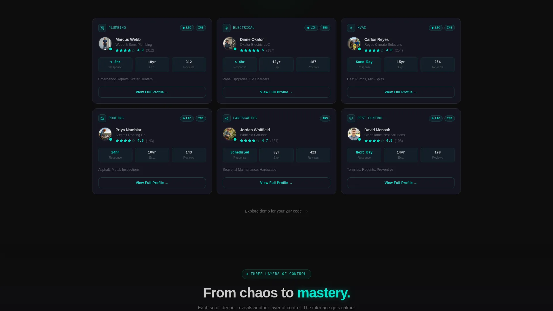
As the visitor scrolls deeper, each service category opens into a mini-dashboard. Provider cards show ratings, estimated response times, and verified license badges, giving the interface a sense of real, useful depth.
Three-Step Progressive Lead Form
The lead capture sequence is split into three focused steps. Step one collects ZIP code and home type. Step two presents a checkbox grid of service categories. Step three captures name and email with an optional phone field. This structure reduces drop-off by keeping each screen simple.
Live Demo Exploration Path
A secondary call-to-action lets visitors skip the form entirely and explore a sample address grid. This builds familiarity and confidence before any commitment is required.
Persistent Mobile Call-to-Action Bar
On mobile, the primary call-to-action, reading "Build My Home Menu," stays pinned to the bottom of the screen as a persistent bar. This ensures the conversion entry point is always one tap away regardless of scroll position.
Page sections overview
| Section | Purpose |
|---|---|
| Dark Glass Header | Displays the service category grid as the primary visual hook |
| Chaos Mosaic Section | Shows the problem state with red-tinted screenshots and pain captions |
| Wipe Transition | Marks the visual shift from chaos to the organized interface |
| Expanded Grid Dashboard | Reveals provider cards with ratings, response times, and license badges |
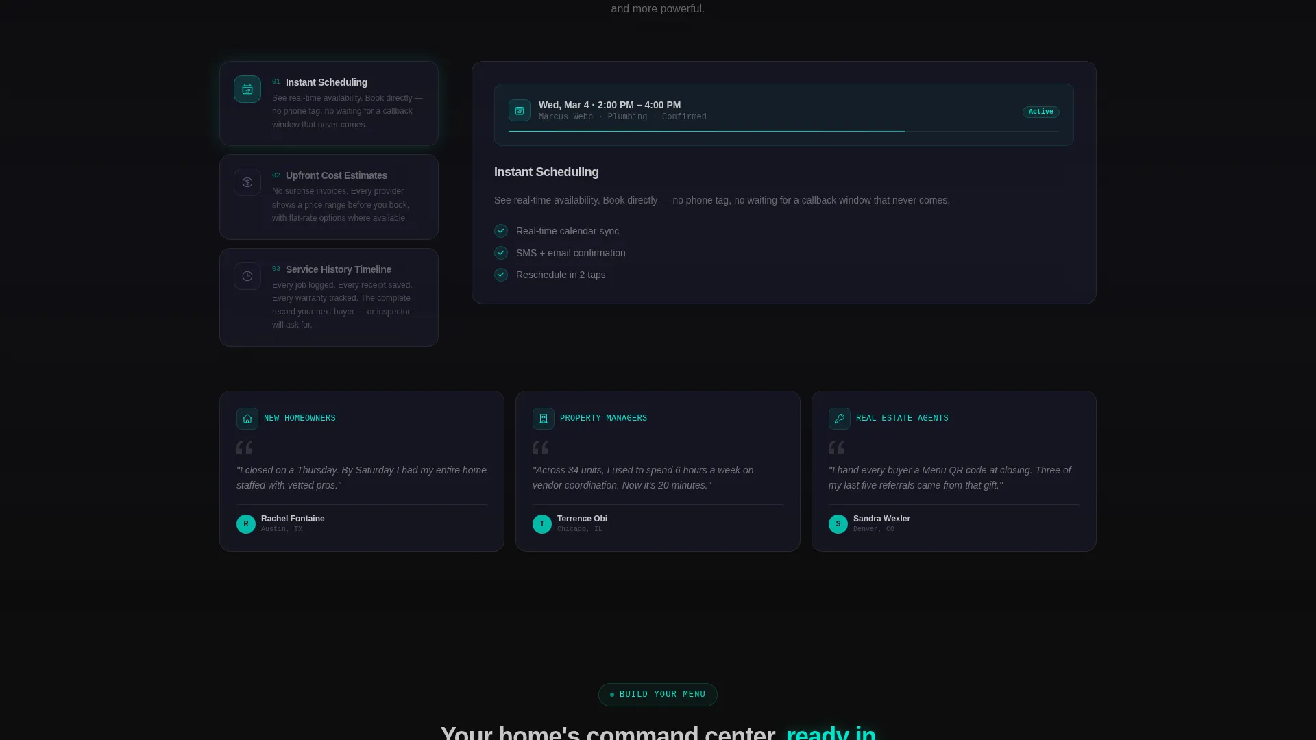
| Scheduling and Estimates | Shows scheduling tools, cost estimate displays, and service history timelines |
| Three-Step Lead Form | Captures ZIP, service needs, and contact details in a progressive sequence |
| Demo Exploration Path | Lets visitors preview a sample grid before committing to the form |
| Persistent call to action Bar | Keeps the mobile call-to-action visible at all scroll depths |
Design & branding system
The visual identity follows a Carbon Fiber color system built around deep, technical tones. Every color decision reinforces the sense of a premium, controlled interface.
- Base backgrounds sit in the deep cockpit black (#0D0D0D) to woven graphite (#1A1A2E) range, keeping the interface dark and focused
- Body text renders in brushed aluminum gray (#A0A0A0), with electric teal (#00E5CC) reserved strictly for interactive states such as toggles, category chips, hover pulses, and the call-to-action glow
- The overall aesthetic follows a Directory and Discovery theme: technically precise, tactile, and minimal, like the center console of a luxury vehicle
Mobile & speed optimization
The template is structured with a mobile-first conversion path in mind. The layout adapts the desktop grid into a scrollable, tap-friendly experience.
- The persistent bottom bar keeps the "Build My Home Menu" call-to-action reachable on mobile without requiring the user to scroll back up
- Card grids and provider dashboards reflow into single-column stacks on smaller screens, maintaining readability across device sizes
How this template helps you convert
The conversion strategy is built into the scroll experience itself. The page earns the click by demonstrating value before it asks for anything.
- The header grid shows the finished product immediately, so visitors understand the offer before reading a single line of body copy
- The Problem-to-Solution arc makes the pain of the current situation vivid, then resolves it visually, creating emotional momentum toward the call-to-action
- The three-step form breaks the commitment into small, low-friction steps, and the live demo path provides a zero-pressure alternative for hesitant visitors
Other information about this template
This template fits within the broader home services digital presence category. It is particularly well suited for anyone building a home services digital menu product or directory.
- The template style is Dashboard/Data Grid, making it suitable for service-directory products and digital concierge concepts
- The Directory and Discovery theme means the layout can support multiple service verticals without feeling cluttered
- This template works well as a home services landing page for companies targeting recently closed homeowners or property management firms
- The Carbon Fiber color system and dark-glass panel aesthetic make it visually distinctive in a category where most competitors rely on bright, generic designs
Theme
Directory & Discovery
Creative direction
Problem→Solution Arc
Color system
Carbon Fiber
Style
Dashboard/Data Grid
Direction
Lead Generation
Page Sections
Dark Glass Header Grid
Problem-to-solution Scroll Arc
Expanded Provider Card Dashboard
Three-step Progressive Lead Form
Live Demo Exploration Path
Persistent Mobile Call to Action Bar
Related questions
Can I change the service categories shown in the grid?
Is the three-step lead form connected to a backend system?
Who is this template best suited for?
How does the live demo path work?
Can I use this template without the dark color scheme?



