Menuboard - Powerful SaaS Landing Page Template
Menuboard is a Bold Brutalist SaaS landing page template built for digital menu platforms targeting multi-location restaurant groups, ghost kitchen operators, and franchise managers. It uses a Stats-First Impact layout with a hub-and-spoke anchor navigation, head-to-head comparison tables, a "Run Your Numbers" ROI calculator, and a Carbon Fiber color system that makes every data point hit hard.
by Rocket studio
Quick summary
Menuboard is a single-page SaaS landing page template designed for B2B digital menu platforms. It opens with a dense product screenshot hero, drives visitors through stat-anchored sections on speed, accuracy, scale, and cost, then closes with a calculator-style lead form and a live demo call to action. The template is built to replace hesitation with hard numbers.
Who this template is for
This template is built for SaaS founders and marketing teams selling digital menu software to the food service industry. It speaks directly to the operators who feel the pain of version control chaos every single week.
- Multi-location restaurant groups and franchise operations managers
- Ghost kitchen operators managing menus across multiple delivery endpoints
- SaaS product teams positioning a live menu platform against spreadsheets, static PDFs, and legacy tools
What problem this template solves
Managing menus across dozens of screens, tablets, and delivery apps by hand is a slow, error-prone process. Ops managers spend real time each week chasing version mismatches and correcting wrong prices on live endpoints.
- Visitors arrive without a clear picture of the time they are losing to manual menu updates
- Competing tools are hard to compare without side-by-side evidence
- Prospects hesitate to switch because they cannot quickly estimate the return on investment
What you get with this template
You get a full hub-and-spoke landing page structured around four anchor navigation spokes: Speed, Accuracy, Scale, and Cost. Each spoke section opens with a brutalist stat callout before any explanation appears.
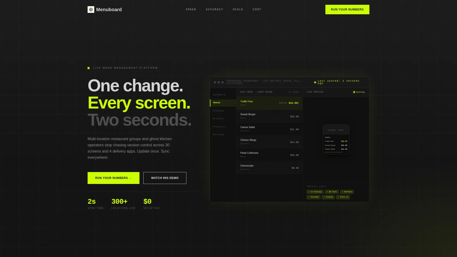
- A product screenshot hero showing the dashboard mid-edit with a live preview panel and a "Last synced: 2 seconds ago" timestamp
- Four comparison tables pitting the platform against manual updates, static PDF tools, and two named competitors, using chartreuse checkmarks and gray X marks
- A "Run Your Numbers" calculator form that outputs a projected time-saved figure before requesting an email, plus a footer "See It Crush Yours" demo call to action
Feature list
This template ships with purpose-built components that carry the full persuasion arc from first impression to lead capture.
Stats-First Hero Section
The header opens with a pixel-perfect product screenshot showing a live menu edit in progress. A phone mockup and a wall-mounted display mockup update simultaneously in the render. The timestamp "Last synced: 2 seconds ago" is visible inside the image, communicating the core product value before a single headline loads.
Hub-and-Spoke Anchor Navigation
A persistent anchor navigation bar links to four named spokes: Speed, Accuracy, Scale, and Cost. Each click snaps the viewport directly to the matching section. Visitors can move non-linearly through the page without losing orientation.
Brutalist Stat Callouts
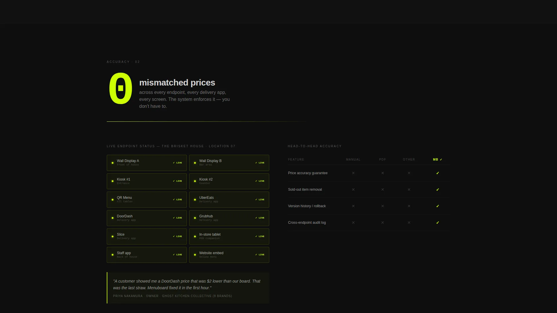
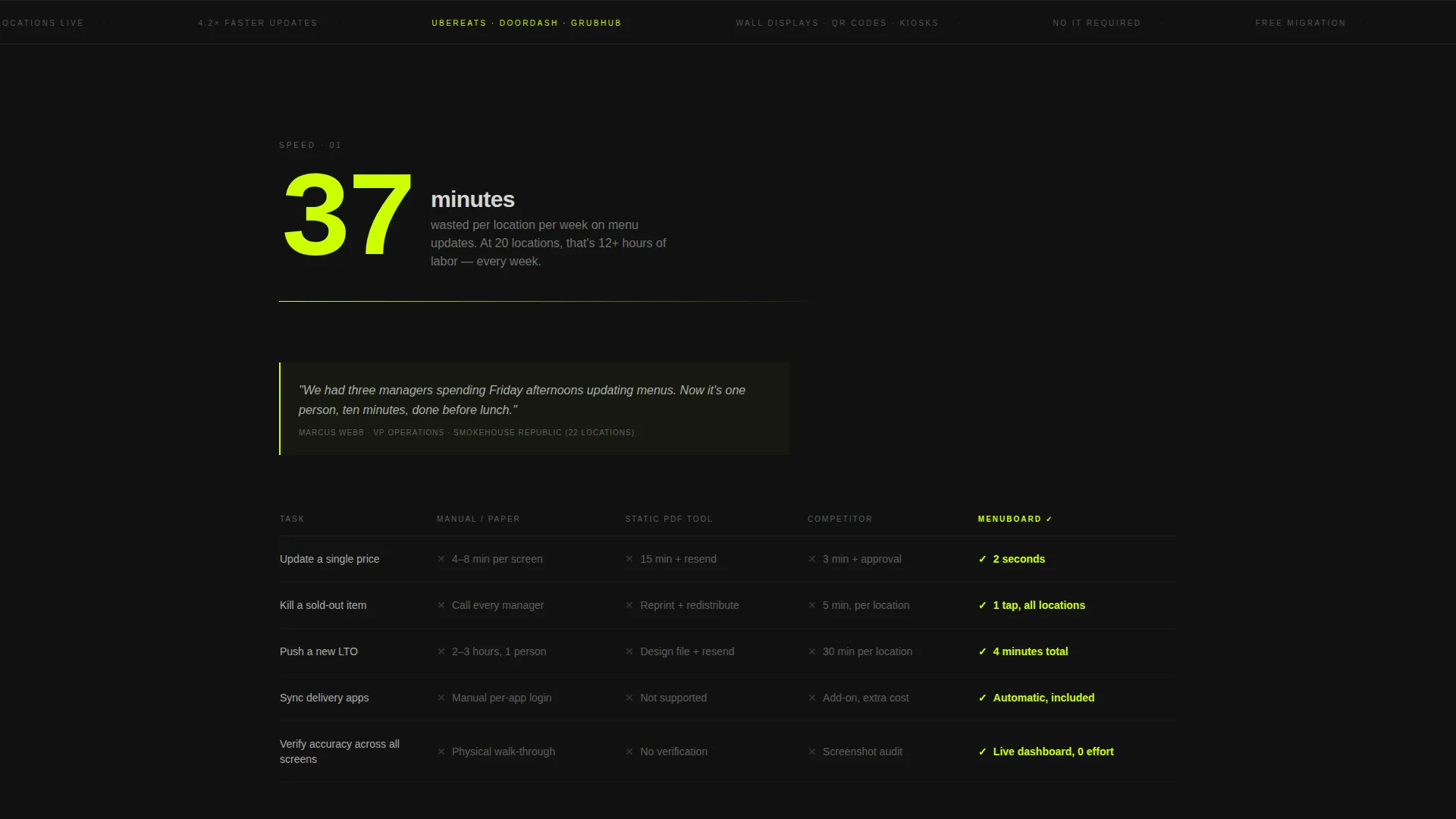
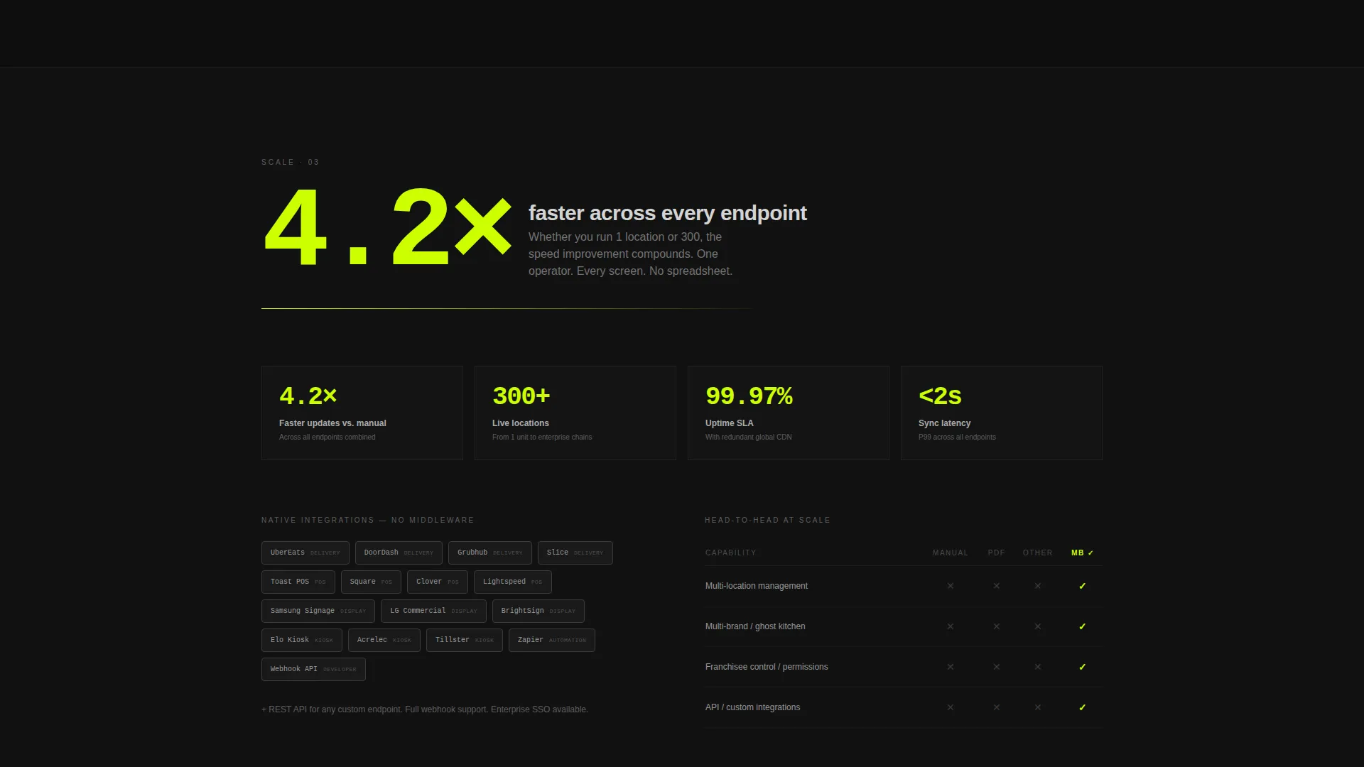
Every spoke section opens with a large, typographically dominant stat before any supporting copy appears. Examples baked into the design include "37 minutes" wasted per location per week, "4.2x" speed improvement after switching, and "0" mismatched prices across endpoints.
Comparison Tables
Each comparison section includes a stark black-and-white table row layout with chartreuse checkmarks for Menuboard and gray X marks for alternatives. Tables cover manual updates, static PDF workflows, and the two nearest competitor tools.
Run Your Numbers Calculator
A calculator-style lead form asks visitors for their number of locations, average menu changes per week, and current method via a dropdown (spreadsheet, PDF, another platform, or paper). The form outputs a projected time-saved figure before prompting for an email address.
See It Crush Yours Demo call to action
The footer section presents a secondary call to action where prospects can upload their current menu and watch it rebuilt live. This converts high-intent visitors who want proof before committing to a full sales conversation.
Page sections overview
| Section | Purpose |
|---|---|
| Product Screenshot Hero | Show the live dashboard edit and sync timestamp as the first impression |
| Anchor Navigation Bar | Let visitors jump directly to Speed, Accuracy, Scale, or Cost |
| Speed Spoke Section | Lead with the "37 minutes" stat and compare update speed head-to-head |
| Accuracy Spoke Section | Lead with the "0 mismatched prices" stat and show endpoint consistency |
| Scale Spoke Section | Show how the platform handles multi-location menu rollouts |
| Cost Spoke Section | Lead with the "4.2x" improvement stat and frame the ROI argument |
| Comparison Tables | Pit the platform against manual methods and competitor tools |
| Run Your Numbers Form | Let prospects calculate their projected time savings before giving an email |
| See It Crush Yours call to action | Close high-intent visitors with a live menu rebuild demo offer |
Design & branding system
The visual identity uses a Carbon Fiber color system built around four deliberate roles. The palette feels industrial and engineered, with no decorative softness anywhere on the page.
- Deep matte black (#121212) dominates all backgrounds; titanium mid-gray (#3A3A3A) structures cards, dividers, and table rows; bare aluminum (#D4D4D4) carries body text for legibility against dark surfaces
- High-voltage chartreuse (#CCFF00) is reserved exclusively for interactive elements, calls to action, live data callouts, and comparison table checkmarks, so every action point on the page is immediately obvious
- The Bold Brutalist theme uses raw typographic weight, dense information blocks, and zero decorative imagery, making the product screenshot the only visual that matters
Mobile & speed optimization
The layout is structured to remain scannable on smaller screens without losing the impact of the stat callouts or comparison tables. The anchor navigation keeps mobile visitors oriented across a long-scroll page.
- Brutalist stat blocks stack cleanly at narrow viewports so the opening number always appears before supporting copy
- Comparison tables are structured for horizontal scroll on mobile so no data is hidden or truncated
- The calculator form uses a simple dropdown and numeric input pattern that works without complex interaction on touch devices
How this template helps you convert
Every structural decision in this template is designed to move a skeptical ops manager from "I've heard this pitch before" to "show me my numbers."
- The Stats-First layout prosecutes the cost of the old workflow with hard numbers before the product is even introduced, so visitors arrive at the product explanation already primed to believe the problem is real.
- The comparison tables remove the "but how does it stack up" objection by presenting side-by-side evidence in a format that takes seconds to scan, and the calculator closes the gap between abstract benefit and personal ROI before asking for contact details.
Other information about this template
This template is a strong fit for SaaS teams building landing pages in the food technology and restaurant operations space. It is designed to work as a standalone persuasion page that drives inbound demo requests and calculator-qualified leads.
- The template style is Hub and Spoke with Anchor Navigation, making it suitable for products with multiple distinct value pillars that need equal page real estate
- The Comparison/Versus landing page direction is purpose-built for markets where prospects are actively evaluating alternatives and need structured side-by-side evidence to move forward
- The Bold Brutalist theme and Carbon Fiber color system are intentionally polarizing, designed to signal that the platform is built for operators, not for lifestyle branding
- The two calls to action serve different funnel stages: "Run Your Numbers" captures early-stage leads through self-serve value, while "See It Crush Yours" closes high-intent prospects ready for a live product demonstration
Theme
Bold Brutalist
Creative direction
Stats-First Impact
Color system
Carbon Fiber
Style
Hub & Spoke (Anchor Nav)
Direction
Comparison/Versus
Page Sections
Stats-first Hero with Product Screenshot
Hub-and-spoke Anchor Navigation
Brutalist Stat Callout Blocks
Head-to-head Comparison Tables
Run Your Numbers ROI Calculator
See It Crush Yours Demo Call to Action
Related questions
What type of business is this template built for?
Can I adapt the comparison tables for my specific competitors?
How does the Run Your Numbers calculator work in the template?
Is this a single-page template or a multi-page website?
Can the Carbon Fiber color system be changed to match a different brand?



