Restaurant Digital Menu Landing Page Template
Menuboard is a modular card-grid landing page template built for restaurant digital menu platforms. It opens with an interactive cost-estimator that shows owners exactly what they spend on manual menu updates, then walks them through a feature-by-feature comparison grid. The dark Dashboard Pro aesthetic and signal-green calls to action make every section feel like a professional kitchen display system.
by Rocket studio
Quick summary
Menuboard is a single-page landing page template designed for live digital menu platforms. It leads with a three-question cost-estimator, then builds trust through alternating comparison and stat callout cards. The Monochrome Steel color system and modular grid keep the layout sharp, utilitarian, and conversion-focused from the first scroll to the final call to action.
Who this template is for
This template is built for teams selling or launching a restaurant digital menu platform. It speaks directly to the operators who feel the daily pain of outdated printed menus and slow update cycles.
- Independent restaurant owners managing multiple delivery apps alongside a physical menu board
- Franchise operations managers who need to push seasonal item changes across many locations overnight
- Ghost-kitchen operators who have no physical dining room but still need a menu that sells online
What problem this template solves
Manual menu updates are slow, expensive, and error-prone. Restaurants lose money every time a sold-out special stays visible or a price change takes days to reflect everywhere.
- Printed menus, PDF links, and static website pages cannot update in real time when kitchen inventory changes
- Paying a designer or developer for every small menu edit adds up to a significant hidden annual cost
- Juggling separate listings across delivery apps creates inconsistency that erodes customer trust
What you get with this template
You get a fully structured landing page template that puts the product's value front and center through interactive estimation and visual comparison. Every section is built to answer a skeptic's question before they ask it.
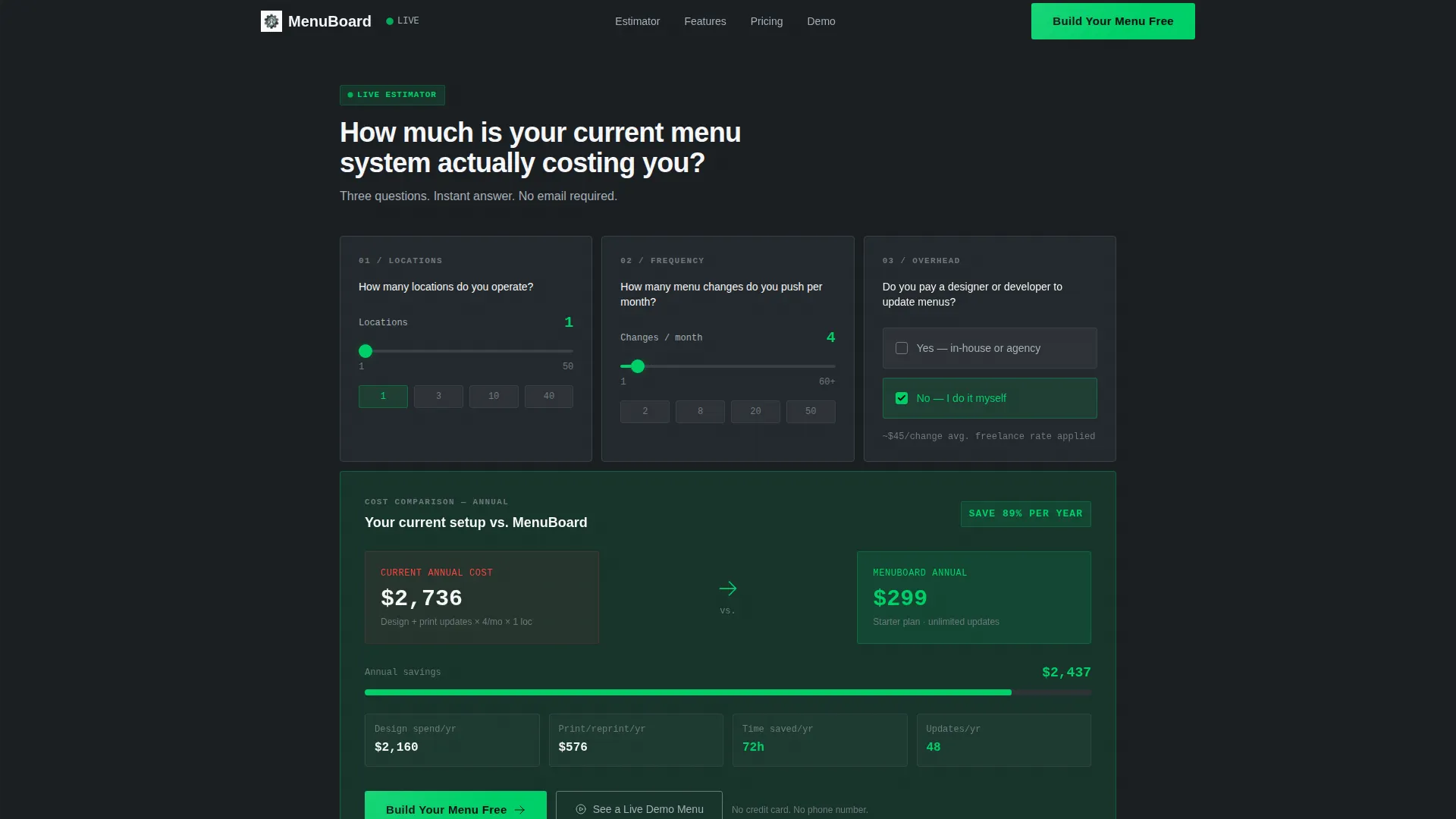
- An interactive estimator header that calculates and displays a visitor's current annual spend against the platform's cost, with savings shown in signal green
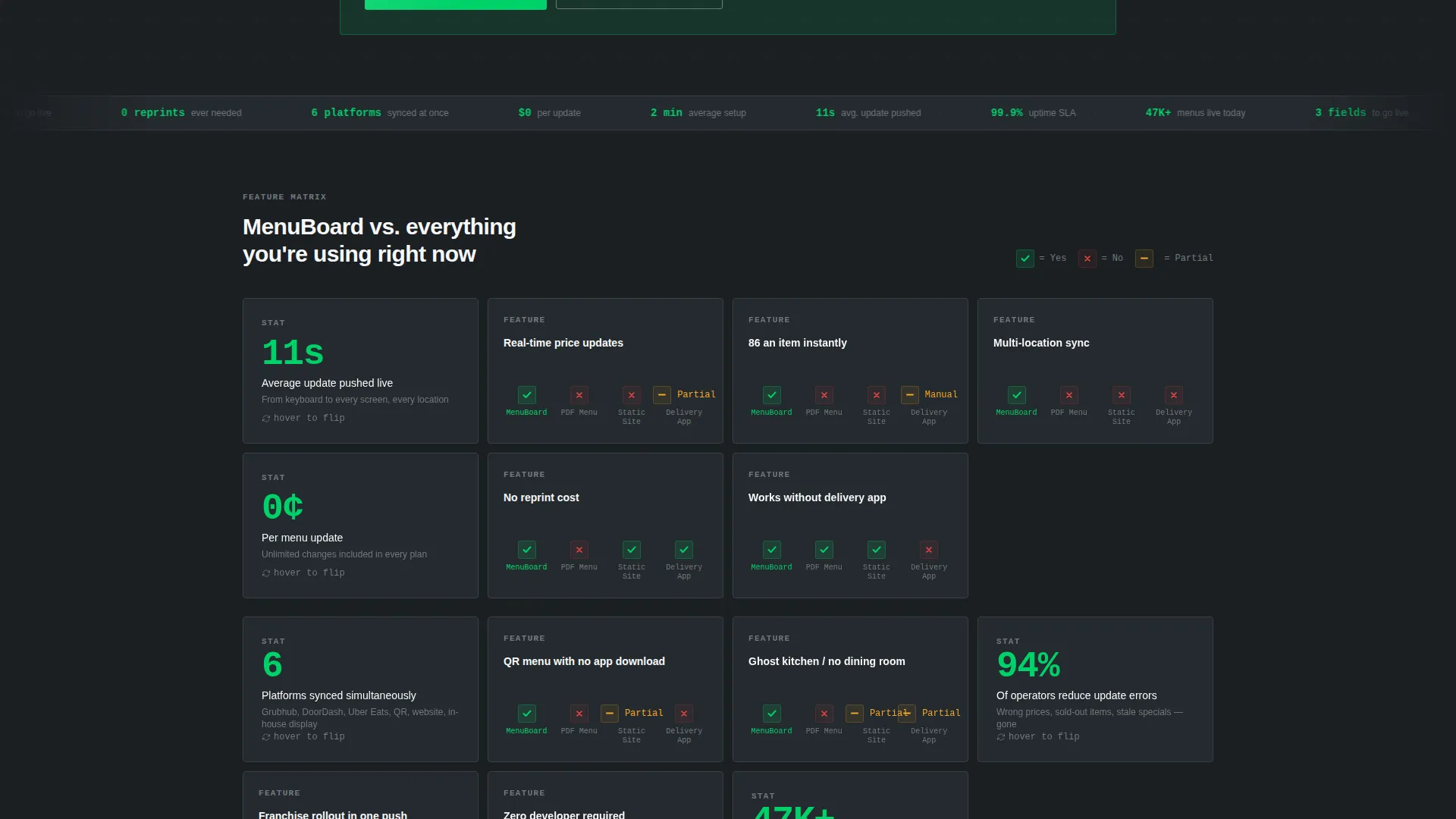
- A modular comparison card grid that flips on hover to reveal micro-stats and feature proof points, alternating with single-stat callout cards
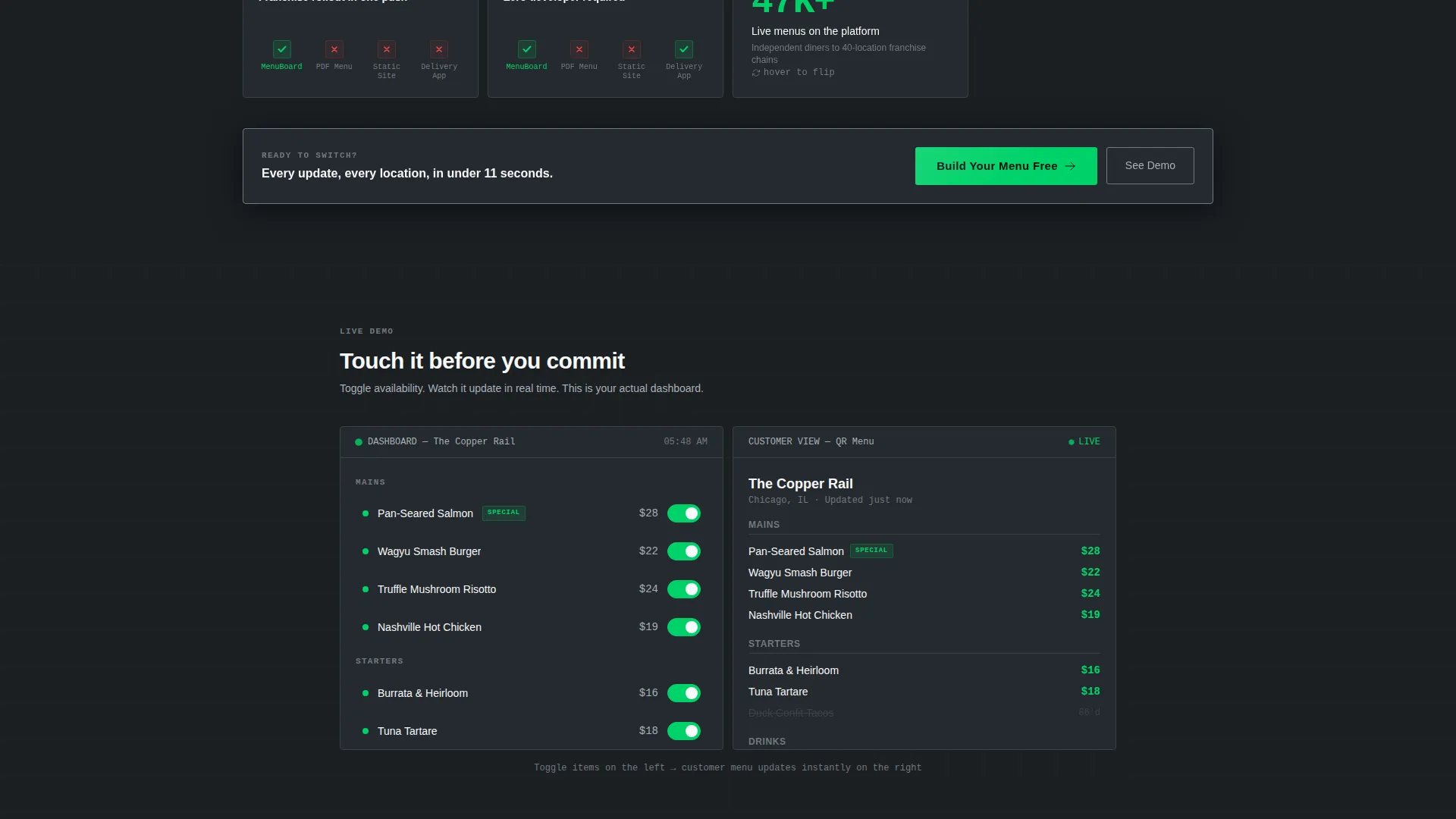
- A dual-path conversion layout with a primary "Build Your Menu Free" call to action and a secondary "See a Live Demo Menu" link for visitors who want to try before signing up
Feature list
This template includes a focused set of purposeful components drawn directly from the brief. Each one serves a specific role in moving a skeptical restaurant operator toward a confident decision.
Interactive Cost Estimator Header
The page opens with a three-question card-form estimator. Visitors enter their number of locations, monthly menu changes, and whether they pay a designer or developer to update their menu. The tool instantly renders a cost-comparison card showing their estimated annual spend versus the platform's annual cost, with the savings figure highlighted in signal green.
Modular Comparison Card Grid
Below the estimator, cards snap into a structured grid comparing the platform against PDF menus, static websites, and third-party delivery app listings. Each card flips on hover to reveal a micro-stat or screenshot, keeping the layout visually active without feeling cluttered.
Single-Stat Callout Cards
Interspersed throughout the grid, standalone stat cards reinforce the platform's speed and efficiency with specific proof points, such as "Average update pushed in 11 seconds." These cards break the comparison rhythm and give readers a concrete number to remember.
Dual-Path Conversion Flow
The primary call to action, "Build Your Menu Free," appears twice: anchored to the bottom of the estimator card and floating at the grid's midpoint after six comparison cards. A secondary path offers "See a Live Demo Menu" for visitors who want hands-on proof before committing.
Minimal Signup Form
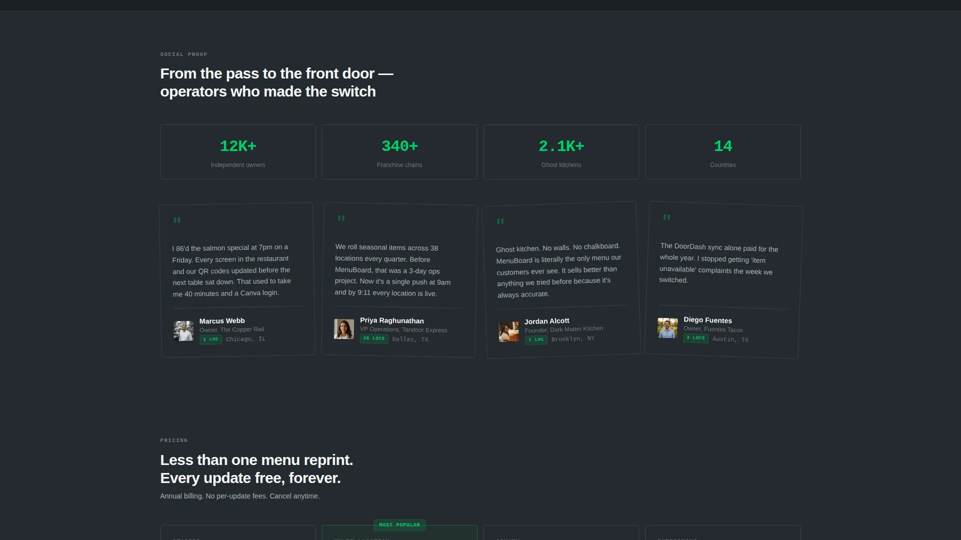
The conversion form collects only three fields: restaurant name, number of locations, and email address. No phone number field and no unnecessary steps keep friction low and completion rates high.
Dashboard Pro Visual System
The template uses a dark charcoal base, brushed steel card borders, and bright white text throughout. Signal green is reserved strictly for active-state indicators, toggle switches, and the primary call to action, giving the interface the purposeful clarity of a professional kitchen display system.
Page sections overview
| Section | Purpose |
|---|---|
| Estimator Header Card | Opens the page with an interactive cost-comparison tool |
| Savings Result Card | Displays estimated annual savings highlighted in signal green |
| Comparison Card Grid | Contrasts platform features against PDF menus and static sites |
| Stat Callout Cards | Delivers single proof-point numbers between comparison cards |
| Mid-Grid call to action | Floats the primary call to action after six comparison cards |
| Demo Menu Link | Offers a secondary path to an interactive sample menu |
| Signup Form | Collects restaurant name, location count, and email to convert |
Design & branding system
The visual identity follows a Dashboard Pro theme built on a Monochrome Steel color palette. Every design decision mimics the disciplined clarity of a back-of-house kitchen display system, where nothing decorative earns a pixel unless it also earns attention.
- Deep charcoal (#1B1F23) for primary backgrounds, brushed steel (#71797E) for card borders and secondary surfaces, and bright white (#F7F8FA) for text and card faces
- Signal green (#00D26A) appears only on active-state indicators, toggle switches, and the primary call-to-action button, keeping its meaning clear and unambiguous
- No hero image, no decorative illustration, and no tagline above the fold; the estimator tool fills the viewport as the sole visual statement on arrival
Mobile & speed optimization
The modular card-grid layout is designed to reflow cleanly across screen sizes without losing its structured rhythm. Restaurant operators frequently check menus and management tools on phones, so the template accounts for that context.
- Card components are built on a modular grid that stacks vertically on smaller viewports, keeping the estimator and comparison cards readable without horizontal scrolling
- The minimal form with three fields keeps the mobile conversion path short and thumb-friendly, reducing the steps between interest and signup
How this template helps you convert
This template treats every scroll as a deliberate step in a cost-justified decision. Rather than leading with emotion or branding, it leads with a mirror: showing visitors the money they are already spending before asking them to spend anything new.
- The estimator creates immediate personal relevance by calculating a visitor's own numbers, making the value case specific rather than generic before they read a single feature description.
- The alternating comparison and stat-callout card grid builds a steady rhythm of evidence, so by the time the floating call-to-action card appears, the visitor has already processed at least six reasons to act.
- The secondary "See a Live Demo Menu" path catches hesitant visitors who are not ready to sign up, giving them a way to engage with the product directly and return with confidence.
Other information about this template
This template is built for the restaurant digital presence category within the broader technology sector. It fits naturally into workflows where a sales or marketing team needs a dedicated landing page to drive trial signups for a live digital menu platform.
- The template style is Card Grid (Modular), making it straightforward to extend or reorder card blocks as the platform's feature set grows
- The creative direction is Calculator and Tool First, meaning the page earns attention through utility rather than storytelling or lifestyle imagery
- The landing page direction follows a Comparison and Versus model, which is well suited to markets where buyers are currently using an inferior alternative and need a clear reason to switch
- This template works equally well for launching a new restaurant digital menu product or refreshing the marketing page of an existing platform
Theme
Dashboard Pro
Creative direction
Calculator/Tool First
Color system
Monochrome Steel
Style
Card Grid (Modular)
Direction
Comparison/Versus
Page Sections
Interactive Cost Estimator
Flip-on-hover Comparison Cards
Single-stat Callout Cards
Dual-path Conversion Layout
Low-friction Signup Form
Dashboard Pro Visual System
Related questions
Can I change the estimator questions to match my platform's pricing model?
Does this template require a developer to set up?
Can I use this template for a franchise with many locations?
Is the secondary demo menu link included in the template?
Can I add more card types to the comparison grid?



