Specialist Franchise Digital Presence Reviews & Social Proof Website Template
Menucommand is a franchise digital menu landing page template built for operators managing dozens to thousands of locations. It presents a data-driven comparison experience that shows exactly how centralized, real-time menu management outperforms legacy static signage. The template is designed to turn operational evidence into confident buyer action, with a sticky audit call to action and gated report download.
by Rocket studio
Quick summary
Menucommand is a single-page comparison landing page template for a franchise digital menu platform. It opens with an animated API code snippet, walks visitors through cost-of-inconsistency data, delivers a head-to-head comparison table, and closes with franchise case studies. Every section builds toward one rational next step: requesting a free menu audit.
Who this template is for
This template is built for professionals who manage menu consistency across multiple franchise locations. If you are responsible for pricing accuracy, limited-time offer rollouts, or brand compliance at scale, this template speaks directly to your daily pressure points.
- Franchise operations directors overseeing 200 or more locations
- Regional marketing managers launching time-sensitive limited-time offers
- Multi-unit franchise owners dealing with outdated combo pricing across stores
What problem this template solves
Franchise operators lose revenue and brand trust when menus fall out of sync across locations. Static laminated boards and PDF price lists cannot respond to same-week pricing changes or regional promotions. This template frames that pain clearly and positions a centralized digital solution as the obvious fix.
- Outdated menus causing pricing inconsistencies and customer complaints
- Slow limited-time offer deployment that misses launch windows
- No single dashboard to confirm every screen at every location is current
What you get with this template
You get a fully structured, scroll-driven landing page that functions like an industry report brought to life. The layout moves visitors logically from problem awareness to competitive proof to conversion, without feeling like a sales brochure.
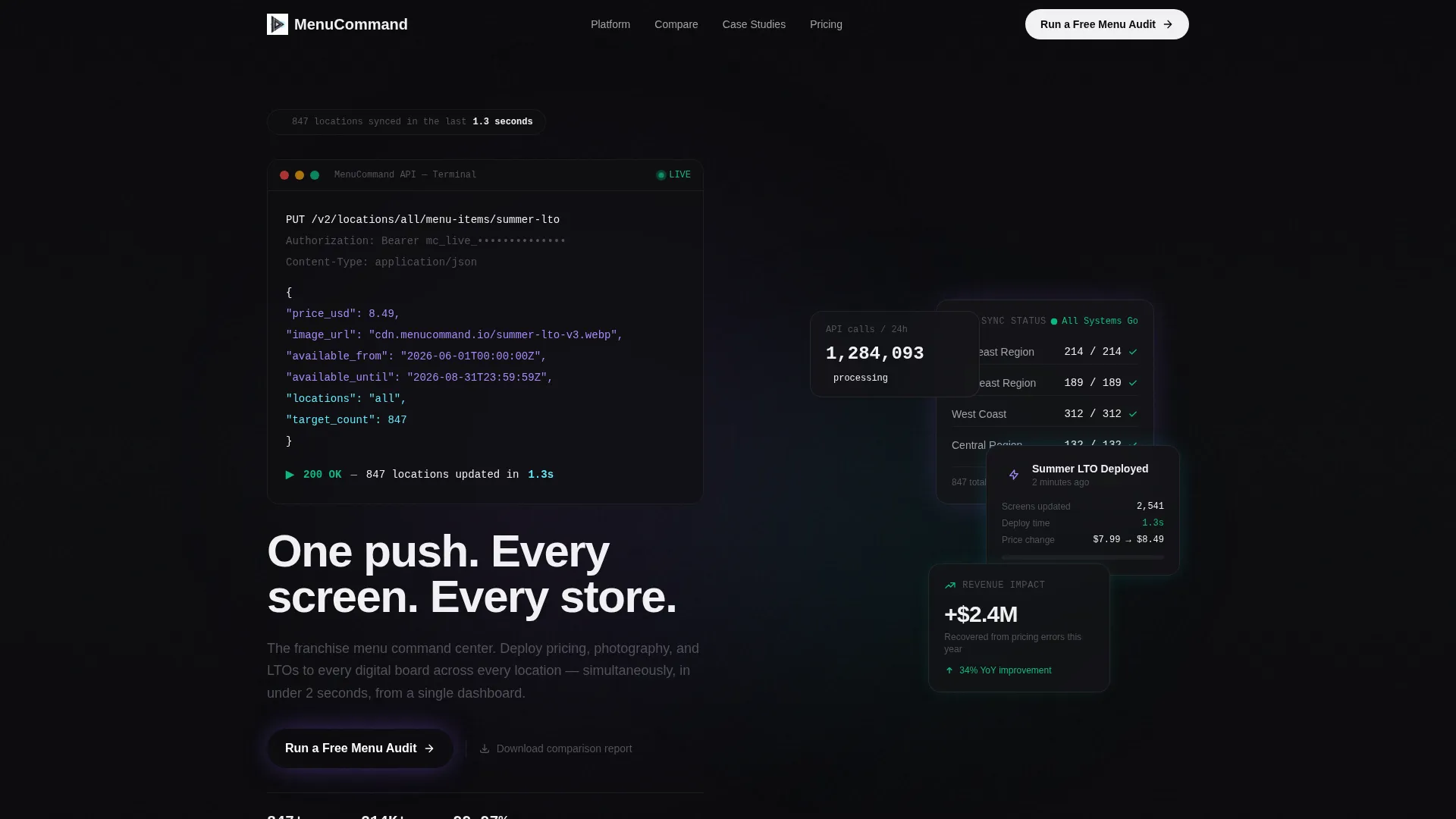
- An animated code snippet header showing a live API call updating 847 locations in 1.3 seconds
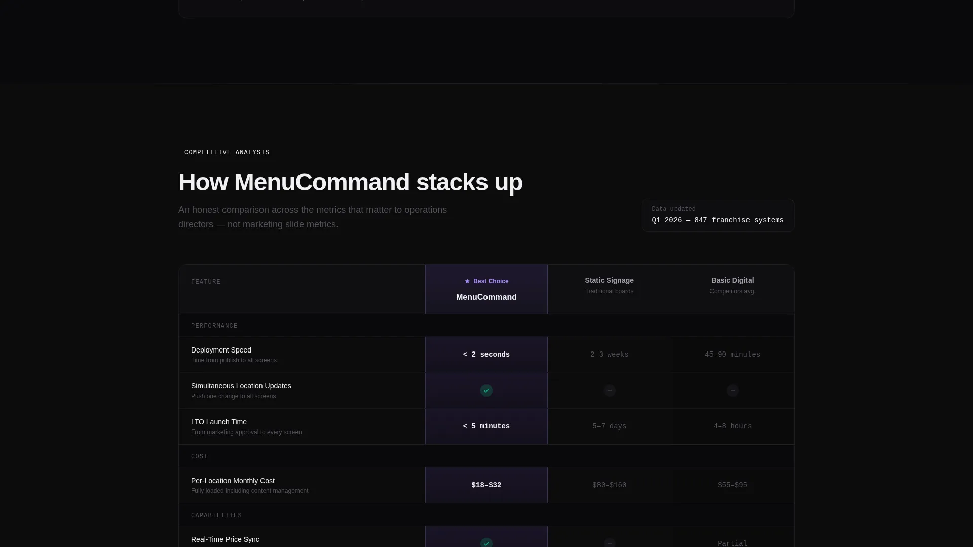
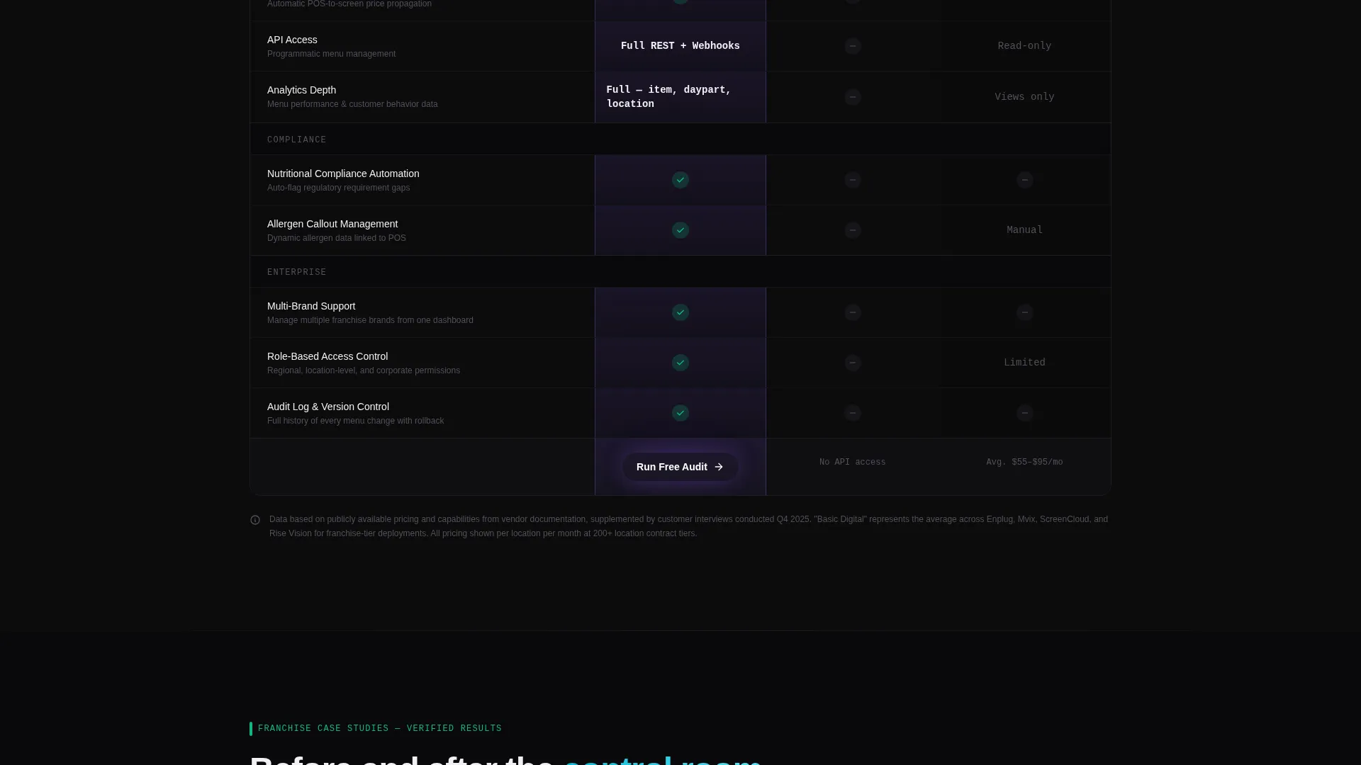
- A three-column comparison table scoring this platform against static signage and competing digital vendors
- Two conversion paths: a free menu audit form and a gated PDF comparison report download
Feature list
This template includes purpose-built sections and interactive components designed specifically for franchise digital menu marketing.
Animated API Code Header
The header opens with a live-syntax code block floating against a void black background. It simulates a real API call updating price, image, and availability data across all locations simultaneously. The terminal-style animation ends with a typed headline: "One push. Every screen. Every store."
Three-Column Comparison Table
The comparison table scores this platform against legacy static signage and competing digital menu vendors. Criteria include deployment speed, per-location cost, real-time sync capability, limited-time offer launch time, analytics depth, and API access. Green checkmarks and violet column highlights make the winning column clear without appearing manipulative.
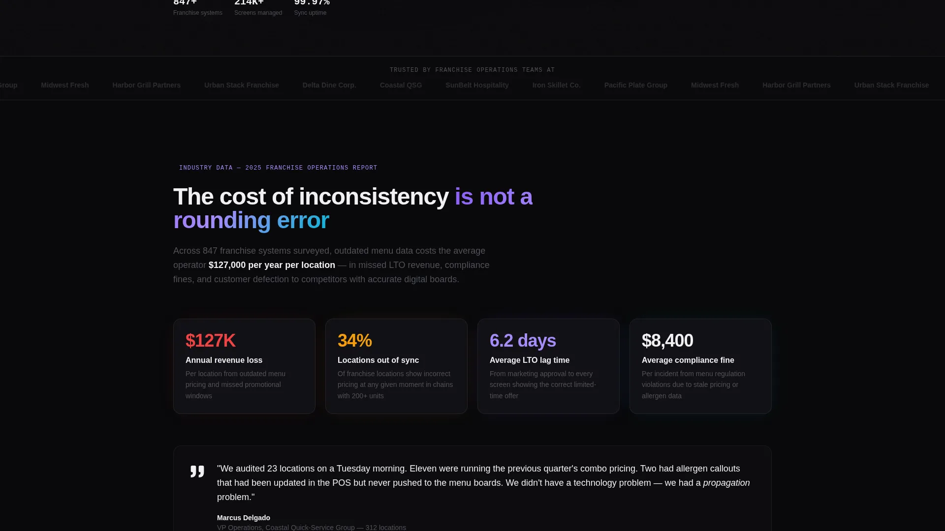
Cost-of-Inconsistency Data Section
Section one presents operational data as an industry white paper. It covers average revenue lost per location from outdated menus, compliance violation rates, and customer complaint benchmarks. The data format builds credibility before the comparison table appears.
Franchise Case Study Cards
Section three presents before-and-after metrics as animated dashboard cards. Each card shows real operational improvements tied to centralized menu management. The card format keeps data readable and visually engaging as visitors scroll.
Dual Conversion Path Design
The primary call to action is a sticky "Run a Free Menu Audit" button placed in the navigation and repeated below the comparison table. A secondary path offers a gated PDF download for visitors who want the data before a conversation. The audit form collects franchise size, current menu system type, and work email.
Data Command Visual Theme
The page uses a dark-surface design language with void black backgrounds, holographic violet interactive states, spectral cyan data accents, and neural white typography. The palette communicates operational authority and analytical precision throughout every scroll depth.
Page sections overview
| Section | Purpose |
|---|---|
| Animated Code Header | Opens with API animation and typed headline to establish platform capability immediately |
| Cost of Inconsistency | Presents revenue loss data, compliance rates, and complaint benchmarks as white-paper evidence |
| Comparison Table | Scores this platform against static signage and digital competitors across six criteria |
| Case Study Cards | Shows before-and-after franchise metrics as animated dashboard cards |
| Menu Audit call to action | Repeats the primary conversion form below the table where data has done the persuading |
| Gated Report Download | Offers a secondary email-capture path for visitors not yet ready to book an audit |
Design & branding system
The visual identity follows a Data Command theme rendered through an AI Iridescent color system. Dark surfaces dominate the layout, with accent colors that shift between analytical cool and algorithmic warmth to reinforce the platform's intelligence narrative.
- Void black (#09090B) for all backgrounds and table cells, holographic violet (#8B5CF6) for interactive states and the winning comparison column
- Spectral cyan (#06B6D4) for live data point accents and toggle switch states, neural white (#F0F0F3) for all body typography and table headers
- Terminal-style animation on the code header and card-based rendering for case study metrics throughout the scroll
Mobile & speed optimization
The template is structured for clean vertical stacking on smaller screens. The comparison table and case study cards are designed to reflow naturally without losing the visual hierarchy that makes the data persuasive.
- Sticky navigation with the audit call to action remains accessible at every scroll depth on mobile
- Comparison table columns collapse to a readable single-focus view on smaller viewports
- Animated elements are contained and lightweight to avoid layout disruption on mobile devices
How this template helps you convert
The page earns conversions by presenting enough operational evidence that clicking "Run a Free Menu Audit" feels like the rational next step, not a sales commitment.
- The animated API header demonstrates real platform capability in the first three seconds, setting a confident and technical tone before any sales copy appears.
- The comparison table gives prospects a structured, data-backed reason to choose this platform, with six scored criteria that make the decision feel informed rather than influenced.
- The dual conversion path captures both ready-to-talk leads through the audit form and research-stage visitors through the gated PDF download, maximizing total lead volume from a single page.
Other information about this template
This template is part of the Franchise Digital Presence category within the Technology segment, designed specifically for the franchise digital menu niche. It is built as a single-page comparison landing page and pairs well with follow-up email sequences or sales enablement decks.
- The audit form includes a dropdown for franchise size (10 to 50, 50 to 200, 200 to 1,000, 1,000 or more locations) and a field for current menu system type
- The gated PDF path is designed to function as a lead magnet for operations and marketing decision-makers who prefer to review data independently before speaking with sales
- The Industry Report creative direction means the scroll experience mirrors a professional franchise operations analysis, which builds trust with analytically minded buyers
Theme
Data Command
Creative direction
Industry Report
Color system
AI Iridescent
Style
Comparison Table
Direction
Comparison/Versus
Page Sections
Animated API Code Header
Three-column Comparison Table
Cost-of-inconsistency Data Section
Franchise Case Study Cards
Dual Conversion Path Design
Related questions
Who is this landing page template designed for?
What does the comparison table include?
What are the two conversion paths on this page?
Can this template support different franchise sizes?
What makes the header section different from a standard hero section?



