Retail Digital Presence Directory Website Template
Menulive is a bento grid landing page template built for digital menu board platforms targeting franchise owners, café operators, and quick-service restaurant directors. It pairs a dark Tech Glass visual identity with interactive flip cards, live-update panel animations, and a freemium signup flow, helping food and beverage businesses replace static printed menus with real-time, phone-managed digital displays.
by Rocket studio
Quick summary
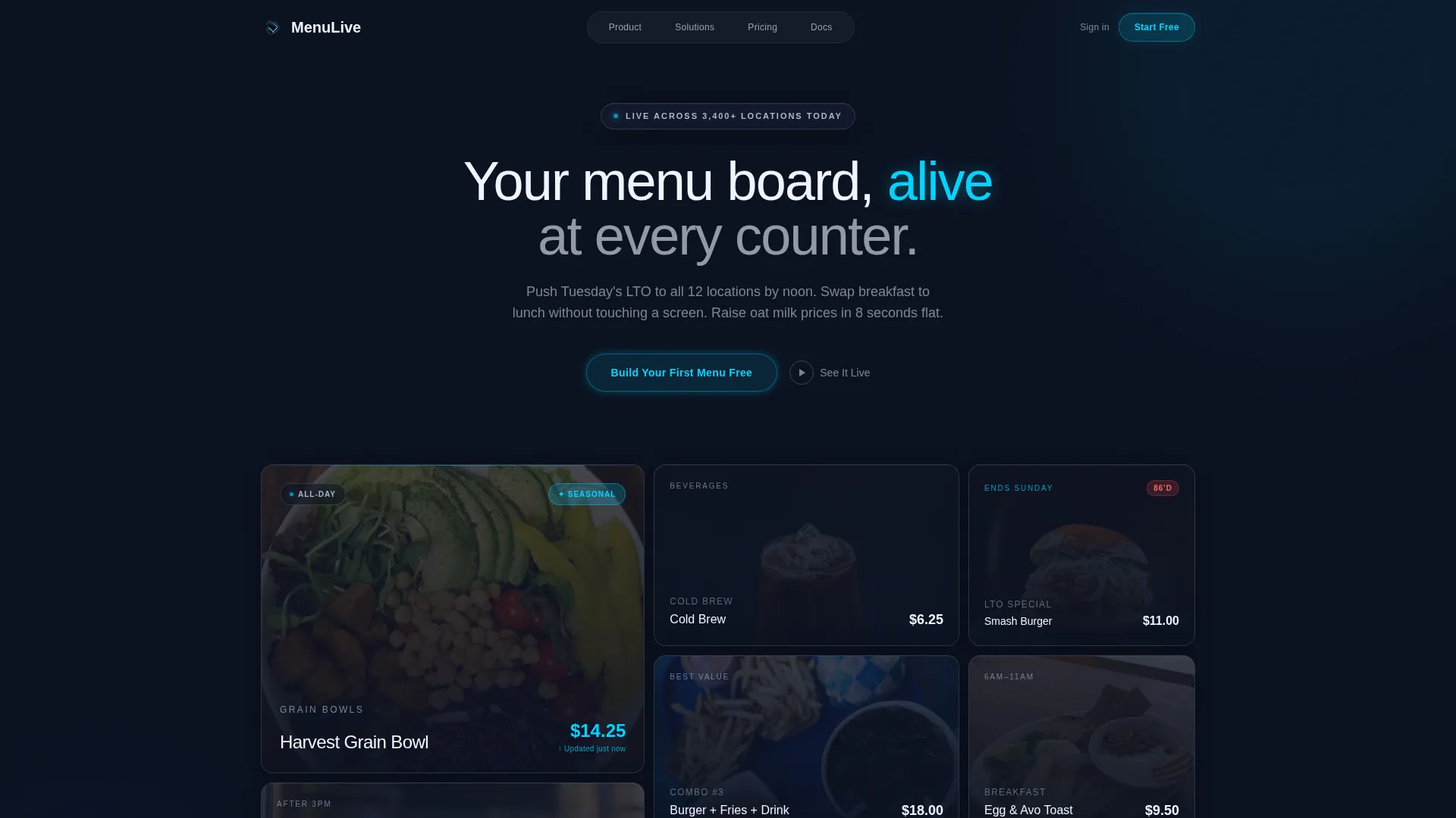
Menulive is a single-page landing page template designed for retail digital menu platforms. It uses an asymmetric bento grid layout, dark glass panels with food photography, and interactive feature cards to walk visitors from first impression to free trial signup. The page targets franchise operators, café owners, and quick-service restaurant regional directors.
Who this template is for
This template speaks directly to food and beverage businesses that manage menus across one or many locations. It is built for operators who need to push updates fast, without printing, without IT tickets, and without asking crew members to swap anything out.
- Franchise owners managing twelve or more locations who need centralized control over limited-time offers and pricing
- Single-unit café operators tired of reprinting laminated sheets every time an ingredient price changes
- Quick-service restaurant regional directors who need daypart menus to switch automatically from breakfast to lunch
What problem this template solves
Static menu boards create a bottleneck. Reprinting takes time. Updating every location by hand is slow, error-prone, and expensive. This template gives digital menu platforms a landing page that makes real-time control feel obvious and desirable.
- Price changes, sold-out tags, and seasonal badges still require manual effort with physical boards
- Operators running multiple locations cannot push a consistent limited-time offer everywhere at once without a centralized system
- Daypart scheduling, shifting from breakfast to lunch service, requires crew intervention with traditional boards
What you get with this template
You get a fully structured bento grid landing page that covers every step of the buyer journey, from visual proof to conversion. The layout is built around dark glass aesthetics, animated panels, and a two-step freemium signup flow.
- A six-panel asymmetric hero bento wall with frosted glass food photography cards and one animated live-update panel
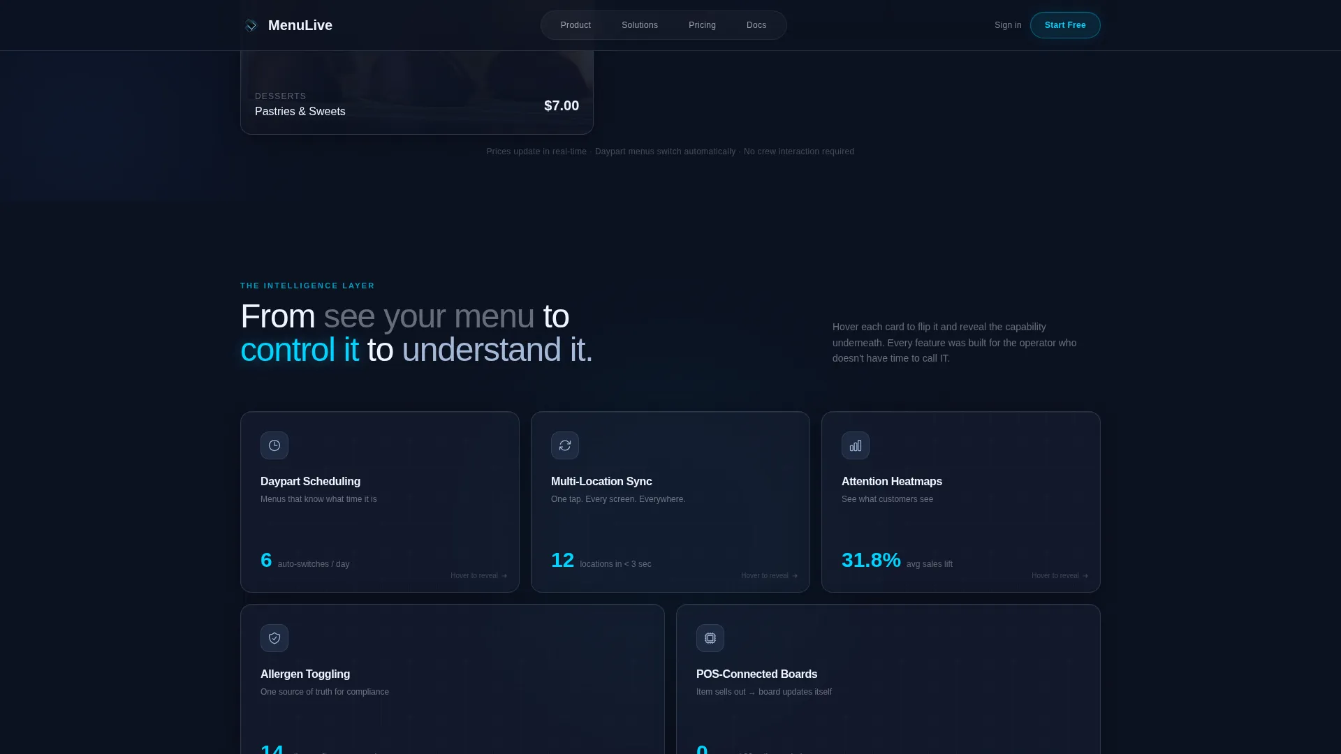
- An interactive feature section with flip cards revealing daypart scheduling, allergen toggling, multi-location sync, and analytics heatmap capabilities
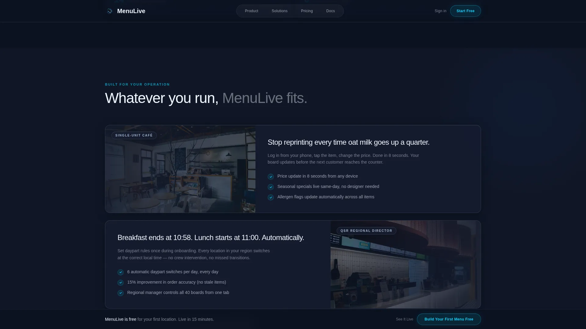
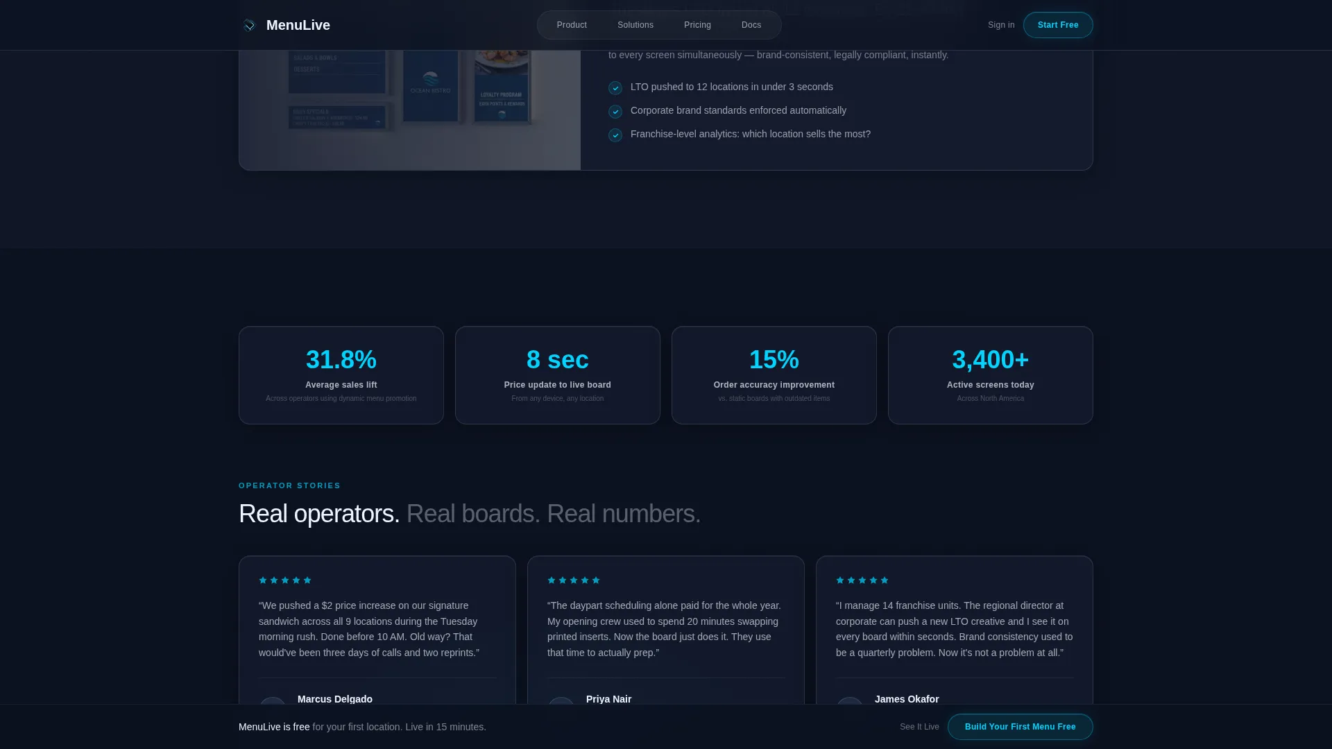
- Three use-case panels for café, quick-service restaurant, and franchise audiences, plus a social proof section with metric callouts and operator testimonials
Feature list
This template is built around specific, purpose-driven components that make the platform's capabilities tangible to every type of operator visiting the page.
Animated Live-Update Hero Panel
One panel inside the six-card bento hero wall animates on page load. A price changes, a sold-out tag appears, or a seasonal badge slides in. This proves to visitors immediately that the menu is alive and phone-manageable.
Interactive Flip Card Feature Grid
Below the hero, a bento grid of feature cards responds to hover. Each card flips with a CSS three-dimensional transform to reveal the capability on the back. Covered capabilities include daypart scheduling, allergen toggling, multi-location sync, and analytics heatmaps showing which menu items attract the most screen attention.
Two-Step Freemium Signup Flow
The primary call to action, "Build Your First Menu Free," opens a two-step modal. Step one asks for business type (café, quick-service restaurant, franchise, or food hall) and number of locations. Step two collects name and email. No credit card is required at any point.
Sticky Conversion Bar
After a visitor scrolls past forty percent of the page, a sticky bottom bar appears with the primary call to action. This keeps the signup prompt visible without interrupting early browsing.
Secondary "See It Live" Path
A secondary call to action links visitors to a read-only demo menu they can swipe through on their own device. This converts curiosity into hands-on familiarity before any signup commitment is made.
Use-Case and Social Proof Sections
Three targeted panels address café operators, quick-service restaurant teams, and franchise owners with concrete outcomes. A metrics wall and operator testimonials with specific numbers, including a 31.8 percent average sales lift and 15 percent order accuracy improvement, back up the platform's claims with real figures.
Page sections overview
| Section | Purpose |
|---|---|
| Hero Bento Wall | Six dark glass panels with food photography; one animated panel proves live updates |
| Flip Card Grid | Interactive feature cards reveal daypart, allergen, sync, and heatmap capabilities |
| Use Case Panels | Three audience-specific panels for café, quick-service restaurant, and franchise operators |
| Social Proof Wall | Metric callouts and operator testimonials with location counts and performance numbers |
| Freemium Call to Action | Sticky bar and modal with two-step business type and email signup flow |
| Footer | Linear single-row footer with essential navigation and brand links |
Design & branding system
The template uses a Tech Glass visual identity built on a Midnight Blue color system. Every surface feels backlit, every edge luminous, and the dark glass itself carries the brand weight. Typography is thin, wide-tracked, and white, hovering above the glass layer like etched signage.
- Color palette: deep terminal navy (#0B1120) as the base, polished obsidian (#161D2F) for card surfaces, frosted glass highlight (#A3B8D6) for secondary elements, and electric accent cyan (#00D4FF) reserved for interactive states and call-to-action pulses
- Typography: Manrope sans-serif with thin, wide-tracked headings to reinforce the dark luxury tone
- Motion: cards lift on hover with a one-pixel cyan border glow, transitions run at 200 milliseconds ease-out, and nothing bounces
Mobile & speed optimization
The template is built desktop-first, reflecting how menu boards are typically managed from a desktop or tablet. It is fully responsive so operators can also review and share the page on mobile devices.
- Desktop and tablet layouts are prioritized for the primary management audience
- Static sections use server components while animated and interactive sections use client components to keep rendering efficient
- Intersection Observer stagger reveals and CSS keyframe animations are scoped to client-side components only
How this template helps you convert
The page is structured to move a visitor from passive browsing to active signup by building trust at each scroll depth.
- The animated hero panel delivers an immediate proof moment: visitors see a live price change before reading a single line of body copy, which removes skepticism early
- The flip card grid escalates the narrative from "see your menu" to "control your menu" to "understand your menu," giving each visitor type a reason to keep scrolling
- The two-step modal and sticky call-to-action bar reduce friction at the moment of decision by asking only for business type and email, with no credit card required
Other information about this template
This template is built specifically for the retail digital menu niche within the broader restaurant technology and business-to-business software-as-a-service space. It is a single landing page, not a multi-page website, making it straightforward to deploy as a standalone conversion page.
- The template is designed for English (United States) copy, USD pricing display, and 12-hour time format, matching the typical quick-service restaurant and café operating context
- Animation intensity is high, using CSS keyframes, CSS three-dimensional flip card transforms, and Intersection Observer stagger reveals for section-by-section entrance effects
- The freemium conversion model means there is no paywall or credit card ask at any point in the signup flow, lowering the barrier for operators evaluating the platform for the first time
- The footer follows a linear single-row pattern, keeping the page exit clean and uncluttered
Theme
Tech Glass
Creative direction
Interactive Explorer
Color system
Midnight Blue
Style
Bento Grid
Direction
Freemium/Trial
Page Sections
Animated Live-update Hero Panel
Interactive Flip Card Feature Grid
Two-step Freemium Signup Modal
Sticky Scroll-triggered Call to Action Bar
Use-case and Social Proof Sections
Secondary Demo Path
Related questions
Who is this landing page template designed for?
What sections are included in this template?
Does the signup flow require a credit card?
Can visitors try the menu before signing up?
Is this template suitable for a single café or only for large franchises?



