Online Skill Courses Specialist Portfolio Website Template
A print-on-demand business online course landing page built for creators who are ready to stop guessing and start selling. This sidebar companion template combines a case study narrative scroll, a persistent sticky sidebar with lead capture, and a Dopamine Pop color system to turn curious visitors into email subscribers and enrolled students.
by Rocket studio
Quick summary
This is a single-page sidebar companion landing page for a print-on-demand business online course. It pairs a vivid case study narrative scroll with a sticky right-rail sidebar that captures leads through a two-field form. The Dopamine Pop color palette and Playful Geometric theme make the page impossible to scroll past without feeling genuinely excited about starting.
Who this template is for
This template is built for course creators who teach beginners how to earn passive income through print-on-demand selling. It works equally well for educators launching their first digital product and for established instructors who want a dedicated content-driven lead capture page.
- Side-hustlers and stay-at-home parents who want to monetize creative skills without quitting their day jobs
- Graphic designers tired of trading hours for dollars who are ready to build royalty income instead
- Course creators who need a proof-heavy, story-driven page that converts skeptical first-time visitors
What problem this template solves
Most online course pages look like every other sales page. They list modules, drop a price, and hope the visitor trusts them. This template solves the trust gap by leading with real student revenue data and a narrative that builds belief one scroll at a time.
- Visitors arrive skeptical and need compounding proof before they will hand over their email
- A generic lead magnet form buried at the bottom of a long page loses warm readers before they convert
- Course creators lack a dedicated content destination that gives away enough value to make the full course feel like an obvious next step
What you get with this template
You get a fully designed sidebar companion landing page laid out around a case study narrative structure. The page is built to give value first and capture leads second, making the free niche profit map download feel like the natural reward for reading.
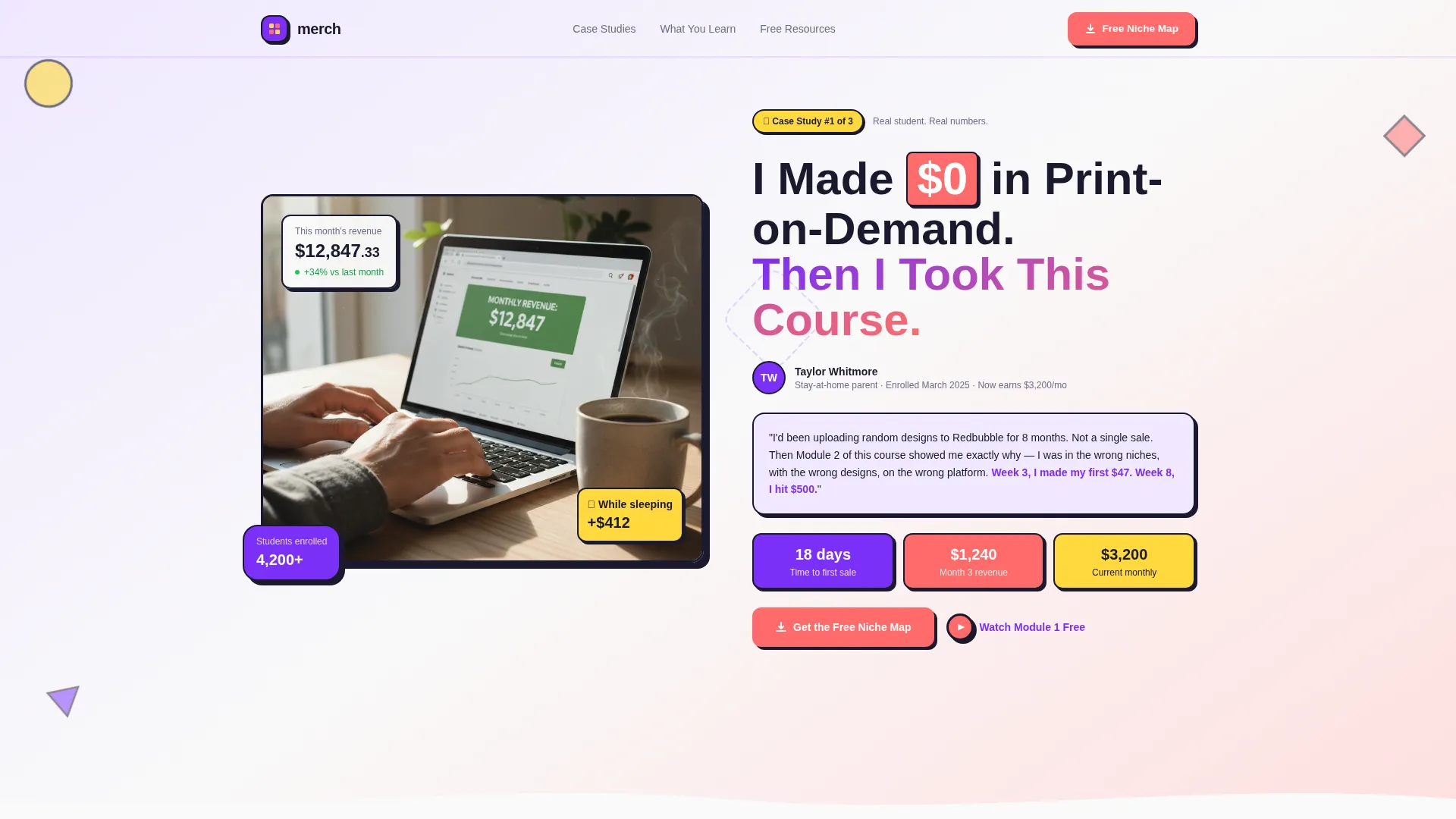
- A Half-Page Photo plus Text split header with a headline, student attribution, and a laptop hero image showing visible revenue numbers
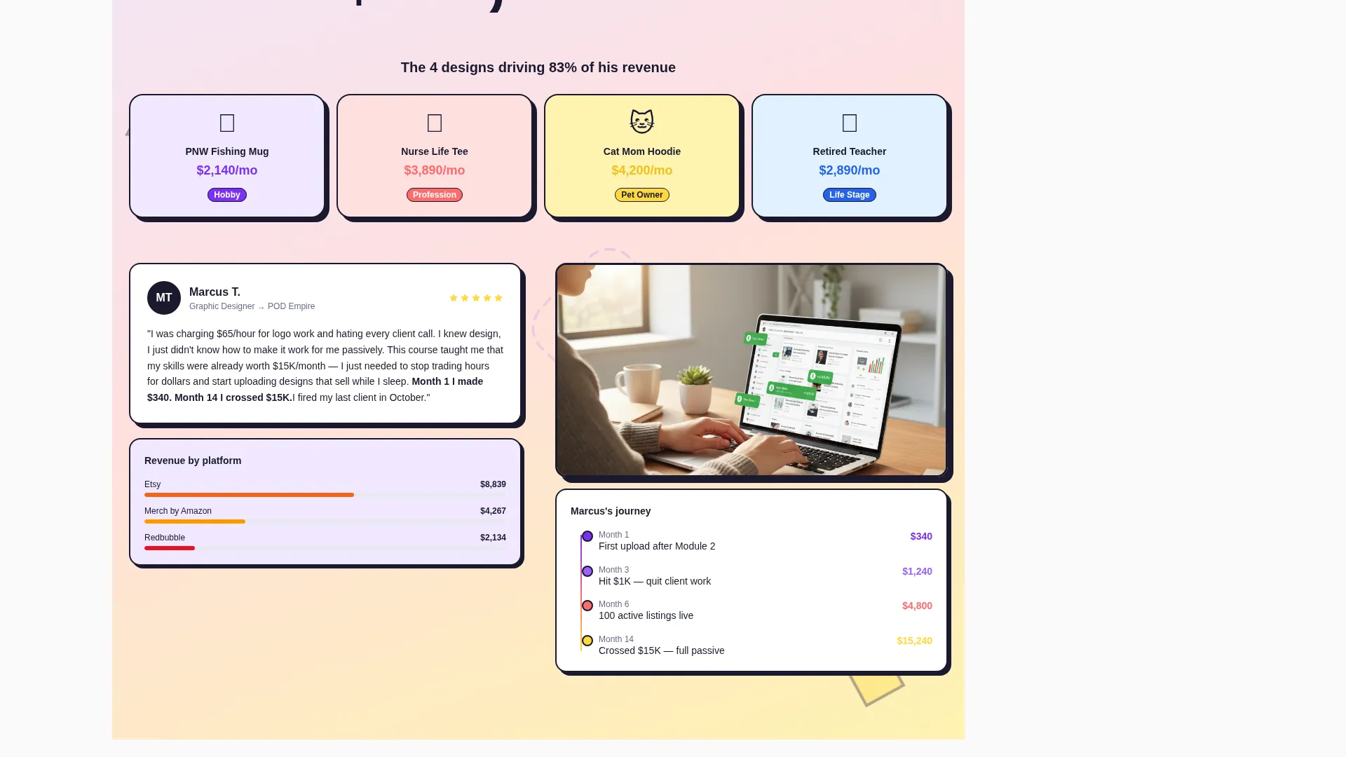
- Four escalating case study scroll sections that follow one real student from zero to profitable store, with revenue milestones at $500, $3,000, and $15,000 per month
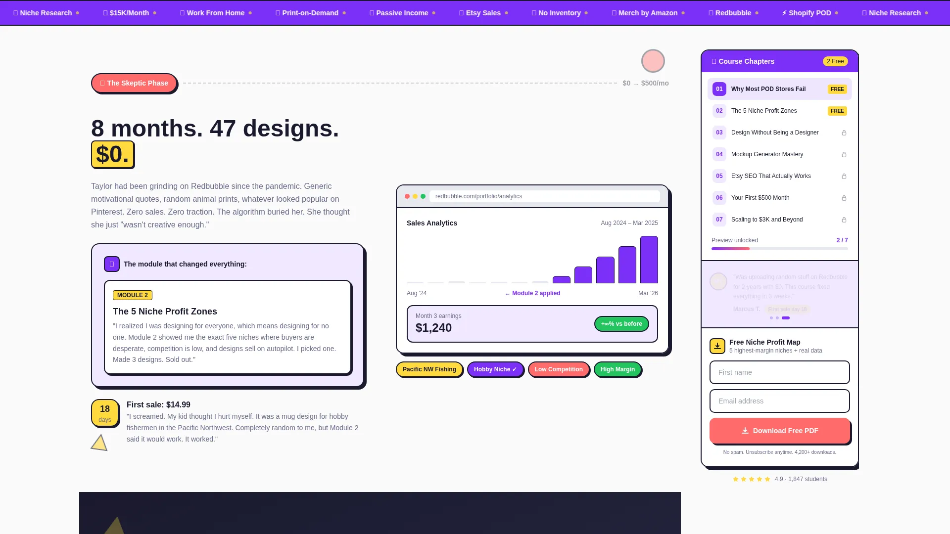
- A sticky sidebar module with rotating mini-testimonials, a course chapter progress list, and a two-field email capture form tied to the free download call to action
Feature list
This section covers the core built-in components delivered with this template.
Sticky Sidebar Lead Capture Module
A persistent right-rail sidebar scrolls alongside the visitor throughout the page. It contains a two-field form asking only for first name and email, keeping friction as low as possible. The sidebar also displays rotating mini-testimonials and a chapter progress list to reinforce trust while the visitor reads.
Case Study Narrative Scroll
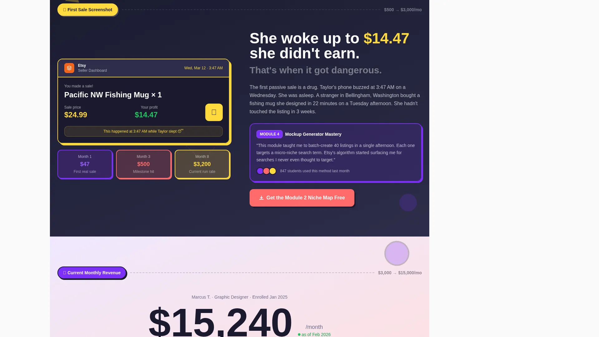
Four sequential scroll sections follow one real student journey from failed uploads to a profitable store. Each section escalates in revenue proof, moving from the first sale screenshot all the way to a current monthly revenue figure. Geometric accent shapes grow bolder and more complex as the revenue numbers climb, visually reinforcing the escalation.
Dopamine Pop Color System
The palette uses electric violet for section backgrounds, hot coral for every call-to-action button and price tag, sunshine yellow for highlighted metrics and student wins, and deep charcoal for body text. The result feels loud and optimistic without ever becoming unreadable.
Half-Page Photo Plus Text Header
The header splits the screen with a lifestyle photo on the left and a bold student-story headline on the right. The photo shows a laptop screen with a visible revenue dashboard, a coffee mug with a quirky design, and morning light framing the scene. The right side names the student and their timeline beneath the headline.
Embedded Video Lesson Gate
A seven-minute video lesson pulled from Module 1 is embedded inside the page and gated behind the same email capture as the free download. Visitors who are not ready to download the guide can still engage with real course content and convert on their own terms.
Playful Geometric Visual System
Circles, triangles, and squiggly dividers float between sections as decorative geometric accent shapes. The visual language follows a Memphis design poster aesthetic crossed with a candy store window display. The shapes grow progressively bolder as the page scrolls deeper into higher revenue proof sections.
Page sections overview
| Section | Purpose |
|---|---|
| Split Header Block | Introduce student story with headline, attribution, and laptop revenue hero image |
| Sticky Sidebar Module | Persist lead capture form, rotating testimonials, and chapter list throughout scroll |
| Skepticism Case Study | Show the starting point: failed uploads and zero sales before the course |
| Niche Selection Module | Highlight the specific course section that changed the student's product direction |
| First Sale Proof | Display the student's first sale screenshot with date and dollar amount visible |
| Monthly Revenue Showcase | Present current monthly income and the designs driving it |
| Free Download Call to Action | Offer the Niche Profit Map PDF as the primary conversion point |
| Gated Video Lesson | Embed the Module 1 preview behind the same email capture form |
Design & branding system
The design language is rooted in Playful Geometric principles with a Dopamine Pop color system that prioritizes visual energy and emotional excitement. Every color has a specific job on the page, and the geometric shapes serve as pacing devices between sections.
- Electric violet (#7B2FF7) dominates section backgrounds in soft washes; hot coral (#FF6B6B) drives every call-to-action and price element; sunshine yellow (#FFD93D) highlights key metrics and student wins; crisp white (#FAFAFA) and deep charcoal (#1A1A2E) keep body copy grounded and readable
- Geometric shapes including circles, triangles, and squiggly dividers are placed between sections like confetti mid-air, growing bolder and more layered as the page scrolls toward higher revenue proof
- The overall feel is described in the brief as a candy store window crossed with a Memphis design poster: unapologetically loud, sugar-rush optimistic, and impossible to scroll past without smiling
Mobile & speed optimization
The sidebar companion layout is designed to adapt across screen sizes so mobile visitors can access the lead capture form without losing the narrative flow of the case study sections.
- On smaller screens the sticky sidebar transitions into an accessible inline module so the two-field form remains reachable without disrupting the scroll experience
- The case study scroll sections are structured to load text and image content in a predictable, lightweight sequence that does not depend on heavy external scripts
- The embedded video lesson section uses a standard embed placeholder layout that supports manual connection to a hosted video source
How this template helps you convert
This template is built around a give-first philosophy. The page earns the email address by delivering so much real revenue data and student proof that the visitor genuinely wants more before they are ever asked for anything.
- The escalating case study narrative builds belief progressively, moving from relatable skepticism all the way to $15,000-per-month revenue proof before the primary call to action appears
- The sticky sidebar keeps the two-field download form visible throughout the entire scroll, so a visitor who is ready to convert at any point does not need to hunt for the form
- The gated video lesson creates a second conversion path for visitors who prefer watching over reading, capturing the same email address through a different value offer
Other information about this template
This template is part of a broader print-on-demand business online course marketing toolkit. It is designed as a standalone content destination rather than a checkout or sales page, meaning the primary goal is list building rather than direct purchase. The Niche Profit Map PDF referenced in the template is a five-niche guide with real margin data, positioned as a free lead magnet. The Mockup Generator workflow referenced in the course content reflects the beginner-friendly product creation process taught inside the course. Platforms like Etsy and Redbubble are mentioned as student selling venues inside the case study narrative sections.
- The template uses a sidebar companion layout, meaning the right-rail module is a persistent design element rather than a pop-up or overlay
- The free niche profit map download and the gated video lesson are two separate but parallel conversion paths that both use the same two-field form
- Course creators can adapt the case study sections to feature their own real student stories and revenue screenshots without restructuring the page layout
Theme
Playful Geometric
Creative direction
Case Study Narrative
Color system
Dopamine Pop
Style
Sidebar Companion
Direction
Content/Resource
Page Sections
Sticky Sidebar with Lead Capture Form
Escalating Case Study Narrative
Half-page Photo Plus Text Header
Gated Video Lesson Embed
Dopamine Pop Color System
Playful Geometric Accent System
Related questions
What is the primary call to action on this landing page?
Does the sidebar stay visible while the visitor scrolls?
Can I replace the case study sections with my own student stories?
What does the gated video lesson section do?
Does this template work as a sales page or a lead generation page?



