Geography Education FAQ & Common Questions Website Template
Meridian is a geography exam prep landing page template built for structured, results-focused revision services. It combines a multi-step intake form, a FAQ-driven content flow, and a side-by-side comparison table to convert anxious students and parents into confirmed registrations. The Forest Trust color system and Corporate Precision theme give it the calm authority of a well-prepared exam hall.
by Rocket studio
Quick summary
Meridian is a single-page template designed for geography exam preparation services. It opens with a guided multi-step form that identifies the student's exam board and weak paper. The page then answers every common parent and student concern through an FAQ-driven layout, anchoring a three-column comparison table at the pricing section. The primary call to action drives event registrations for upcoming cohort sessions.
Who this template is for
This template is built for tutors, revision programmes, and education businesses running structured geography exam prep. It speaks directly to time-pressured students and the parents searching late at night for something more reliable than generic flashcards.
- Geography tutors and small revision services offering tiered programmes
- Education businesses targeting Year 11 students and A-Level resitters
- Exam prep providers with multiple pricing tiers who need a clear comparison layout
What problem this template solves
Most revision service pages fail to answer the real questions a parent or student brings to a search. They list features without addressing fear, urgency, or the difference between pricing options. Meridian is built specifically to dissolve those doubts in sequence, from first click to confirmed registration.
- Students and parents cannot quickly tell which programme fits their timeline or budget
- Generic landing pages do not address exam-specific concerns like board choice or paper focus
- Services lose warm leads who are interested but not yet ready to pay
What you get with this template
Meridian delivers a complete single-page layout that takes a visitor from uncertainty to registration in one scrolled session. Every section is purposeful and sequenced to reduce friction at each stage of the decision.
- A multi-step header form pre-filling exam board and tier into the registration flow
- A FAQ-driven content body that answers real student and parent questions in order
- A three-column comparison table covering three programme tiers with clearly defined rows
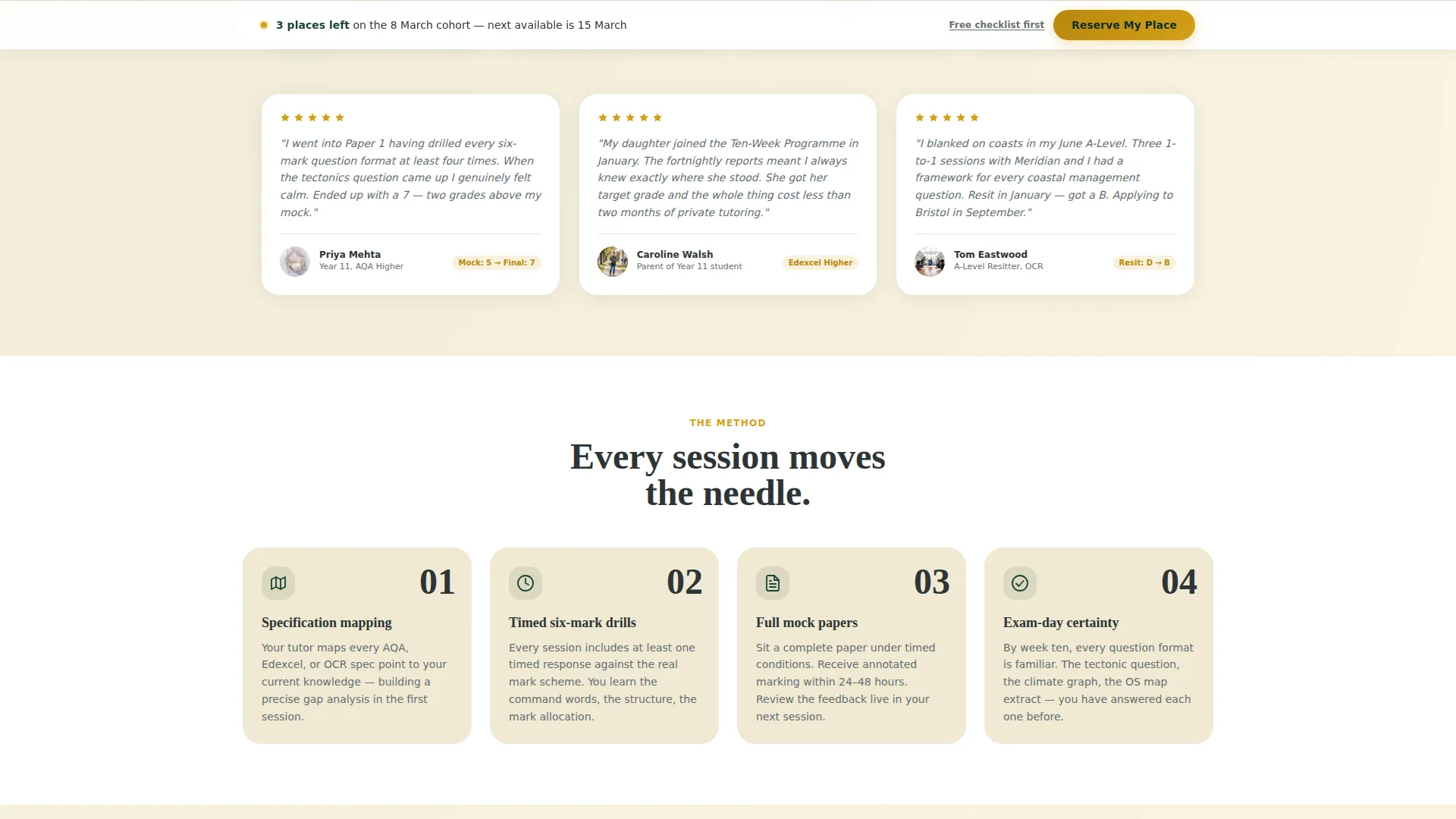
- A sticky bottom bar with the primary "Reserve My Place" call to action
- A secondary lead-capture path offering a free downloadable topic checklist
Feature list
This section highlights the core built-in components that make Meridian work as a conversion-focused geography exam prep landing page.
Multi-Step Intake Form
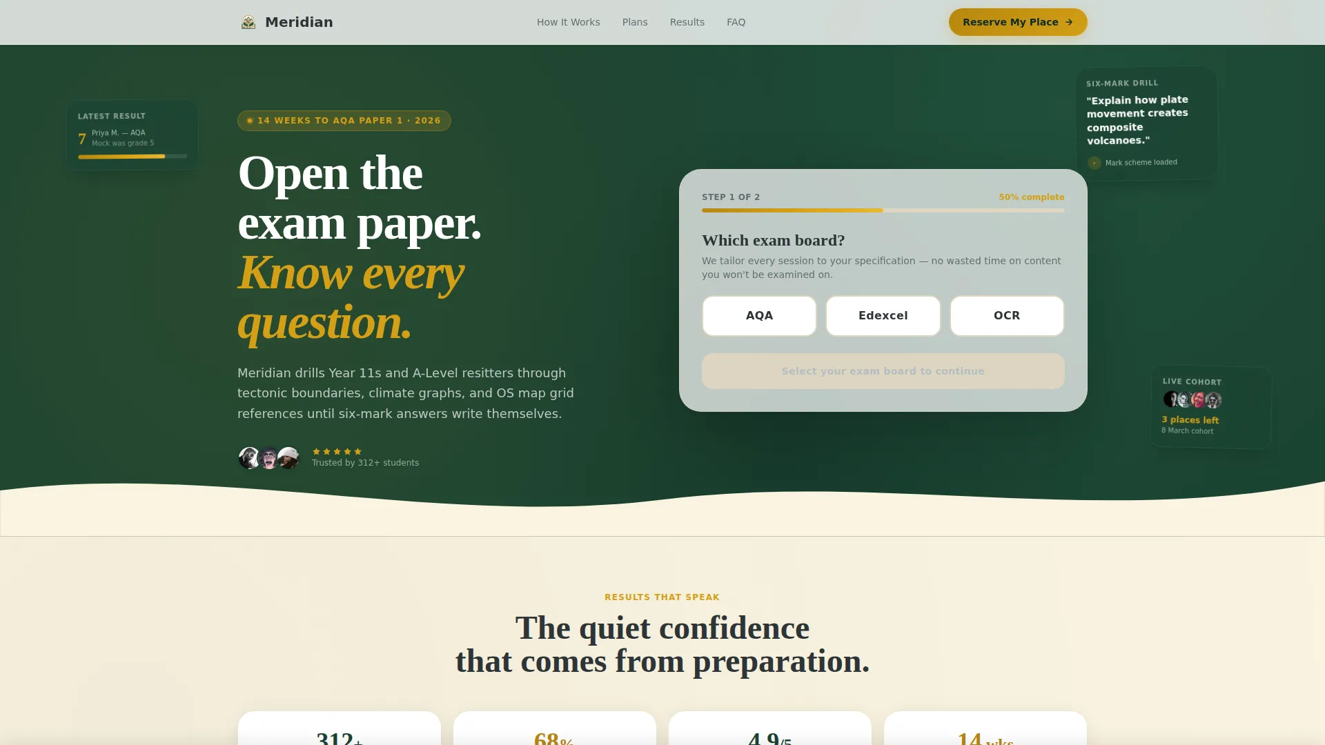
The header opens on Step 1 already in progress, asking the visitor to select their exam board from three labelled buttons. Step 2 follows with topic tiles carrying small icons for key geography themes. A topographic amber progress bar fills left to right as the visitor moves through steps, making the form feel like the start of a lesson rather than a signup wall.
FAQ-Driven Content Sections
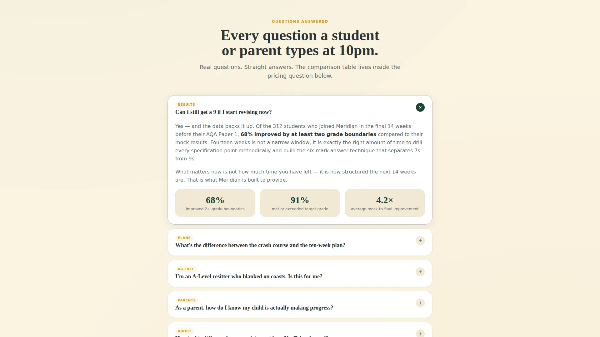
Each content section below the fold opens with a real question a student or parent would search for online. Answers are calm, specific, and sequenced to dissolve one worry at a time. This format keeps readers engaged and moves them naturally toward the registration call to action.
Three-Column Programme Comparison Table
The comparison table sits inside the answer to the pricing question. It lines up the Weekend Intensive, the Ten-Week Programme, and the One-to-One Rescue Package across three columns. Rows cover number of live sessions, mock exams included, marking turnaround time, and whether parents receive progress reports. Active row highlights use topographic amber for instant scannability.
Sticky Registration Bar
After the visitor completes Step 1 of the header form, a sticky bottom bar appears with the primary "Reserve My Place" button in topographic amber. This keeps the call to action visible throughout the full scroll without interrupting the reading experience.
Event Registration Form
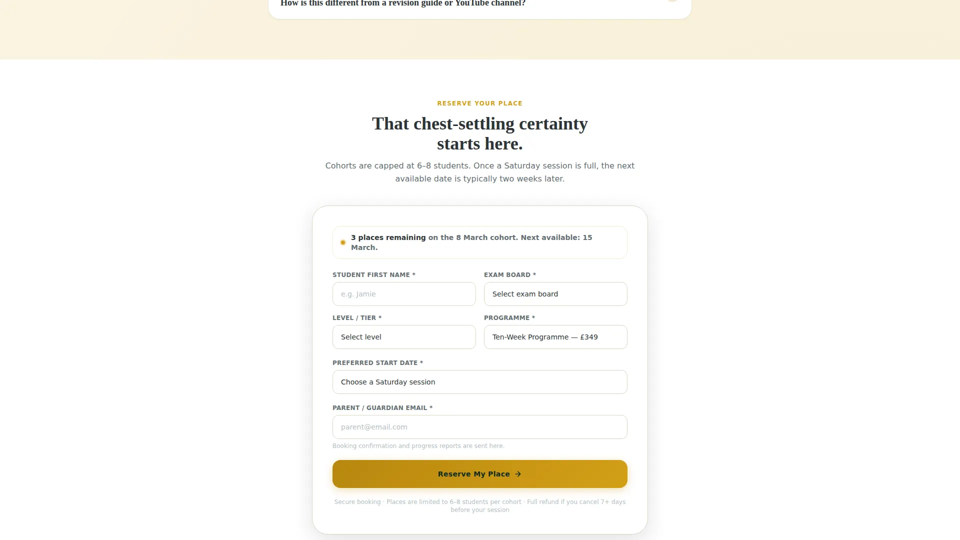
The full registration collects student first name, exam board and tier pre-filled from the header form, a preferred cohort start date from a dropdown of upcoming Saturday sessions, and a parent email address for the booking confirmation. The pre-fill reduces repetition and keeps the form completion fast.
Free Topic Checklist Lead Capture
A secondary conversion path sits alongside the primary registration option. Visitors who are not ready to commit can exchange their email address for a downloadable PDF that maps every specification point to a revision priority rating. This keeps warm leads inside the funnel.
Page sections overview
| Section | Purpose |
|---|---|
| Multi-Step Header Form | Identify exam board and weakest paper before the visitor scrolls |
| Sticky Bottom Bar | Keep "Reserve My Place" visible throughout the page |
| FAQ Content Sections | Answer real student and parent questions in sequence |
| Programme Comparison Table | Show tier differences across sessions, mocks, and reporting |
| Event Registration Form | Collect student and parent details for cohort booking |
| Lead Capture Offer | Convert undecided visitors with a free topic checklist download |
Design & branding system
The visual identity follows a Corporate Precision theme grounded in the Forest Trust color palette. The combination of deep greens and warm parchment gives the page the grounded, authoritative feel of a well-used Ordnance Survey map on a library desk.
- Deep canopy green (#1B4332) and contour-line charcoal (#2D3436) provide the primary structural colours for backgrounds and text
- Parchment cream (#FAF3E0) softens large data sections and the comparison table background
- Topographic amber (#D4A017) is reserved for buttons, badges, active table-row highlights, and the progress bar fill
Mobile & speed optimization
Meridian is structured for clean single-column stacking on smaller screens, keeping the multi-step form and comparison table readable without horizontal scrolling. The layout prioritises the most decision-critical elements at the top of the mobile view.
- The multi-step form collapses to a full-width single-column flow on mobile
- The comparison table is designed to scroll horizontally on narrow screens so row labels stay visible
- The sticky bottom bar remains anchored on mobile, keeping the primary call to action always reachable
How this template helps you convert
Meridian is built around a deliberate sequence that mirrors the way a student or parent actually makes a purchasing decision. Every design and content choice pushes toward a clear, low-friction registration.
- The multi-step form creates immediate personalisation, pre-filling exam board and tier so the registration form later feels nearly complete before the visitor reaches it.
- The FAQ-driven layout removes the most common objections one by one, replacing anxiety with the quiet confidence that comes from having every question answered.
- The sticky "Reserve My Place" bar and the secondary checklist download ensure that both ready-to-commit visitors and cautious browsers have a clear next step, reducing drop-off across both audience types.
Other information about this template
Meridian is categorised under Education and Training, within the Geography Education subcategory. It is purpose-built for geography exam prep services targeting the United Kingdom secondary and post-secondary revision market.
- The template style is a Comparison Table layout, making it well-suited to services with multiple programme tiers
- The creative direction is FAQ-Driven, which aligns naturally with high-intent search behaviour from students and parents
- The header concept is a Multi-Step Form, reducing the cold-start feeling of a blank registration page
- The landing page direction is Event Registration, supporting cohort-based session booking with upcoming Saturday start dates
- The theme is Corporate Precision, which balances academic authority with approachable, parent-friendly design
Theme
Corporate Precision
Creative direction
FAQ-Driven
Color system
Forest Trust
Style
Comparison Table
Direction
Event Registration
Page Sections
Multi-step Intake Form with Progress Bar
Faq-driven Content Flow
Three-column Programme Comparison Table
Sticky Registration Bottom Bar
Pre-filled Event Registration Form
Secondary Lead Capture Path
Related questions
Can I customise the exam board options in the header form?
How does the comparison table handle the three programme tiers?
When does the sticky 'Reserve My Place' bar appear on the page?
What does the secondary lead capture path offer visitors?
Is this template suitable for both GCSE and A-Level geography services?



