No-Code Enterprise Software Directory Website Template
Mesbuilder is a bento grid landing page template built for no-code manufacturing execution system platforms. It pairs a Data Command visual theme with a Carbon Fiber color system to create a control-room aesthetic. The layout guides plant managers and operations directors from industry pain points straight to an interactive demo, using stat cards, live-dashboard imagery, and clear calls to action.
by Rocket studio
Quick summary
Mesbuilder is a single-page bento grid template designed for no-code manufacturing execution system (MES) platforms. It opens with a full-width product screenshot hero, moves through industry-stat cards that flip to reveal relevant features, and closes with a sticky conversion bar. The visual language feels like a live control room: matte carbon black, machined aluminum type, and status-green highlights that only fire when something matters.
Who this template is for
This template is built for teams selling or showcasing no-code MES platforms to industrial buyers. It speaks directly to the people who feel the daily cost of outdated production systems.
- Operations directors at mid-size discrete manufacturers who are ready to move beyond spreadsheets and tribal knowledge
- Production engineers tired of waiting months for IT to customize legacy systems
- Continuous improvement managers who need real-time data to justify capital expenditure requests
What problem this template solves
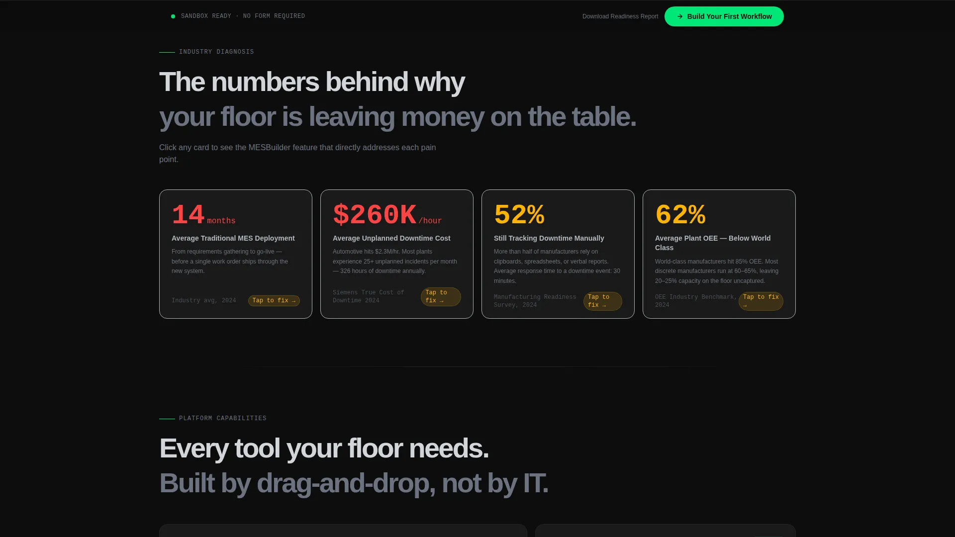
Traditional MES deployments average 14 months and require dedicated IT involvement at every step. Meanwhile, 62% of manufacturers still track downtime manually. This template reframes that gap as a competitive problem, then positions the platform as the fix.
- Visitors arrive skeptical; the layout diagnoses their pain before pitching a solution
- Stat cards use hard industry numbers to earn trust before asking for a click
- The page removes form friction entirely, sending warm prospects directly into a sandbox demo
What you get with this template
You get a fully structured bento grid landing page that reads like a manufacturing operations briefing. Every section has a clear job, and the scroll rhythm moves from diagnosis to proof without losing momentum.
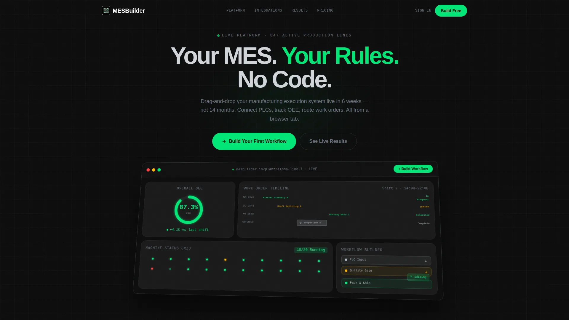
- A full-width hero section with a high-fidelity product screenshot on an isometric tilt, a bold headline, and a native-looking "Build Your First Workflow" call-to-action button
- A flippable industry-stat card row showing deployment timelines, downtime cost data, and manual-tracking percentages alongside the feature that solves each one
- A sticky bottom conversion bar that activates after 40% scroll depth, keeping the primary call to action visible without interrupting reading
Feature list
This section covers the core structural and functional elements delivered in the Mesbuilder template.
Full-Width Product Screenshot Hero
The header section displays a high-fidelity capture of the platform's live production dashboard. It shows an OEE (Overall Equipment Effectiveness) donut chart at 87.3%, a Gantt-style work order timeline with color-coded job statuses, a machine status grid with green, amber, and red indicators, and a drag-and-drop workflow builder mid-edit. The screenshot sits on a subtle isometric tilt against carbon black.
Flippable Industry Stat Cards
The first bento row presents hard industry numbers: average MES deployment time (14 months traditional versus 6 weeks on-platform), the percentage of manufacturers still tracking downtime manually (62%), and the cost of one hour of unplanned downtime by sector. Each card flips on click to reveal the specific platform feature that addresses that data point.
Scroll-Progressive Bento Grid Layout
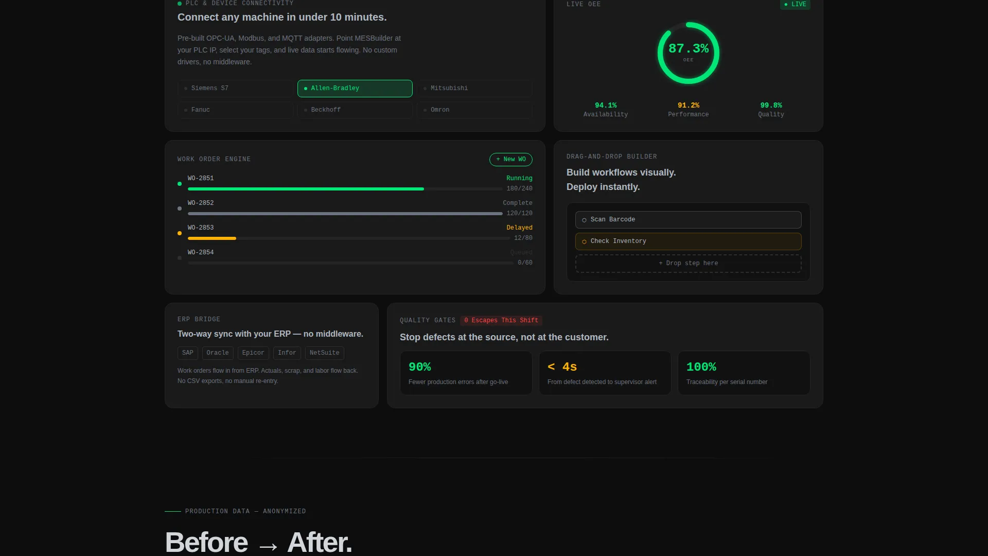
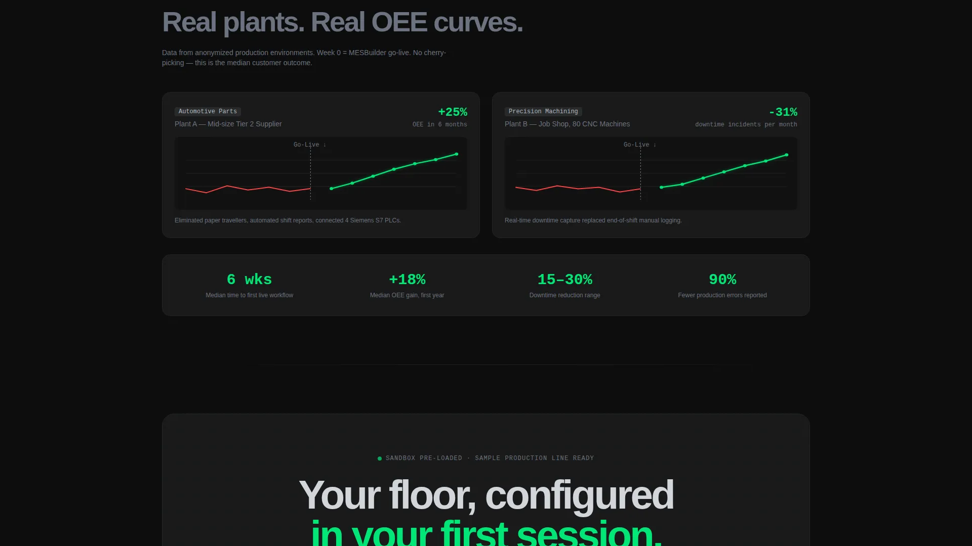
The grid tightens as the visitor scrolls. It moves from industry-wide problem framing through specific workflow demos to anonymized customer production data showing before-and-after OEE curves. The rhythm follows a consulting deck structure: diagnose, prescribe, prove.
Sticky Conversion Bar
A persistent bottom bar activates after the visitor has scrolled past 40% of the page. It keeps the primary call to action in view without blocking content. This removes the need to scroll back up to convert.
Dual Call-to-Action Architecture
The primary call to action, "Build Your First Workflow," appears in status-green inside the hero screenshot as a native-looking user interface button, then repeats after the industry stats row and again in the sticky bar. A secondary text link offers a downloadable industry readiness report, capturing intent from visitors who are not yet ready to enter the demo.
No-Form Demo Entry
There is no lead capture form on this page. The primary call to action lands visitors directly in a sandbox instance pre-loaded with a sample production line. This removes friction for high-intent buyers and shortens the path from interest to hands-on evaluation.
Page sections overview
| Section | Purpose |
|---|---|
| Hero Screenshot Header | Introduce the platform with a live dashboard visual and primary call to action |
| Industry Stat Cards | Present hard manufacturing data points that flip to reveal matching features |
| Workflow Demo Cards | Show specific drag-and-drop workflow capabilities in context |
| Before/After OEE Data | Display anonymized customer production curves to prove platform impact |
| Sticky Conversion Bar | Keep the primary call to action accessible after 40% scroll depth |
| Secondary Report Link | Capture email from visitors not yet ready for the sandbox demo |
Design & branding system
The visual identity follows a Data Command theme built on a Carbon Fiber color system. Every color choice carries a functional meaning, just like indicator lights on industrial hardware.
- Deep carbon black (#0D0D0D) forms the base background; machined aluminum (#B0B8C1) handles body type and structural dividers
- Status-green (#00E676) is reserved for live data indicators, positive KPIs, and the primary call-to-action button
- Caution amber (#FFB300) appears on interactive hover states and secondary accents, signaling interactivity without noise
Mobile & speed optimization
The bento grid layout is structured to adapt cleanly across screen sizes. The control-room aesthetic remains readable at smaller breakpoints because its design language relies on color signals and clear typographic hierarchy rather than dense imagery.
- Bento cards reflow into a single-column stack on smaller screens, keeping stat cards and flip interactions accessible on touch devices
- The sticky conversion bar is designed to sit outside the main scroll flow, so it does not compete with content on narrow viewports
- No lifestyle photography or factory floor imagery is used anywhere on the page, which keeps asset weight low by design
How this template helps you convert
The page architecture is built around one goal: getting the right visitor into the demo sandbox with as little friction as possible.
- The hero section makes the product the proof. The dashboard screenshot shows real metrics and a live workflow builder, so the visitor understands the platform's capability before reading a single bullet point.
- The stat card row earns trust with industry data before asking for action. When a card flips to reveal a feature, the visitor connects their own pain to a specific solution, making the click feel logical rather than promotional.
- The dual call-to-action and secondary report link serve two buyer stages. High-intent visitors click through to the sandbox; research-stage visitors share their email for the report, keeping both groups inside the conversion funnel.
Other information about this template
This template is categorized under Technology, in the No-Code Enterprise Software subcategory, with a niche focus on No-Code MES platforms. It was designed specifically for the intersection of industrial operations software and no-code builder tooling.
- The template style is Bento Grid, matching the layout language of modern SaaS dashboards and making the page itself feel like a product artifact
- The creative direction is Industry Report, meaning the scroll narrative reads like a consulting briefing rather than a marketing brochure
- The header concept is Product Screenshot, using the platform's own interface as the hero visual with zero lifestyle or stock imagery
- The landing page direction is Click-Through, optimized to move visitors into a live sandbox rather than into a form or nurture sequence
- The Intersection Match Score for this template configuration is 13, reflecting a tightly matched combination of theme, style, direction, and niche
Theme
Data Command
Creative direction
Industry Report
Color system
Carbon Fiber
Style
Bento Grid
Direction
Click-Through
Page Sections
Product Screenshot Hero Section
Flippable Industry Stat Cards
Scroll-progressive Bento Grid
Sticky Bottom Conversion Bar
No-form Demo Entry Path
Dual Call-to-action Structure
Related questions
Does this template require any coding to customize?
What type of business is this template designed for?
Is there a lead capture form included on this page?
Can I update the statistics shown in the flip cards?
Why is the bento grid a good layout choice for an MES platform page?



