Specialist Data Mesh Technology Professional Website Template
Mesh is a dashboard-style landing page template built for a data mesh newsletter and community. It opens with an interactive Kanban-style data grid in the header, drives scroll momentum with live subscriber counts and article performance stats, and converts visitors through a freemium model. The Tech Glass visual identity uses carbon black and electric cyan to feel precise, terminal-ready, and alive.
by Rocket studio
Quick summary
Mesh is a single-page landing page template designed for data mesh newsletters and technical communities. It greets visitors with a working mini-dashboard in the header, builds trust through live community signals, and earns the subscription through a freemium conversion flow. The carbon fiber visual identity makes every panel feel like a high-precision instrument.
Who this template is for
This template is built for technical publishers and community operators who need their landing page to do real work. It suits teams that want to convert skeptical, analytically minded readers who respond to proof over persuasion.
- Platform engineers and data leads running domain-oriented architecture newsletters
- Community managers who want to show live activity and social proof before asking for a signup
- Technical founders or independent publishers launching a data mesh resource hub with free and paid tiers
What problem this template solves
Most newsletter landing pages use static screenshots and vague value propositions. For a technically sophisticated audience like data engineers and CTOs, that approach falls flat fast. Readers want to see the product before they commit, and they want evidence the community is active.
- Static pages cannot show the quality and freshness of content without asking for blind trust
- Generic templates lack the visual weight and precision that signals credibility to a technical audience
- Freemium conversion flows are often buried or weak, making it hard to communicate tier value clearly
What you get with this template
You get a fully structured, single-page landing page with a layered conversion system built in. Every section is purpose-built to move a skeptical technical reader from curiosity to subscription at their own pace.
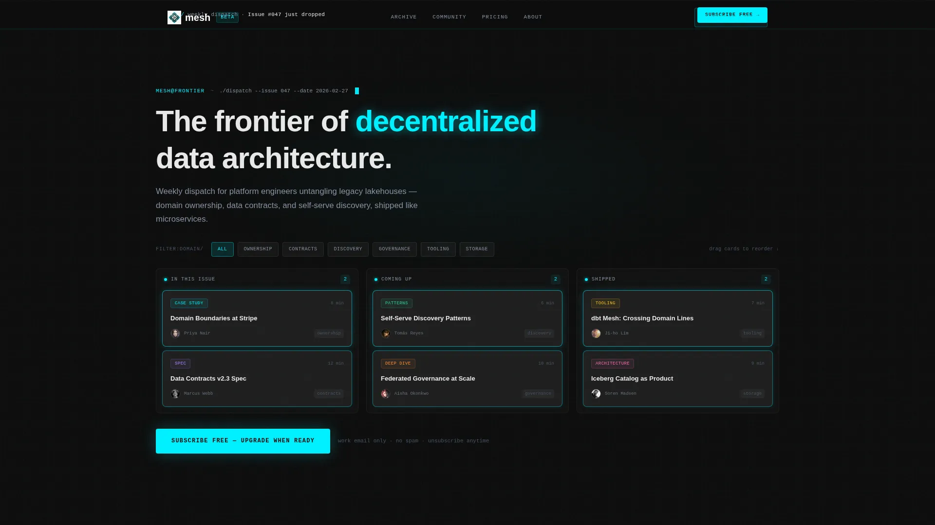
- An interactive header dashboard with a draggable, filterable Kanban-style data grid showing real issue topics and metadata
- A staggered-load content feed including a top-articles carousel with open-rate stats, a community activity feed with event and thread previews, and a schema-style free versus Pro comparison grid
- A pinned frosted-glass subscription bar with a primary free-tier call to action and an inline-expanding secondary call to action for the 14-day Pro trial
Feature list
This template delivers a precise set of built-in components. Each one is drawn directly from the design brief.
Interactive Header Dashboard
The header renders a live mini-dashboard directly in the viewport. Visitors can drag, filter, and hover cards in a Kanban-style data grid showing the latest issue topics. Each card displays a title, read time, domain tag, and contributor avatar. A faint cyan border pulses on load. The visitor is already inside the product before scrolling.
Live Subscriber and Freshness Signals
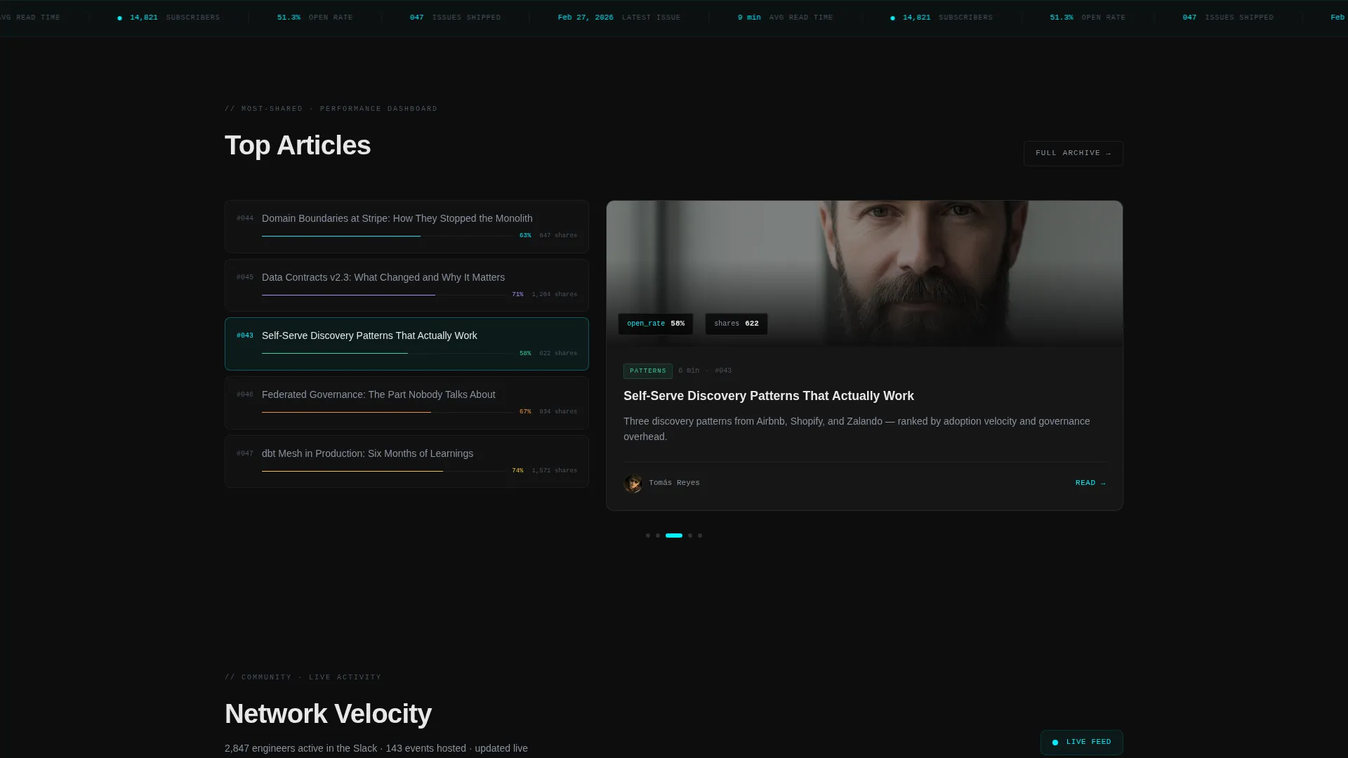
A live subscriber count ticks upward and a "Latest Issue" timestamp is visible immediately on page load. These signals establish community velocity and content freshness before the reader reaches any call to action. They work as passive proof that the network is real and growing.
Top Articles Performance Carousel
A horizontal carousel showcases the five most-shared articles. Each entry displays open-rate statistics styled like a performance dashboard readout. This gives prospective subscribers a concrete preview of the content quality and reach they are joining.
Community Activity Feed
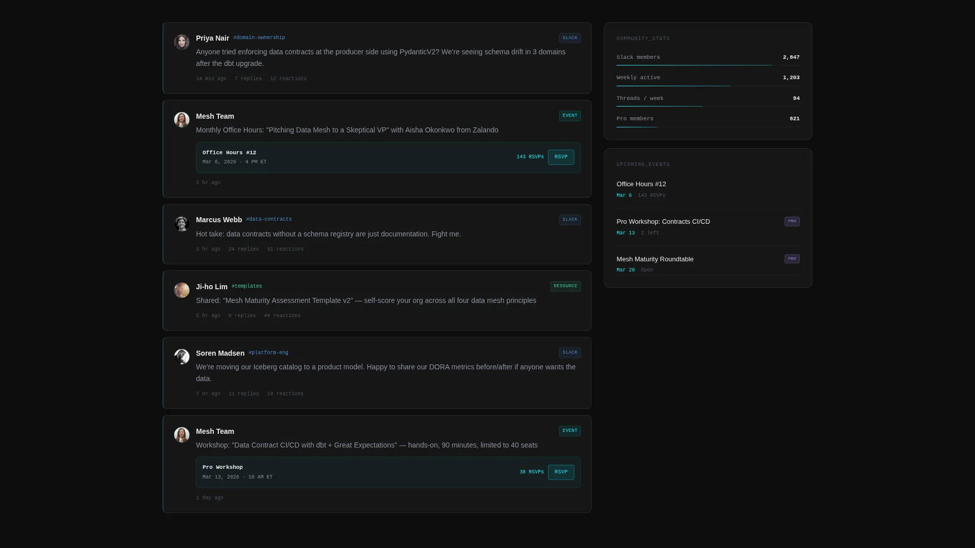
A live-style feed shows real Slack thread previews and event RSVPs. This section communicates that the community is active right now, not dormant. It lowers the perceived risk of subscribing by showing who else is already engaged.
Freemium Conversion Bar and Pro Trial Expansion
A frosted-glass sticky bar pins the primary call to action after the first scroll. A secondary call to action below the community section expands inline to reveal Pro tier benefits: full archive search, private Slack channels, monthly office hours, and data mesh maturity assessment templates. The two-step flow lets visitors self-qualify before committing.
Staggered Terminal-Style Section Loading
Each content section loads with a staggered fade animation that mimics terminal output: line by line, fast, and deliberate. This pacing reinforces the technical identity of the product and creates a sense of momentum as the visitor scrolls down the page.
Page sections overview
| Section | Purpose |
|---|---|
| Interactive Header Dashboard | Lets visitors explore real content in a live Kanban grid before scrolling |
| Subscriber and Freshness Bar | Shows live subscriber count and latest issue timestamp for instant trust |
| Top Articles Carousel | Displays the five most-shared articles with open-rate performance stats |
| Community Activity Feed | Previews Slack threads and event RSVPs to prove the community is active |
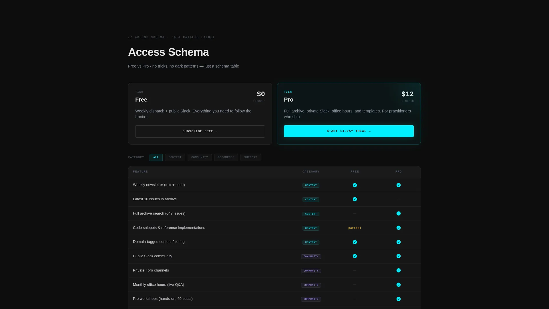
| Free versus Pro Comparison Grid | Schema-table layout contrasting free-tier and Pro membership benefits clearly |
| Inline Pro Trial Expansion | Reveals Pro benefits in an expanding panel triggered by a secondary call to action |
| Pinned Subscription Bar | Frosted-glass sticky bar with the primary free-tier subscription call to action |
Design & branding system
The visual identity follows a Tech Glass theme built on a Carbon Fiber color system. Every design choice reinforces precision, depth, and technical credibility.
- Deep carbon black (#0D0D0D) and woven graphite (#1A1A2E) form the base layer, with translucent panel gray (#FFFFFF0A) used as frosted-glass overlays on interactive surfaces
- Electric cyan (#00F0FF) marks every interactive edge, hover state, and data accent, creating razor-thin reflections that make the dark surface feel alive under halogen light
- The overall aesthetic is matte darkness interrupted by precise cyan highlights, modeled on the look and feel of carbon fiber held under direct light
Mobile & speed optimization
The staggered loading approach and section-by-section reveal structure keep the page feeling fast and responsive as content loads. The design system is built for crisp rendering on any screen size.
- Frosted-glass overlay panels and card-based layouts adapt naturally to narrower viewports without losing visual hierarchy
- Staggered fade animations are designed to be fast and deliberate, avoiding heavy transitions that would slow perceived performance on mobile connections
- The Kanban grid and carousel components are built for touch interaction, supporting drag and filter behaviors on mobile devices
How this template helps you convert
This template earns the click instead of demanding it. Every section builds a case for subscribing by showing real value before asking for anything.
- The interactive header dashboard puts visitors inside the product immediately, letting them experience content quality firsthand before any call to action appears.
- Live subscriber counts, freshness timestamps, article stats, and community feed activity stack up as social proof that the community is real and worth joining.
- The two-step freemium flow separates the low-friction free signup from the higher-commitment Pro trial, giving every visitor a natural entry point that matches their current level of trust.
Other information about this template
This template is well suited for any technically oriented newsletter or data community that wants a landing page with real interactivity and layered conversion logic. It is built for a single-page flow and does not require multi-page navigation to deliver its full conversion sequence.
- The template is designed around a freemium model where the free tier requires only a work email, lowering the barrier to initial sign-up
- Content cards in the header grid include metadata fields for read time, domain tag, and contributor avatar, making the template adaptable to different content types within the data and technology space
- The schema-table comparison grid is styled to feel like reading a data catalog, which resonates strongly with readers who work in data engineering, data architecture, or platform infrastructure roles
- The inline Pro trial expansion reveals four concrete Pro benefits: full archive search, private Slack channels, monthly office hours, and data mesh maturity assessment templates
Theme
Tech Glass
Creative direction
Launch Energy
Color system
Carbon Fiber
Style
Dashboard/Data Grid
Direction
Freemium/Trial
Page Sections
Interactive Kanban Header Dashboard
Live Subscriber and Freshness Signals
Top Articles Performance Carousel
Community Activity Feed
Two-step Freemium Conversion Flow
Staggered Terminal-style Load Animation
Related questions
Can I customize the content cards in the header dashboard?
Does the template support both a free tier and a paid membership offer?
Is this template suitable for a technical newsletter outside the data mesh space?
How does the community activity feed work in this template?
What makes this landing page different from a standard newsletter template?



