Complete Data Mesh Technology Professional Website Template
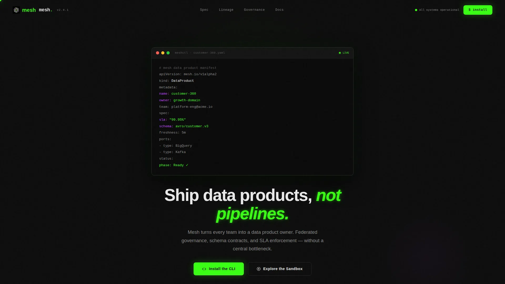
Mesh is a dark-mode dashboard landing page template built for data mesh platforms. It opens with an auto-typing YAML terminal header, then walks visitors through four numbered specification cards covering domain ownership, self-serve provisioning, federated governance, and observability. The page closes with a CLI install command and a sandbox access path, designed to earn the download before asking for it.
by Rocket studio
Quick summary
Mesh is a single-page, dashboard-style landing page template for federated data platform products. It combines a live-typed code snippet header, a scrolling spec card grid, and a direct CLI install call to action. The Acid Digital color system keeps the visual tone precise and technical. Every section earns trust before asking for commitment.
Who this template is for
This template is built for technical teams launching or promoting a federated data mesh platform. It speaks the language of engineers and data product owners, not marketing generalists.
- Platform engineers who need a focused, technical product page that respects their audience's intelligence
- Data product owners ready to move beyond monolithic pipeline tooling and communicate a new operating model
- Chief Technology Officers who need a credible, precise landing page to back a federated data strategy
What problem this template solves
Most platform landing pages are either too vague or too polished in the wrong direction. They use metaphors when engineers want specifications. They bury the architecture behind stock photography and hero animations that mean nothing.
- Teams lack a structured way to communicate domain ownership, governance, and observability in a single scrollable page
- Visitors arrive technically informed but leave unconvinced because the page never shows the actual model
- The gap between reading about data mesh concepts and seeing an operational product manifests as lost signups
What you get with this template
This template delivers a complete, single-page layout that takes a technical visitor from first impression to install action. Each section is purposeful and sequenced to build confidence progressively.
- An animated YAML terminal header that auto-types a data product manifest line by line with phosphor glow effects
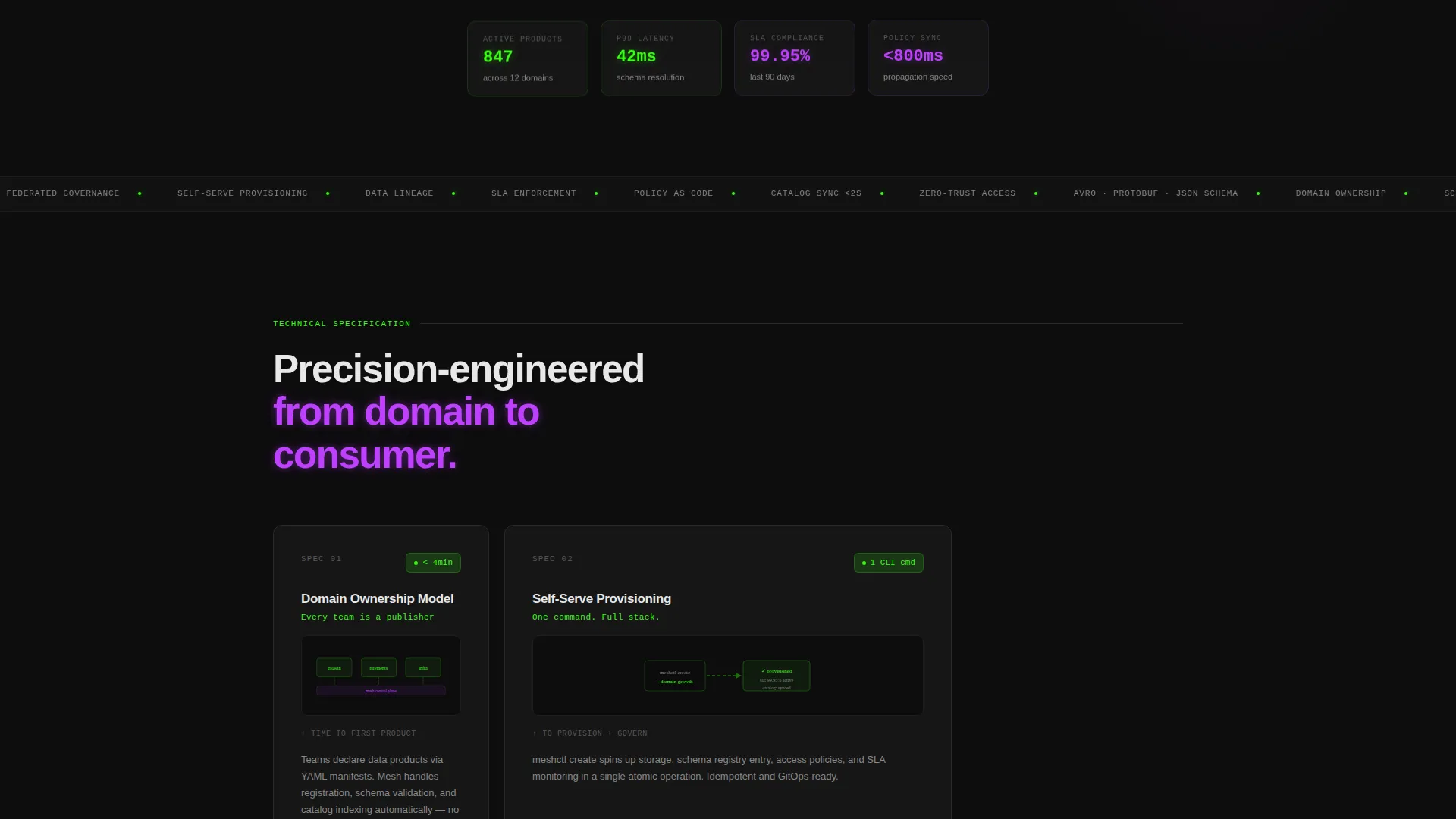
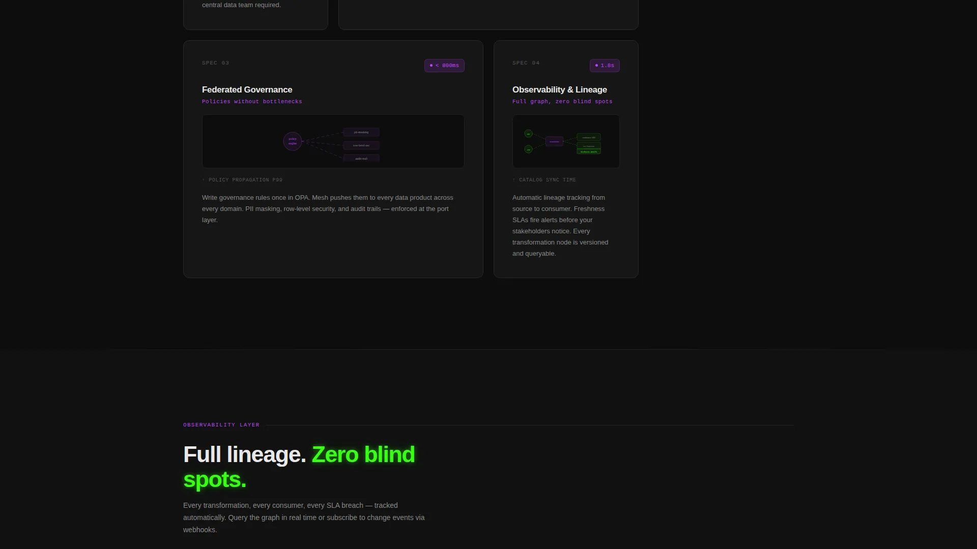
- Four numbered specification cards, each containing a metric, a micro-diagram, and a three-line technical explanation
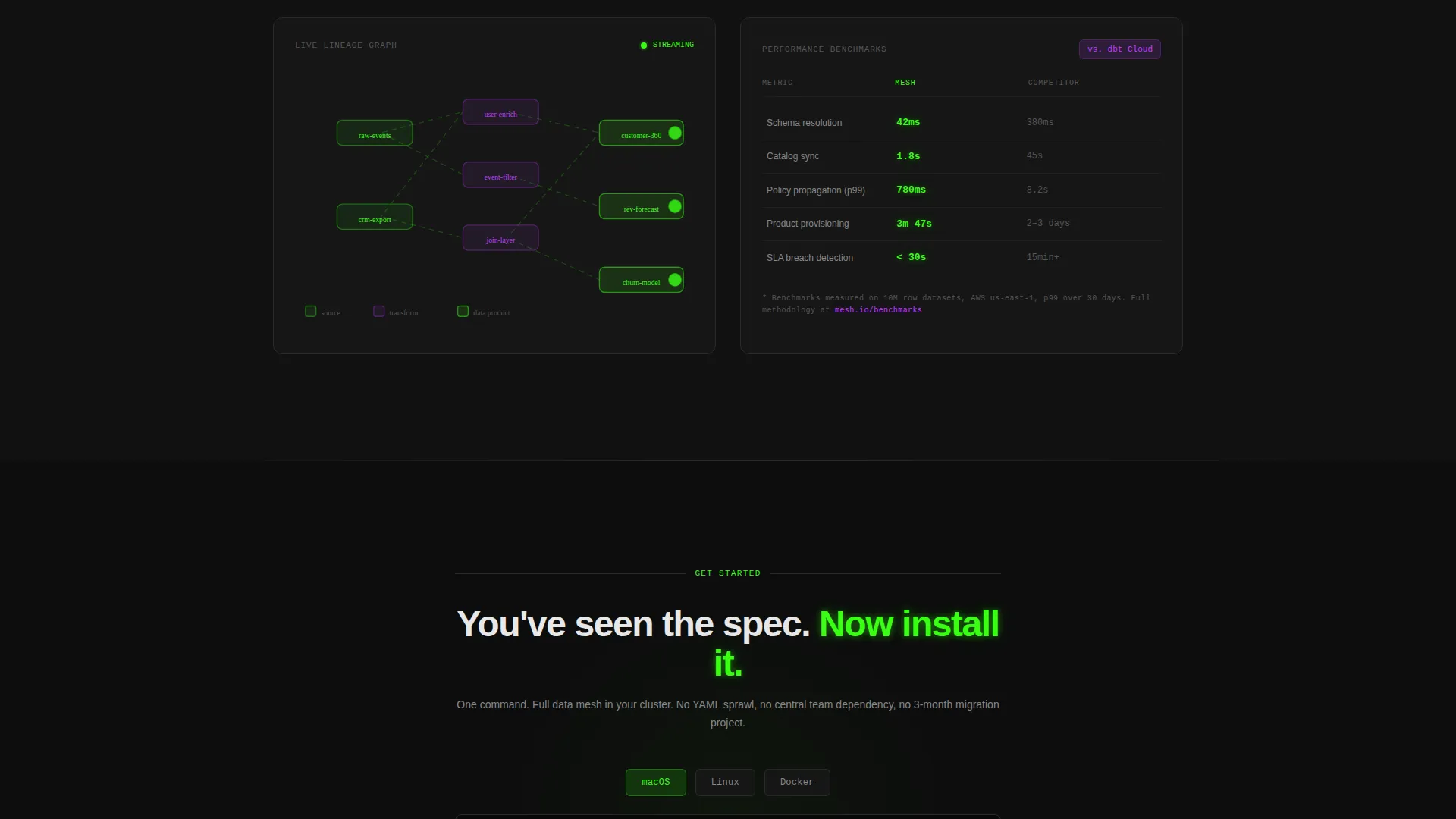
- A CLI install section with a one-click copy command, platform toggle pills for macOS, Linux, and Docker, and a secondary sandbox access path via GitHub OAuth
Feature list
This section covers the core built-in components and interaction patterns included in the template.
Auto-Typing Terminal Header
The header renders a syntax-highlighted YAML block inside a terminal frame. Each key-value pair types in line by line with a phosphor glow effect and a blinking cursor. Visitors immediately see a real data product manifest taking shape, which sets the technical tone before any prose loads.
Numbered Specification Cards
Four spec cards structure the main content area like a technical datasheet. Each card carries a reference number, a headline specification area, a metric value such as p99 latency or catalog sync time, a compact micro-diagram, and a three-line explanation. The grid tightens as the visitor scrolls, shifting from spacious overview panels to dense, information-rich detail views.
CLI Install Call to Action
The primary call to action presents a ready-to-run install command with a one-click copy-to-clipboard interaction. Platform toggle pills let visitors switch between macOS, Linux, and Docker variants without leaving the page. This removes decision friction at the moment of conversion.
Sandbox Access Path
A secondary conversion route offers a hosted playground environment accessible through a GitHub OAuth login. This gives visitors who are not ready to install locally a low-barrier way to experience the platform directly, keeping them moving forward.
Acid Digital Color System
The visual identity uses void black as the background, terminal phosphor green for calls to action and status indicators, ultraviolet accent for hover states and graph edges, and signal white for body text. The palette creates a dark-mode IDE atmosphere that feels native to the audience.
Scrolling Dashboard Grid Layout
The page uses a data grid structure where sections compress as the visitor scrolls deeper. The layout mimics the experience of zooming into a live dashboard from a high-level overview into granular detail, reinforcing the product's positioning at every scroll depth.
Page sections overview
| Section | Purpose |
|---|---|
| Terminal Header | Auto-types YAML data product manifest with blinking cursor |
| Headline Fade-In | Reveals core product message after terminal animation completes |
| Spec 01 Card | Explains the domain ownership model with metric and diagram |
| Spec 02 Card | Covers self-serve provisioning with sync time metric |
| Spec 03 Card | Details federated governance with policy propagation speed |
| Spec 04 Card | Shows observability and lineage with p99 latency metric |
| CLI Install Block | Copy-to-clipboard install command with platform toggle pills |
| Sandbox Access | Secondary path to hosted playground via GitHub OAuth |
Design & branding system
The Acid Digital color system drives every visual decision in this template. The palette is synthetic and precise, designed to feel native to engineers who live in dark-mode terminals.
- Void black (#0D0D0D) backgrounds keep data and code legible with maximum contrast
- Terminal phosphor green (#39FF14) dominates calls to action, status indicators, and code highlights, while ultraviolet (#BF40FF) marks interactive hover states and graph edges
- Signal white (#E8E8E8) carries all body text, keeping reading comfortable across long specification sections
Mobile & speed optimization
The dashboard grid layout adapts across screen sizes so the specification cards and terminal header remain readable on smaller viewports. The template is structured to minimize layout shifts as scroll-triggered animations activate.
- Specification cards restack vertically on mobile so each metric and diagram stays clearly associated with its explanation
- The CLI install block and platform toggle pills are touch-friendly and remain functional on mobile browsers
- The auto-typing terminal header animation is lightweight by design, relying on text rendering rather than video or heavy asset loads
How this template helps you convert
The page is engineered so that intellectual friction disappears before mechanical friction begins. By the time a visitor reaches the install command, they have already processed the architecture, the benchmarks, and the governance model.
- The terminal header establishes technical credibility in the first five seconds, signaling that this product was built by people who understand the stack
- The four specification cards front-load evidence, so the call to action feels like a logical next step rather than a leap of faith
- The dual conversion path, CLI install for ready users and sandbox for explorers, captures intent at two different stages of the buyer's readiness
Other information about this template
This template sits inside the Startup Velocity theme family, which is designed for technically ambitious products that need to communicate speed, precision, and operational maturity.
- The template style is a Dashboard and Data Grid layout, making it a strong fit for platform, infrastructure, and developer tooling products beyond the data mesh category
- The header concept is classified as Code Snippet, a pattern that works well for any product where the interface is a command line, an API, or a configuration file
- The creative direction follows a Spec Sheet approach, meaning the page earns trust through demonstrated specificity rather than aspirational prose
- The landing page direction is App Download, meaning every design and copy decision is optimized toward getting a qualified visitor to run an install command or enter a sandbox
Theme
Startup Velocity
Creative direction
Spec Sheet
Color system
Acid Digital
Style
Dashboard/Data Grid
Direction
App Download
Page Sections
Auto-typing Terminal Header
Numbered Specification Cards
CLI Install Block with Platform Toggles
Sandbox Access Via Github Oauth
Acid Digital Color System
Scrolling Dashboard Grid Layout
Related questions
Can I change the YAML content in the terminal header?
Do I need a live backend to use this template?
Is the specification card grid limited to four cards?
Who is this template designed for?
Can I replace GitHub OAuth with a different login method for the sandbox path?



