Bold Ministry Newsletter Landing Page Template
Epistle is a bold brutalist ministry newsletter landing page template built for pastors, parish admins, and megachurch communications directors. It combines an Industry Report creative direction with a Midnight Blue color system, a three-tier comparison table, and a freemium conversion path, giving ministry teams a raw, striking framework to prove their email problem and capture engaged leads.
by Rocket studio
Quick summary
Epistle delivers a single-page, evidence-first landing page for religious organization email newsletter services. The brutalism-rooted design pairs heavy monospaced typography with a deep navy palette, guiding ministry communicators from benchmark data straight to a free-tier sign-up or a downloadable report.
Who this template is for
This landing page is perfect for ministry communications professionals who need a structured, bold framework to present their newsletter offering.
- Pastors and parish admins drafting newsletters manually and frustrated by low open rates
- Megachurch communications directors managing segmented campaigns across multiple campuses
- Ministry-focused SaaS teams running a freemium or trial conversion model
What problem this template solves
Most church email newsletters bleed engagement silently. Weak subject lines, poor mobile rendering, and frequency fatigue all erode the audience before a single word lands. This landing page frames those problems with data, then positions the solution clearly.
- No structured way to present open-rate benchmarks and engagement drop-off information to prospective users
- Generic newsletter pages that fail to stand out or speak directly to ministry communicators
- Missing a tiered pricing comparison that helps buyers understand which plan fits their congregation size
What you get with this template
You get a fully structured, single landing page that reads like an industry briefing and converts like a focused sales page. Every section is purposeful and raw, nothing decorative, everything functional.
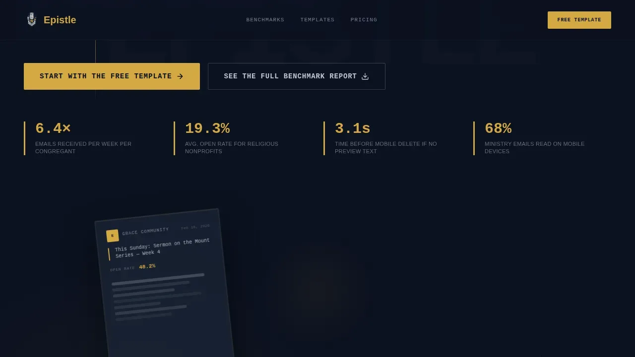
- A hero section with dark glass panels, brutalist stat blocks, and a dual call-to-action form
- A three-tier comparison table with conviction gold highlights and heavy vertical rules separating Free, Growth, and Shepherd plans
- A dual lead-capture form that converts both ready-to-build visitors and report-curious researchers
Feature list
This landing page template includes six tightly scoped sections. Each one is designed to earn the next scroll.
Brutalist Hero with Stat Blocks
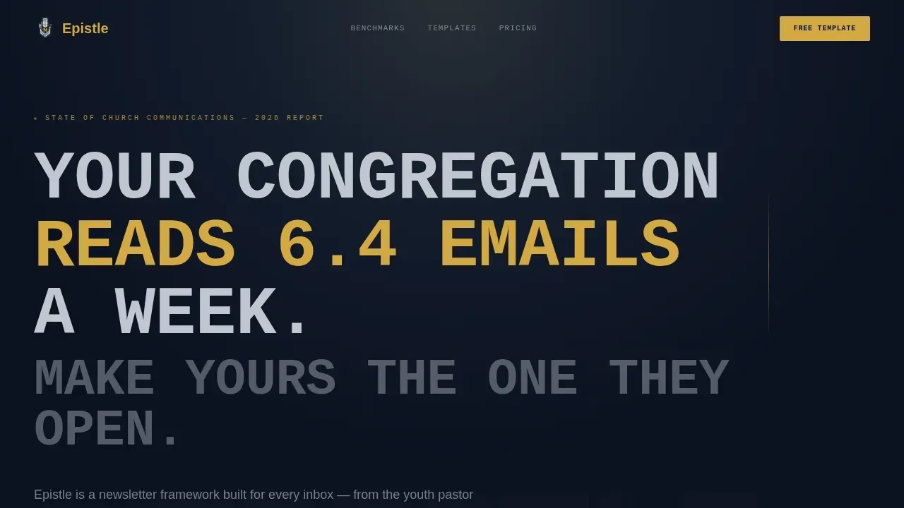
The hero opens with three frosted glass panels floating against an abyssal navy background. Massive, all-caps monospaced typography punches a benchmark statistic directly into the dark. Brutalism here emphasizes function: the stat lands before any description of the product appears.
Industry Report Scroll Section
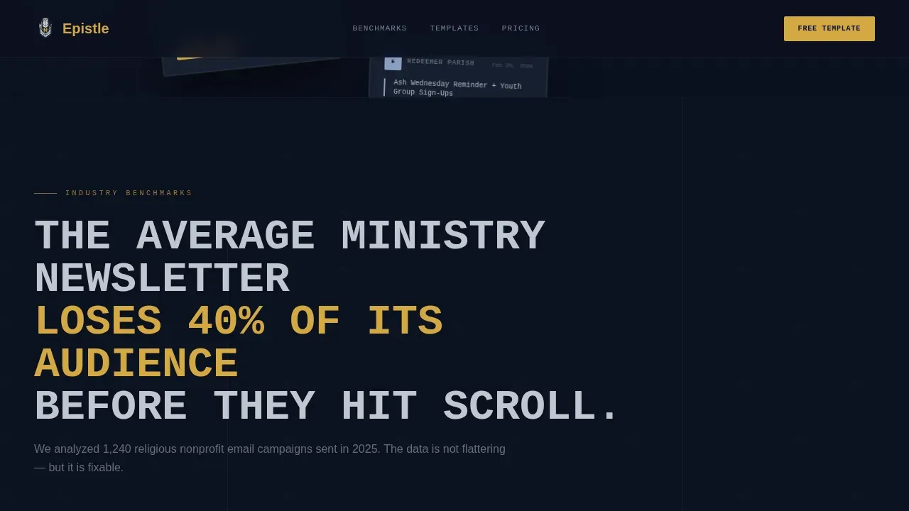
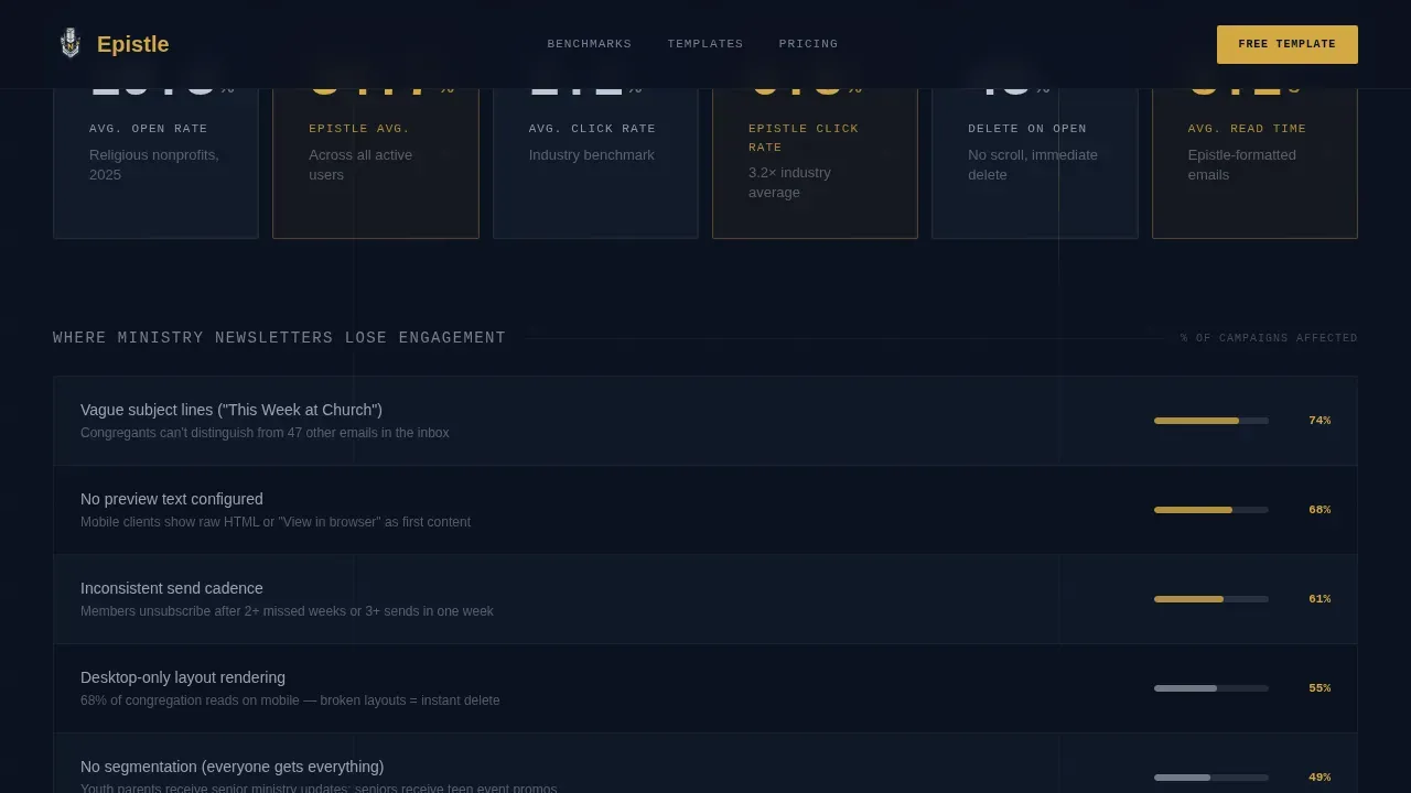
The page presents open-rate benchmarks and engagement drop-off data in bold brutalist stat blocks. This section communicates a strong message to the audience by proving the church email problem before introducing the solution. Raw information, no embellishment.
Three-Tier Comparison Table
The comparison table separates Free, Growth, and Shepherd plans with heavy vertical rules. Feature rows alternate between sanctuary slate and abyssal navy. Active highlights and toggle states render in conviction gold, making it easy to read the differences at a glance.
Dual Conversion Form
The call-to-action section includes two paths: "Start With the Free Template" and "See the Full Benchmark Report." Both gates ask only for an email address and a congregation size dropdown, keeping friction low and sign-up rates high.
Social Proof Section
Testimonials from real pastors, parish admins, and communications directors appear with church names attached. Open-rate improvement metrics give the social proof section specific, credible weight rather than generic praise.
Pricing Toggle and Interactive Table
The comparison table supports a pricing toggle and spotlight hover effects. These interactive pages elements help visitors self-select their tier without needing to read every row in detail.
Page sections overview
| Section | Purpose |
|---|---|
| Hero Stat Block | Open with benchmark data and dual call to action |
| Industry Report | Prove email engagement problems with raw stats |
| Comparison Table | Differentiate Free, Growth, Shepherd plans |
| Social Proof | Testimonials with church names and metrics |
| Conversion Form | Capture leads via free template or PDF report |
| Footer Row | Single-row linear footer for navigation |
Design & branding system
The design system embraces brutalism fully. Strong, contrasting colors and bold typography replace decorative elements with raw visual authority. Pages feel like a stained-glass window at midnight: rich, intentional, and precise.
- Abyssal navy (#0B1120) as the dominant background, sanctuary slate (#1E2A3A) for card and table surfaces, communion silver (#C0C7D1) for body text
- Conviction gold (#D4A843) reserved exclusively for calls to action, toggle states, and active comparison highlights
- JetBrains Mono for headlines, DM Sans for body copy, bold and unconventional typography that avoids unnecessary embellishments
Mobile & speed optimization
This landing page is built mobile-first, recognizing that many ministry communicators draft and review on phones. The design scales without sacrificing its brutalist statement or functional clarity.
- Single-column stacking for the comparison table and stat blocks on smaller screens
- Scroll reveals, beam drops, and spotlight cards are implemented as client-side components to keep static sections fast
- Server Components handle static sections; interactive table and animation layers run client-side
How this template helps you convert
The page is structured as an evidence-first narrative. Every scroll depth earns the template's right to ask for an email address.
- The hero stat block and Industry Report section establish credibility with benchmark data before any product claim appears, so visitors trust the information they read.
- The comparison table makes self-selection easy, guiding each visitor toward the plan that fits their congregation size without requiring a sales conversation.
- The dual form captures both action-ready and research-stage visitors, maximizing lead volume across different audience intent levels.
Other information about this template
This template is perfect for ministry-focused teams who want to embrace a bold design approach without needing traditional programming skills. Brutalism in web design is ideal for those who want a functional and visually striking website, and it can be intimidating, making it best suited for teams willing to take risks and make a statement.
- No-code tools and vibe coding workflows can work alongside this template. Users can create functional pages quickly using natural language prompts and AI-powered web development tools that streamline code generation.
- The Epistle bold brutalist ministry newsletter landing page template ships with tags for congregation size segmentation built directly into the dual lead-capture form, making it easier to understand your audience from day one.
- Brutalist web design is based on the idea that simplicity and honesty are more important than sophisticated appearance, a principle that aligns naturally with ministry communications values.
Theme
Bold Brutalist
Creative direction
Industry Report
Color system
Midnight Blue
Style
Comparison Table
Direction
Freemium/Trial
Page Sections
Brutalist Hero with Benchmark Stat Blocks
Industry Report Scroll Section
Three-tier Comparison Table
Dual Lead-capture Conversion Form
Social Proof with Church-named Testimonials
Interactive Pricing Toggle and Spotlight Effects
Related questions
Who is this landing page template designed for?
Does the comparison table support three pricing tiers?
Can I use this template without coding experience?
What does the dual conversion form capture?
Why does this template use a brutalist design style?



