Utility Company Vertical SaaS Professional Website Template
The Meter Real-Time Grid Analytics Dashboard Landing Page Template is a dark glassmorphic single-page template built for utility-sector SaaS products. It combines animated KPI cards, a stats-first scroll structure, a hero product screenshot, and two clear conversion paths into one commanding control-room aesthetic designed to turn grid data into confident decisions.
by Rocket studio
Quick summary
The Meter dashboard template is a single-page, stats-first landing page built for utility analytics platforms. It opens with a 3D-tilted product screenshot, rolls through kinetic odometer statistics, and closes every section with a proof panel showing the monitoring dashboard in action. Two conversion paths sit inside the page: a demo click-through and a mid-page inline email capture for a downloadable grid reliability report.
Who this template is for
This dashboard template was designed with three distinct utility-sector roles in mind. Each role arrives on the page with a different question, and the template answers all three without losing focus or burying the most important data.
- Operations directors at regional utilities who need real-time monitoring of grid load, peak demand headroom, and system average interruption duration (SAIDI) before the morning briefing ends.
- Regulatory compliance officers who assemble quarterly filings from fragmented SCADA (Supervisory Control and Data Acquisition) data and need documented accuracy they can defend in a filing.
- Chief financial officers who need revenue-per-megawatt trend lines and energy usage cost summaries without waiting weeks for an analyst to produce a spreadsheet.
What problem this template solves
Utility analytics platforms carry a specific credibility burden. The product handles millions of kilowatt-hour readings, pressure logs, and outage events. The landing page has to show that complexity working, not just describe it. Most analytics dashboard landing pages rely on abstract feature lists or generic charts that could belong to any industry. They fail to earn the trust of a grid operations professional in the first thirty seconds. This template solves that directly.
- It replaces vague feature copy with oversized kinetic statistics that prove the product's performance before any explanation appears, making data analysis legible from the first scroll.
- It shows the energy monitoring dashboard in motion inside the hero section, so users understand what they are clicking into before they ever reach a call to action.
- It structures the scroll as a punch-proof-punch-proof rhythm, escalating from real time monitoring of operational data to predictive analytics to compliance automation, matching how utility decision-makers actually evaluate software.
What you get with this template
This is a fully built single-page template. Every section, animation, and design component is included. Users do not need to assemble the layout from scratch or source separate animation libraries. Using a pre-made template with built-in widgets like this one can save weeks of development time compared to building a custom dashboard landing page from the ground up.
- Five core page sections: Hero with animated KPI cards and grid map, two stats proof sections, a predictive analytics bento grid, and a mid-page email capture, all followed by a linear single-row footer.
- Two conversion paths: A primary demo click-through button anchored in the hero and repeated after the third stats section, plus a secondary inline email capture offering a downloadable grid reliability report.
- Full animation suite: GSAP ScrollTrigger odometer counters, cyan trace animations along chart lines, parallax depth layers, and pulsing glow states on every call to action, so the monitoring dashboard feels live even in a static preview.
Feature list
This dashboard template ships with a focused set of prompt-defined capabilities. Every feature listed here is present in the template as specified in the source brief.
Hero Product Screenshot with Animated KPI Panel
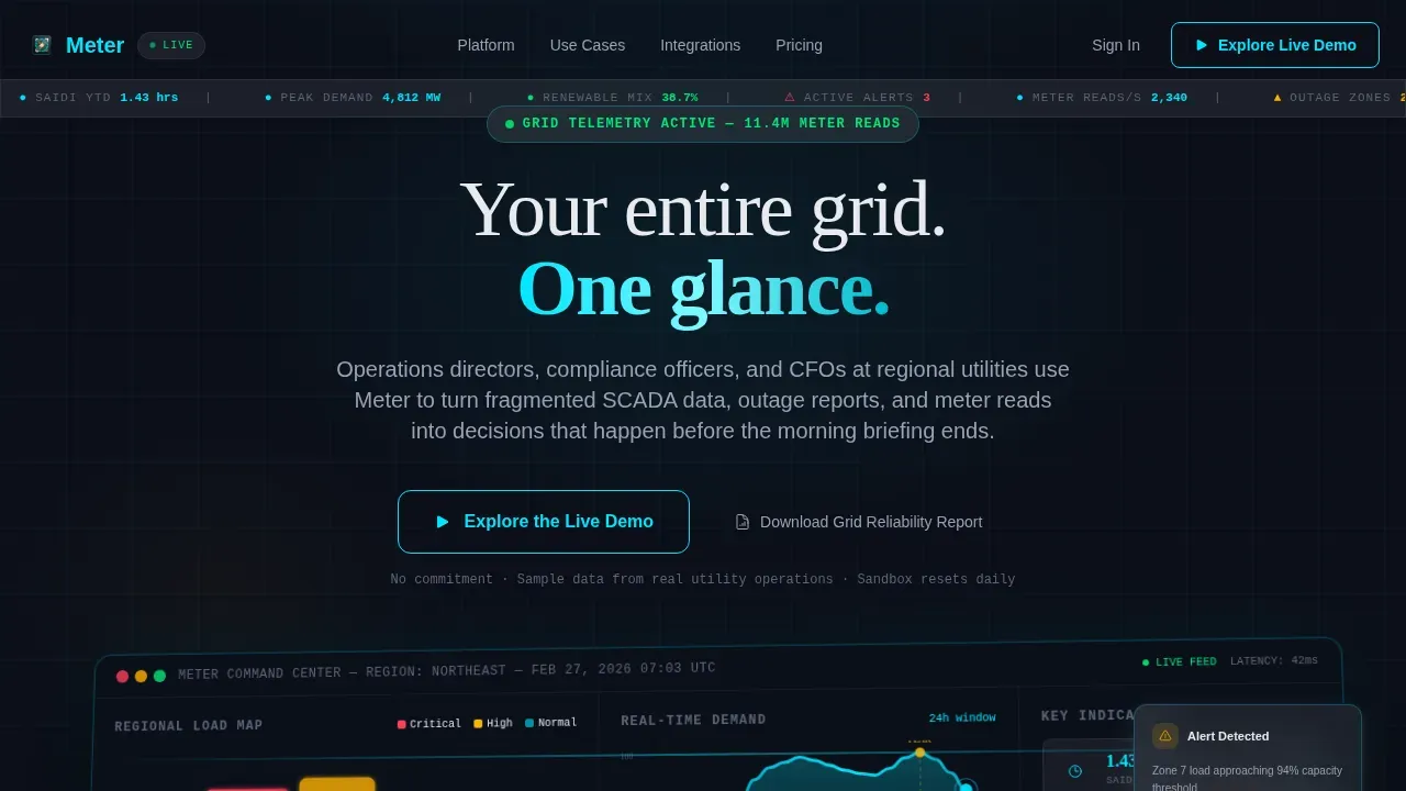
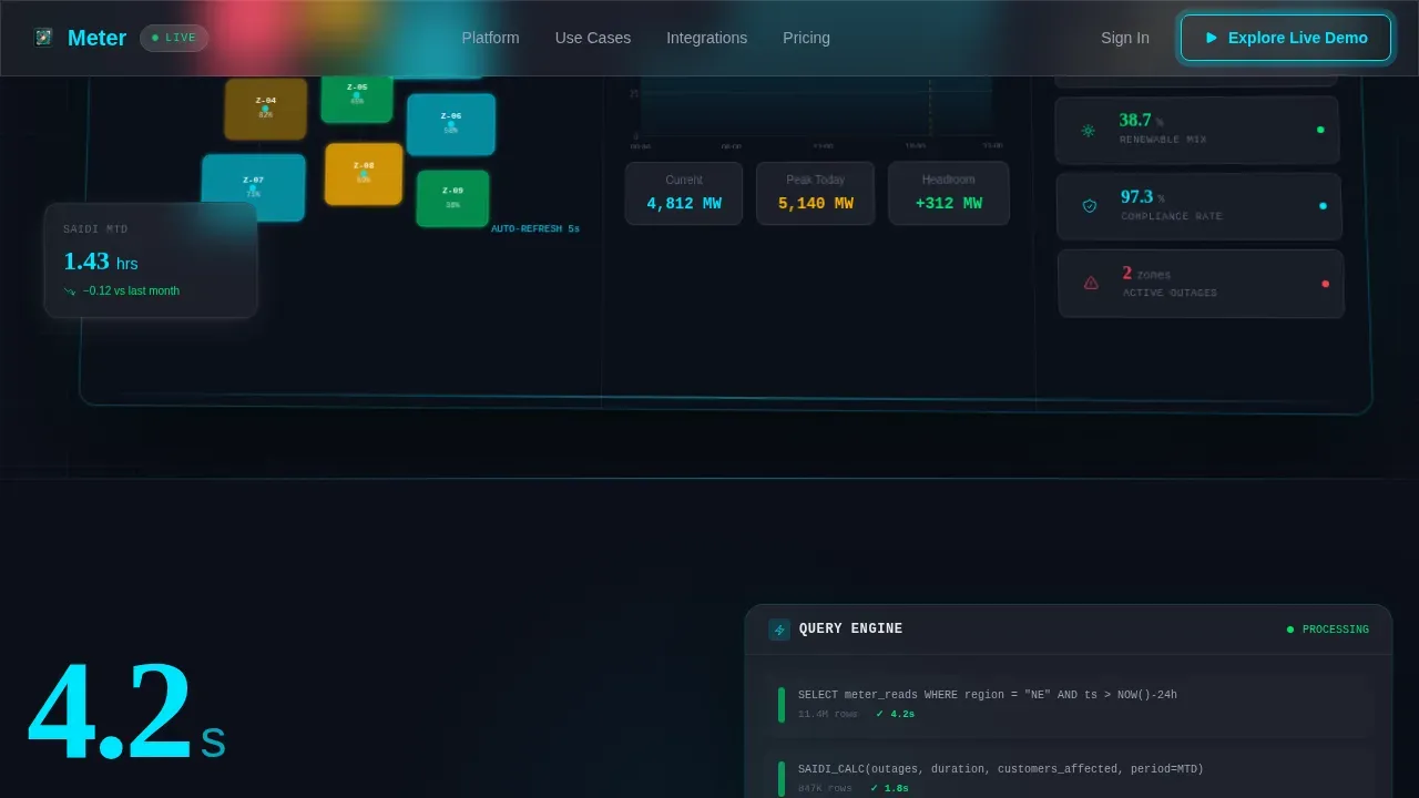
The hero section displays a full-width 3D-tilted screenshot of the analytics dashboard in action. The left side shows a color-coded regional grid map with load zones pulsing gently. The center carries a real-time demand curve. A vertical KPI card stack on the right surfaces key performance indicators a utility director recognizes instantly: SAIDI, peak demand versus capacity headroom, and renewable energy mix percentage. Numbers are mid-animation on page load, so the monitoring dashboard appears alive from the first second. This approach follows the principle that an outcome-focused design should show the product working, not merely describe its key features.
Stats-First Scroll Structure with Odometer Counters
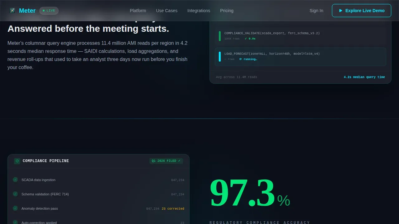
Each section of the page opens with a single oversized statistic before any explanation text appears. The first reads "4.2 seconds," then a paragraph reveals that is the average query time across eleven million meter reads. The second reads "97.3%," the regulatory filing accuracy rate after automated validation. Each stat animates in with kinetic motion, rolling up like an odometer, then a supporting dashboard panel slides in from below to show exactly where that number lives inside the product. This punch-proof-punch-proof rhythm is the core engagement mechanic of the template. Dashboards can utilize various visual elements, such as charts and graphs, to present complex data in an easily digestible format, and this section design applies that principle at full scale.
Predictive Analytics Bento Grid
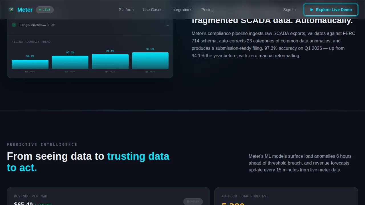
The third content section uses a bento-style card layout to surface three forward-looking capabilities: revenue forecasting, load prediction, and outage prevention. Each card functions as a concise snapshot of one predictive use case. The cards use the same glassmorphic depth system as the rest of the template, with frosted panel surfaces and cyan-glowing data traces. This section mirrors the product journey from seeing data to trusting data to act, which is the escalation logic the template is built around. A flexible, draggable grid system allows users to customize their view with various widgets like line charts, heatmaps, gauges, and tables, and the bento layout demonstrates that flexibility visually.
Dual Conversion Architecture
Two conversion paths are built into the page at the structural level. The primary call to action, "Explore the Live Demo," sits anchored in the hero and repeats after the third stats section. It uses a frosted glass button with a cyan border that pulses once on scroll-arrival. The secondary call to action, "Download the Grid Reliability Report," appears mid-page as a softer conversion. It uses a single inline email field. Limiting form fields to three or four essential pieces of information increases completion rates, and this template applies that principle directly by keeping the capture to one field. The result is a high-converting landing page that demonstrates how the technology solves problems like energy waste or grid instability rather than simply listing capabilities.
Glassmorphic Dark Theme Control Room Design
The entire dashboard design is built on a dark glassmorphic color system that evokes a substation control room at night. Deep grid black serves as the background. Frosted panel white at twelve percent opacity layers translucent cards above it. Electric arc cyan carries all active data traces and interactive glows. Warning amber is reserved strictly for alert states and call-to-action pulses. Maintaining clarity in dashboard design often involves using three to four primary colors, and this palette applies exactly that discipline. Cyan hover glows on interactive elements mimic a capacitor charging, reinforcing the energy management context at the visual layer. The dark theme also improves readability for data-dense environments by letting white text and glowing metrics breathe against the dark field.
GSAP ScrollTrigger Animation System
The animation layer is built on GSAP ScrollTrigger, a high-performance JavaScript animation library. Odometer counters roll up as users scroll into each stats section. Cyan trace animations travel along chart lines like current through a circuit. Parallax depth layers create a sense of three-dimensional depth across the frosted panel stack. Pulsing glow states activate on call-to-action buttons on scroll-arrival. All transforms are GPU-accelerated to keep motion smooth. Live data synchronization utilizes technologies like WebSockets or APIs to refresh charts and tables automatically in the real product, and the animation system here is designed to make that live-data feel present even in a static template preview.
Page sections overview
| Section | Purpose |
|---|---|
| Hero dashboard screenshot | Show animated grid map, demand curve, and KPI cards in a 3D-tilted product frame to establish immediate credibility |
| Stats proof one | Display the 4.2-second query performance stat with odometer animation and a sliding dashboard panel as proof |
| Stats proof two | Display the 97.3% regulatory accuracy stat with animation and a compliance filing panel as proof |
| Predictive analytics bento | Present revenue forecasting, load prediction, and outage prevention in a glassmorphic card grid |
| Mid-page email capture | Offer the Grid Reliability Report download via a single inline email field as a secondary conversion |
| Linear footer row | Close the page with a single-row footer linking key navigation and legal items |
Design & branding system
The visual identity of this dashboard template is built around a Dynamic Motion theme expressed through a Glassmorphic color system. Every design decision reinforces the control-room aesthetic described in the brief. The template uses exactly four core colors, which aligns with the principle that maintaining clarity in dashboard design often involves keeping the palette to three or four primaries.
- Color palette: Deep grid black (#0B0F19) as the base, frosted panel white at 12% opacity (#FFFFFF1F) for layered card surfaces, electric arc cyan (#00E5FF) for active data traces and interactive states, and warning amber (#FFB300) reserved exclusively for alert conditions and call-to-action pulse moments.
- Typography: DM Sans handles all body copy, user interface labels, and supporting text. Fraunces handles display numerics in the oversized stats sections, giving the kinetic number animations a distinct editorial presence that separates them visually from explanatory paragraphs.
- Depth system: Backgrounds use layered translucent panels with soft blur. Cards stack with subtle depth shadows. Cyan traces animate along chart lines. Hover states carry a faint cyan glow that mimics a capacitor charging, reinforcing the energy production and energy management context at every interactive point.
Mobile & speed optimization
This template is designed desktop-first, reflecting the control-room console aesthetic it is modeled on. The layout is responsive to tablet viewports, ensuring that users reviewing the page on a tablet still receive a coherent and legible experience. Dashboard templates should be tailored to the target device, and this one prioritizes the wide-screen environment where utility operations teams work while maintaining usability at smaller widths.
- Desktop-first layout: Column structures, bento grids, and the side-by-side KPI panel in the hero are optimized for wide viewports. Grid templates are built for high performance and can scale as the number of data points or users increases, and the layout architecture supports that scaling direction.
- GPU-accelerated transforms: All animation is handled via GPU-accelerated transforms only. Static content uses server components. Animated sections use client components. This split ensures that heavy motion does not block the initial render of key data panels.
- Tablet responsiveness: The layout reflows cleanly to tablet widths. Card grids stack into single-column views. The bento grid consolidates into a scrollable vertical sequence. The inline email capture remains accessible on various devices without requiring zoom or horizontal scroll.
How this template helps you convert
The page is engineered for one primary outcome: a demo click-through. Every structural and visual decision supports that goal, and the secondary email capture provides a lower-commitment conversion for visitors who are not yet ready to explore the sandbox. The conversion rate logic is built into the section sequence, not bolted on at the end.
- Show before you explain. The 3D hero screenshot puts the energy monitoring dashboard in motion before any marketing copy appears. Users see the product working. The demo then feels like a continuation of what they have already been experiencing, not a commitment to something unknown. This is how the template turns user engagement into a click rather than a bounce.
- Prove with numbers, then place them. Each oversized stat arrives before its explanation. Visitors absorb the number first, then the supporting panel shows exactly where that metric lives inside the dashboard. This sequence builds trust in the data analysis the product performs, making the primary call to action feel earned rather than premature.
- Offer a softer path mid-page. The "Download the Grid Reliability Report" inline capture gives visitors who are not yet ready to demo a way to engage. A single form field keeps friction minimal. This mid-page option increases total lead generation without diluting the primary demo conversion path, because the two calls to action serve different stages of the buyer journey.
Other information about this template
This section covers additional context about how the Meter Real-Time Grid Analytics Dashboard Landing Page Template relates to broader dashboard template categories, comparable dashboard examples, and practical considerations for teams evaluating it alongside other pre-made templates or analytics tools.
- The template is comparable to other analytics dashboard and management dashboard landing pages in its overall structure, but its energy sector specificity and animation depth place it beyond typical financial dashboard or e-commerce dashboard examples. Teams familiar with building out a management dashboard or a financial dashboard for other verticals will find the section architecture familiar, while the dark theme and animation intensity are unique to this template.
- Teams that typically use presentation-layer tools like a ppt template or slide-based reporting may find this template a compelling alternative, since it delivers the same concise snapshot of performance data in a live web format rather than a static slide deck. This matters for operations teams who need real time data visible at a glance rather than buried inside a quarterly ppt template export.
- The dashboard design here draws on the same principles that guide other strong dashboard examples: a clean professional layout, color-coded statuses, and data visualization that makes patterns immediately apparent even to non-technical stakeholders. The template's structured grid format simplifies complex datasets, making patterns and outliers visible at a glance.
- Unlike a free template with only basic features, this template ships with a full animation suite, dual conversion architecture, and a role-specific content strategy covering operations, compliance, and financial use cases. Users evaluating a free template for a utility analytics product should weigh the development time saved against the gaps a free template typically leaves in interactivity and data visualization depth.
- The solid dashboard approach here keeps the page focused. There are no to-do lists, unrelated widgets, or navigation distractions pulling attention away from the primary conversion path. This mirrors the principle that a well-designed dashboard allows users to quickly access critical information at a glance.
- For teams exploring how a monitoring dashboard landing page compares to other analytics tools in their stack, this template is designed to complement rather than replace tools like Google Analytics or Google Data Studio. Those analytics tools handle tracking and reporting on the website's performance and advertising campaigns. This template's job is to present the grid analytics product itself, not to act as one of those analytics tools or ad platforms.
- The template does not include built-in tracking for ad campaigns, Google Ads conversions, or advertising campaigns by default. Teams running paid acquisition through Google Ads or other ad platforms will need to add their own tracking scripts. Similarly, teams running e-commerce attribution across multiple platforms should integrate their own conversion rate tracking layer.
- Dashboard templates can help users manage and analyze data for various applications beyond utility operations. The architecture here, with its stats-first scroll, bento grid, and dual conversion path, is adaptable to other energy management or energy efficiency SaaS products with minimal structural changes.
- The ppt template comparison is worth noting for compliance teams. Regulatory officers often rely on a ppt template to present SCADA-sourced quarterly data to leadership. This landing page demonstrates a product that replaces that workflow with an automated, real-time monitoring approach, which is a key selling point the template surfaces through the 97.3% accuracy stat section.
- Displaying visual indicators such as color-coded statuses to highlight anomalies or critical threshold breaches is a core dashboard design principle, and this template demonstrates that principle through the warning amber alert states built into the color system.
- The template can support integration with various data sources for real-time data visualization and analysis, as described in the project brief. Data accuracy is ensured in the underlying product through normalization processes that standardize data from diverse sensors and equipment into a unified format.
- For teams considering multiple platforms or different channels for their marketing content, this landing page is designed to serve as the primary destination from paid search, direct outreach, and referral traffic alike. It consolidates the pitch into a single interface without requiring visitors to navigate across multiple platforms.
- The user friendly interface and user friendly design of the template mean that non-technical stakeholders reviewing the page, including legal, communications, or procurement teams, can understand the product value without needing a technical background. Dashboard templates are designed to be user-friendly, allowing non-technical users to engage with and understand the content easily.
- Progress bars and other visual progress indicators are not included as standalone components in this template, but the animated demand curve and KPI counters serve an equivalent purpose by showing directional momentum in the data rather than static endpoint values.
Theme
Dynamic Motion
Creative direction
Stats-First Impact
Color system
Glassmorphic
Style
Dashboard/Data Grid
Direction
Click-Through
Page Sections
Animated Hero with Live-style KPI Cards
Stats-first Odometer Scroll Sections
Predictive Analytics Bento Grid
Dual Conversion Path Architecture
Glassmorphic Dark Theme Design System
GSAP Scrolltrigger Animation Suite
Related questions
What page sections are included in this template?
Who is this landing page template designed for?
Does the template include a lead capture form?
Can this template be adapted for other energy or SaaS products?
What animation library does this template use?



