Software & SaaS Cost Calculator Website Template
Metric is a bold brutalist product analytics landing page template built for teams who need answers, not more dashboards. It opens with a live retention revenue calculator, walks visitors through a Problem-to-Solution arc across anchor-nav sections, and drives toward a single clear call to action. Black dominates. Violet detonates on every insight. Data is the hero.
by Rocket studio
Quick summary
Metric is a hub and spoke landing page template for a product analytics platform. It pairs a live revenue calculator header with a sticky anchor navigation that guides visitors through escalating pain points before resolving them. The design is Bold Brutalist: void black surfaces, ultraviolet accents, and monospaced type at scale. Every element earns its place. Nothing is decorative.
Who this template is for
This template is built for teams who live inside product data and need a landing page that speaks their language without softening the truth.
- Growth product managers who are overwhelmed by too many behavioral data tabs and need a cleaner narrative for their platform
- Startup founders who cannot explain why trial-to-paid conversion dropped and need a page that surfaces that exact pain
- Data teams tired of rebuilding fragile funnel queries and looking for a template that positions their product as the fix
What problem this template solves
Most product analytics landing pages bury the value. They open with a hero image, list a wall of features, and never make the cost of inaction feel real. Metric flips that structure.
- Visitors see their own lost revenue number before they ever read a feature list, thanks to the calculator header
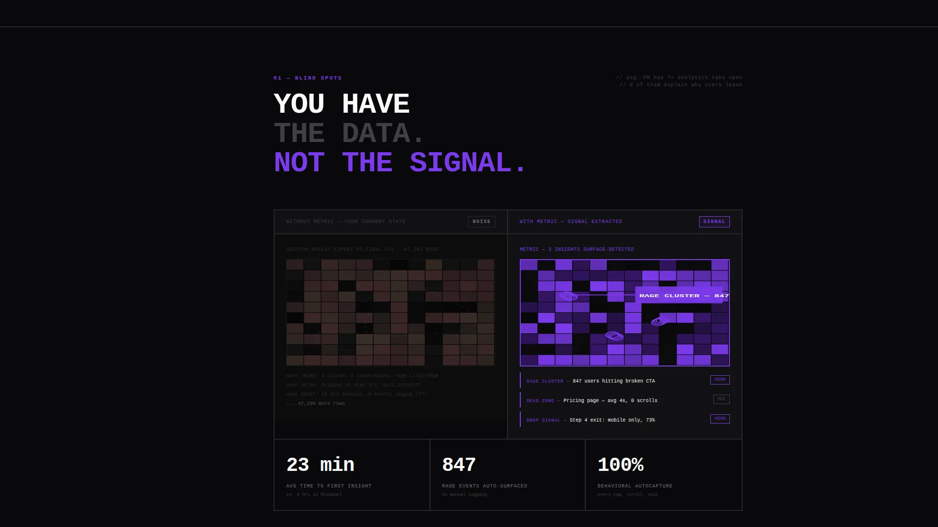
- The Problem-to-Solution arc shows a "without" state and a "with" state side by side, so the contrast is impossible to ignore
- Anchor navigation lets visitors jump directly to the section that matches their pain, reducing drop-off from irrelevant scrolling
What you get with this template
Metric delivers a fully structured, single-page layout with every section pre-built and logically sequenced. The design system is ready to apply from the first pixel.
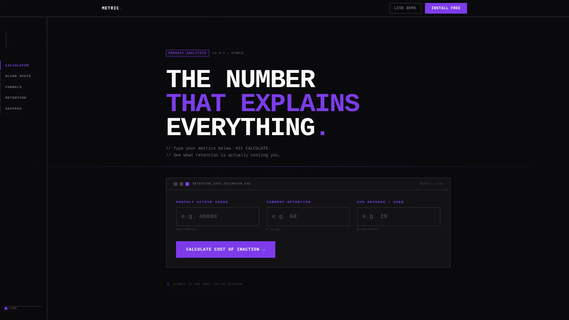
- A live Calculator/Estimator header panel where visitors input monthly active users, retention rate, and average revenue per user to see a personalized revenue projection
- A sticky left-rail anchor navigation with brutalist section labels that keeps visitors oriented and in control throughout the full scroll
- A complete Problem-to-Solution arc spanning multiple hub sections, each pairing a raw chaotic "without" state against an organized, violet-highlighted "with" state
Feature list
This template ships with a focused set of components, each designed to do one job precisely.
Live Retention Revenue Calculator
The header is an interactive input panel on a pure black field. Visitors enter their monthly active users, current retention rate, and average revenue per user. The output renders instantly as a violet-highlighted revenue projection showing the financial impact of a five percent retention improvement. The number is personal, specific, and designed to earn the click.
Sticky Anchor Navigation Rail
A left-rail navigation stays fixed as visitors scroll. Section labels are written in brutalist uppercase: BLIND SPOTS, FUNNELS, RETENTION, SHIPPED. Active anchors fire in deep ultraviolet. The structure lets visitors move directly to the section that matches their current frustration without losing their place.
Problem-to-Solution Section Arc
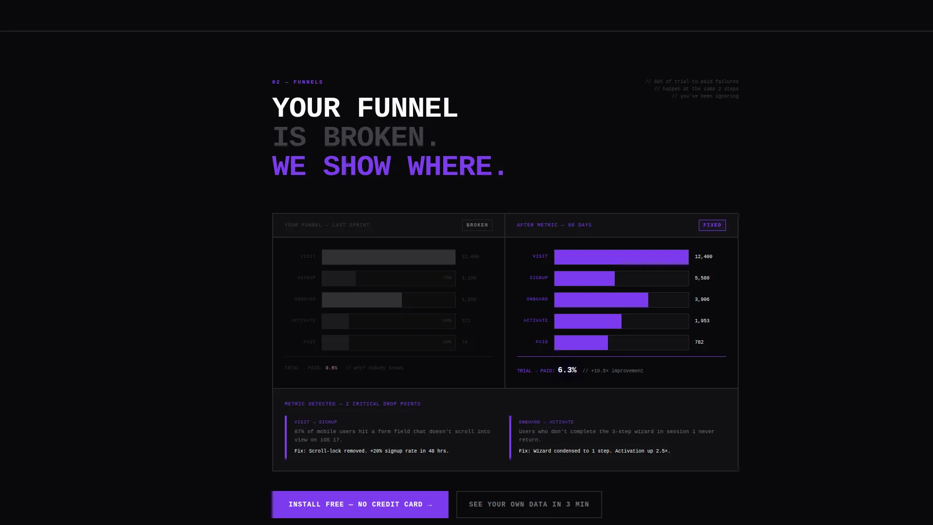
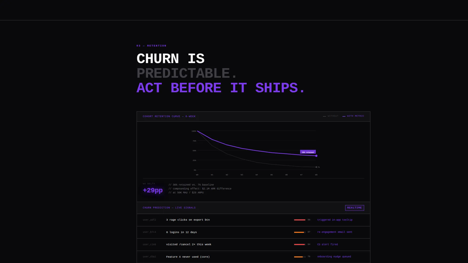
Each hub section escalates the pain before resolving it. The scroll opens with anonymized heatmaps of confused user sessions and broken funnel flowcharts. Then the arc turns: the same data reappears organized, annotated, and actionable. The tension mimics the experience of debugging, building toward a clear breakthrough moment.
Brutalist Call-to-Action System
The primary call to action, "Install Free, No Credit Card," is a thick-bordered violet-on-black button. It appears at the calculator output, at the arc's turning point, and again at the final section. A secondary path offers a sandboxed demo link. Repetition is intentional and structurally placed for maximum visibility.
Void and Violet Design System
Absolute void black dominates every surface. Deep ultraviolet activates on hover states, chart accents, and active navigation anchors. Bruised plum supports depth. Bare phosphor white is used only for monospaced type, axis labels, and key performance indicator figures. No gradients, no rounded corners, no decorative elements.
Monospaced Data Typography
Numbers render at 120 pixels, styled like a stock ticker. All data labels and key figures use monospaced typefaces. The typographic system treats data as the visual hierarchy anchor, not imagery. Every number communicates function. Nothing is styled for aesthetics alone.
Page sections overview
| Section | Purpose |
|---|---|
| Calculator Header Panel | Personalizes lost revenue before any feature pitch |
| Sticky Anchor Nav | Keeps visitors oriented across the full scroll |
| Blind Spots Section | Opens the pain arc with confused session heatmaps |
| Funnels Section | Shows broken funnel flowcharts as the "without" state |
| Retention Section | Turns the arc with organized, annotated retention data |
| Shipped Section | Closes the arc and delivers the resolution moment |
| Primary call to action Block | Drives installs with a thick-bordered brutalist button |
| Demo Path Link | Offers a sandboxed route for visitors not ready to install |
Design & branding system
The visual identity is Bold Brutalist. It is built for a product that has nothing to hide and no patience for decoration. Every design decision serves function.
- Color system uses absolute void black (#09090B), deep ultraviolet (#7C3AED), bruised plum (#4C1D95), and bare phosphor white (#FAFAFA), creating the feeling of a server room lit only by a single purple LED strip
- Typography is oversized and monospaced throughout, with key performance indicator figures rendered at 120 pixels and all data labels kept in a fixed-width typeface for precision and legibility
- No gradients, no rounded corners, and no soft visual comfort anywhere in the layout; every surface is flat, industrial, and intentional
Mobile & speed optimization
The template is structured with a responsive layout in mind, so the brutalist hierarchy holds across screen sizes without losing its visual impact.
- The sticky anchor navigation adapts for smaller screens so visitors on mobile can still move between sections without losing context
- The calculator input panel is built to remain functional and readable on touch devices, keeping the revenue projection accessible wherever the visitor lands
- Oversized monospaced type is set to scale proportionally, so the data-first visual hierarchy reads correctly on both large desktop monitors and compact mobile viewports
How this template helps you convert
Every structural decision in Metric is pointed at a single outcome: turning a curious visitor into someone who clicks install.
- The calculator makes the cost of inaction personal before any feature copy appears, so the visitor arrives at the call to action already holding their own lost revenue number
- The Problem-to-Solution arc builds emotional tension across sections, releasing it precisely at the moment the primary call to action appears, so the click feels earned rather than pushed
- The call to action repeats at three structurally distinct points, including the calculator output, the arc's turning point, and the final section, so no visitor reaches a dead end
Other information about this template
Metric is designed specifically for product analytics platforms targeting growth-focused teams. A few additional details are worth noting before you build.
- The template is categorized under Technology, Software and SaaS, and Product Analytics, making it a strong fit for platforms positioned against tools like Mixpanel or similar behavioral analytics products
- The hub and spoke layout with anchor navigation is well suited to products with multiple distinct use cases or user personas, since each spoke can address a different pain point independently
- The sandboxed demo secondary path is pre-wired as a link component, so teams can connect it to a live demo environment without restructuring the layout
- The template is designed as a single landing page, not a multi-page site, so all conversion paths resolve within the same scroll experience
Theme
Bold Brutalist
Creative direction
Problem→Solution Arc
Color system
Void & Violet
Style
Hub & Spoke (Anchor Nav)
Direction
App Download
Page Sections
Live Retention Revenue Calculator
Sticky Brutalist Anchor Navigation
Problem-to-solution Section Arc
Repeating Brutalist Call to Action System
Void and Violet Design System
Monospaced Data-first Typography
Related questions
Who is the primary audience for this template?
Can I change the calculator inputs and output formula?
Does the template include the demo environment itself?
How does the anchor navigation work across sections?
Can this template be adapted for a different color palette?



