Nonprofit Software & SaaS Cost Calculator Website Template
Metric is a hub and spoke nonprofit analytics dashboard landing page built on a Tech Glass visual system. It opens with a live impact calculator that animates your numbers in real time, then walks development directors, grant managers, and executive directors through donor retention, grant pipelines, program outcomes, and one-click board reporting in a single scroll.
by Rocket studio
Quick summary
Metric is a single-page nonprofit analytics dashboard template designed for organizations that need clarity fast. An embedded impact calculator fires up above the fold, animating donor lifetime value, retention curves, and cost-per-outcome as the visitor types. Five anchored spoke sections then expand each metric into full annotated walkthroughs, guiding every reader toward one action: launching their dashboard.
Who this template is for
This template is built for nonprofit professionals who work with data every day but struggle to make it visible to the people who need it most.
- Development directors managing donor data across multiple fundraising tools who need a unified retention view
- Grant managers working against 90-day foundation reporting deadlines who must prove program outcomes quickly
- Executive directors preparing board presentations or walking into major donor meetings with minutes to spare
What problem this template solves
Nonprofit teams often carry their impact story across disconnected systems: separate donor databases, manual grant spreadsheets, and program reports that live in different folders. Pulling that into something board-ready takes hours, and by the time it is ready the data is already stale.
- No single view connects donor retention, grant deadlines, and program outcomes in one place
- Board-ready narratives require manual assembly from multiple sources, creating delays and inconsistencies
- Visitors exploring a nonprofit analytics product need to experience its value before they commit to signing up
What you get with this template
Metric delivers a fully structured, interactive landing page that demonstrates the dashboard's value before a visitor even scrolls past the header. Every section is built around a progressive magnification narrative: the calculator shows the whole picture first, and each spoke section zooms deeper.
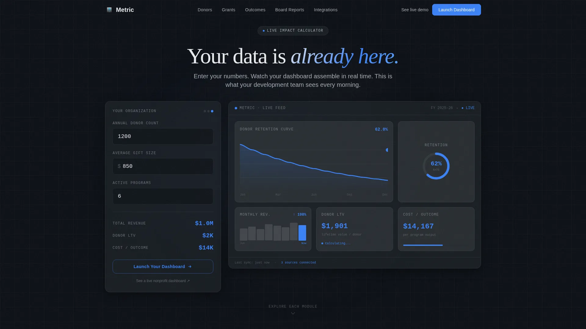
- An interactive impact calculator above the fold with three input fields and a live animated mini-dashboard response
- Five anchor-navigated spoke sections covering Donors, Grants, Outcomes, Board Reports, and Integrations
- A closing full-width call-to-action panel that replays the visitor's own calculated metrics alongside a final prompt to act
Feature list
This section describes the core built-in capabilities included in the Metric template.
Live Impact Calculator Header
The header embeds a functioning calculator directly above the fold. Visitors enter their annual donor count, average gift size, and number of active programs. A frosted glass card sits over an animated mini-dashboard that responds in real time: a retention curve bends, a cost-per-outcome gauge drops, and a donor lifetime value ticker climbs as they type.
Sticky Anchor Navigation Rail
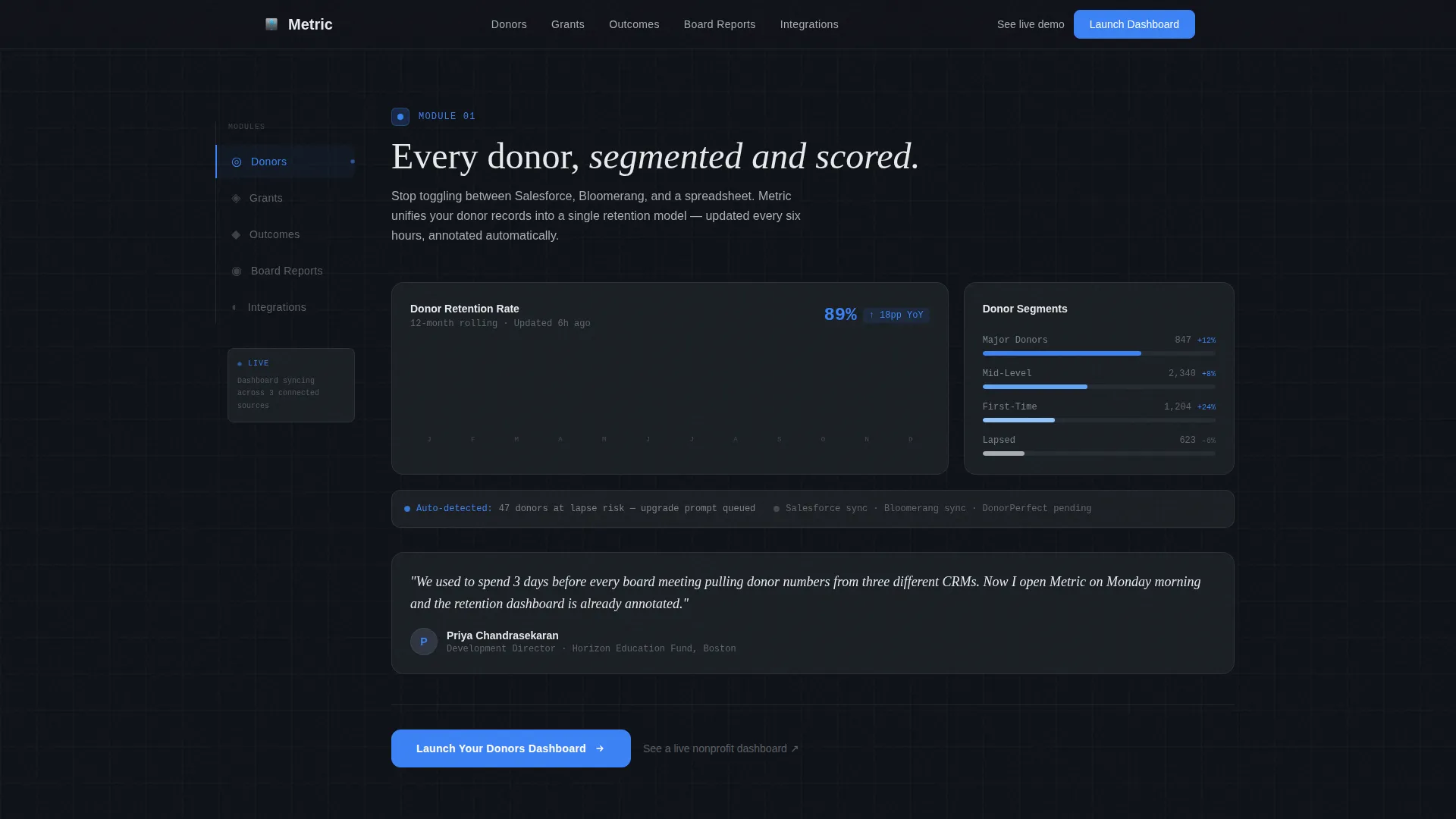
A persistent left-rail navigation keeps five labeled anchors visible as the visitor scrolls: Donors, Grants, Outcomes, Board Reports, and Integrations. Each anchor jumps to its corresponding spoke section. The active anchor glows signal-blue, so the visitor always knows where they are in the story.
Progressive Magnification Spoke Sections
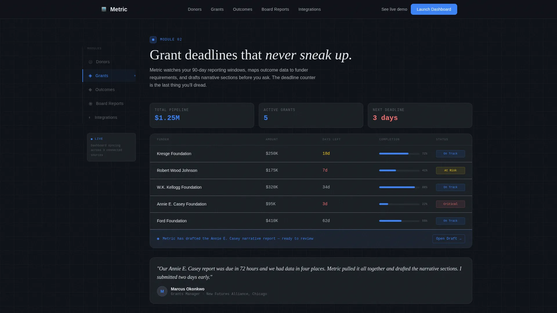
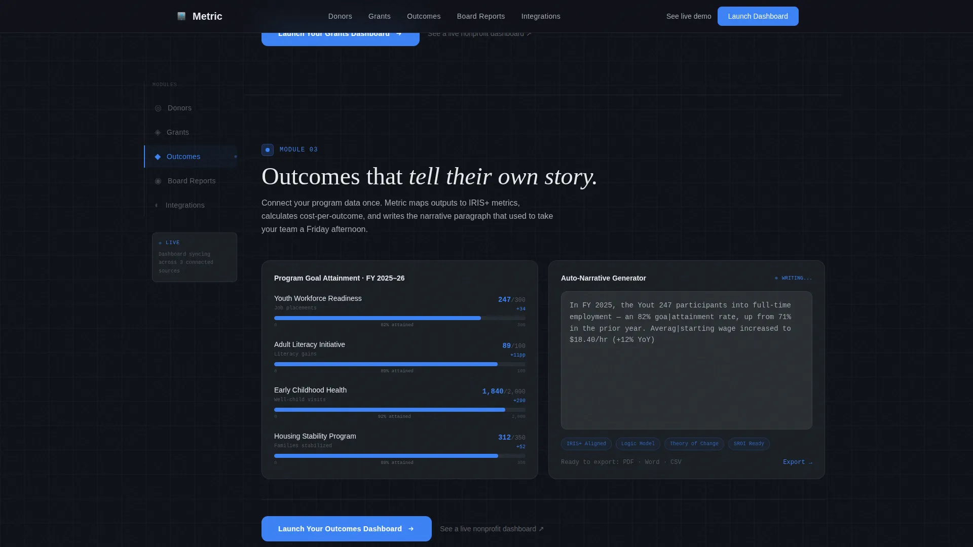
Each of the five spoke sections expands one quadrant of the mini-dashboard the visitor saw in the header. Donors reveals full-width retention curves and segmentation views. Grants shows a pipeline tracker with deadline countdowns. Outcomes presents program reporting with auto-generated narrative. Board Reports demonstrates a one-click deck generator. Integrations displays the tool connection grid.
URL Parameter Call-to-Action Flow
The primary "Launch Your Dashboard" call to action passes the visitor's calculator inputs as URL parameters into the signup flow. The first screen they see after clicking already mirrors the numbers they entered on the landing page. No form sits on this page; the experience is frictionless and continuous.
Role-Specific Social Proof
Inline proof points appear throughout the page, including metrics such as "$2.3M tracked" and "47% retention lift." Testimonials are role-specific, pairing development director voices with the donor section and grant manager voices with the grants section, so each reader finds a peer speaking directly to their situation.
Ghost-to-Filled Call-to-Action Progression
The call to action evolves visually across the page. It first appears as a ghost-outline button beside the calculator results. It solidifies into a filled signal-blue button at the close of each spoke section. The closing panel anchors the final version alongside the visitor's replayed metrics, reinforcing their own data as the reason to act.
Page sections overview
| Section | Purpose |
|---|---|
| Hero Calculator | Live impact calculator with animated mini-dashboard and ghost call to action |
| Donors Spoke | Full-width donor retention curve, segmentation view, and filled call to action |
| Grants Spoke | Grant pipeline tracker with deadline countdowns and filled call to action |
| Outcomes Spoke | Program outcome reporting with auto-generated narrative and filled call to action |
| Board Reports Spoke | One-click board deck generator walkthrough and filled call to action |
| Integrations Spoke | CRM and tool connection grid display |
| Closing Panel | Full-width replay of visitor metrics with final "Launch Your Dashboard" prompt |
| Footer | Single-row minimal footer |
Design & branding system
Metric uses a Tech Glass visual identity built on a Monochrome Steel color palette. The aesthetic is intentionally precise: frosted panels, translucent layers, and a server-rack midnight feeling where cool alloy surfaces catch the faint pulse of a single accent color.
- Core palette: deep gunmetal (#1B1F24) for backgrounds, brushed aluminum (#A8ADB5) for body text, frosted panel white (#E8EAED) for light-mode text surfaces, and signal-blue (#3B82F6) reserved exclusively for interactive states and live data points
- Typography pairs DM Sans for all interface and body copy with Fraunces reserved for editorial headline moments, creating a contrast between utility and emphasis
- Animation is high throughout: scroll-linked reveals, staggered data point entries, real-time chart responses in the calculator, and signal-blue hover and active states on every interactive element
Mobile & speed optimization
Metric is designed desktop-first, reflecting how development directors and executive directors typically work: on a laptop or desktop screen during planning and board preparation sessions. The layout adapts responsively to tablet viewports as a secondary target.
- Static content sections use server-rendered components to keep initial load lean while the calculator and animation layers load as client components
- The sticky anchor navigation and animated chart layers are built for high interactivity on wider screens, with simplified presentation on tablet-sized viewports
- Desktop-first layout decisions prioritize the side-by-side calculator and dashboard panel arrangement that makes the header interaction immediately readable
How this template helps you convert
Metric is designed to move a skeptical nonprofit professional from curiosity to action without asking them to trust a static screenshot or read a feature list first.
- The impact calculator personalizes the page immediately. Visitors see their own donor count and gift size reflected in moving charts before they read a single marketing claim, which builds evidence-based confidence in the product.
- The ghost-to-filled call-to-action progression creates a natural escalation of commitment. By the time the visitor reaches the closing panel, the "Launch Your Dashboard" button is surrounded by the exact numbers they calculated, making the step feel like a logical next move rather than a leap.
Other information about this template
Metric sits at the intersection of nonprofit software, analytics dashboard design, and B2B SaaS landing page strategy. A few additional details worth noting before you decide.
- A secondary text link labeled "See a live nonprofit dashboard" opens a read-only demo in a new tab for visitors who need more evidence before committing
- The template is localized for English-language audiences using USD currency formatting and MM/DD/YYYY date display
- The footer follows a single-row minimal pattern, keeping the closing panel's call to action as the dominant final impression
- This template suits organizations evaluating nonprofit analytics tools, impact measurement platforms, or donor management software that wants to lead with the product experience rather than a static pitch
Theme
Tech Glass
Creative direction
Calculator/Tool First
Color system
Monochrome Steel
Style
Hub & Spoke (Anchor Nav)
Direction
Click-Through
Page Sections
Live Impact Calculator Header
Sticky Anchor Navigation Rail
Progressive Magnification Spoke Sections
URL Parameter Call-to-action Flow
Ghost-to-filled Call-to-action Progression
Role-specific Social Proof
Related questions
Does this template include a working calculator, or is it a visual mockup?
Can I customize the calculator fields and output metrics?
How does the call-to-action flow work without a form on the page?
Is this template suitable for a nonprofit just beginning to explore analytics tools?



