Advanced Advanced Tech & AI Platforms Comparison Website Template
Pulse is a creator analytics landing page template built for the moment a creator stops guessing and starts knowing. It presents a live metrics wall, a side-by-side comparison of fragmented dashboards versus unified data, and a single bold call to action. The result is a page that turns raw platform data into a clear content valuation story.
by Rocket studio
Quick summary
Pulse is a single-page landing page template designed for creator analytics platforms. It opens with a live stats wall, walks visitors through a Problem-to-Solution comparison arc, and closes with a full-width call to action. The design uses a dark studio aesthetic built around void black and electric violet, making data the visual centrepiece from the first scroll.
Who this template is for
This template fits founders and product teams building analytics tools for content creators. It is equally useful for creator economy startups that need to communicate complex data value in a single, persuasive page.
- Mid-tier YouTubers, podcast hosts, and TikTok creators who need to understand their true content worth
- Creator managers and brand partnership coordinators who rely on performance metrics to negotiate deals
- Analytics platform teams who want a desktop-first, data-forward landing page that converts on first impression
What problem this template solves
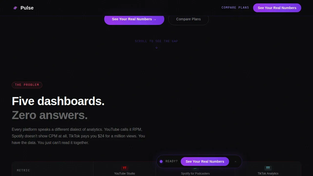
Creators juggle multiple fragmented dashboards. YouTube Studio, TikTok Analytics, and Spotify for Podcasters each speak a different data language. The result is scattered business data, no unified revenue picture, and no confident answer when a brand manager asks for a true rate. This template frames that pain directly and then resolves it visually.
- Creators cannot make data driven decisions when their metrics live across five separate tools
- Visitors leave analytics landing pages without acting because they never sense the gap between what they know and what they should know
- Platform teams struggle to show their value proposition quickly without a strong visual comparison structure
What you get with this template
You get a fully structured, single-page landing page template with six distinct sections built around a Problem-to-Solution Arc. Every section is designed to deepen the visitor's understanding of the data gap and move them toward the call to action.
- A live hero section with an animated metrics wall, typewriter headline, and floating call to action pill button
- A two-part comparison data table showing fragmented dashboards side by side with a unified Pulse view
- A full-width call to action bar, platform proof section, and a minimal single-row footer pattern
Feature list
This section covers the core capabilities built into the Pulse landing page template. Each feature is grounded in the project brief and reflects what the template actually delivers.
Animated Live Metrics Hero
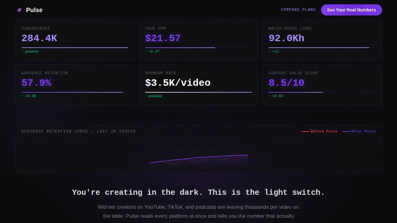
The hero section functions as a full-viewport stats wall. Subscriber counts, revenue per mille figures, and audience retention curves animate with ticking counters and micro-animations. Monospaced typography renders every data point in signal white on void black. The effect makes data feel alive and immediately establishes the platform's purpose. Visual hierarchy places the most critical metrics at the top, following natural scanning patterns.
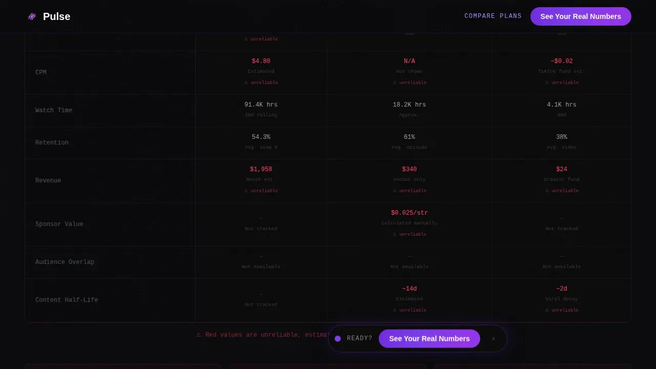
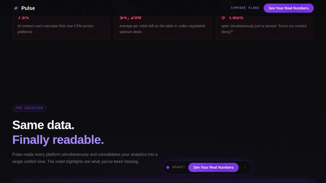
Problem-to-Solution Comparison Tables
Two mirrored data table blocks sit at the heart of the page. The first table shows fragmented dashboards from multiple data sources in a deliberately cluttered layout. The second table shows the same data unified inside Pulse, with violet highlights on insights that were previously invisible. This side-by-side structure lets the visitor directly analyze the gap. Interactive charts and hover states on table rows add interactivity without requiring any technical skills from the visitor.
Conversational Data and AI-Powered Insights Layer
Pulse connects to various data sources and presents results in plain language. The template supports an ai powered insights approach where users can answer follow up questions about their content performance without needing advanced technical skills. The platform automatically detects anomalies and trends in the data, surfacing actionable insights that help creators and their teams make smarter decisions faster.
Floating and Full-Width Call to Action System
Two call to action placements are built in. A floating pill button appears immediately after the hero section. A full-width bar anchors the bottom of the page after the final comparison table. Both direct visitors to a connect-your-accounts onboarding flow. No form appears on this page. A secondary ghost button labelled "Compare Plans" serves visitors who are already sold and want to access pricing details.
Real-Time Monitoring and Data Updates Engine
Pulse provides always-on data updates when creator data changes. Real time data flows into the dashboard continuously, so the analytics dashboard reflects the latest information at any given time range. Real time monitoring means creators and their teams track shifts in audience retention, sponsorship cost per mille, and content half-life without waiting for weekly reports.
Dynamic Motion and Scroll-Reveal Animation System
The Dynamic Motion theme drives the entire scroll experience. Scroll reveals, marquee elements, and typewriter effects are built into the section flow. Each scroll deeper reveals another layer of buried value: true cost per mille, audience overlap across platforms, and content half-life metrics. The animation system uses client-side components for animated sections and server-side rendering for static content.
Page sections overview
| Section | Purpose |
|---|---|
| Hero Metrics Wall | Opens with live animated creator data and typewriter headline |
| Problem Comparison Table | Exposes fragmented dashboard data from multiple platforms |
| Solution Unified Table | Shows the same data consolidated with violet insight highlights |
| Platform Proof Block | Displays compatibility indicators and aggregate social proof numbers |
| Full-Width call to action Bar | Drives the final "See Your Real Numbers" click to onboarding |
| Minimal Footer Row | Closes the page with a clean, single-row footer pattern |
Design & branding system
The Void and Violet color system dominates the visual identity. Absolute void black (#09090B) covers roughly 80 percent of the canvas, creating the dark studio aesthetic. Electric violet (#7C3AED) pulses through borders, progress bars, active states, and call to action elements. Consistent color coding signals status and urgency throughout the page without creating visual confusion.
- Phantom lavender (#A78BFA) handles secondary text, hover states, and supporting visualization labels
- Signal white (#FAFAFA) renders all data figures, headlines, and key metrics in high-contrast monospaced type using JetBrains Mono
- DM Sans handles all body copy and descriptive text, keeping the reading experience clean and legible against the dark background
Mobile & speed optimization
The template is built desktop-first because the comparison tables and animated charts require wider viewports to communicate clearly. A mobile-responsive fallback ensures the core message and call to action remain accessible on smaller devices. Client-side components handle animations while server-side rendering covers static sections, which keeps the experience stable across device types.
- Animated elements use client components to isolate interactivity without blocking the static content load
- The floating call to action pill and full-width bar remain visible and tappable across device sizes
- Tables and charts reflow on smaller screens so visitors on any device can still read the data comparison clearly
How this template helps you convert
The page earns the click by showing the gap between what creators currently know and what they should know. By the time a visitor reaches the final call to action, not clicking feels like choosing to stay in the dark. Every section is sequenced to build that tension and then release it through the platform's solution.
- The animated metrics wall creates immediate credibility by showing real data moving in real time, which signals that the platform delivers live, meaningful analysis rather than static reports.
- The two-part comparison data table makes the cost of fragmented tools visceral. Visitors identify bottlenecks in their own workflow by seeing their scattered data represented on screen, then immediately see the relief that unified dashboards provide.
- The dual call to action placement, floating pill after the hero and full-width bar after the final table, catches visitors at the two moments they are most ready to act, without requiring them to fill out a form.
Other information about this template
This template is part of a growing set of creator economy tools designed for businesses and organizations that want professional reporting without heavy development overhead. It is especially well-suited for growing teams who need to share insights with stakeholders quickly and configure new data views without waiting on an engineering sprint.
- The pulse real time creator analytics dashboard landing page template is optimized for data analytics platforms serving creator-focused businesses
- The pulse dashboard design follows business intelligence best practices: the most critical key performance indicators appear top-left, following natural user scanning patterns
- Pulse ensures that users can access deeper insights by connecting multiple data sources including platform APIs, and it supports custom integrations for teams with specific reporting needs
- Custom dashboards can be shared with stakeholders directly, and the template supports a resource allocation view that helps creator managers plan across product lines and campaign events
- The page structure supports google sheets data pipelines and is compatible with reporting workflows that currently rely on google analytics exports, making it straightforward to map existing data into the Pulse interface
- Teams that currently configure reports manually will find that the template reduces reliance on technical staff, since no advanced technical skills required to operate the core dashboard views
- The template supports professional reporting for businesses that need to provide information to brand partners, customer contacts, or internal team leads without a full data engineering function
Theme
Dynamic Motion
Creative direction
Problem→Solution Arc
Color system
Void & Violet
Style
Comparison Table
Direction
Click-Through
Page Sections
Animated Live Metrics Hero Wall
Problem-to-solution Comparison Tables
Ai-powered Insights and Anomaly Detection
Dual Call-to-action Conversion System
Real-time Monitoring and Always-on Data Updates
Dynamic Motion Scroll-reveal Animation
Related questions
Does this template require coding or technical skills to use?
How does the comparison table section work?
Can visitors answer follow up questions or interact with the data on the page?
Is there a form on this landing page?
What types of creators and businesses is this template best suited for?


