DTC Brand Case Study & Shopify Store Results Website Template
Metrics is a split-screen eCommerce case study landing page built for DTC operators and Shopify founders who need to show proof, not promises. The Feature Matrix layout pairs a locked navigation panel with swappable case study content, while a Carbon Fiber color system and animated metric counters give every result the weight it deserves.
by Rocket studio
Quick summary
Metrics is a high-impact, single-page case study template for eCommerce brands ready to present real growth data. A split-screen Feature Matrix structure, Dashboard Pro visual theme, and a Carbon Fiber palette combine to turn dashboards, funnels, and split-test results into a compelling, evidence-first experience that earns trust before it asks for a click.
Who this template is for
This template is built for operators who live inside performance data and need a page that reflects that world. It speaks directly to the people running growth at serious DTC brands.
- Shopify founders who need to show investors or partners exactly how revenue scaled
- DTC brand operators managing return on ad spend (ROAS) across multiple ad accounts
- eCommerce managers who report contribution margin to a board and need clean visual proof
What problem this template solves
Most case study pages bury the proof. They tell a story instead of showing the data. Visitors leave before they reach the numbers that would have converted them.
- Generic layouts fail to convey the scale, specificity, or credibility behind real performance results
- Scattered content makes it hard for visitors to compare results across different store verticals
- Weak conversion paths let high-intent visitors browse without ever committing to a next step
What you get with this template
You get a structured, performance-focused landing page that doubles as a database of proof. Every section is designed to present case study data clearly and move visitors toward a trial or audit signup.
- A 50/50 split-screen layout with a locked left navigation panel and a swappable right content panel
- Animated metric counters, step diagrams, and a two-step freemium conversion form
- A secondary lead-capture path for visitors who want the case library before connecting a store
Feature list
This template includes a set of purpose-built components, each grounded in the brief and designed to do one job well.
Scrolling Logo Bar Header
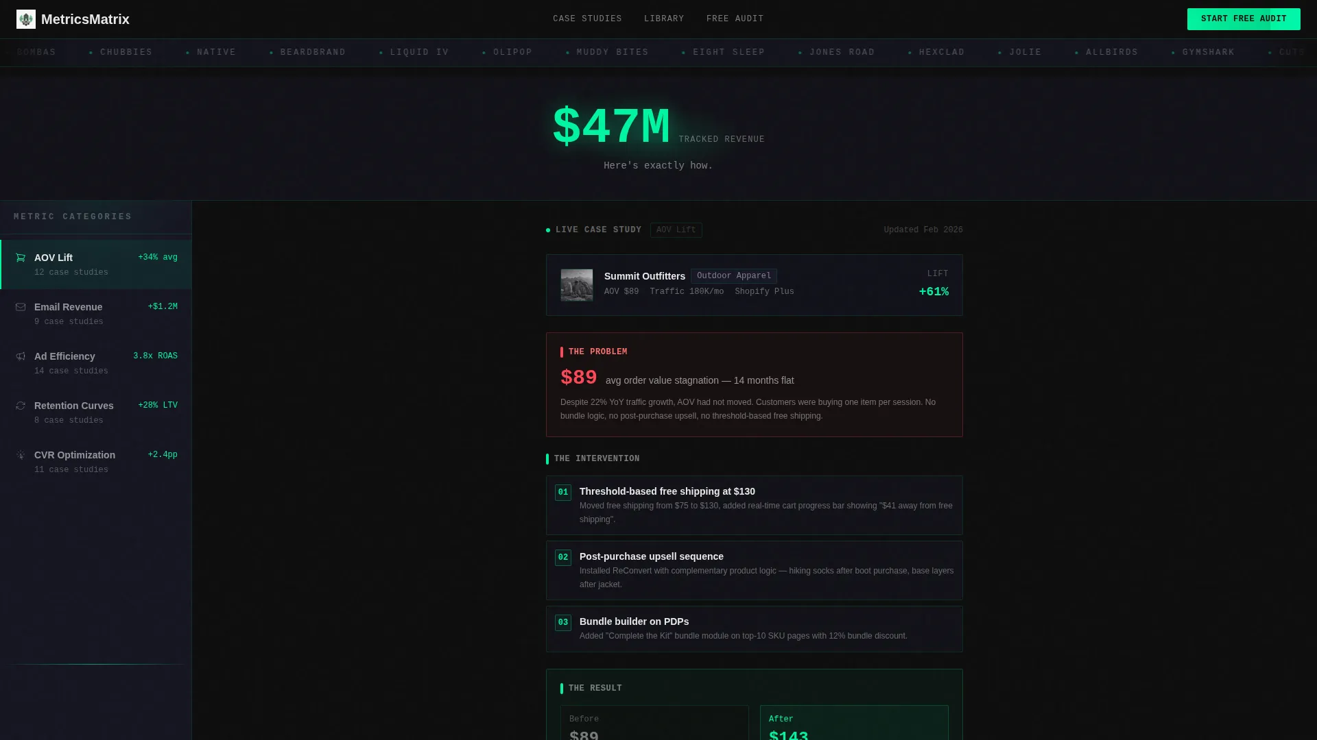
A horizontal strip of DTC brand logos scrolls at a deliberate pace against cockpit black. Above it, a single oversized stat in data-pulse green anchors credibility instantly. Below it, a subhead in charcoal confirms the page's promise before a single case study loads.
Locked Feature Matrix Layout
The left panel holds a fixed navigation column of metric categories: average order value (AOV) lift, email revenue, ad efficiency, and retention curves. The right panel swaps case study content as visitors click or scroll. This structure builds a browsable database of proof rather than a linear story.
Structured Case Study Cards
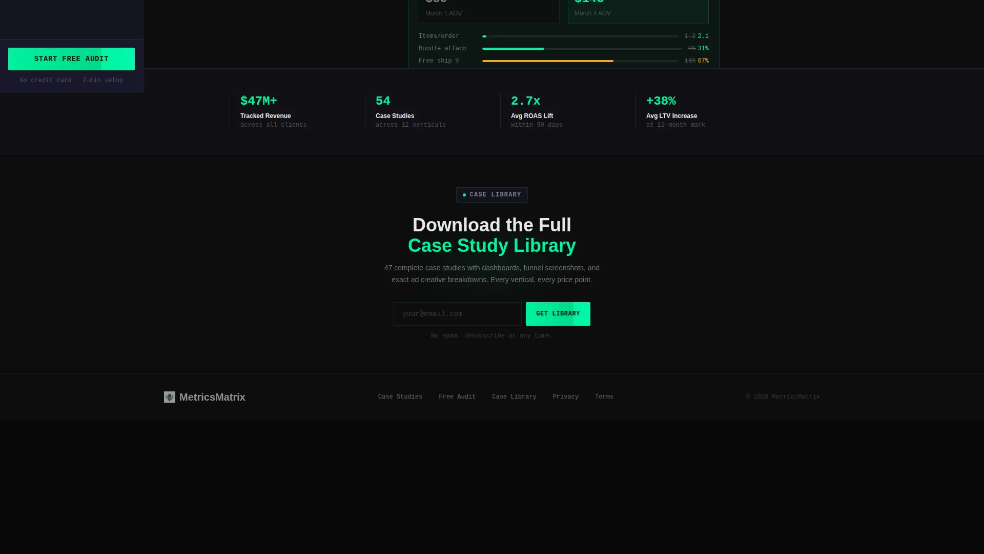
Every case study follows an identical format. A store profile sits at the top, followed by the core problem shown as a single red-lined metric, an intervention mapped in a step diagram, and an animated counter ticking from the before number to the after number.
Pinned Freemium call to action Panel
The primary call to action, "Start Your Free Audit," is pinned to the bottom of the locked left panel. It travels with the visitor through every case study. Clicking opens a two-step form: first, paste a Shopify store URL; second, select the biggest bottleneck from a visual grid covering traffic, conversion, retention, and margins.
Gated Secondary Lead Path
A second conversion path offers "Download the Full Case Library" behind an email field. This captures visitors who are not ready to connect a store but still want the data. It widens the funnel without diluting the primary offer.
Progressive Content Unlock
Each case study is displayed at 60% depth. A grayed-out "full breakdown" section is visible but locked. It unlocks after a trial signup, creating a clear incentive to convert while previewing the value waiting on the other side.
Page sections overview
| Section | Purpose |
|---|---|
| Logo Bar Header | Establishes credibility with brand logos and a headline stat |
| Metric Category Nav | Lets visitors filter case studies by performance area |
| Case Study Panel | Displays structured proof with problem, intervention, and result |
| Pinned Audit call to action | Keeps the primary conversion action visible at all times |
| Step Diagram Block | Maps the intervention process inside each case study |
| Animated Result Counter | Shows before-and-after metric movement as a live counter |
| Gated Case Library | Captures email leads with a downloadable content offer |
| Two-Step Signup Form | Collects store URL and bottleneck type for the free audit |
Design & branding system
The Carbon Fiber color system is built to feel like a mission-control room. Every color choice carries functional meaning, and nothing bright appears without a reason.
- Core palette: cockpit black (#0D0D0D), instrument-panel charcoal (#1A1A2E), data-pulse green (#00F5A0), and alert white (#E8E8E8)
- Green appears only on climbing metrics; charcoal panels tile across the page like widgets in a live analytics dashboard
- Typography in alert white keeps readability high against dark backgrounds without breaking the focused, cockpit aesthetic
Mobile & speed optimization
The split-screen layout is designed with deliberate structure that adapts across screen sizes. The template keeps the experience functional and readable whether a founder checks it on a laptop at the office or a phone late at night.
- The locked left panel and swappable right panel are structured to reflow cleanly on smaller viewports
- Animated counters and step diagrams are built to render without heavy asset dependencies
- The two-step form and gated content paths are designed for straightforward interaction on touch screens
How this template helps you convert
The Metrics template is engineered around a freemium conversion model. Every design and layout decision pushes toward one of two outcomes: an audit signup or an email capture.
- The pinned "Start Your Free Audit" call to action stays visible throughout the entire case study browsing experience, reducing the distance between interest and action at any scroll depth.
- The progressive content unlock creates a visible reward for signing up. Visitors can see exactly what they are missing, which sharpens the decision to convert rather than leaving it abstract.
- The gated case library acts as a softer second path, capturing visitors who need more evidence before committing, and keeping them in the funnel for a later conversion.
Other information about this template
This template is part of a broader ecosystem of eCommerce-focused design tools and is well-suited for teams building on modern no-code or low-code platforms.
- The Dashboard Pro theme and Carbon Fiber palette are consistent with design systems popular among performance marketing and analytics-focused product teams
- The Feature Matrix creative direction works especially well for agencies or consultancies presenting multi-client results across different verticals and price points
- The template is built for the eCommerce store case study page niche, making it a strong fit for Shopify ecosystem partners, growth consultants, and eCommerce SaaS tools looking to present proof at scale
- The Freemium/Trial landing page direction is aligned with modern product-led growth (PLG) acquisition models, where showing results before asking for commitment is the most effective path to conversion


Theme
Dashboard Pro
Creative direction
Feature Matrix
Color system
Carbon Fiber
Style
Split Screen (50/50)
Direction
Freemium/Trial
Page Sections
Scrolling DTC Logo Bar
Locked Feature Matrix Navigation
Structured Case Study Cards
Pinned Free Audit Call to Action
Gated Case Library Download
Progressive Content Unlock
Related questions
Can I customize the metric categories in the left navigation panel?
How does the two-step free audit form work?
What does the gated case library offer capture?
Can this template handle case studies across different store verticals?
Is this template a good fit for a growth agency presenting client results?


