IoT & Hardware Booking Website Template
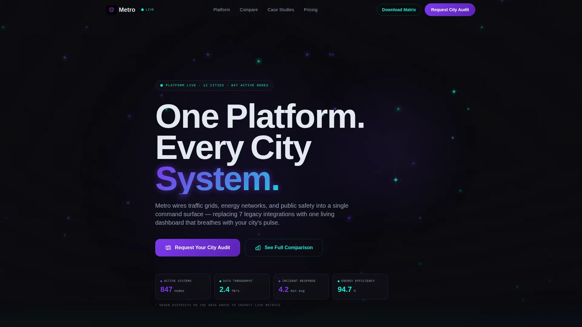
Metro is a single-page comparison landing page template built for smart city solution providers. It showcases a dynamic 3D wireframe city header, animated head-to-head comparison rows, and two carefully designed conversion paths. The template targets municipal decision-makers and helps them see Metro's platform value against legacy systems before a single meeting is booked.
by Rocket studio
Quick summary
Metro is a comparison landing page template designed for smart city solution providers. It opens with a live-feel 3D wireframe city grid, moves visitors through animated platform comparisons, and closes with a dual conversion strategy. Every section is built to earn the trust of technical municipal buyers before asking for their time.
Who this template is for
This template speaks directly to the people responsible for city-wide infrastructure decisions. They are not casual browsers. They need evidence, not promises.
- Municipal chief information officers evaluating platform migrations away from legacy systems
- Urban planning directors managing siloed, disconnected infrastructure environments
- Smart infrastructure consultants building internal business cases for city council approval
What problem this template solves
Most smart city platforms struggle to explain their value across departments and systems in a single conversation. A static brochure page does not cut through the skepticism of a city council or a procurement committee. Metro solves this by making the comparison do the persuading.
- Decision-makers cannot see platform superiority without a side-by-side breakdown
- High-stakes audiences leave generic pages quickly without a visual proof point
- Research-stage buyers need something they can download and share internally
What you get with this template
Metro delivers a fully structured, single-page layout packed with motion-driven comparison sections and two distinct lead capture flows. Everything is built around one goal: turning a skeptical municipal buyer into a qualified lead.
- An interactive 3D city grid header with hover-triggered metric simulations
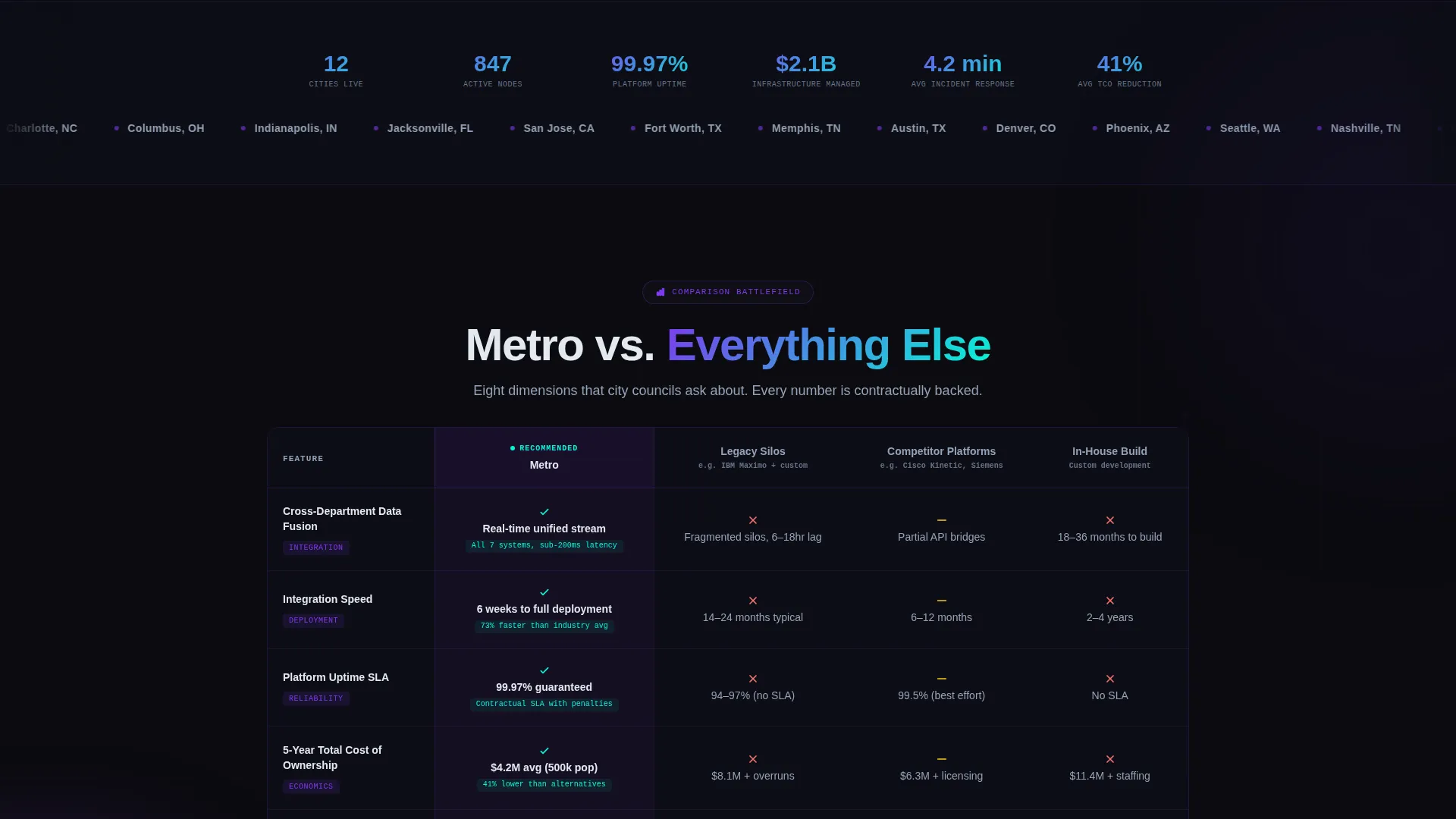
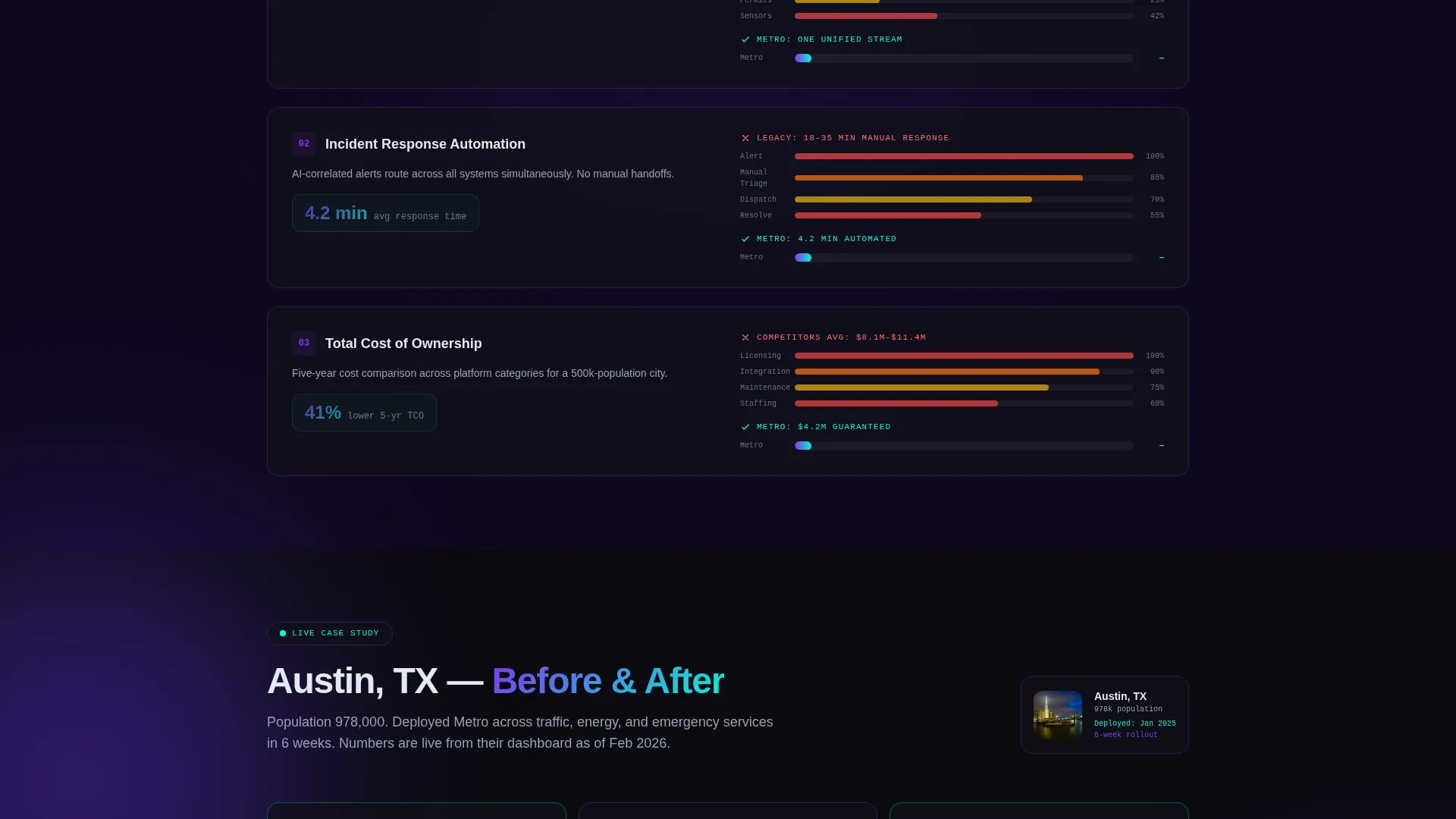
- Animated head-to-head comparison rows covering integration speed, uptime, total cost of ownership, and live case study results
- A sticky "Request Your City Audit" call-to-action bar and a gated PDF download form for high-funnel research visitors
Feature list
This section outlines the core interactive and structural capabilities built into the Metro template.
Interactive 3D City Grid Header
The header renders a stylized wireframe city in violet lines against void black. Visitors hover over districts to trigger real-time metric simulations. Traffic throughput, energy consumption, and incident response times each animate into view with kinetic motion trails.
Animated Comparison Matrix
Each comparison row is a micro-interaction, not static text. Hovering a feature like cross-department data fusion triggers a split animation. The competitor side shows fragmented feeds collapsing into a unified stream on Metro's side.
Sticky Conversion Bar
A "Request Your City Audit" call-to-action bar activates automatically after the visitor scrolls past the third comparison row. The timing is intentional. It appears only after the visitor has already seen enough evidence to act.
Dual Lead Capture System
The primary form captures municipality name, current platform environment via dropdown, population tier, and work email. The secondary gated download requires only email and role title, keeping friction low for early-stage research visitors.
Scroll-Triggered Case Study Row
A dedicated comparison row surfaces a real city's before-and-after metrics. The numbers animate on scroll, making the proof tangible and timed to the visitor's reading pace.
Dynamic Motion Design System
The entire page uses the Void and Violet color system with purposeful motion at every layer. Comparison columns alternate between ultraviolet and near-black. The winning column pulses faintly with violet luminance to guide the eye.
Page sections overview
| Section | Purpose |
|---|---|
| Interactive City Header | Immerse visitors with a hover-responsive 3D wireframe city grid |
| Hero Intro Block | Frame Metro's core value proposition above the comparison content |
| Metro versus. Legacy | Compare Metro directly against siloed legacy infrastructure systems |
| Metro versus. Competitors | Show head-to-head feature parity against rival smart city platforms |
| Metro versus. In-House | Address the build-it-yourself objection with cost and time comparisons |
| Live Case Study Row | Animate real before-and-after city metrics triggered on scroll |
| Sticky call to action Bar | Surface the audit request form after sufficient scroll depth |
| PDF Download Gate | Capture high-funnel leads with a low-friction research download offer |
Design & branding system
Metro's visual identity is built on the Void and Violet color system. The palette is designed to feel like energy moving through darkness, not a standard corporate color scheme.
- Core colors: absolute void black (#0B0B0F), deep ultraviolet (#2D1B69), electric violet (#7C3AED), and signal cyan (#06F5D6) reserved for live data accents and hover states
- Text renders in cool white (#E2E8F0) against dark backgrounds, keeping contrast strong and readability high
- The winning comparison column pulses faintly with violet luminance, and every highlight carries visual meaning rather than decoration
Mobile & speed optimization
Metro is designed so that its motion-rich experience scales responsibly across screen sizes. The Dynamic Motion theme is built with intentional layering rather than brute-force animation.
- Comparison rows and the sticky conversion bar are structured to reflow cleanly on smaller viewports
- Motion trails and hover interactions are scoped to enhance rather than overwhelm, keeping the layout navigable on touch devices
How this template helps you convert
Metro is architected around a comparison-first conversion strategy. Every structural choice is made to build confidence before asking for a commitment.
- The animated comparison matrix handles objections visually before a sales call happens, giving municipal buyers a self-serve proof experience that earns trust progressively.
- The sticky audit request bar activates only after the visitor has moved past three full comparison rows, ensuring the ask arrives at maximum credibility rather than at page load.
- The gated PDF download provides a second conversion path for visitors still in the research phase, capturing email and role title with minimal friction so no high-value lead leaves empty-handed.
Other information about this template
Metro is categorized under the Technology vertical, sitting at the intersection of the Internet of Things and smart city solutions. It is designed to serve providers operating in a space where procurement cycles are long and stakeholder audiences are technically demanding.
- The template style is a Comparison Table layout, purpose-built for the Comparison and Versus landing page direction
- The header concept is an Interactive Preview, and the creative direction follows an Interactive Explorer scroll logic throughout
- The theme is Dynamic Motion, meaning the page communicates through movement as much as through words
- Metro is suitable for teams pitching platform migrations to cities currently running environments such as Cisco Kinetic, Siemens MindSphere, IBM Maximo, custom legacy builds, or no platform at all

Theme
Dynamic Motion
Creative direction
Interactive Explorer
Color system
Void & Violet
Style
Comparison Table
Direction
Comparison/Versus
Page Sections
Interactive 3D City Grid Header
Animated Head-to-head Comparison Matrix
Scroll-activated Sticky Call to Action Bar
Dual Lead Capture Paths
Scroll-triggered Case Study Row
Void and Violet Motion Design System
Related questions
Who is the Metro template built for?
What makes the comparison rows different from a standard feature table?
How does the dual conversion system work?
What fields does the lead capture form include?
Is Metro a single-page or multi-page template?



