Microservices Technology Cost Calculator Website Template
A high-performance engineering landing page built for microservices research labs. This hub-and-spoke template opens with a live architecture decomposition calculator, then cascades through latency benchmarks, resilience data, and mesh comparisons. It drives visitors toward downloading the Benchmark Suite with a persistent, contextual call-to-action bar. Built dark, dense, and data-forward for platform engineers who trust numbers over narratives.
by Rocket studio
Quick summary
This template is a single-page, anchor-nav landing page designed for a microservices research lab. It leads with an interactive estimator that makes the visitor's own system the subject. From there, it delivers cascading benchmark data across latency, resilience, and mesh comparison sections. Every section ends with a clear path to downloading the Benchmark Suite.
Who this template is for
This template is built for technical teams and independent research labs working in distributed systems infrastructure. It speaks directly to the people who live inside the problem, not around it.
- Platform engineers debugging cascading failures who need hard latency numbers to act on
- DevOps leads evaluating service meshes and comparing real-world performance across options
- CTOs leading monolith-to-microservices migrations who need cost and reliability data to justify the roadmap
What problem this template solves
Most infrastructure landing pages lead with marketing language. They make claims without evidence, and they lose technical audiences within seconds. This template flips that pattern.
- Engineers arrive and immediately see their own system modeled in the header calculator, not a generic hero image
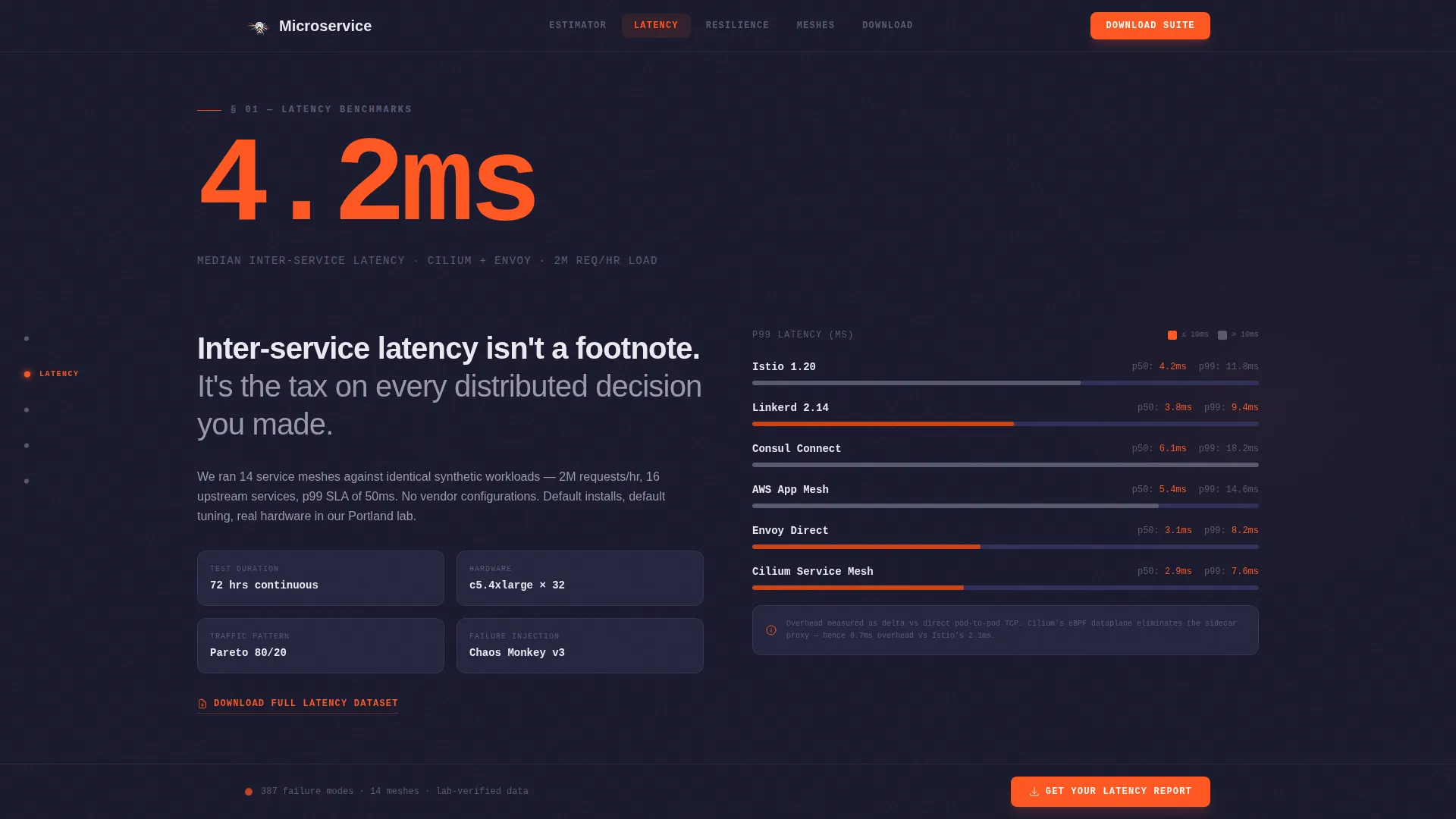
- Each research section opens with a single, massive data point before any explanation appears
- The download flow stays persistent and contextual, removing friction at every scroll position
What you get with this template
You get a fully structured, dark-themed landing page that puts research data at the center of every section. The layout is hub-and-spoke, with an anchor navigation rail keeping each spoke reachable at all times.
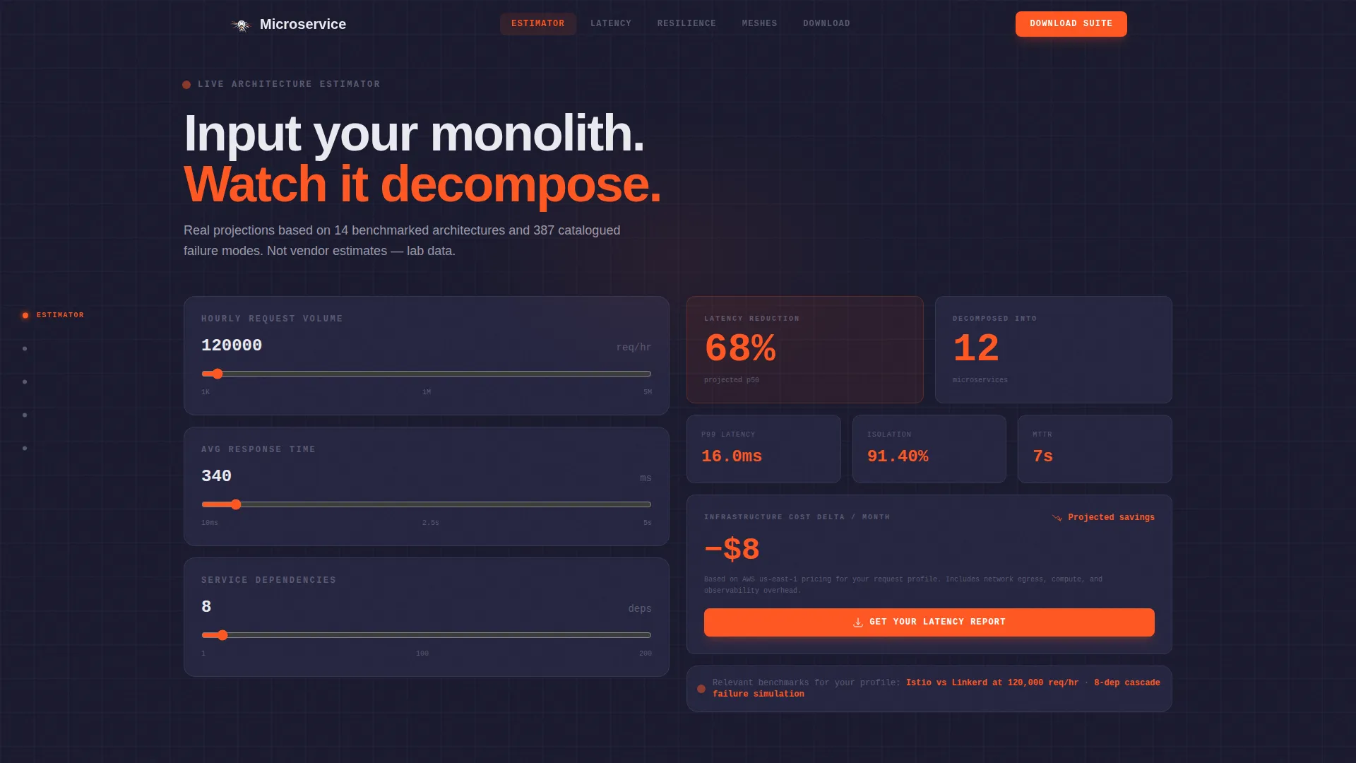
- A live architecture decomposition estimator in the header that accepts request volume, response time, and dependency count as inputs
- Five distinct content spokes covering latency benchmarks, resilience data, mesh comparisons, and the download call to action
- A persistent bottom bar that updates its label contextually after each spoke section, always routing to the same download flow
Feature list
This section walks through the key functional and visual components built into the template.
Live Architecture Decomposition Calculator
The header is the tool. Visitors input their monolith's request volume, average response time, and number of service dependencies. The calculator outputs projected latency reduction, failure isolation gains, and infrastructure cost delta in real time. Numbers animate like a stock ticker using GSAP ScrollTrigger and number counter animations, with orange digits climbing and settling.
Stats-First Spoke Sections
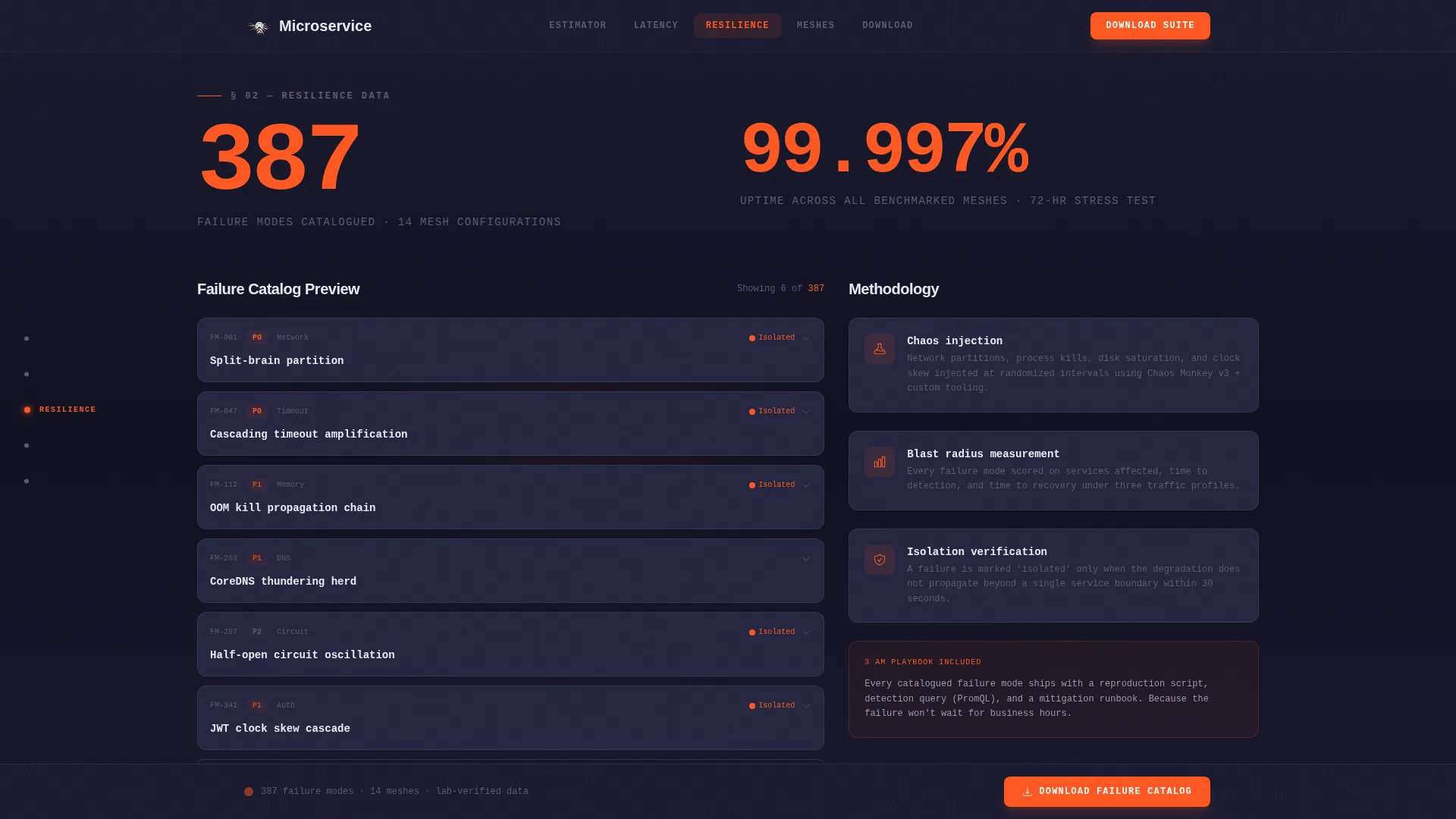
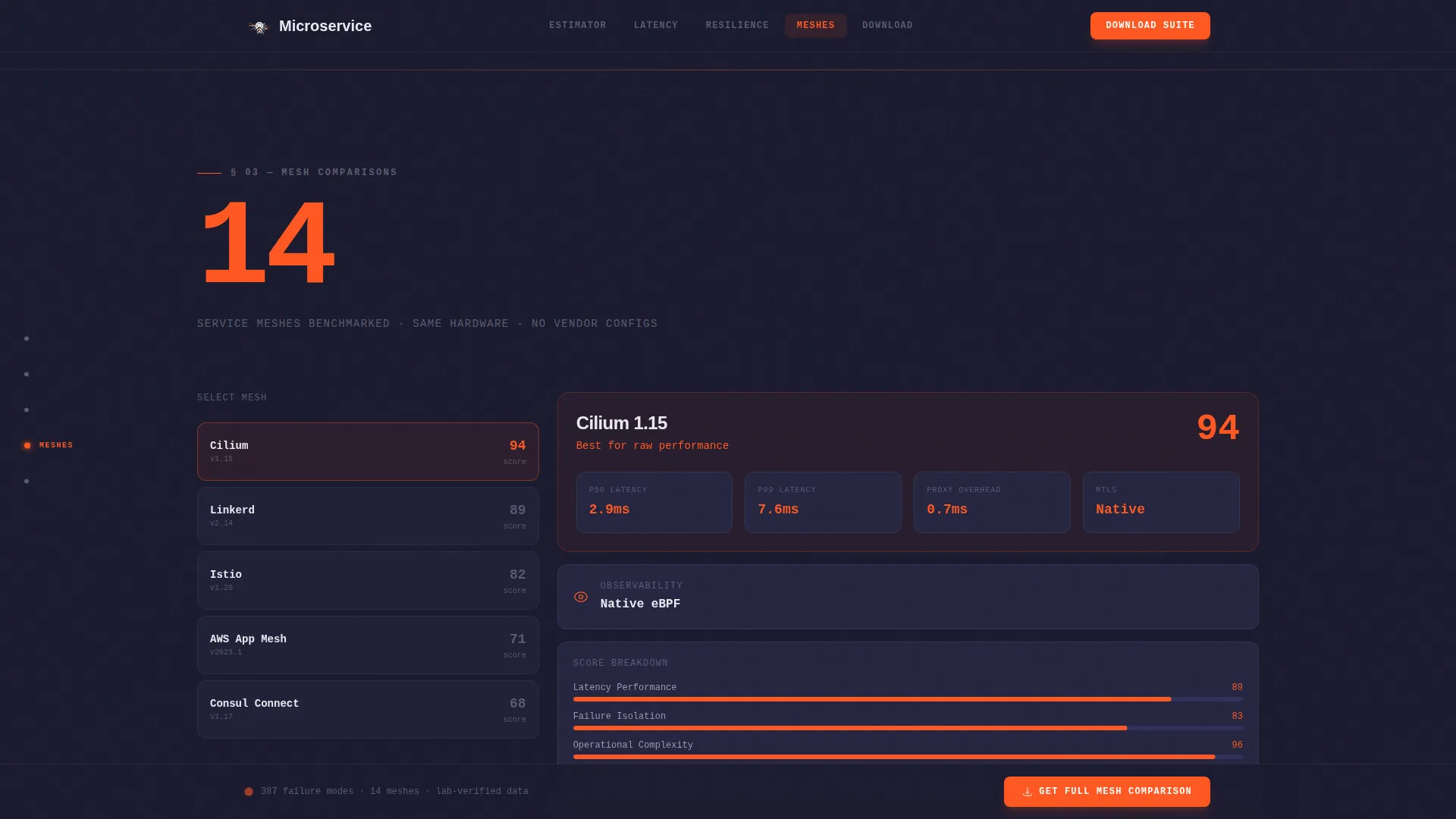
Each research spoke opens with a single, massive statistic rendered in ignition orange before any explanation appears. Examples from the brief include 4.2ms median inter-service latency, 99.997% uptime across 14 benchmarked meshes, and 387 failure modes catalogued. The rhythm is punch-then-prove: the number stops the reader, the methodology earns the trust.
Anchor Navigation Rail
A persistent left-side navigation rail links every spoke section by anchor. Visitors can jump between latency, resilience, and mesh benchmark sections without losing their place. Each anchor label updates to reflect the active section, keeping orientation clear on long scroll paths.
Contextual Persistent Bottom Bar
A sticky bottom bar resurfaces the primary call to action after every spoke section. Its label updates contextually: "Get Your Latency Report" after the latency section, "Download Failure Catalog" after the resilience section. Every label routes to the same Benchmark Suite download flow.
Platform-Toggle Download Flow
The primary call-to-action section includes a platform toggle for macOS, Linux, and Docker. Visitors select their environment, enter a work email, and opt into research updates with a single checkbox. The estimator in the header seeds urgency by surfacing exactly which benchmarks match the visitor's inputs.
GitHub Developer Minimal Footer
The footer follows a developer-minimal pattern, keeping the page grounded in a technical context. It avoids marketing clutter and stays consistent with the dark dashboard aesthetic used throughout.
Page sections overview
| Section | Purpose |
|---|---|
| Header Calculator | Decompose visitor's architecture live and project latency, isolation, and cost outcomes |
| Latency Stats Spoke | Present 4.2ms median inter-service latency with methodology and interactive chart |
| Resilience Data Spoke | Show 99.997% uptime and 387 catalogued failure modes with catalog preview |
| Mesh Benchmarks Spoke | Compare 14 service meshes using real latency numbers and downloadable datasets |
| Download Call to Action | Deliver Benchmark Suite with platform toggle, email field, and opt-in checkbox |
| Developer Minimal Footer | Close the page with a technical, clutter-free footer pattern |
Design & branding system
The visual identity runs on a Carbon Fiber color system. The palette feels like the inside of a server rack at midnight: dark, dense, and purposeful, with every flash of orange acting as a live signal.
- Colors: deep graphite black (#1A1A2E) as the base, woven carbon gray (#30305A) for surface layers, high-beam white (#EAEAF0) for body text, and ignition orange (#FF5722) reserved exclusively for data points, counters, and calls to action
- Typography: DM Sans handles body copy and interface labels, while JetBrains Mono renders numbers, code snippets, and data outputs for technical clarity
- Animation style: GSAP ScrollTrigger drives staggered section reveals, number counter animations on statistics, and a stock ticker effect on the header estimator outputs
Mobile & speed optimization
The template is built desktop-first, reflecting the reality that platform engineers and DevOps leads typically work on large monitors. Mobile is treated as a functional fallback rather than the primary experience.
- Static content sections use server-side rendering patterns to keep load behavior stable for text-heavy research data
- The interactive calculator and GSAP animations run as client-side components, keeping heavy interactivity scoped and isolated from static content
- The anchor navigation rail adapts to smaller viewports without losing its core orientation function
How this template helps you convert
The conversion architecture is built around reducing friction for a highly skeptical, technically sophisticated audience. Every element earns attention before asking for action.
- The header calculator makes the visitor's own system the subject immediately, creating personal relevance before any research claim is made
- The stats-first spoke structure delivers evidence in the order engineers actually process it: number first, methodology second, download third
- The contextual bottom bar keeps the download offer visible and relevant at every scroll position, updating its label to match the research section just read
Other information about this template
This template is part of the Startup Velocity theme family, designed for technically ambitious projects that need to communicate credibility through data rather than design polish. It pairs well with teams building in the microservices infrastructure and distributed systems space.
- Template style: Hub and Spoke with Anchor Navigation, structured for long-scroll technical research content
- Creative direction: Stats-First Impact, where every spoke section leads with a hard number before any narrative begins
- Header concept: Calculator and Estimator, making the visitor's architecture the interactive subject from the first scroll position
- Landing page direction: App Download, optimized to drive Benchmark Suite downloads with minimal friction
- Color system: Carbon Fiber, using a four-color palette where ignition orange is reserved as a signal color for data and action only
- The template supports English (United States) localization with technical terminology suitable for platform engineering and distributed systems audiences
Theme
Startup Velocity
Creative direction
Stats-First Impact
Color system
Carbon Fiber
Style
Hub & Spoke (Anchor Nav)
Direction
App Download
Page Sections
Live Architecture Decomposition Calculator
Stats-first Spoke Sections
Anchor Navigation Rail
Contextual Persistent Bottom Bar
Platform-toggle Download Flow
Developer Minimal Footer
Related questions
Who is this landing page template designed for?
What does the header calculator actually do?
Can I customize the benchmark statistics in each spoke section?
Does the template include the actual Benchmark Suite download file?
Is this template suitable for mobile users?



