Powerful Twilio | Free Website Template | Rocket
Migrate is a split-screen landing page template built for technical teams moving off costly communication APIs. It pairs a dark terminal aesthetic with dynamic motion design to guide engineering leads and CTOs through a migration playbook download funnel. Every section is crafted to build evidence, reduce hesitation, and convert a skeptical technical audience into an engaged download.
by Rocket studio
Quick summary
Migrate is a single-page template designed for technical migration guides and developer-focused playbook offers. It uses a 50/50 split-screen layout, a Midnight Blue color system, and Dynamic Motion visuals to present cost benchmarks, architecture comparisons, and a clear download call to action. The result feels like a live monitoring dashboard: focused, data-driven, and built for a technical audience.
Who this template is for
This template is built for teams who need to present a complex technical decision with clarity and urgency. The layout supports high-trust, evidence-first funnels where the audience is skeptical and detail-oriented.
- Backend leads and DevOps engineers evaluating communication infrastructure changes
- CTOs and engineering managers who need a compelling, data-backed case for switching providers
- Developer tool companies and technical consultancies publishing migration guides or playbooks
What problem this template solves
Technical audiences distrust marketing pages. They scroll past vague claims and abandon forms the moment they sense friction. This template solves that by leading with data and earning the download before asking for an email.
- Generic landing pages fail to communicate cost-per-message benchmarks or architecture tradeoffs in a scannable way
- Standard templates lack the visual language that signals credibility to engineers and DevOps professionals
- Most playbook funnels bury the value below the fold, losing a technical visitor before the offer lands
What you get with this template
You get a fully structured single-page layout with distinct content zones designed for a technical report funnel. Every section has a defined job: build credibility, present evidence, and convert.
- A split-screen header with an animated logo bar, a monospaced headline, and a live message counter above the fold
- Interactive comparison zones with side-by-side pricing charts and a filterable migration complexity matrix
- A dual call-to-action section with an email capture form and a no-form secondary path to an API documentation comparison
Feature list
This template delivers six purpose-built layout components. Each one is designed to move a technical reader from skepticism to action.
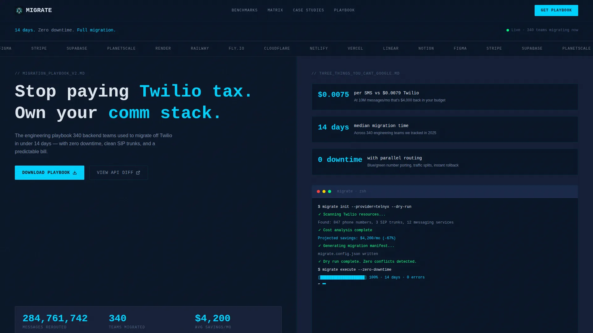
Animated Logo Bar Header
The header opens with a horizontal ribbon of company logos rendered in monochrome chalk white against the deep terminal navy background. The logos pulse left to right, simulating data packets moving through a network. A monospaced headline sits above: "14 days. Zero downtime. Full migration." Below it, a live counter animates upward showing aggregate messages routed off the previous provider.
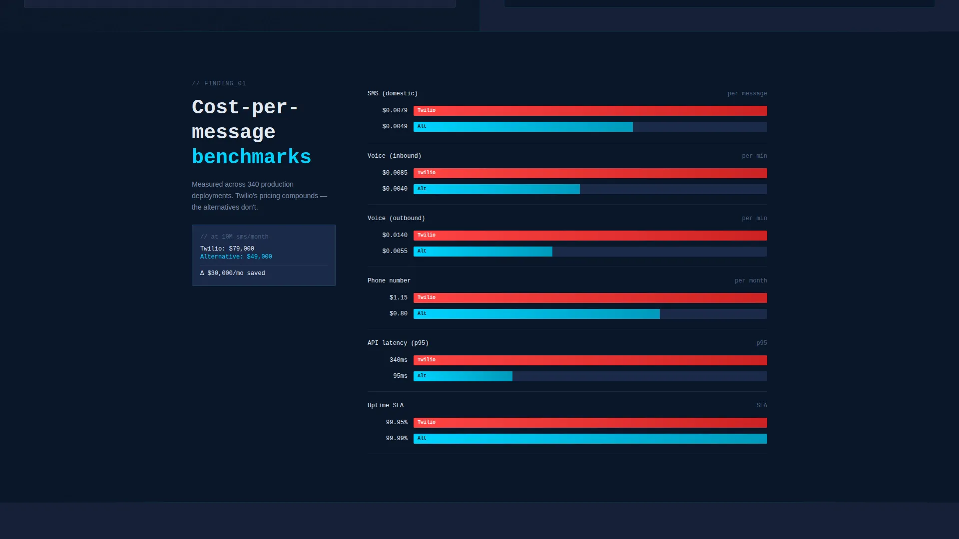
Split-Screen Pricing Comparison
The core content zone uses a 50/50 split screen to place two pricing views side by side. Bar charts animate to scale as the visitor scrolls, making the cost delta immediately visible. This layout removes the need for the visitor to do mental math.
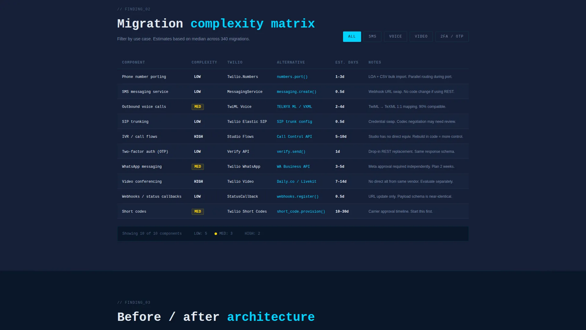
Migration Complexity Matrix
A filterable matrix lets visitors select their use case from options including SMS, voice, video, and two-factor authentication (2FA). The matrix then displays relevant complexity data for that migration path. This keeps the page relevant to a wide range of engineering scenarios without overwhelming any single visitor.
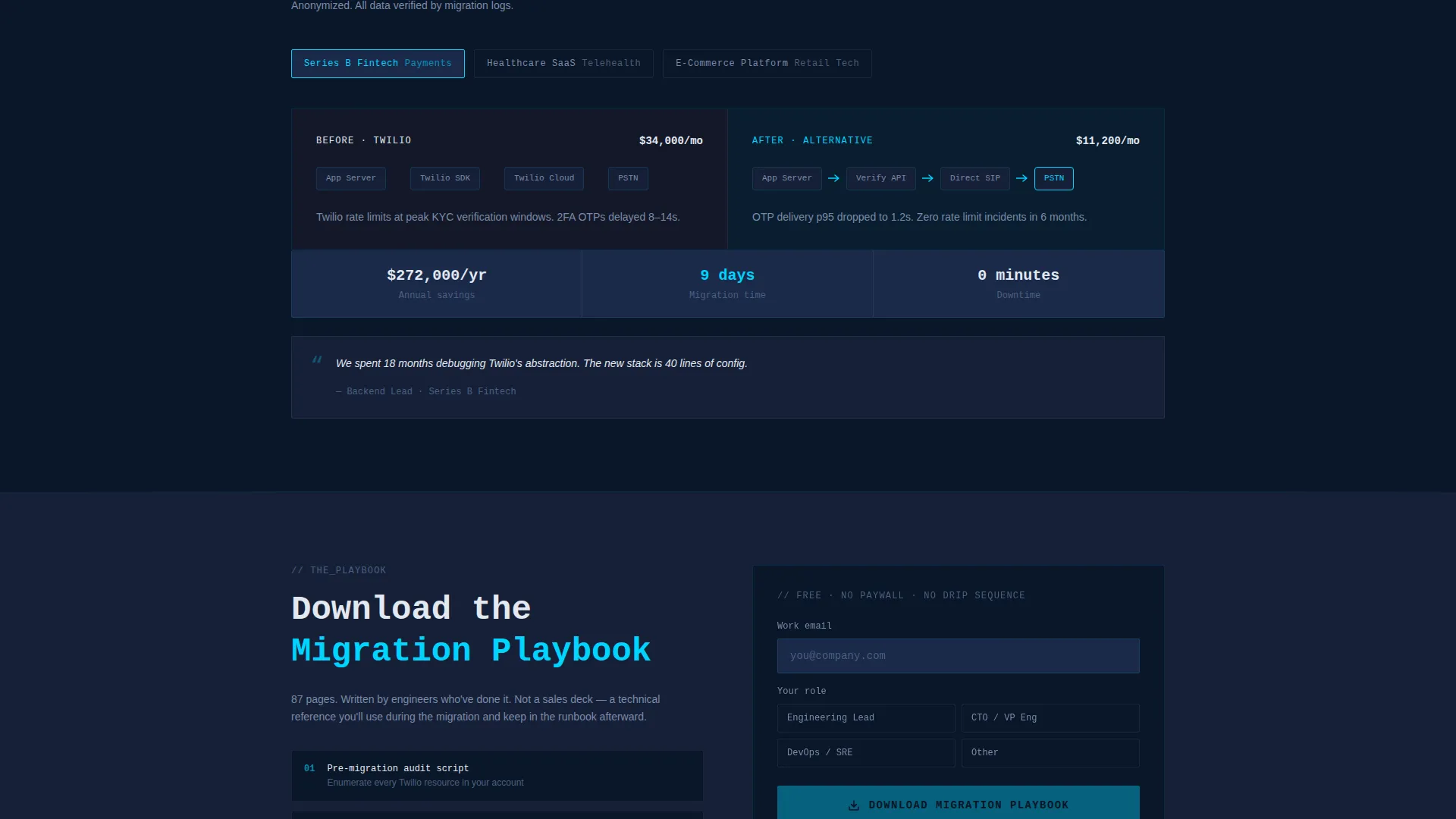
Anonymized Case Study Snapshots
Before-and-after architecture diagrams appear as the visitor scrolls, drawn progressively to simulate a deployment script executing. Each snapshot is anonymized, keeping the focus on the architectural decision rather than the company name.
Playbook Download Form
The primary conversion point is a minimal form with a single email field and a role selector. Role options include Engineering Lead, CTO, DevOps, and Other. The form is front-loaded with three high-value data points from the playbook, so the visitor already sees proof of quality before submitting.
No-Form API Diff Path
A secondary call to action links directly to an interactive documentation comparison labeled "View the API Diff." This path requires no form submission and serves visitors who are deeper in evaluation and want technical specifics immediately.
Page sections overview
| Section | Purpose |
|---|---|
| Logo Bar Header | Establishes social proof and kinetic energy above the fold |
| Live Message Counter | Communicates scale and real-time momentum instantly |
| Above-Fold Data Points | Front-loads three report findings to prove guide value |
| Pricing Comparison Charts | Side-by-side cost benchmarks with animated bar charts |
| Migration Complexity Matrix | Filterable use-case view for SMS, voice, video, and 2FA |
| Architecture Diagram Snapshots | Before-and-after case study visuals drawn on scroll |
| Playbook Download Form | Email and role capture with role selector dropdown |
| API Diff Secondary Path | No-form link to interactive documentation comparison |
Design & branding system
The visual identity uses a Midnight Blue color system that feels like a monitoring dashboard at 3 a.m. Every color choice is intentional and earns its place by signaling something meaningful to the reader.
- Deep terminal navy (#0A1628) as the primary background, muted steel (#1B2A4A) for card surfaces and section dividers, electric signal cyan (#00D4FF) for interactive elements and data highlights, and cool chalk white (#E2E8F0) for body text
- Monospaced typography for headlines reinforces the terminal aesthetic and signals technical precision to an engineering audience
- Motion is constant but purposeful: numbers count up, diagrams draw themselves, and comparison columns slide into frame on scroll
Mobile & speed optimization
The template is structured for clean rendering across device sizes. The 50/50 split-screen layout is designed to restack gracefully on narrower viewports.
- Section-led scroll behavior keeps each content zone discrete, making navigation intuitive on touch screens
- Animation triggers are scroll-based, so motion activates only when the relevant section enters the viewport
How this template helps you convert
The conversion strategy is built on evidence accumulation. Each scroll section adds a new data point until the download decision feels like the logical next step.
- Three data points from the playbook appear above the fold, proving the guide contains intelligence the visitor cannot find elsewhere and creating immediate pull toward the form
- The filterable complexity matrix and animated pricing charts let each visitor self-qualify by use case, increasing the relevance of the offer before the call to action appears
- The dual conversion path accommodates both the visitor ready to commit and the visitor who still needs technical proof, reducing drop-off at the form stage
Other information about this template
This template sits in the Documentation and Support category, specifically under the Twilio Documentation subcategory and the Twilio Migration Guide niche. It is a strong fit for teams building content around communication API migration, SMS gateway switching, voice infrastructure changes, or developer-facing technical guides.
- The template style is Split Screen (50/50) with a Dynamic Motion theme, making it well suited for technical SaaS, developer tools, and infrastructure product marketing
- The creative direction follows an Industry Report cadence, which works particularly well for Twilio migration guide content, communication cost benchmarking, and SIP trunk evaluation pages
- The header concept is a Logo Bar, which can be adapted to showcase partner logos, customer logos, or recognized industry names relevant to the migration context
Theme
Dynamic Motion
Creative direction
Industry Report
Color system
Midnight Blue
Style
Split Screen (50/50)
Direction
App Download
Page Sections
Animated Logo Bar with Live Counter
Split-screen Pricing Comparison
Filterable Migration Complexity Matrix
Scroll-triggered Architecture Diagrams
Playbook Download Form with Role Selector
No-form API Diff Secondary Path
Related questions
Can I adapt this template for a migration guide that is not communication-focused?
Does the template include the actual playbook content or report data?
How does the dual call-to-action path work in practice?
Is the role selector in the download form customizable?
What makes this template different from a standard documentation page?


