IT Services & Consulting Professional Website Template
Migrate is a scroll-reveal landing page template built for cloud migration consultancies. It opens with a full-width migration assessment dashboard screenshot, then progressively reveals your methodology layer by layer. With a dark navy and cyan visual identity, two conversion paths, and a four-field free assessment form, it turns a complex technical offer into a clear, credible pitch.
by Rocket studio
Quick summary
Migrate is a single-page scroll-reveal template designed for cloud migration consultancies. It leads with a product screenshot header, reveals your methodology as visitors scroll, and drives conversions through a free assessment form. The design feels like a live network operations center: focused, dark, and precise. Every section earns trust before asking for anything.
Who this template is for
This template is built for consultancies that move legacy infrastructure into modern cloud environments. It speaks directly to technical buyers who need proof before they commit.
- Chief Technology Officers at mid-market companies inheriting aging on-premises stacks and a board mandate to modernize
- IT directors at healthcare organizations who cannot afford downtime during a cutover window
- Operations leads at software-as-a-service companies whose cloud bills ballooned after an unplanned first migration
What problem this template solves
Cloud migration is a high-stakes decision. Technical buyers do not respond to vague promises. They need to see the methodology, understand the risk, and trust the team before they book a call. Most consulting landing pages fail that test immediately.
- Visitors leave when they cannot see what the process actually looks like or what outputs they will receive
- Complex service offerings get flattened into generic hero text that fails to differentiate the consultancy
- Conversion forms ask for too much too soon, creating friction before trust is established
What you get with this template
You get a complete, production-ready landing page that walks a technical buyer through your migration process from first scroll to final call to action. Every section is structured to deliver one clear layer of information before the next appears.
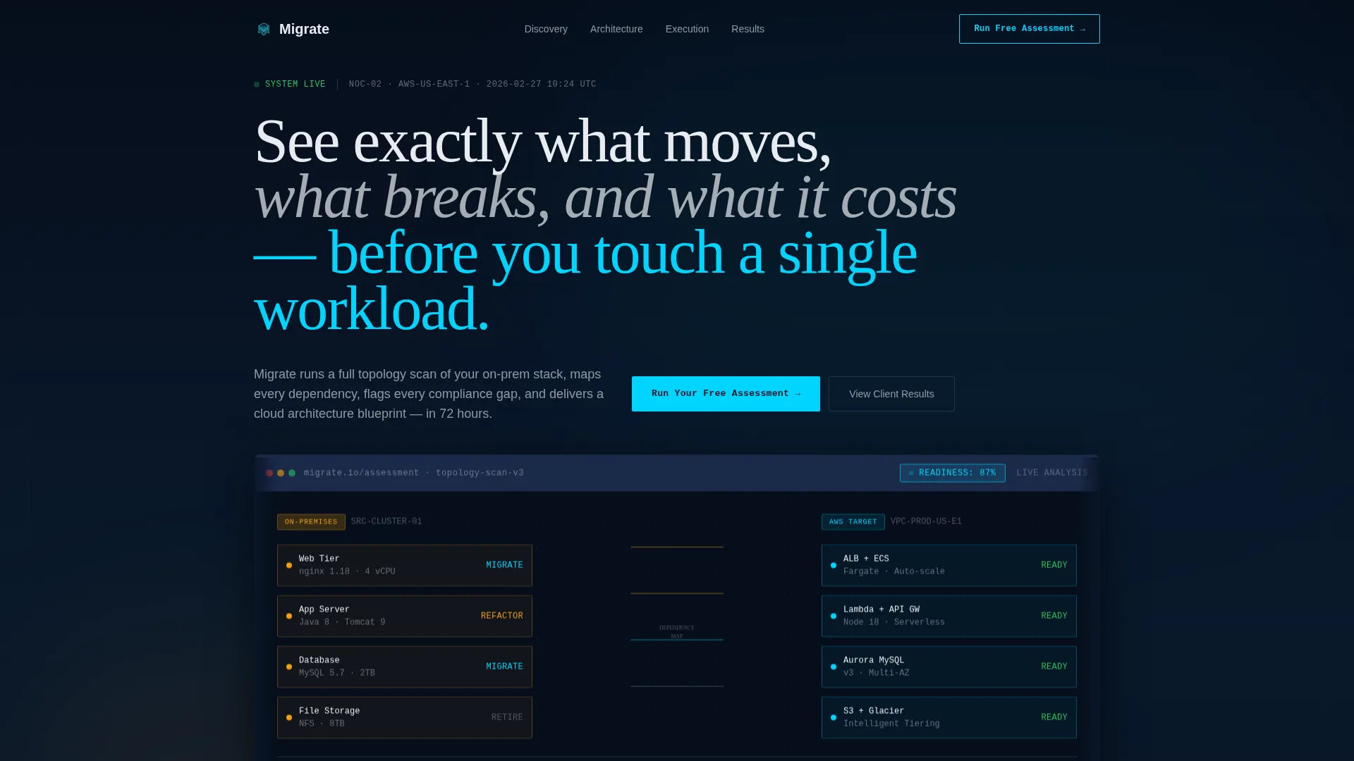
- A full-width product screenshot header showing a live topology map of source and target infrastructure, with a visible readiness score
- A progressive scroll-reveal layout that presents your discovery audit, architecture design, and execution timeline as sequential spec-sheet panels
- Two distinct conversion paths: a four-field free assessment form and a gated spec template download requiring only an email address
Feature list
This section covers the core functional and design elements built into the Migrate template.
Progressive Scroll Reveal Layout
Each section animates into view as the visitor scrolls, one discrete layer at a time. The rhythm is deliberate: a section fully lands and breathes before the next begins rising. This gives visitors the feeling of reviewing a structured proposal rather than being sold to.
Product Screenshot Header
The header opens with a pixel-perfect, full-width capture of a migration assessment dashboard. The screenshot sits at a subtle isometric angle with soft depth-of-field blur at the edges. On-premises nodes appear in amber on the left, cloud target nodes appear in cyan on the right, and dependency lines connect them with a readiness score displayed in the upper corner.
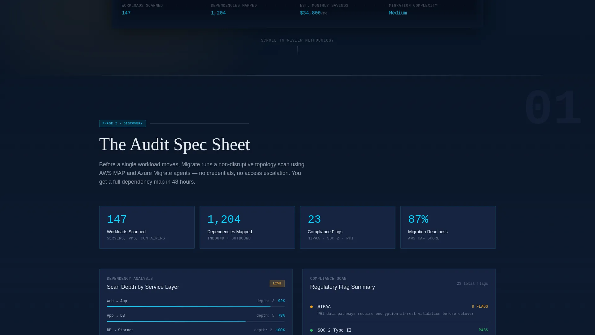
Spec Sheet Section Panels
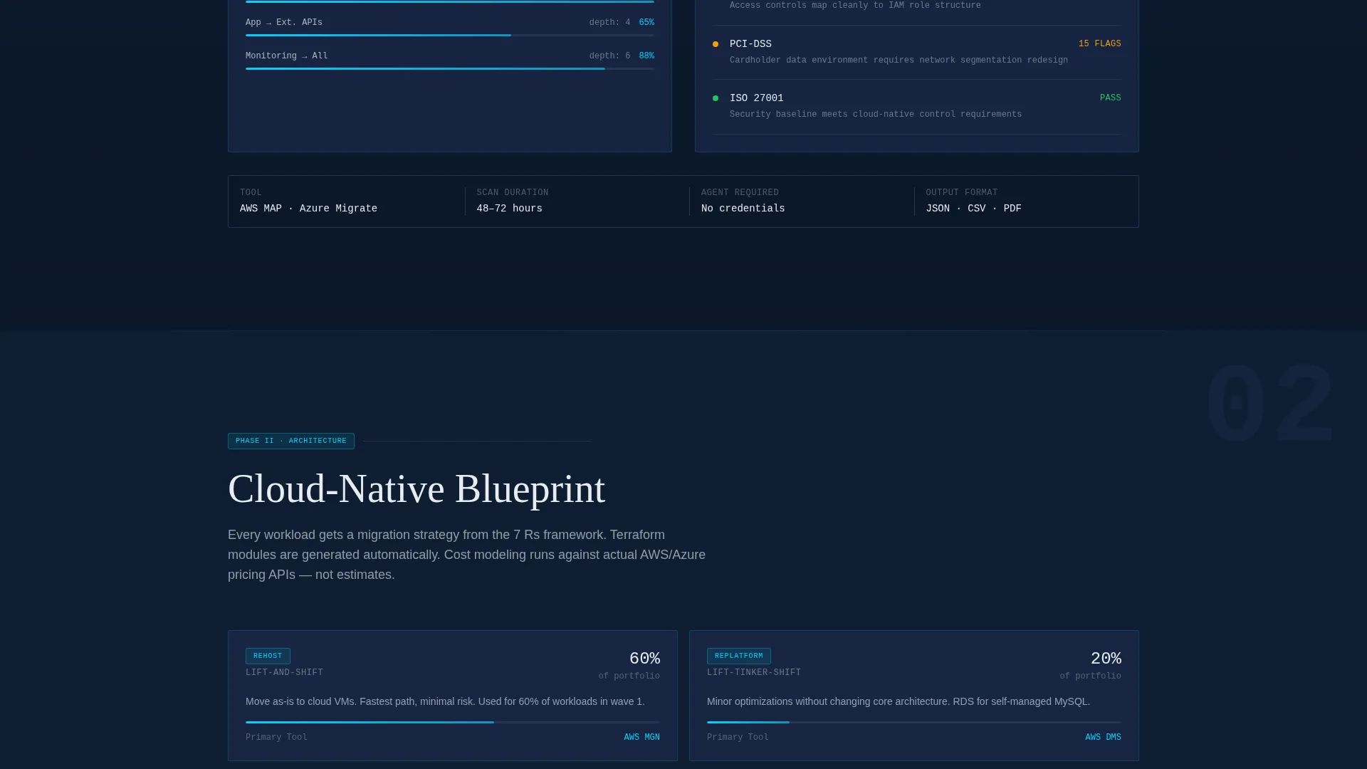
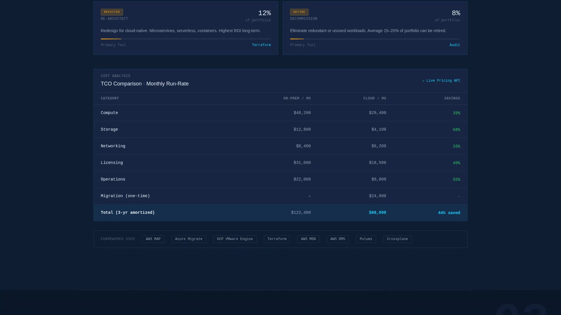
Three sequential content panels reveal the methodology in clinical detail. The first shows discovery audit specifications: workload counts, dependency depth, and compliance flags. The second presents cloud-native architecture diagrams and cost-comparison tables. The third displays an execution timeline with phase gates and rollback protocols.
Dual Conversion Path Design
The primary call to action is a four-field free assessment form asking for company name, estimated workload count, current infrastructure type, and work email. A secondary path at the page bottom offers a downloadable migration spec template, gated behind email only, for visitors not yet ready to run the assessment.
Persistent Bottom Call-to-Action Bar
After the visitor passes the second scroll-reveal section, a persistent bar appears at the bottom of the page repeating the primary call to action. This keeps the conversion option visible without interrupting the reading experience.
Midnight Blue Visual Identity
The color system uses deep terminal navy as the primary background, muted satellite blue for card surfaces and section dividers, signal white for body text, and live-status cyan reserved exclusively for interactive elements, progress indicators, and call-to-action borders. Cyan never appears on static elements.
Page sections overview
| Section | Purpose |
|---|---|
| Header Screenshot | Displays live topology map with readiness score to anchor credibility immediately |
| Primary call to action Block | Introduces the free assessment form beneath the header screenshot |
| Discovery Audit Panel | Reveals workload scan specs, dependency depth, and compliance flags on scroll |
| Architecture Design Panel | Shows cloud-native diagrams and cost-comparison tables on scroll |
| Execution Timeline Panel | Presents phase gates and rollback protocols as the methodology concludes |
| Persistent call to action Bar | Repeats the free assessment prompt after the second scroll-reveal section |
| Spec Download Section | Offers the gated migration spec template download for lower-intent visitors |
Design & branding system
The visual identity is built around a network operations center aesthetic: dark backgrounds, purposeful points of light, and zero decorative noise. Every color decision carries functional meaning.
- Background layers use deep terminal navy (#0A1628) as the base and muted satellite blue (#1B2A4A) for card surfaces and section dividers, so content panels float forward like monitoring dashboards
- Signal white (#E8ECF1) is used for all body text and data labels, maintaining legibility against the dark background
- Live-status cyan (#00D4FF) appears only on interactive elements, progress indicators, and call-to-action borders, never on static content
Mobile & speed optimization
The template is structured for clean rendering across screen sizes. The scroll-reveal behavior and fixed layout proportions are designed to translate from desktop to smaller viewports without losing the spec-sheet reading rhythm.
- The isometric header screenshot scales responsively so the topology map remains readable on tablet and mobile screen widths
- The persistent bottom call-to-action bar is sized and positioned to remain accessible on touch devices without covering content
How this template helps you convert
The conversion strategy is built on showing the output before asking for the input. Visitors see the dashboard result first, which removes uncertainty about what they will receive.
- The header screenshot previews the exact migration assessment output, so the visitor understands the value of the free tool before encountering the form
- The four-field form design keeps the primary ask lightweight: company name, workload range, infrastructure type, and work email only, with no phone number and no meeting request
Other information about this template
This template is well suited for consultancies positioning their offer within structured cloud migration frameworks. The spec-sheet creative direction and methodology-forward layout work naturally alongside recognized industry practices and tooling narratives.
- The architecture panels and cost-comparison tables in this template can support references to migration frameworks and infrastructure-as-code tooling such as Terraform modules
- The topology map header and readiness score display make this template a strong fit for consultancies that use platforms like AWS Migration Acceleration Program, Azure Migrate, or Google Cloud migration tools in their workflow narrative
- The Directory and Discovery theme means the layout reads as a tool interface rather than a brochure, which aligns well with how technical buyers evaluate cloud migration service providers
Theme
Directory & Discovery
Creative direction
Spec Sheet
Color system
Midnight Blue
Style
Scroll Reveal (Progressive)
Direction
Freemium/Trial
Page Sections
Progressive Scroll Reveal Layout
Product Screenshot Header
Spec Sheet Methodology Panels
Dual Conversion Path Design
Persistent Bottom Call to Action Bar
Midnight Blue Color System
Related questions
Who is this landing page template designed for?
Can I customize the assessment form fields?
What are the two conversion paths included in this template?
Does this template work for consultancies using specific cloud platforms?
How does the scroll-reveal structure support the sales process?


